Peter Dawson - Graphic Design Rules: 365 Essential Design DOS and Donts
Here you can read online Peter Dawson - Graphic Design Rules: 365 Essential Design DOS and Donts full text of the book (entire story) in english for free. Download pdf and epub, get meaning, cover and reviews about this ebook. year: 2019, publisher: White Lion Publishing, genre: Romance novel. Description of the work, (preface) as well as reviews are available. Best literature library LitArk.com created for fans of good reading and offers a wide selection of genres:
Romance novel
Science fiction
Adventure
Detective
Science
History
Home and family
Prose
Art
Politics
Computer
Non-fiction
Religion
Business
Children
Humor
Choose a favorite category and find really read worthwhile books. Enjoy immersion in the world of imagination, feel the emotions of the characters or learn something new for yourself, make an fascinating discovery.

- Book:Graphic Design Rules: 365 Essential Design DOS and Donts
- Author:
- Publisher:White Lion Publishing
- Genre:
- Year:2019
- Rating:3 / 5
- Favourites:Add to favourites
- Your mark:
Graphic Design Rules: 365 Essential Design DOS and Donts: summary, description and annotation
We offer to read an annotation, description, summary or preface (depends on what the author of the book "Graphic Design Rules: 365 Essential Design DOS and Donts" wrote himself). If you haven't found the necessary information about the book — write in the comments, we will try to find it.
Peter Dawson: author's other books
Who wrote Graphic Design Rules: 365 Essential Design DOS and Donts? Find out the surname, the name of the author of the book and a list of all author's works by series.
Graphic Design Rules: 365 Essential Design DOS and Donts — read online for free the complete book (whole text) full work
Below is the text of the book, divided by pages. System saving the place of the last page read, allows you to conveniently read the book "Graphic Design Rules: 365 Essential Design DOS and Donts" online for free, without having to search again every time where you left off. Put a bookmark, and you can go to the page where you finished reading at any time.
Font size:
Interval:
Bookmark:
Revised Edition
365 Essential Design Dos & Donts

Hi. Im a design school dropout. I lasted all of four weeks in typography class.
A few years ago I decided to go back to school. I wasnt happy as a graphic designer; maybe I wasnt happy as a person. Who can say? But like any self-conscious middle-class fauxhemian with a New Yorker subscription, I had convinced myself that a graduate degree would fix me right up. But those things are pricey, so I thought Id test the waters first, and enrolled in a night class at Art Center College of Design, where I had studied years before. Unfortunately, by the time I set out on this experiment, almost all the fancy classes were full. No 3D model making with the laser lathe for me. The one class that still had an open slot was Basics of Typography.
Now, by this time, I had worked as an officially credentialed graphic designer for about eight years and as a paid dilettante for easily fifteen. On top of that, Art Centers night programme was then designed mostly for younger students who needed to build up their portfolio to get accepted into the degree programme. I was feeling pretty solid about my type skills, and downright cocky about the competition. But I thought, Eh, dont be that way. Pride goeth before destruction, and a haughty spirit before a fall. Besides, were none of us above revisiting the basics. Thisll be fun!
With this being the trial balloon for my return to life at the academic retreat and resort, I was looking forward to rediscovering the fundamentals with the excitement of a novice and the work ethic of a semi-seasoned pro. Instead of rushing through assignments in fear at the last possible minute, trying to guess what would please my teacher, Id approach each task with leisurely reflection and joy. This wouldnt be client work. Itd be my little treat to myself each week. Itd be the way I had always dreamed school should be.
Of course, none of that came to pass. I wasnt taking time off from work. I just added this to my giant to-do list in the hopes that it would somehow keep paying gigs at bay. Which it didnt. So I rushed, and I fudged, and instead of learning to see old things with new eyes, I used the same tricks on my new teacher that I was using on my commercial work, too. It was just one more thing I had to get out the door.
That wasnt what made me quit after four weeks, though. I couldve done it. I couldve pulled through, even though the whole exercise had become somewhat pointless by now. Yes, I was going through the motions, but I was technically a student again, and maybe Id meet somebody cute on campus. Not a trivial benefit.
But what was the real problem anyway? Was it just the hectic pace? I was used to that. Was it that I had to submit to the critiques from teachers or my fellow students? Nah. That didnt bother me. It was all very good-natured stuff, and I was better for hearing it. No, what did me in was listening to the teacher giving feedback to the younger students.
All of it was highly professional, of course well considered, and totally correct: open up the leading a little. This part over here might need to be kerned a little bit more carefully. Have you considered the negative space youre creating on the page? Perfectly good stuff. Stuff Ive been told a hundred times and that Ive said to people a hundred times in turn. But somehow I just couldnt handle seeing it applied to these eager young students just trying to get into school.
Just leave them alone!, I thought. Yes, I agree that this isnt the proper way of doing it. But maybe theyre on to something! Something new! And fantastic! What would happen if we just let them run with it?
But they werent on to anything. They were just stumbling along, trying to get better. Whats more, they didnt want to be left alone. They were there specifically to be corrected, to absorb the rules, to learn and play it straight.
Still, I couldnt handle it. It triggered something in me maybe one too many memories of haggling with clients over one extra point of type size or a logo placement and I had to leave. I didnt even quit. I just stopped showing up.
In the end, I learned first hand that the old saw is right: no matter if you want to follow the rules or you want to break them, you have to know them first and know them well. And that is, of course, the point of all this.
You can look at this book as a guide to avoiding rookie mistakes, or you can be an ornery bastard like me and see it as a list of Oh yeah? Well see about that! challenges. Either way is good. But the fact is, everything in this book is stuff you need to know, and youre getting it from people who have proven that they know what theyre doing.
Everything here is true, and to have it gathered in one volume is simply incredibly useful.
And its a good thing that all of it is happening in book form, too, because I have to admit that there are at least fourteen things here that Ive been doing wrong for years. Would I have ever dared to ask anybody about it? Hell no. Because thats the other thing about school. And life. You dont want to look stupid. This book will help with that. A lot.
Now lets never speak of this again.
Stefan G. Bucher
Thou shall not use
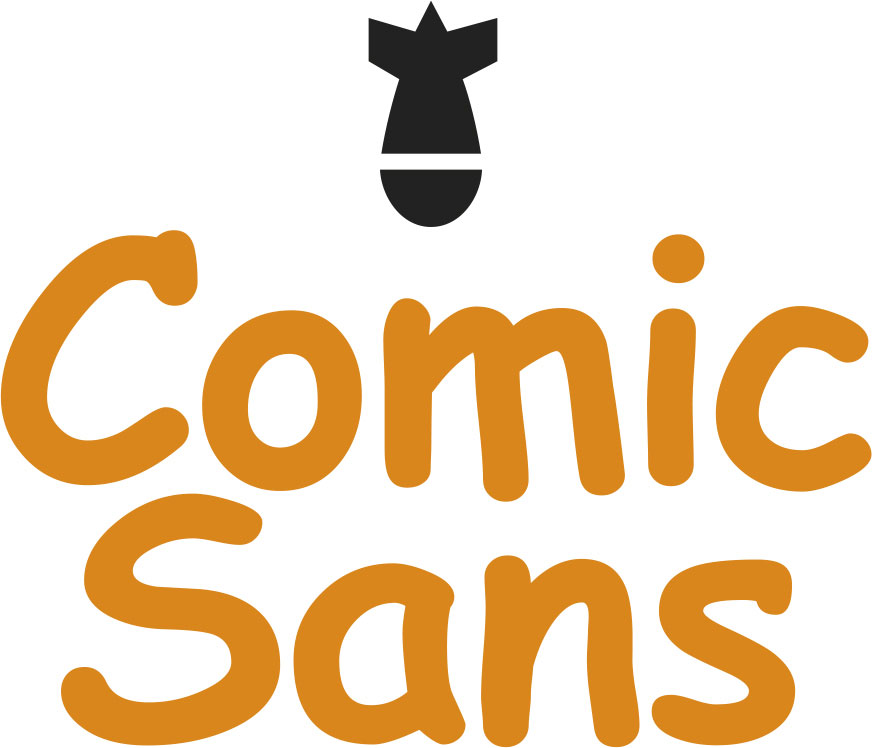
Commentary Well, we had to put it in, didnt we? Comic Sans is arguably the most inappropriately used typeface in history after its first appearance in 1995. It was designed for Microsoft a year earlier by Vincent Connare (who incidentally is very philosophical about his notoriety among type fans) to supply user-friendly menus for people who were a bit scared of computers. When it was included as one of the font choices in Windows 95, it took off faster than a speeding bullet. Everyone with a PC and the notion they could do graphic design started using it on their home-grown letterheads, party invites, curricula vitae, shop signs, haulage firm truck-sides, and, well, you get the picture. Comic Sans wasnt designed to do all these things, so why did everyone like it so much? Connare himself thinks people like to use it because its not like a typeface. Ouch! What better reason can there be to not use Comic Sans? TS
Thou shall use Comic Sans

ironically
Commentary Did I just say you shouldnt use Comic Sans? Well, I was only kidding. One of the great things about typefaces that become vilified due to inappropriate application or overuse is they gain a platform from which they can be used to portray irony, sarcasm, satire, dry wittedness, and so on. If youve got a dispiriting message that you want to make light of, for instance Turning 46 next week and really happy about it party on!, Comic Sans might just be the typeface of choice. The problem here is, unless everyone youre inviting to your birthday bash is a graphic designer, they wont get it. Using type ironically can be very effective and indeed great fun, but only if the irony isnt wasted. Therefore, think carefully before you decide to use Comic Sans,
Font size:
Interval:
Bookmark:
Similar books «Graphic Design Rules: 365 Essential Design DOS and Donts»
Look at similar books to Graphic Design Rules: 365 Essential Design DOS and Donts. We have selected literature similar in name and meaning in the hope of providing readers with more options to find new, interesting, not yet read works.
Discussion, reviews of the book Graphic Design Rules: 365 Essential Design DOS and Donts and just readers' own opinions. Leave your comments, write what you think about the work, its meaning or the main characters. Specify what exactly you liked and what you didn't like, and why you think so.