THE GRAPHIC DESIGN READER
THE GRAPHIC DESIGN READER
BY
STEVEN HELLER

2002 Steven Heller
All rights reserved. Copyright under Berne Copyright Convention, Universal Copyright Convention, and Pan-American Copyright Convention. No part of this book may be reproduced, stored in a retrieval system, or transmitted in any form, or by any means, electronic, mechanical, photocopying, recording, or otherwise, without prior permission of the publisher.
06 05 04 03 02 5 4 3 2 1
Published by Allworth Press
An imprint of Allworth Communications
10 East 23rd Street, New York, NY 10010
Book design by Christoph Neimann
Page composition/typography by SR Desktop Services, Ridge, NY
Library of Congress Cataloging-in-Publication Data
Heller, Steven.
The graphic design reader / by Steven Heller.
p. cm.
Includes bibliographical references and index.
ISBN 1-58115-214-0
1. Graphic artsUnited States. 2. Commercial artUnited States.
3. Popular cultureUnited States. I. Title.
NC998.5.A1 H438 2002
741.60973dc21
2001006464
Printed in Canada
CONTENTS

DEDICATION
This book is dedicated to the people
who have given meaning to my life.
Nicolas Heller, son
Louise Fili, wife
Seymour Chwast, best friend, East Coast
Dugald Stermer, best friend, West Coast
Brad Holland, mentor
Lita Talarico, collaborator
Paula Scher, confidant
Tom Bodkin, boss
Art Spiegelman, good friend
Marian Rand, good friend
Martin Fox, good friend
Rick Poynor, good friend
Tad Crawford, good publisher
Milton Heller, dad
Bernice Heller, mom
ACKNOWLEDGMENTS
Thanks to all the editors at the magazines who edited and published some of these articles and essays:
Julie Lasky, Interiors
Joyce Rutter Kaye, Print
Nancy Bernard, Critique
Marty Neumier, Critique
Martin Pedersen, Metropolis
John Walters, Eye
Hans Dieter Reichert, Baseline
Tom Zeller, the New York Times
Andrea Codrington, Trace, AIGA Journal
Also thanks to friends and colleagues who have given me
support and succor:
Silas Rhodes
David Rhodes
Marshall Arisman
Art Chantry
Mirko Ilic
Barbara Kruger
James Victore
RichardWilde
Thanks again to the crew at Allworth:
Bob Porter, associate publisher
Nicole Potter, editor
Jamie Kijowski, production editor
Liz Van Hoose, associate editor
Kate Lothman, associate editor
And finally, but not least, thanks to
Christoph Neimann, for his witty design.
READ ME

INTRODUCTION

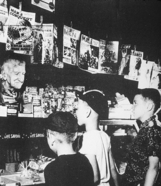
The author (middle) looking for a job.
I never wanted to be a plumber. Although I have a healthy respect for good plumbers, the idea of performing a task where I follow rote procedures is definitely not for me, and I am sure I would fail at it anyway. So, by singling out plumbers I mean no disrespect.
Plumbing is akin to graphic design because, in a sense, a graphic designer plumbs communications problems using a finite number of tried and true solutions. The difference between the two professions is that to be a proficient plumber demands years of apprenticeship, but to be a great graphic designer requires innate talent. This certainly does not diminish the proficiency a designer garners over time, nor minimize the talent of a plumber, but it introduces the distinction between service provider and commercial artist. It implies that, given talent, a graphic designer potentially contributes to culture which is not to say that the plumber does not benefit society. But, although they intersect, society and culture are not the same thing.
Culture is the product of a societys collective and individual actions manifest in art, literature, music, sports, and politics. The plumbers job is to maintain societys infrastructure. Graphic designers, serving as both primary and supporting creators, help build cultural objects.
This book is a paean to their achievements, large and small, good and bad. It is also a reflection of my varied, obsessive interests in popular culture. Frankly, I cannot think of anything I would rather be doing than working every day as an art director, except maybe writing about the influence of visual culture. That is, unless a really easy plumbing job came along.
Steven Heller
CRITIQUES

SECTION I

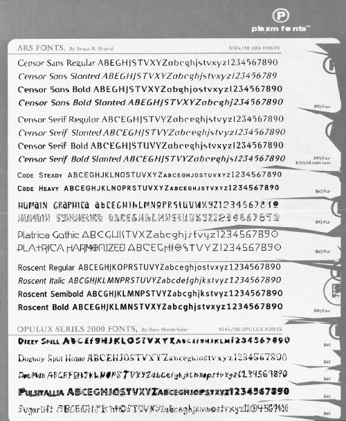
Detail of a 1999 specimen sheet for contorted and distressed typefaces from Plazm Fonts.
Thank god its over, said Milton Glaser, responding to my question, How do you feel about the self-indulgent, designer-as-artist-above-all-else era of graphic design that we just passed through? What else could he say? I miss it already? or Too bad sobriety has returned? But despite the loaded question, the fact is, during the past decade there has been a fervent desire among many young designers to be considered independently hip. Exhibit one: the many showcase design books with the words hot, cool, and killer in the titles, mostly about type, typography, and Web sites, that reinforce by reward the notion that novelty and slavish idiosyncrasy is somehow a virtue.
What constitutes hot-cool-killer design? I would characterize it as a clash of new technologies and old styles with novel conceits and faddish fashions. Timely labels for theselike Grunge, New Wave, Techno, Post-Punk, New Minimalism, and even Neo-Modernism have added to the eras edgy cachet. But perhaps Me Too Design is a better catch phrase. For this was an era when popular acceptance (or at least acknowledgment) of graphic design by the mass media (e.g., the New York Times, Time, Newsweek, etc.) encouraged designers to become relentlessly expressive. Many graphic designers, however, found their means of expression in the same basic sources: supermarket signage, twentieth-century Modern art, futuristic fantasies, computer programming quirks, and even a little of that old-time corporate Modernism. The end product (or byproduct) was a pre-proto-neo-post stew, tasty but hard to digest.
Nineties graphic design began to evolve in the early eighties, when a rebellion against sterile corporate Modernism and slick opulent professionalism erupted. Designers attacked the Swiss style that ordered and clarified information and replaced it with type and image that literally collided on a single page. Once sacrosanct rules of form and function were expunged through the use of distressed or distorted letterforms that resulted in dissonant compositions. So-called post-Modern graphic designers from progressive design schools in Holland, Switzerland, England, and the United States borrowed the language of poststructuralism from highbrow French literary critics. This allowed them to talk about themselves, expose their own mechanics, and hold a dialog or discourse about their own constructs, explains Katherine McCoy, the former co-chair of Cranbrook Academy of Art, once the wellspring of graphic designs deconstruction movement.
Next page
