Thank you for purchasing this How Design eBook.
Sign up for our newsletter and receive special offers, access to free content, and information on the latest new releases and must-have designing resources! Plus, receive a coupon code to use on your first purchase from MyDesignShop.com for signing up.
or visit us online to sign up at
http://howdesign.com/ebook-promo
For a designer, illustrator or letterer, an invitation to create a cover for a design magazine is validation of having made it or of being on the verge of making a professional markan unparalleled honor, to be sure. The prototypical commercial art trade periodicals, including the early 20th-century Das Plakat in Germany and the 1930s PM (later renamed AD) in the U.S., invite the most accomplished practitioners of their respective eras to show off their familiar styles or experimental accomplishments. Just imagine the thrill and challenge of that tabula rasa on which almost anything is possible (within limits). Of course, the general public is not the intended audienceand design magazines are afforded license that commercial ones are not allowed. A cover implies certain acceptance into a community of graphic and advertising designers (and later, photographers, too) that can help in building a career. It is a trophy.
Print magazines covers fit neatly into this long and proud heritage. From the nascent period when, in 1940, printer and publisher William Edwin Rudge founded the magazine as a journal for the graphic arts, up to and including the present, Prints covers reflect both the individual and broader aesthetic stylesand cultural attitudes expressed through graphics. The covers serve as a timeline of form and content within the context of applied and fine art.
Whether Print actually launched or simply responded to current styles in its early years is subject to debate, but showcasing the designer or illustrators work at times resulted in overwhelming popularity in the designs marketplace. Depending on the cover, circulation could be impacted, as well. The diversity of Prints covers further established it as a wellspring of eclecticismand even orthodox formalist designers enjoy variety.
Surveying Prints 75 years of covers speaks volumes about the field as a whole and the specific tastes of its editors. Even during the Rudge years, which were noted for classical type and book design, modernism, for instance, made a few appearances. The first cover was as abstract as it got back then. Later, when Leo Lionni was the creative force at Print, a hybrid form of modernism was introduced. Early covers were also bellwethers of new technologies; for example, there was the clarion of the typewriter as design tool and later of the computer age. During the 30+ years of the Martin Fox era in which Andrew P. Kner was art director, the covers were an intended surprise from issue to issue, which was maintained afterward, too.
Carefully editing hundreds of these covers down to a symbolic 75 that somehow represents the magazines lifespan is an exercise in sadomasochism. There are so many wonderfully conceived covers on the cutting room floorand so many more historically fascinating ones lying with themthat this collection is as much a reason to cry as to celebrate. Although not every year is represented, an average of one out of six issues is assembled here. Apologies to those whose covers didnt make the cut. Still, 75 is a realistic number of covers to convey Prints importance as a signpost of graphic design evolutionary achievement.
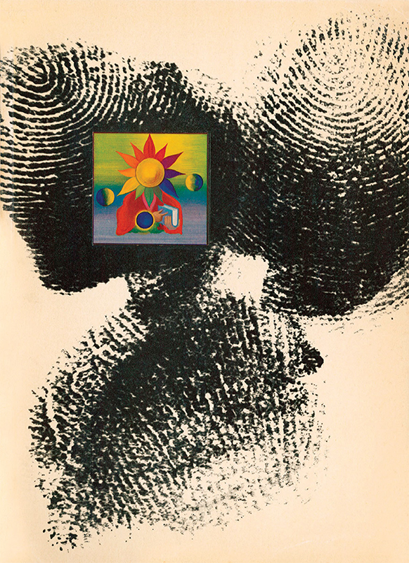
Print Vol. I No. 1, June 1940
Howard Trafton (cover designer)
Bruce Rogers (thumbprints contributor)
Howard Trafton (18971964) designed the first Print cover, and the reason for that is not entirely clear. But Trafton, who taught at The Art Students League of New York and is best known for the typefaces Trafton Script (1933) and Cartoon (1936), believed that the principles of art and design were the same. It was daring for Print to publish such an abstract cover (even though the thumbprints belonged to the classical book designer Bruce Rogers). In a way, this cover illustrated a footnote to the first editorial, which read, There has been little agreement so far as to a proper definition of the term graphic arts. Print takes the term broadly: to describe all the means by which ideas are reproduced in visual form.

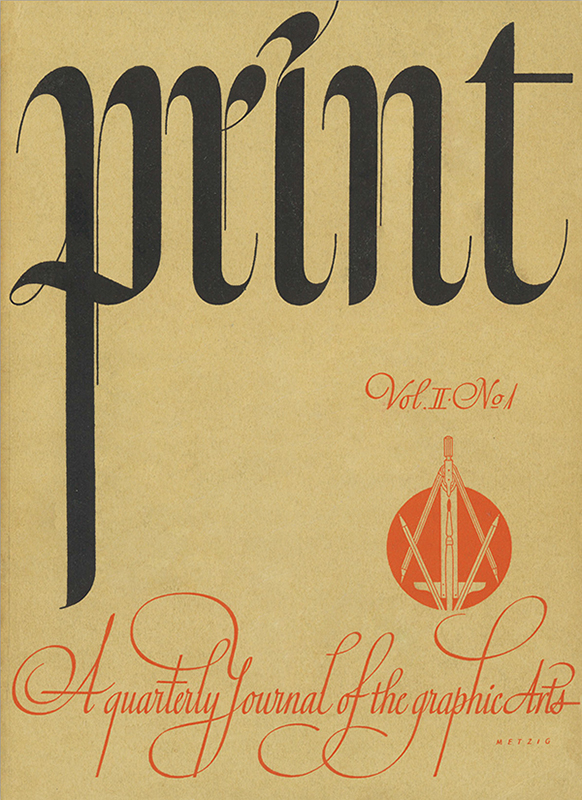
Print Vol. II No. 1, May/June 1941
William Metzig (cover designer)
William Edwin Rudge established Print to advocate a masterful level of craft and precision. German-born William Metzig (18931989) met those expectations with his design of this calligraphic cover, which was produced before Print settled on a fixed nameplate. Metzig founded a design and lettering studio in Hanover, Germany, during the 1920s, where he designed trademarks, logos, letterheads, brochures and posters, notably for the Pelikan Ink Company. A leading calligrapher in Germany, he transplanted well when he immigrated to the U.S. in 1939 and settled in New York. There, he taught his exemplary style while carrying out assignments and writing the book Heraldry for the Designer (1983).

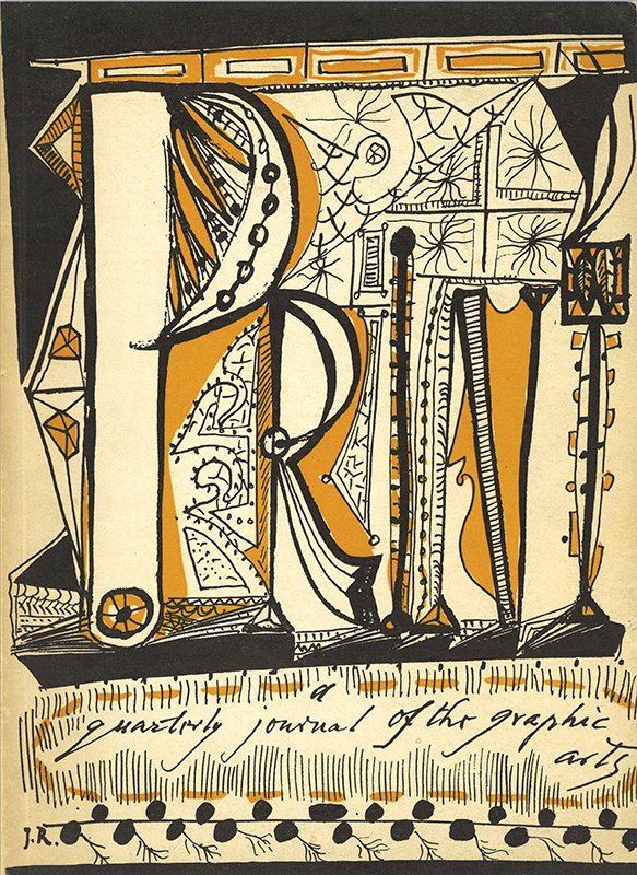
Print Vol. V No. 4, 1948
Imre Reiner (cover artist)
The handlettered exuberance of Imre Reiner (19001987), a Hungarian-born type designer and author of books on type and lettering, stands out among Prints early covers, and many of the later covers, for being robust and joyful. The fungible nature of the Print nameplate did not restrict designers like Reiner, who took full ownership of the space to exercise his lettering muscles. This form of illustrated typography fell out of favor when modernism kicked in during the early 1950sindeed, extreme lettering like this was not seen again for decades, although today the aesthetic and practice are back in force. Reiner wrote now-classic books, such as Modern and Historical Typography (1946), that promoted a range of modern and eclectic lettering. He also designed many typefaces, including Meridian (1930), Corvinus (1934), Matura (1938), Mercurius Script (1957) and Pepita (1959).

Print IX:4, 1955
Jerome Snyder (cover artist)
Still with William Edwin Rudge Publisher Inc., Prints format moved from that of essentially a journal to a magazine. While retaining much of the same content as earlier volumes, including a feature on figurative typography, the magazine also stepped outside of the norms with an article on printmaker Josef Scharl by the Albert Einstein. This cover, by Sports Illustrated art director and illustrator Jerome Snyder (19161976), stretched around to the back and offered a little cognitive dissonance from the articles on classical themes, instead illustrating the variety of entries in the AIGAs 13th Annual Exhibition of Design and Printing for Commerce. Snyder later co-authored with Milton Glaser a popular column in

