Sandee Cohen - From Design Into Print
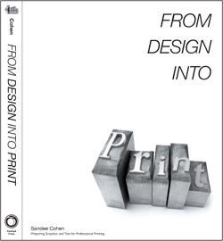
Here you can read online Sandee Cohen - From Design Into Print full text of the book (entire story) in english for free. Download pdf and epub, get meaning, cover and reviews about this ebook. year: 2009, publisher: Pearson Education Limited (US titles), genre: Romance novel. Description of the work, (preface) as well as reviews are available. Best literature library LitArk.com created for fans of good reading and offers a wide selection of genres:
Romance novel
Science fiction
Adventure
Detective
Science
History
Home and family
Prose
Art
Politics
Computer
Non-fiction
Religion
Business
Children
Humor
Choose a favorite category and find really read worthwhile books. Enjoy immersion in the world of imagination, feel the emotions of the characters or learn something new for yourself, make an fascinating discovery.
- Book:From Design Into Print
- Author:
- Publisher:Pearson Education Limited (US titles)
- Genre:
- Year:2009
- Rating:3 / 5
- Favourites:Add to favourites
- Your mark:
- 60
- 1
- 2
- 3
- 4
- 5
From Design Into Print: summary, description and annotation
We offer to read an annotation, description, summary or preface (depends on what the author of the book "From Design Into Print" wrote himself). If you haven't found the necessary information about the book — write in the comments, we will try to find it.
From Design Into Print — read online for free the complete book (whole text) full work
Below is the text of the book, divided by pages. System saving the place of the last page read, allows you to conveniently read the book "From Design Into Print" online for free, without having to search again every time where you left off. Put a bookmark, and you can go to the page where you finished reading at any time.
Font size:
Interval:
Bookmark:
Preparing Graphics and Text for Professional Printing
by Sandee Cohen

From Design Into Print: Preparing Graphics and Text for Professional Printing
Sandee Cohen
Peachpit Press
1249 Eighth Street
Berkeley, CA 94710
510/524-2178
510/524-2221 (fax)
Find us on the Web at: www.peachpit.com
To report errors, please send a note to
Peachpit Press is a division of Pearson Education.
Copyright 2009 by Sandee Cohen and Robin Williams
Project Editor: Becky Morgan
Production Editor: Hilal Sala
Copyeditor: Dave Awl
Indexer: Valerie Haynes Perry
Cover design: Mimi Heft
Interior design: Mimi Heft
Layout: Sandee Cohen
Notice of Rights
All rights reserved. No part of this book may be reproduced or transmitted in any form by any means, electronic, mechanical, photocopying, recording, or otherwise, without the prior written permission of the publisher. For information on getting permission for reprints and excerpts, contact .
Notice of Liability
The information in this book is distributed on an As Is basis without warranty. While every precaution has been taken in the preparation of the book, neither the author nor Peachpit Press shall have any liability to any person or entity with respect to any loss or damage caused or alleged to be caused directly or indirectly by the instructions contained in this book or by the computer software and hardware products described in it.
Trademarks
Adobe, InDesign, Photoshop, Lightroom, and Acrobat are either registered trademarks or trademarks of Adobe Systems Incorporated in the United States and/or other countries. QuarkXPress is a registered trademark of Quark Incorporated in the United States and/or other countries.
PANTONE and other Pantone, Inc. trademarks are the property of Pantone, Inc.
Many of the designations used by manufacturers and sellers to distinguish their products are claimed as trademarks. Where those designations appear in this book, and Peachpit was aware of a trademark claim, the designations appear as requested by the owner of the trademark. All other product names and services identified throughout this book are used in editorial fashion only and for the benefit of such companies with no intention of infringement of the trademark. No such use, or the use of any trade name, is intended to convey endorsement or other affiliation with this book.
ISBN-13: 978-0-321-49220-3
ISBN-10: 0-321-49220-X
9 8 7 6 5 4 3 2 1
Printed and bound in the United States of America
This book was prepared on a MacBook Pro running the Adobe Design Premium Creative Suite 4. Layout was done in InDesign. Vector illustrations were created in Illustrator. Photo and image retouching was done in Photoshop. Screen shots were taken using Ambrosias SnapzPro. Fonts used were Chapparal Pro, Myriad Pro, and European Pi 3. GridIron Flow was used to track use and versions of graphics and layout files.
My students. You ask the right questions to help me understand the answers.
This is the book I wish I had had twenty years ago, when I first started working with computer graphics. Back then, it didnt take long to realize that as soon as I put anything down on the page, I was acting as a production manager in addition to the designer or layout person. Just defining a color meant I needed to understand what the requirements were for color separations. Working with a photograph required an understanding of that strange concept called resolution. And then there were all those questions about the difference between RGB and CMYK colors.
During my years in advertising, I relied on the book, Pocket Pal, A Graphic Arts Production Handbook, published by the International Paper Corporation. The book was given out for free by International Paper representatives when they visited ad agencies. It covered all parts of the printing and publishing process and even had a page of proofreaders marks. I loved leafing through the pages reading about halftone screens, impositions, separations, and other parts of printing documents.
Back in those days, however, Pocket Pal covered almost no digital or computer graphics. Digital cameras, scanners, and computer graphics were missing from its pages. Thats when I thought there needed to be a book that covered the same topics as Pocket Pal, but did it from the point of view of the digital artist or designer. And would be written in a friendlier, more fun, style.
In 1994, Robin Williams, author of The Mac is not a typewriter, came out with The Non-Designers Design Book. The concept was brilliant. Since desktop publishing had made it easier for those without formal design training to create business cards, advertising, brochures, and other printed projects, Robin wrote a book that helped these non-designers learn to look at the page in design terms.
I met up with Robin at a computer event and told her that the Non-Designers concept was great. But she should now do a Non-Designers book on prepress and production. Robin liked the idea and some time later, she and I began work on The Non-Designers Scan and Print Book.
The idea behind the book was simple. We would create a book for all those non-designers who didnt have a clue about production and explain how to best create their digital files.
We also expanded the book slightly out of the Non-Designers series to include real designers who also had no idea how to prepare their files for the print shop. They were puzzled why their graphics wound up looking jagged or the text was hard to read in the final printed project.
In 1999, the book was published by Peachpit Press with great reviews and feedback. Designers thanked us for writing a book that helped them talk to print shops and production managers. It answered the questions they had been too embarrassed to ask. Production managers thanked us for a book they could give to their designers. And computer graphics teachers told us how great the book was for their classeshigh school, college, and adult ed.
I was thrilled. And for over seven years we didnt have to do anything in regards to the book. It practically sold itself. But around 2006, it became clear that the book needed updating. It wasnt that parts of it were wrong, it was that advances in computer graphics had made many concepts out of date.
Looking through the original book in 2006, it was very obvious that it was no longer topical. For instance, software had changed dramatically. All through the book we spoke about QuarkXPress and PageMaker. XPress was the dominant program in the industry while PageMaker was just hanging on. We had to mention both equally. Adobe and Macromedia had competing vector illustration programs called Illustrator and FreeHand which also needed equal treatment.
The book covered scanning in great detail, but the information on digital cameras was sparse. Few people used digital cameras back then and the concept of a camera phone was out of a Dick Tracy cartoon.
And in an effort to save production costs, the book had been printed in two colors. This had made some topics, especially the chapters on color theory, hard to explain.
It was time for an update.
Since Robin was now involved with other projects, I took on the task of rewriting the book myself. First thing Peachpit and I did was agree that it would be printed in full color. Not just a color insert, but four-color throughout the book. This made the book even better than my old
Font size:
Interval:
Bookmark:
Similar books «From Design Into Print»
Look at similar books to From Design Into Print. We have selected literature similar in name and meaning in the hope of providing readers with more options to find new, interesting, not yet read works.
Discussion, reviews of the book From Design Into Print and just readers' own opinions. Leave your comments, write what you think about the work, its meaning or the main characters. Specify what exactly you liked and what you didn't like, and why you think so.

