Table of Contents
2009 by Rockport Publishers, Inc.
All rights reserved. No part of this book may be reproduced in any form without written permission of the copyright owners. Every effort has been made to locate the copyright owners of the material used in this book. Please let us know if an error has been made, and we will make any necessary changes in subsequent printings. Every effort has been made to ensure that credits accurately comply with information supplied. We apologize for any inaccuracies that may have occurred and will resolve inaccurate or missing information in a subsequent reprinting of the book.
First published in the United States of America by
Rockport Publishers, a member of
Quayside Publishing Group
100 Cummings Center
Suite 406-L
Beverly, Massachusetts 01915-6101
Telephone: (978) 282-9590
Fax: (978) 283-2742
www.rockpub.com
LIBRARY OF CONGRESS CATALOGING-IN-PUBLICATION DATA
Tondreau, Beth.
Layout essentials : 100 design principles for using grids / Beth Tondreau.
p. cm.
Includes bibliographical references.
ISBN-13: 978-1-59253-472-2 ISBN-10: 1-59253-472-4
1. Grids (Typographic design) 2. Layout (Printing) 3. Graphic design (Typography) I. Title.
Z246.T65 2008
686.2252--dc22
2008035091
ISBN-13: 978-1-59253-472-2
ISBN-10: 1-59253-472-4
10 9 8 7 6 5 4 3 2 1
Design: BTDNYC
Diagrams: Punyapol Noom Kittayarak
Printed in Singapore
For Pat
NO LIST OF ESSENTIALS ADEQUATELY CAPTURES YOU.
Grids are the most misunderstood and misused element in page layout. A grid is only useful if it is derived from the material it is intended to handle.
DEREK BIRDSALL Notes on Book Design
A grid is truly successful only if, after all of the literal problems have been solved, the designer rises above the uniformity implied by its structure and uses it to create a dynamic visual narrative of parts that will sustain interest page after page.
TIMOTHY SAMARA Making and Breaking the Grid
Introduction
... Mr. Rauschenberg... gained a respect for the grid as an essential compositional organizing tool.
MICHAEL
KIMMELMAN,
on the importance
of grids to
the artist Robert
Rauschenberg.
The New York
Times, May 14,
2008, obituary for
Rauschenberg
A grid is used to organize space and information for the reader; it maps out a plan for the overall project.
In addition, a grid is a holding pen for information and a way to ordain and maintain order.
Although grids have been used for centuries, many graphic designers associate grids with the Swiss. The rage for order in the 1940s led to a very systematic way of visualizing information. Decades later, grids were considered monotonous and boringthe sign of a designersaur. Today, grids are again viewed as essential tools, relied upon by professionals who are both new to the practice and seasoned by decades of experience.
Each of the 100 principles in this book exists to provide a helpful nugget as you build a layout, system, or site, and each is illustrated by a project designed and published (in old or new media) in the last few years.
I hope the examples in Layout Essentials will instruct, intrigue, and inspire, while guiding you to keep in mind a most essential precept of communication: relate your typography and layout to the material.
Getting Started
ELEMENTS OF A GRID
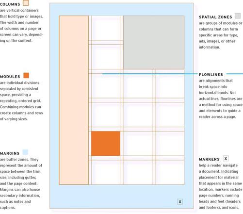
1. Know the Components
T he main components of a grid are margins, markers, columns, flowlines, spatial zones, and modules.
BASIC GRID DIAGRAMS
2. Learn the Basic Structures
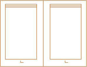
A SINGLE-COLUMN GRID is generally used for continuous running text, such as essays, reports, or books. The main feature on the page or spread is the block of text.
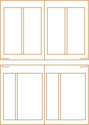
A TWO-COLUMN GRID can be used to control a lot of text or to present different kinds of information in separate columns. A double-column grid can be arranged with columns of equal or unequal width. In ideal proportions, when one column is wider than the other, the wider column is double the width of the narrow column.
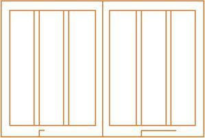
MULTICOLUMN GRIDS afford greater flexibility than single-or two-column grids, combine multiple columns of varying widths and are useful for magazines and websites.
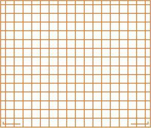
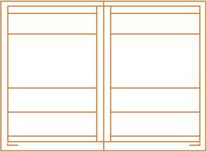
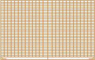
MODULAR GRIDS are best for controlling the kind of complex information found in newspapers, calendars, charts, and tables. They combine vertical and horizontal columns, which arrange the structure into smaller chunks of space.
HIERARCHICAL GRIDS break the page into zones. Many hierarchical grids are composed of horizontal columns.
DETERMINE THE APPROPRIATE GRID
3. Assess the Material

C ontent, margins, amount of imagery, desired number of pages, screens, and panels all factor into deciding how to set up a grid. Above all, the into deciding how to set up a grid. Above all, the content determines the structure of the grid. The grid you use depends on each specific design problem, but below are some general guidelines:
Use a SINGLE-COLUMN GRID when working with continuous text, such as an essay or a book. A single column of text can seem less intimidating and more luxurious than multiple columns, making it suitable for art books or catalogs.
For more complicated material, TWO-COLUMN or MULTICOLUMN grids afford flexibility. Columns that can be further broken into two provide the greatest number of variations. Multicolumn grids are used for websites to manage a huge range of information that includes stories, videos, and ads.
For a lot of information, such as that in a calendar or schedule, a MODULAR grid helps to arrange units of information into manageable chunks. A modular grid can also be applied to newspapers, which have many zones of information.
HIERARCHICAL grids divide pages or screens HORIZONTALLY and are often useful for simple websites, in which chunks of information are ordered, to provide easier reading while scrolling down a page.
All grids create order, and all involve planning and math. Whether a designer is working in pixels, picas, or millimeters, the key to the rational order of a grid is making sure the numbers add up.

