THE POCKET
UNIVERSAL
PRINCIPLES OF DESIGN
William Lidwell Kritina Holden Jill Butler
Contents
Author Favorites
Our Most Used Principles of Design
WILLIAM LIDWELL
002 80/20 Rule
006 Affordance
026 Confirmation Bias
038 Desire Line
052 Flexibility Trade-Offs
065 Hanlons Razor
078 KISS
114 Root Cause
122 Selection Bias
132 Sunk Cost Effect
KRITINA HOLDEN
019 Chunking
042 Errors
050 Fitts Law
054 Forgiveness
059 Garbage In-Garbage Out
066 Hicks Law
086 Mapping
100 Performance vs. Preference
111 Recognition Over Recall
130 Storytelling
JILL BUTLER
011 Area Alignment
014 Back-of-the-Dresser
040 Dunning-Kruger Effect
051 Five Hat Racks
053 Flow
069 Highlighting
070 Horror Vacui
082 Legibility
088 Mental Model
126 Signal-to-Noise Ratio
Less and More.
Dieter Rams
3D Projection
A tendency to see things as three-dimensional when certain visual cues are present.
People see two-dimensional things as three-dimensional when certain visual cues are present.
When items are relatively larger, lower, less dense in pattern, lighter, clearer, or in front of other objects, they are perceived to be closer.
When items are relatively smaller, higher, denser in pattern, bluer, blurrier, or behind other objects, they are perceived to be farther away.
Consider 3D projection in the depiction of three-dimensional elements and environments. Strongest depth effects are achieved when the visual cues are used in combination; therefore, use as many of the cues as possible to achieve the strongest effect.
See Also Common Fate Figure-Ground Law of Prgnanz Top-Down Lighting Bias Visuospatial Resonance
Applying 3D projection in sidewalk art can create stunning three-dimensional effects on two-dimensional surfaces.
80/20 Rule
A high percentage of effects in any large system is caused by a low percentage of variables.
Proposed by the economist Vilfredo Pareto, who observed that 20 percent of the Italian people possessed 80 percent of the wealth.
Applying the 80/20 rule means identifying and focusing resources on the critical 20 percent. Focusing on aspects of a design beyond the critical 20 percent yields diminishing returns.
For example, 80 percent of a products usage involves 20 percent of its features; 80 percent of a products bugs are caused by 20 percent of its components.
Use the 80/20 rule to assess the relative value of elements, target areas of redesign and optimization, and focus resources in an efficient manner. Note that 80/20 is just an estimate. The actual percentages can be more or less (e.g., 70/30, 90/10).
See Also Cost-Benefit Feature Creep Hanlons Razor Normal Distribution Ockhams Razor
In 1979, most believed that a music player with no radio, no speakers, no recording function, and small headphones was doomed to fail. Sony proved them wrong. The Walkman possessed the critical 20 percent of what people wantedportability and tape playbackenabling the rest to be cut.
Abbe
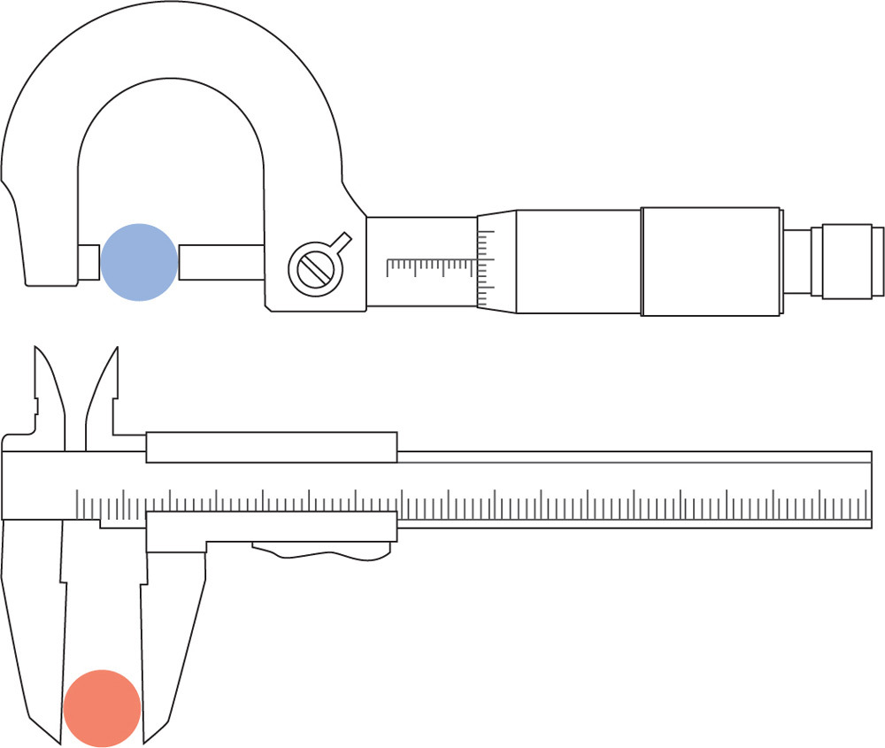
Measure things as close to their action as possible.
Proposed by the German physicist Ernst Abbe.
Abbe errors are angular errors that increase with distance. For example, wobble from a bent axle increases with the length of the axle. The Abbe principle prevents this type of error.
The Abbe principle states that the best measurements are achieved when taken as close to the action as possible. For example, placing a temperature sensor near a heat source will result in more accurate measurements than a sensor placed farther away.
The principle also has implications for the design of mechanisms. Actuators and bearings should be placed as close to lines of action as possible.
Consider the Abbe principle in measurement, and the design of mechanical systems and structures. Locate measurement devices and components as close to the areas of action as possible.
See Also Error Redundancy Saint-Venants Principle
A caliper that measures in its line of action (top) is more accurate than a caliper that measures away from its line of action (bottom).
Accessibility
Things should be designed to be usable, without modification, by as many people as possible.
Historically, accessibility in design focused on accommodating people with disabilities.
Modern practice accepts that most accommodations can be designed to benefit everyone.
Make things perceptible by everyone. For example, position controls and information so that seated and standing people can perceive them.
Make things usable by everyone. For example, minimize repetitive actions and the need for sustained physical effort.
Make things learnable by everyone. For example, use redundant coding methods (e.g., textual, iconic, and tactile) on controls and signage.
Make the consequences of errors non-catastrophic, and reversible whenever possible.
See Also Affordance Forgiveness Normal Distribution
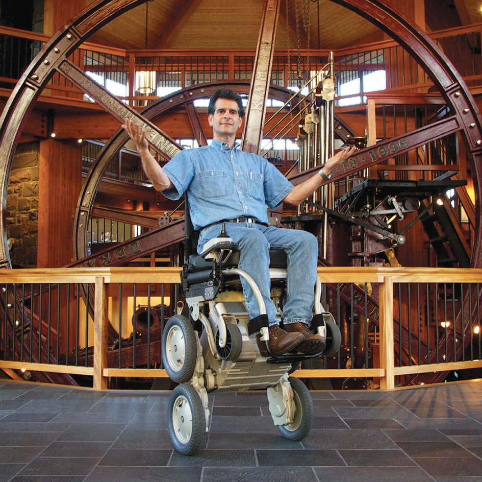
Inventor Dean Kamen demonstrating the iBot, a Transformer-like wheelchair that makes a world designed for those who can stand and walk accessible to wheelchair users.
Aesthetic-Usability Effect
Aesthetic things are perceived to be easier to use than ugly things.
Aesthetic things are often subjectively rated as easier to use, even when no usability advantage can be objectively measured.
Aesthetic things are more effective at fostering positive attitudes than ugly things, making people more tolerant when problems are encountered.
Aesthetic things are more likely to be tried, accepted, displayed, and repeatedly used than ugly things.
Aspire to create aesthetically pleasing designs. It is more than ornamentationit is an investment in user acceptance, forgiveness, and satisfaction.
See Also Attractiveness Bias Cognitive Dissonance Form Follows Function IKEA Effect
People display the HomeHero extinguisher on counters due to its striking aesthetic, making it more accessible in emergencies.
Affordance
The physical characteristics of a thing influence its function and use.
The form of a thing makes it better suited for some functions than others. For example, wheels afford rolling, and negatively afford being stationary.
The form of a thing makes it better suited for some interactions than others. For example, buttons afford pushing, and negatively afford pulling.
