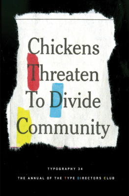
Type Directors Club - Typography 35
Here you can read online Type Directors Club - Typography 35 full text of the book (entire story) in english for free. Download pdf and epub, get meaning, cover and reviews about this ebook. publisher: HarperCollins, genre: Art. Description of the work, (preface) as well as reviews are available. Best literature library LitArk.com created for fans of good reading and offers a wide selection of genres:
Romance novel
Science fiction
Adventure
Detective
Science
History
Home and family
Prose
Art
Politics
Computer
Non-fiction
Religion
Business
Children
Humor
Choose a favorite category and find really read worthwhile books. Enjoy immersion in the world of imagination, feel the emotions of the characters or learn something new for yourself, make an fascinating discovery.

- Book:Typography 35
- Author:
- Publisher:HarperCollins
- Genre:
- Rating:3 / 5
- Favourites:Add to favourites
- Your mark:
Typography 35: summary, description and annotation
We offer to read an annotation, description, summary or preface (depends on what the author of the book "Typography 35" wrote himself). If you haven't found the necessary information about the book — write in the comments, we will try to find it.
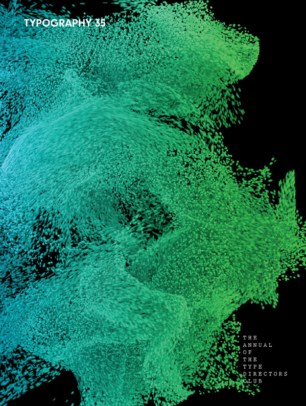
A showcase of the years best typographic work in print and on screen in advertising, communications, education, marketing, and publishing.
The only annual publication devoted exclusively to the art of type, Typography 35 presents the finest work in the field for 2013. Selected from approximately 2,300 international submissions to the annual Type Directors Club competition, the winning designs are models of excellence and innovation in the use of type design, representing a wide range of categories in diverse fields, including books, magazines, corporate branding, logos, stationery, annual reports, video and web graphics, and posters.
Each year, the Type Directors Club selects a prominent design studio or designer to curate the latest Typography book and select the winners of their annual typography competition. Tremendous creative freedom is given to each studio, allowing the annual to evolve dramatically with each new publication. Typography 35 is designed by...
Type Directors Club: author's other books
Who wrote Typography 35? Find out the surname, the name of the author of the book and a list of all author's works by series.


Typography 35 — read online for free the complete book (whole text) full work
Below is the text of the book, divided by pages. System saving the place of the last page read, allows you to conveniently read the book "Typography 35" online for free, without having to search again every time where you left off. Put a bookmark, and you can go to the page where you finished reading at any time.
Font size:
Interval:
Bookmark:
MEDALIST
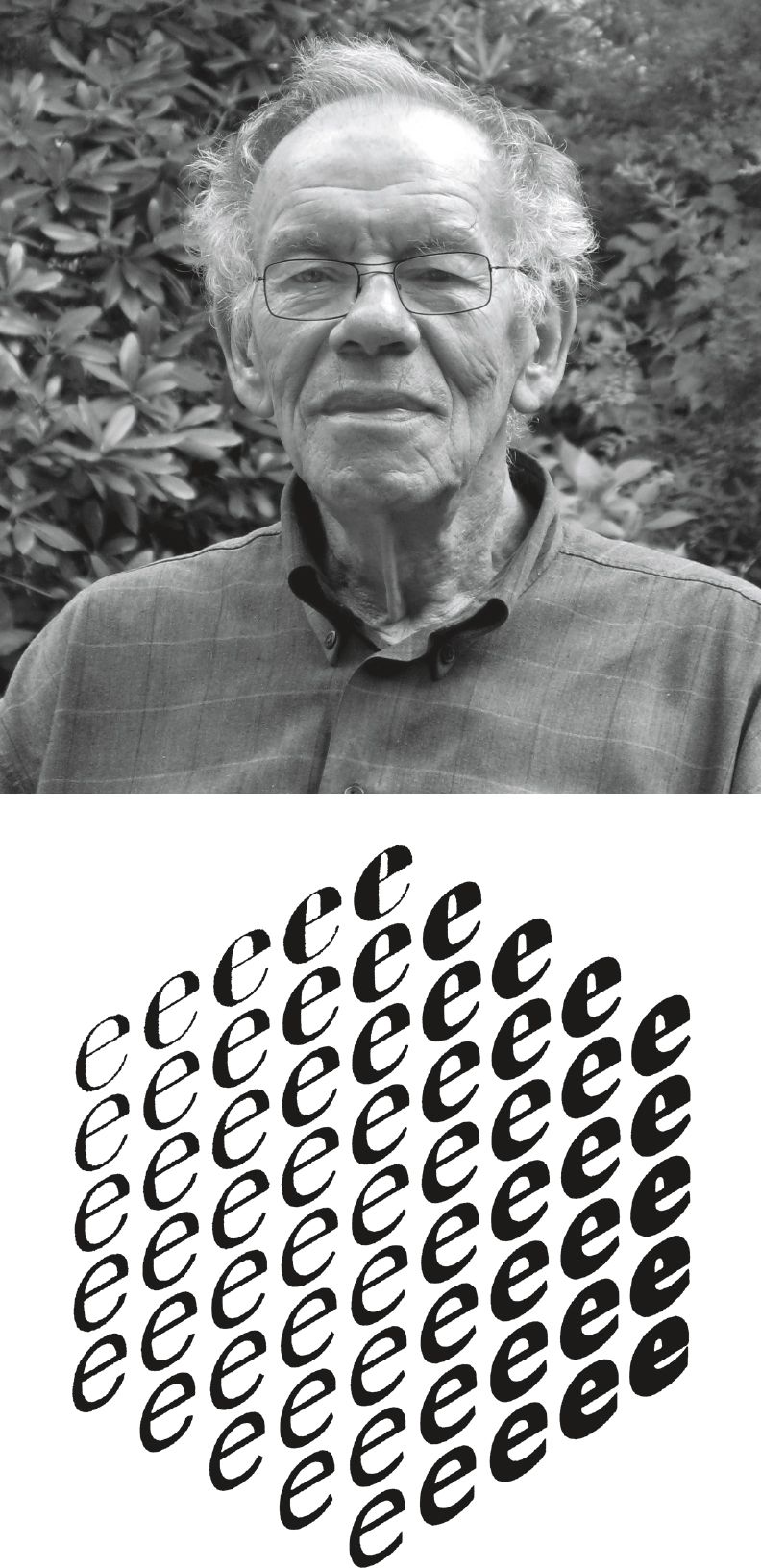 Dutch typographer, type designer, author, lettering artist, and influential teacher Gerrit Noordzij was born in 1931 in Rotterdam and began teaching type design in 1960 at the Royal Academy of Art in The Hague. From 1970 until his retirement in 1990, he was an authoritative force in the writing and lettering program of the department of graphic design. Noordzijs influence is passed on to the international type community through the work of his former students Petr van Blokland, Erik van Blokland, Just van Rossum, and Luc de Groot among them. He also continues to influence new generations of designers, as the method of teaching type design at the Academy is still largely based on his theoretical models, and his writings are still published in a variety of languages. Although Noordzij has designed a number of typefaces, not many of them are available to the public. Instead, he has focused on type for his own projects, including his book design work for Van Oorschot publishers.
 He continues to refine, redraw, and add to many of his works. Ruse, Noordzijs first publicly distributed typeface, was issued by The Ensched Font Foundry in 2000 when he was 68. Noordzij is perhaps best known for The Stroke: Theory of Writing (the first incarnation of which was published in Dutch as The Stroke of the Pen in 1985), reissued by Hyphen Press in 2005. Noordzijs theory is that type is in its very essence calligraphic although Noordzij would never use that word. He asserts that type is inextricably tied to writing, his preferred term, and defines typography as writing with prefabricated letters. He proposes that handwriting reveals the logical construction of letters, through the dynamic translation, expansion, and rotation that occur when one is writing with a pen.
With his cube theory, Noordzij can be seen as a progenitor of digital type development, in which typefaces have distinct axes of design variables that can be smoothly interpolated. TDC board member Matteo Bologna pinpoints Noordzijs pivotal influence on type design software such as Superpolator itself developed by Noordzijs student Erik van Blokland which helps type designers generate type families with multiple axes of weight, width, contrast, et cetera. Noordzij also wrote and edited LetterLetter, a journal in English for ATypI in which he published a series of meditations on typography, lettering, and typeface design. Noordzijs wit and irreverence are particularly evident in this series, where he spars with his most faithful opponent Nicolete Gray. The Gerrit Noordzij Prize, an initiative of the Type and Media masters program of the Royal Academy, is bestowed upon typographic designers for extraordinary contributions to the field. The award, given every three years, recognizes writing and teaching as essential qualifications.
Past recipients include Erik Spiekermann, Tobias Frere-Jones, and Wim Crouwel. Noordzij was the first person to receive this prize, in 1996. TDC60
COMMUNICATION
DESIGN Ive done everything in my power to avoid writing this statement, other than balancing my checkbook or getting my teeth cleaned. It shouldnt be that hard. I love type everything about it, from ascender to descender, from initial cap to final punctuation. Good type makes getting through difficult text easier, even painless, and the shame of it all is that most people dont even realize it.
But not us were special. As type aficionados, we revel in each new font release, cherish weathered and worn ghost signs, and collect crazy things like old bottle caps because of the typography (okay, that one may just be me). We bookmark, we hoard. Few people get us, but we soldier on undeterred. We attend lectures. We join TDC.
We have passion and a desire to share with our colleagues, and we crave more, more. More type blogs. More apps. More attention to letterspacing. We obsess. Welcome to Typography 35, the place where we type folks can feel safe in our obsessions.
Pore through the smartly designed pages from the folks at Collins and feel free to linger. You know you want to. Youll see familiar faces from annuals past, and hot new talent that makes your head explode. My thanks are extended to our fabulous jury for being so generous with their time and wisdom. Much gratitude goes to everyone who volunteered valuable weekend hours to help out, whether it was hanging posters or herding cats. And of course, without TDC Executive Director Carol Wahler, wed just be printing a blank book.
Enjoy Typography 35, absorb it, and revisit it often for inspiration. Thats the end of my statement; its time to turn the page. Gail Anderson  GAIL ANDERSON Gail Anderson is a New Yorkbased designer, writer, educator, and partner at Anderson Newton Design. From 2002 to 2010, Gail served as creative director of design at SpotCo, a New York City advertising agency that creates artwork for Broadway and institutional theater. From 1987 to early 2002, she worked at Rolling Stone, serving as designer, deputy art director, and finally as the magazines senior art director. Gail is co-author, with Steven Heller, of The Typographic Universe, as well as New Modernist Type, New Ornamental Type, and New Vintage Type.
She teaches at the School of Visual Arts and serves on The Citizens Stamp Advisory Committee and the board of the Type Directors Club. Gail is the recipient of the 2008 Lifetime Achievement Medal from the American Institute of Graphic Arts. 

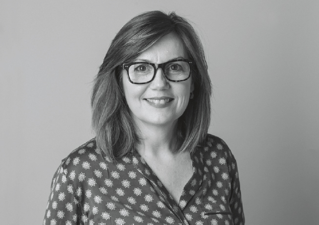 DEBRA BISHOP Debra Bishop is creative director of More magazine. Previously she was vice president, design director, and initial brand creator of Blueprint magazine for Martha Stewart Living Omnimedia. During her twelve years at MSLO, Deb was in charge of branding several publications, including Martha Stewart Baby, Kids: Fun Stuff to Do Together, Body&Soul, and Marthas first catalog: Martha by Mail. Debs early years were spent working for House & Garden, Rolling Stone, and Paula Scher.
Deb has been lauded by the Art Directors Club, the Type Directors Club, AIGA, and American Illustration and American Photography. Kids: Fun Stuff to Do Together won an ASME award for design in 2005. It was also named Magazine of the Year by the Society of Publication Designers in both 2004 and 2005, and Blueprint received that honor in 2008. More magazine was nominated for a General Excellence award by ASME in 2011 and was a finalist for Magazine of the Year by the Society of Publication Designers in 2010. 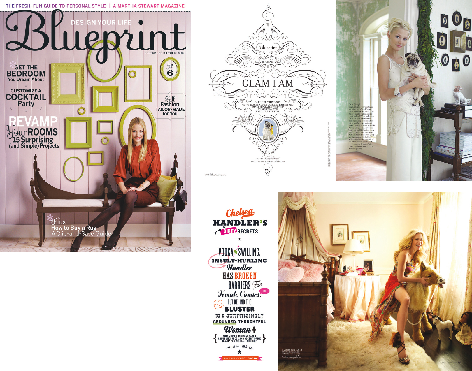

Font size:
Interval:
Bookmark:
Similar books «Typography 35»
Look at similar books to Typography 35. We have selected literature similar in name and meaning in the hope of providing readers with more options to find new, interesting, not yet read works.
Discussion, reviews of the book Typography 35 and just readers' own opinions. Leave your comments, write what you think about the work, its meaning or the main characters. Specify what exactly you liked and what you didn't like, and why you think so.