Without his inspiration, this book would never have been possible. A part of him lives in every page. Gracias, Papi. Te extraamos mucho.
Acknowledgments
The original idea for this book was born almost eighteen years ago, so the list of people who helped through the years is extraordinarily long. We'll do our best to keep it short, while trying hard not to forget anyone.
First, we should thank Claudean Wheeler who has been there from the beginning and was there when the first sign was photographed in Cincinnati all those years ago. She was the first person who believed in the concept and pushed us to stick with it. We thank her for that, for her friendship and, of course, for the photography she so graciously contributed. We'd also like to thank everyone we've met in our travels collecting images: our friends in Venezuela, Japan, Singapore and Spain, but especially Alejandro and Hans in Bogot, and Teseo and Memo in Mexico City. In addition, we want to thank Lea Girard, Eli Zigdon and Jason Bash for their photographs. For their help, we also acknowledge Alicia Cartenuto, Steven Speeg, ChaChanna Simpson, Tom Barnow, Vincent Ward and Steve Medizabal.
Of course, we thank all the people at HOW Books: Amy, Grace, Megan, Scott and Claudean (again). Finally, we lovingly thank our mother Mara Margarita, our sister Erika, the Lutmers, Beth, the rest of our family and friends, and our dogs (Emma and Shampoo) who had to sit in the car and wait while we ran out, snapped a few pictures and ran back before we got a ticket or got hit by a truck.  Kansas City, Missouri
Foreword
INNOCENT MESSAGES I don't own the alphabet. But I wish I did. Imagine the royalties. Sweet. Sweet.
The truth is, no one owns the alphabet. It's the original open-source software. Anyone is free to pick it up and put it to use. Indeed, that's one of the alphabet's great strengths. The more people who use it, the more valuable it becomes. The same can be said of words and language.
Still, the magic of the alphabet, words and language is so common that we can overlook this miracle. Billions of people can understand my language and recognize the words I write. Even if they are strangers or far away, I can craft a message that will make sense to them. It's astounding that some squiggles on a surface can produce thoughts in people's heads. Sometimes these marks can even make them think, believe or behave in a desired way. This writing is powerful stuff.
It's a miracle anyone can perform. After all, making the shapes of letters isn't hard. Kids can learn to draw a bunch of letters in an afternoon. The shapes are simple. And the level of precision required is very low. Almost any line that goes up, down, up, down will pass for the letter M. Only the absolute worst handwriting fails to be understood.
The environments most of us live in are full of written messages. Many of these messages are crafted by professional designers and marketing wizards who work for corporate clients. You see their work every day on TV and in magazines. But our environment is also full of vernacular messages created by ordinary people who haven't studied the niceties of typography and design. People who just have something to say. Vernacular messages are ubiquitous, and that very fact makes them hard to notice.
But if you really look, you'll begin to see plain-talking, hand-crafted and hand-lettered messages everywhere. Look for them on side streets and bulletin boards. There you can see the vernacular messages of the person having a garage sale, the business owner, or the kid who's lost a pet. These people are trying to solve the same communication problem that professionals face. How can I make my message clear? How can I get people to pay attention? But their approaches can be wildly different. The most interesting ones gallop off in unexpected directions.
They are bold, vigorous, innocent, charming, crude, witty, innovative or shocking. Still, they manage to be clear and capture our attention. This book is full of such examples. Studying them can lead you to more interesting design solutions. They suggest new ways to organize content, command attention, create surprising juxtapositions, exploit materials and deliver a message all with almost no budget. In a few cases, the examples instruct by showing what to avoid.
Beyond all that, there's a broader message. Vernacular designs like these remind us that design and clear communication are bigger than any profession can contain. As Tibor Kalman and Kerrie Jacobs wrote in Print in 1990, The vernacular is designed as if design were a regular thing to do, and not the sacred mission of an elite professional class. The problems our society faces are daunting. Design can help. But if we promote the notion that design is an activity for only learned experts, we're marching in the wrong direction.
Design has never been reserved for designers and never should be. The innocent, frisky and peculiar examples in this book are a reminder that, at some level, we are all designers. Don Moyer www.thoughtformdesign.com Pittsburgh, September 2009  Detroit, Michigan

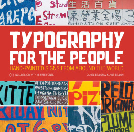





 TYPOGRAPHY FOR THE PEOPLE Copyright 2010 by Daniel Bellon and Klaus Bellon. Manufactured in China. All rights reserved. No other part of this book may be reproduced in any form or by any electronic or mechanical means including information storage and retrieval systems without permission in writing from the publisher, except by a reviewer, who may quote brief passages in a review. Published by HOW Books, an imprint of F+W Media, Inc., 4700 East Galbraith Road, Cincinnati, Ohio 45236. (800) 289-0963.

 Kansas City, Missouri
 Detroit, Michigan