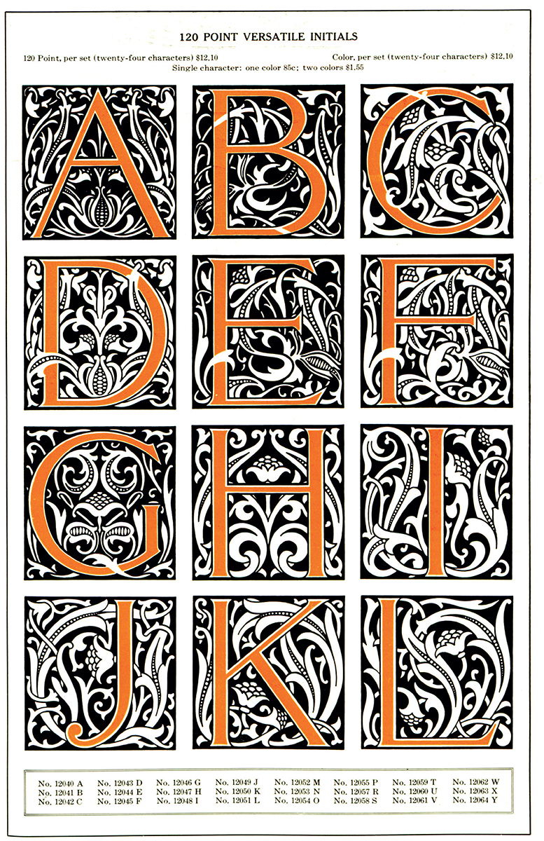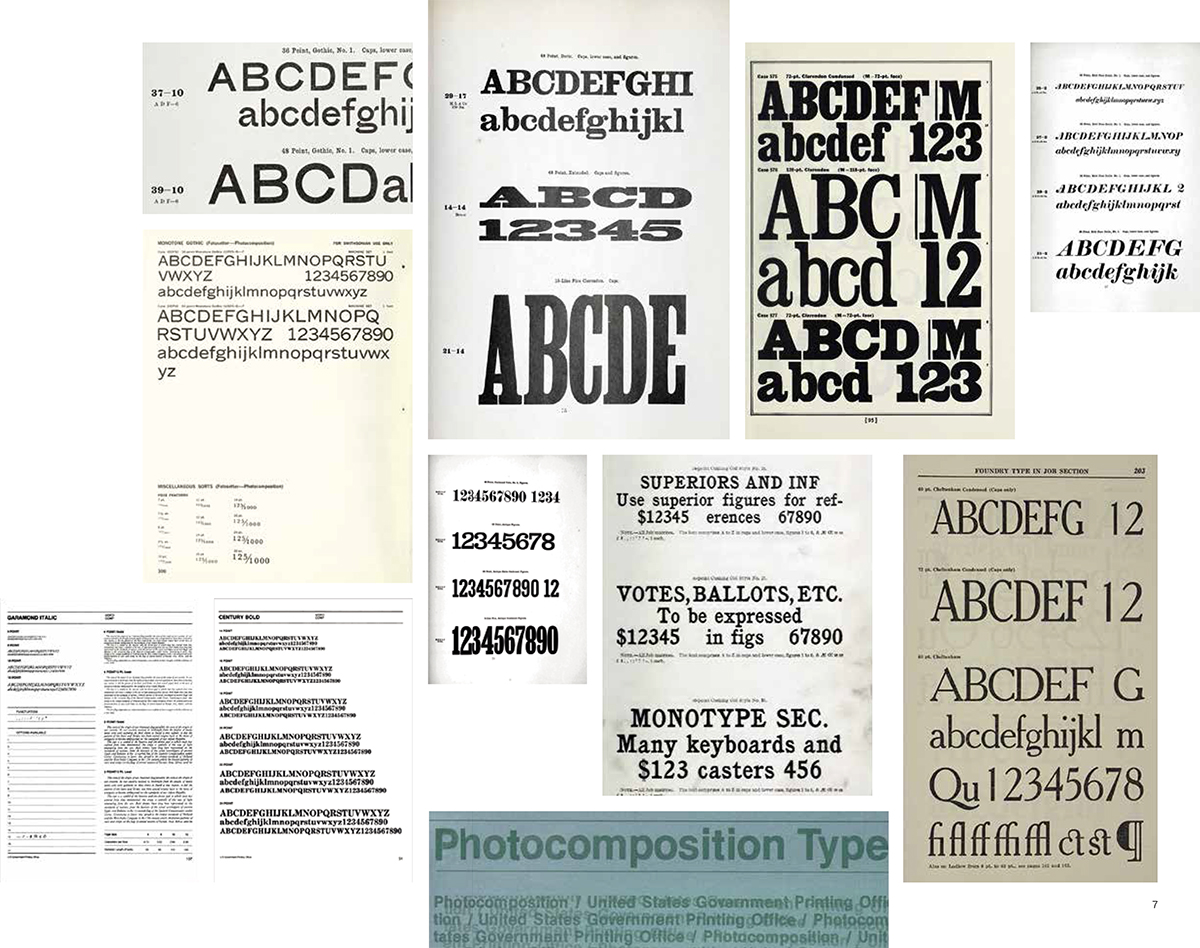
American Specimen Book of Type Styles, American Type Founders, 1912.

BLOOMSBURY VISUAL ARTS
Bloomsbury Publishing Plc
50 Bedford Square, London, WC1B 3DP, UK
1385 Broadway, New York, NY 10018, USA
29 Earlsfort Terrace, Dublin 2, Ireland
This electronic edition published in 2022 by Bloomsbury Publishing Plc
BLOOMSBURY, BLOOMSBURY VISUAL ARTS and the Diana logo are trademarks of Bloomsbury Publishing Plc
First published in Great Britain 2022
Copyright Bloomsbury, 2022
Dori Griffin has asserted her right under the Copyright, Designs and Patents Act, 1988, to be identified as Author of this work.
For legal purposes the constitute an extension of this copyright page.
Cover design: Louise Dugdale
Cover image: Antique wood type kjohansen/iStock.
All rights reserved
You may not copy, distribute, transmit, reproduce or otherwise make available this publication (or any part of it) in any form, or by any means (including without limitation electronic, digital, optical, mechanical, photocopying, printing, recording or otherwise), without the prior written permission of the publisher. Any person who does any unauthorised act in relation to this publication may be liable to criminal prosecution and civil claims for damages.
Bloomsbury Publishing Plc does not have any control over, or responsibility for, any third-party websites referred to or in this book. All internet addresses given in this book were correct at the time of going to press. The author and publisher regret any inconvenience caused if addresses have changed or sites have ceased to exist, but can accept no responsibility for any such changes.
A catalogue record for this book is available from the British Library.
Library of Congress Cataloging-in-Publication Data
Names: Griffin, Dori, author.
Title: Type specimens : a visual history of typesetting and printing / Dori Griffin.
Description: New York : Bloomsbury Visual Arts, 2021. | Includes .
Identifiers: LCCN 2021023396 (print) | LCCN 2021023397 (ebook) | ISBN 9781350116603 (hardback) | ISBN 9781350116597 (paperback) | ISBN 9781350116610 (epub) | ISBN 9781350116627 (pdf)
Subjects: LCSH: Type and type-founding--Specimens. | Typesetting--History. |
Typesetting--History--Pictorial works. | Printing--History. | Printing--History-Pictorial works.
Classification: LCC Z250 G85 2021 (print) | LCC Z250 (ebook) |
DDC 686.2/24--dc23
LC record available at https://lccn.loc.gov/2021023396
LC ebook record available at https://lccn.loc.gov/2021023397
ISBN: 978-1-350116-60-3 (HB)
ISBN: 978-1-350116-59-7 (PB)
ISBN: 978-1-350116-61-0 (eBook)
ISBN: 978-1-350116-62-7 (ePDF)
To find out more about our authors and their books please visit www.bloomsbury.com where you will find extracts, author interviews and details of forthcoming events, and to be the first to hear about latest releases and special offers, sign up for our newsletters.
CONTENTS

Desktop Specimens, US Government Printing Office, 18961981.
The United States Government Printing Offices desktop reference specimens offer a snapshot view of changing typographic technologies. The 1896 edition offered type from individual foundries, with a few display faces from the newly-formed American Type Founders corporate trust. In 1912, mechanized typesetting warranted its own specialized Specimen Book of Monotype Faces. The 1916 specimen indicated whether a typeface originated from Monotype or Linotype, appending M or L to its catalog listing. In 1950, Linotype, Monotype, Intertype, and Ludlow faces were available, plus a section of foundry type for special purposes, but the new technology of phototype wasnt yet represented. By 1962, though, all of this material was supplemented by an extensive selection of Fotosetter phototype faces. 1962s Jobbing section still included miscellaneous fonts of script, text, and wood type which printers were advised to avoid unless absolutely necessary due to limited supply. By 1981, phototype required its own volume, United States Government Photocomposition Type Faces. Overt visualizations marked none of these swift changes in technology, however. Page composition reflected evolving design tastes, but the differences between foundry, hot metal, and photo type remained all but invisible on the printed page. Cover images occasionally provided more robust clues. Photocomposition simulated moving the negative during printing plate exposure, one of the physical contortions available with film typeunlike metal, a physically flexible medium.
Who is this books audience?
If youre a student or teacher of design, I wrote this book for you. The first time I taught a type specimen project in the university design studio, my students and I needed access to useful historical images in color, accompanied by accurate contextual information, with bonus points for relevance to contemporary studio practice. Though a quick Google search for type specimen lent plenty of images, few included context. At conferences, colleagues suggested we should just go see the real thing at a local archive, which would have worked if I were teaching in a major metro area. But I was teaching at a public university in southern Mississippi, and there werent any such archives in the entire state. So I asked my students if theyd be interested in a book about type specimens, at least enough to pick it up and look at the pictures. They said yes, and I started researching and writing this book. In it, Ive prioritized the following goals:
1: Wide access. I want as many people as possible to be able to find, afford, and enjoy this book. It wont replace the experience of viewing printed artifacts in person. But it can enable students, teachers, practicing designers, and design-curious readers to access resources otherwise unavailable because of constraints in time, money, or geographical location.
2: Historical context. Graphic design notoriously lacks a diverse, carefully researched body of disciplinary literature. Introductory survey textbooks and specialized academic monographs certainly address typographic history, but there arent many resources in the space between these two extremes. As a teacher, I believe we can do a better job of solving todays design problems and anticipating tomorrows if we understand yesterdays problems and solutions. This book provides context for understanding typographic design and communication practices.
3: Diverse global geographies. The type specimenas both a visual form and a professional practicehas intrinsically Eurocentric beginnings. Its historical roots are neither value-neutral nor culturally diverse. In choosing images, though, this book seeks to be as global and inclusive as possible. At the same time, its important to acknowledge the exclusion, discrimination, settler colonialism, and cultural imperialism that have accompanied the spread of western print capitalism, a problem this book takes seriously, but doesnt pretend to solve.


