Type Foundry Catalog
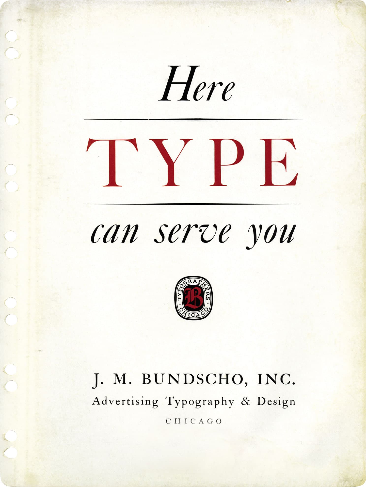
Title Page, 1935
J. M. Bundscho, Inc.
Chicago, II, USA
Introduction
Typography is the craft of endowing human language with a durable, visible form.
Robert Bringhurst, The Elements of Typographic Style
T ype is the descriptive term used for letterformsalphabet, numbers, and punctuationthat, when used together, create words, sentences, and narrative form. The term typeface refers to the design of all the characters referenced above, unified by common visual elements and characteristics. Typography is designing with type.
Type is a unique element in the graphic designers vocabulary because it has dual functions. It can function on its purest level as any fundamental visual element such as point, line, form, shape, and texture in a composition. However, its primary function is verbal and visualit is to be read. When type has a relationship only to its verbal meaning, its communicative character lacks visual impact. When type reflects a visual treatment that enhances both its verbal and visual meaning, it is perceived on multiple levels, not only intellectually but also sensually and, more importantly, emotionally.
Type, of course, is all around us. The goal of any graphic designer is not to just place type on a printed or digital page, but rather to understand it and use it effectively in all areas of graphic design. The selection and choice of type, as well as its size, alignment, style, color, and spacing all are critical considerations for the graphic designer.
Since the beginning of mankind, we have needed to communicate our lives to one another. After we learned to speak verbally, we then spoke visually by leaving crude marks on walls and surfaces. From cave paintings and hieroglyphics to Roman inscriptions and medieval scripts, communicating experiences to one another has been a common human denominator for telling our stories at any given time. As our world has become more complex, so has the means by which we communicate those stories in their many forms and media. The most universal means throughout history has been, and will continue to be, type.
For more than five hundred years, type has been an essential visual communicator that continues to reflect civilization, culture, technology, and the human condition at any given time period. Its evolution follows the parallel developments of human communication needs, print technologies from the rudimentary hand to mechanical printing, to the invention of typesetting such as the Linotype and Monotype systems, to the twentieth-century developments of phototypesetting and digital typesetting methodologies.
Graphic design provides a means for you to express your own imagination in ways that do not rely solely upon spoken or written language. Every element used in graphic design, such as type, has the potential to express something specific. Although the explanation and ultimate use of design elements and principles may seem cut-and-dry, the quality of these elements and principles is perceived solely through the expression of the total message by a graphic designer.
Type is one of the most powerful forms of visual expression and communications. When used in combination with imagery, color, and other relevant design elements, it can convey a memorable and timeless message that will always be associated with a specific human emotion.
Typography in practice is the process of arranging letters, words, and text for almost any context imaginable. It is among the most important design principles you need to master for creating effective and meaningful graphic design. Graphic designers learn the nuances of typography in order to use it creatively, with imagination and a sense of exploration, while maintaining respect for its rules and traditions.
Design School: Type is a back-to-basics, practical guide on the rules and practices of type. The foundation of any successful graphic designer relies upon their understanding of the fundamentals of type, a crucially important skill which underpins almost every other aspect of graphic design. This book provides an in-depth understanding of the basic elements and principles of typewhat they are, why they are important, and how to use them effectively.
Design School: Type not only explores the graphic design student experience; it includes work by some of the most successful and renowned design practitioners from around the world and how they have applied these basic principles to their work. By examining both student and professional work, Design School: Type is also a more meaningful, memorable, and inspiring guide for students, as well as novice practitioners starting their professional careers.
Section 1
Type Classifications
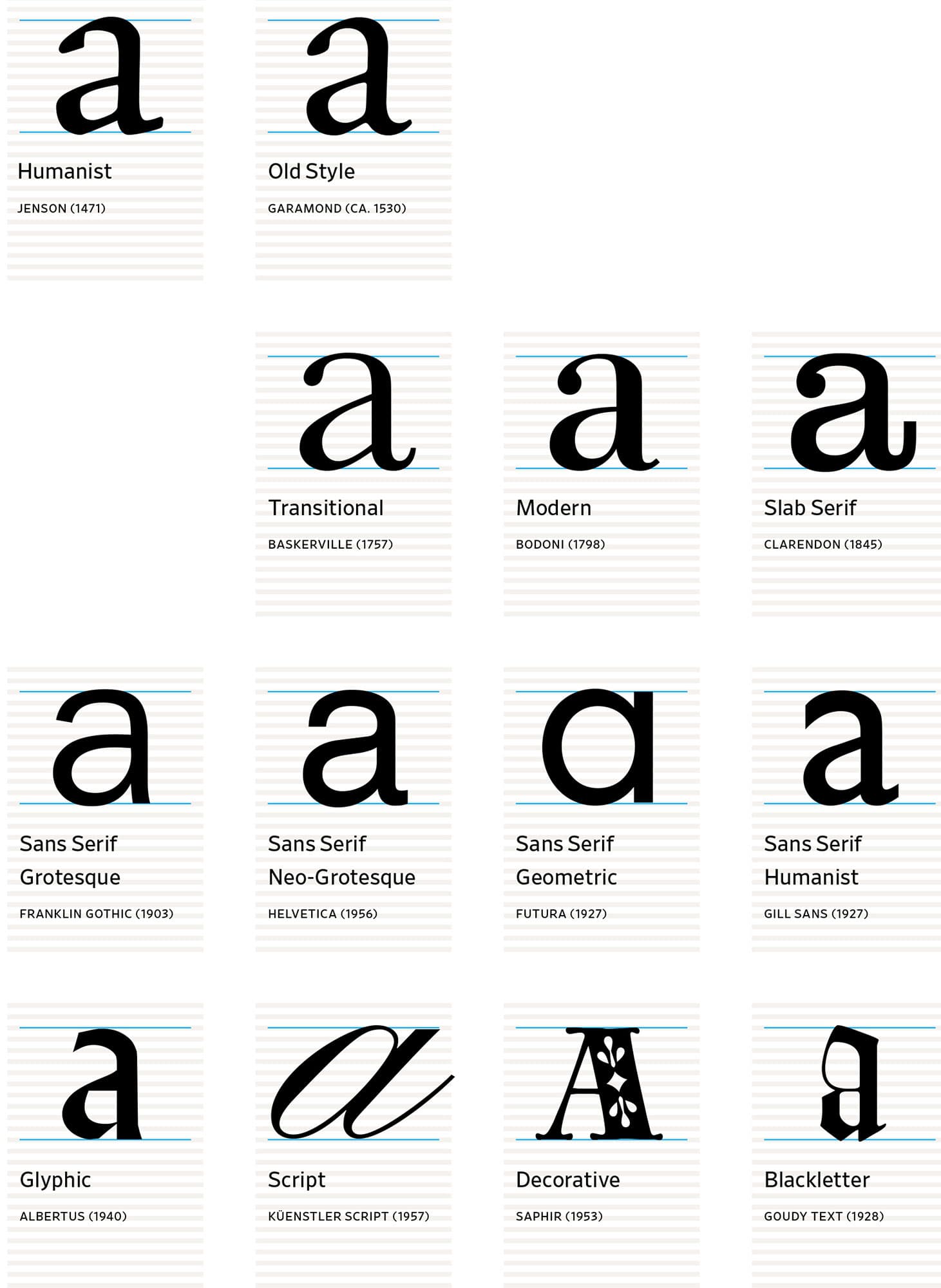
T his section examines in detail the history of type through the organization and classification of type styles and time periods. Each type classification is presented with an overview, brief biographies of prominent type designers, visual characteristics, and applications, as well as sidebars covering distinct developments or features of each type classification.
How does a graphic designer determine, among the thousands of typefaces available, which font or fonts might fulfill a specific need? While most typefaces are classified into three categoriesserif, sans serif, and scriptit is a limited and somewhat shortsighted classification system. One method for familiarizing yourself with typefaces and their unique characteristics and attributes, as well as understanding their historical development and potential applications, is to use a more detailed and accurate system of type classification.
All type classification systems use the historical development of type, from the fifteenth century to the present day, as their organizational framework. While there are no two type classification systems that agree upon specific categorization of every typeface, these systems still remain an effective and informative reference guide for identifying and utilizing the number of typefaces available today.
An early type classification system by typographer Francis Thibaudeau (French, 18601925) was based on four broad categories of typefaces, namely Antiques (Sans Serifs), Egyptiennes (Slab Serifs), Didots (moderns), and Elzvirs (typefaces with triangular serifs).
A basic system for classifying typefaces was also devised in the nineteenth century, when printers sought to identify a heritage for their own craft analogous to that of art history. Humanist letterforms are closely connected to calligraphy and the movement of the hand. Transitional and modern type-faces are more abstract and less organic. These three main groups correspond roughly to the Renaissance, Baroque, and Enlightenment periods in art and literature. Historians and critics of typography have since proposed more finely detailed schemes that attempt to better capture the diversity of letterforms. Designers in the twenty-first century have continued to create new typefaces based on these historic characteristics.


