Editors of Time Magazine - Inside the Red Border
Here you can read online Editors of Time Magazine - Inside the Red Border full text of the book (entire story) in english for free. Download pdf and epub, get meaning, cover and reviews about this ebook. year: 2013, publisher: Liberty Street, genre: Politics. Description of the work, (preface) as well as reviews are available. Best literature library LitArk.com created for fans of good reading and offers a wide selection of genres:
Romance novel
Science fiction
Adventure
Detective
Science
History
Home and family
Prose
Art
Politics
Computer
Non-fiction
Religion
Business
Children
Humor
Choose a favorite category and find really read worthwhile books. Enjoy immersion in the world of imagination, feel the emotions of the characters or learn something new for yourself, make an fascinating discovery.
- Book:Inside the Red Border
- Author:
- Publisher:Liberty Street
- Genre:
- Year:2013
- Rating:4 / 5
- Favourites:Add to favourites
- Your mark:
- 80
- 1
- 2
- 3
- 4
- 5
Inside the Red Border: summary, description and annotation
We offer to read an annotation, description, summary or preface (depends on what the author of the book "Inside the Red Border" wrote himself). If you haven't found the necessary information about the book — write in the comments, we will try to find it.
Inside the Red Border — read online for free the complete book (whole text) full work
Below is the text of the book, divided by pages. System saving the place of the last page read, allows you to conveniently read the book "Inside the Red Border" online for free, without having to search again every time where you left off. Put a bookmark, and you can go to the page where you finished reading at any time.
Font size:
Interval:
Bookmark:

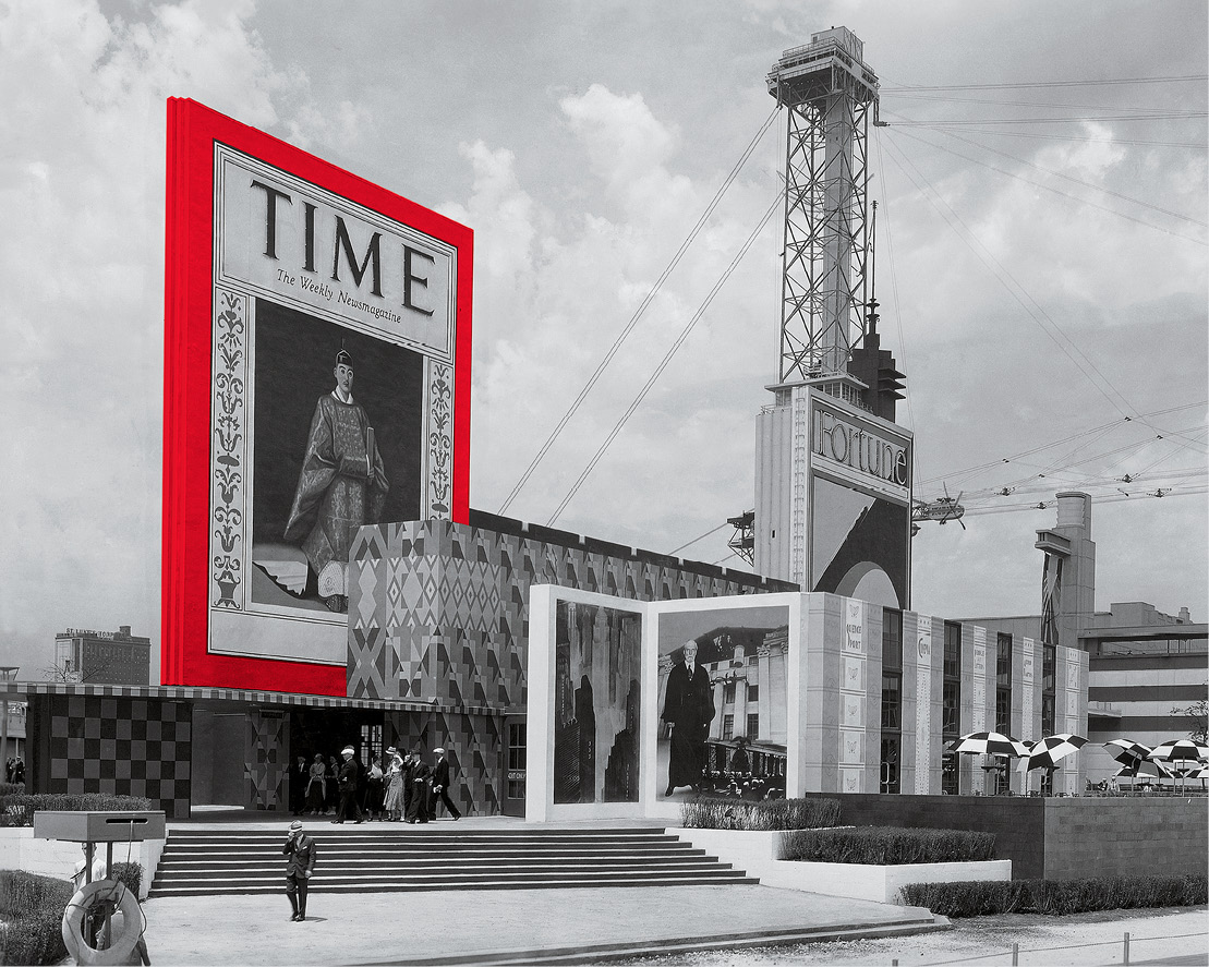
A giant facsimile of the June 6, 1932, cover with Japans Emperor Hirohito looms over an entrance to the TIME and Fortune pavilion at the 1933 Worlds Fair in Chicago (red border colorized)
Contents
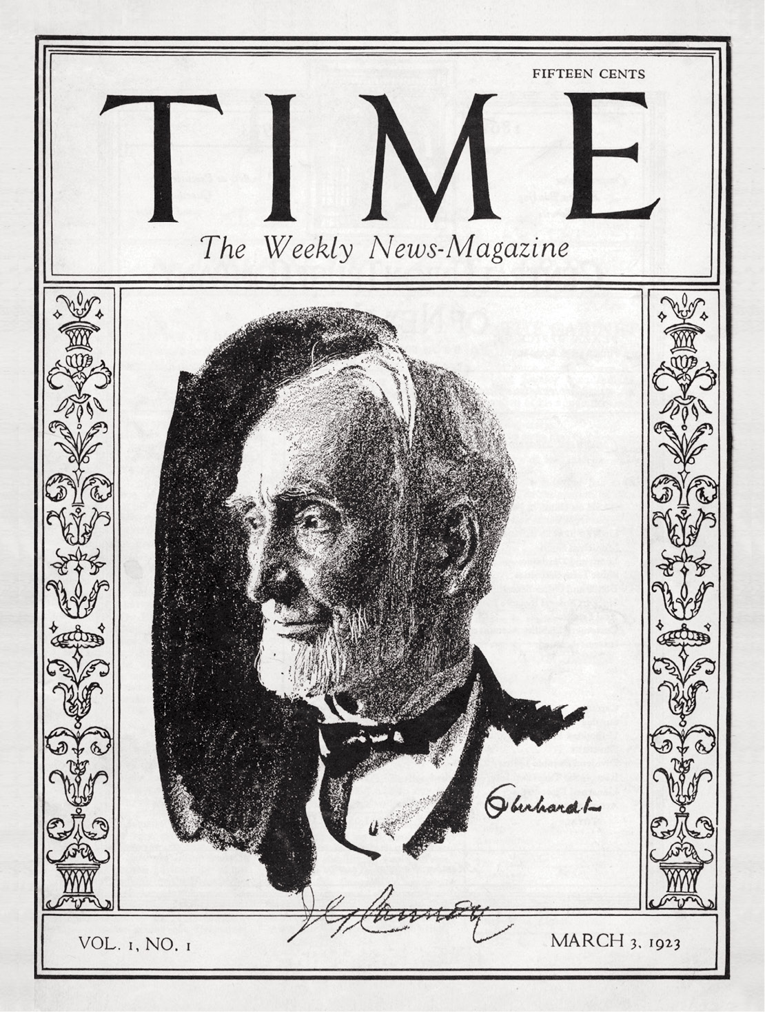
U.S. Representative Joseph Cannon, a former Speaker of the House, was on the first cover of TIME, March 3, 1923
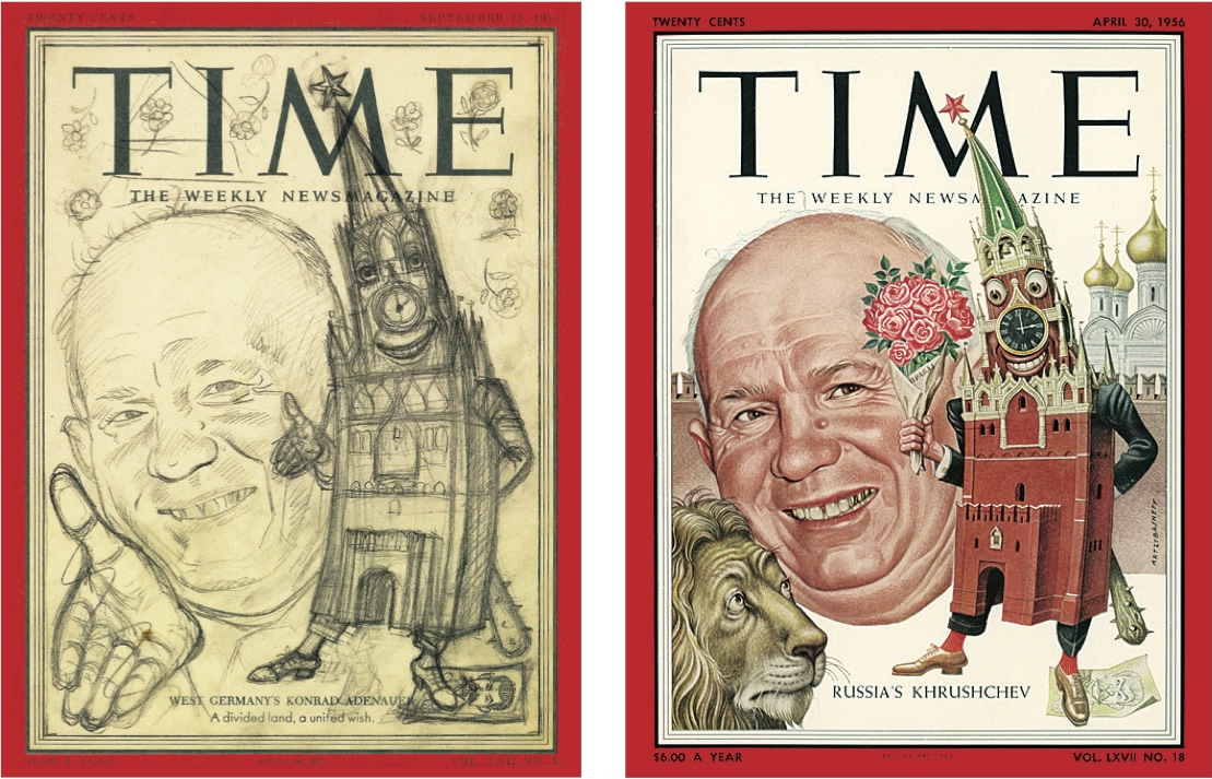
A preliminary sketch, above left, by Boris Artzybasheff for the April 30, 1956, cover with Soviet leader Nikita Khrushchev, drawn on a previous cover template. The final cover, above right.
introduction
A Rough Draft Of History, One Cover at a Time
By Richard Stengel
Managing Editor, time magazine
T he time cover is the most important real estate in journalism. The iconic red border grabs you by the lapels and says, Pay attention. That border divides the world into everything outside it and everything inside; everything inside is important, meaningful, urgentand everything outside, well, not so much. The red border is a visual drum roll that has the effect of heightening everything inside it so that the image and the line get enhanced power and relevance and focus. It started as a visual flourish and ended up as one of the most recognizable signatures in the world. Each week, the TIME cover fuses word, art and design to become a part of history.
The red border didnt exist when TIME was born in 1923. For the first four years of our history, there was just an elegant filigree to the left and right of the black-and-white charcoal portraits of the magazines cover subjects. But the magazine was languishing on the newsstand. In 1930, according to The Man Time Forgot , Isaiah Wilners biography of Briton Hadden, who founded the magazine with Henry Luce, TIM E s advertising chiefs went to newsdealers for advice, and one of them said, What you need on the cover is pretty girls, babies or red and yellow. The girls and babies just didnt fill the bill, and yellow seemed too garish. One day, sitting in Haddens office, a friend of his named Philip Kobbe took a red crayon and drew a border around the cover of the current issue. Everyone loved it.
The red border debuted on the first issue of 1927, gracing a portrait of Leopold C. Amery, the British Secretary of State for the Colonies. Few remember Amery, but the red border stuck. In fact, the business side soon upgraded the paper stock so it would better accept color, and the cost was soon recouped by the additional revenue earned from selling color ads on the inside and back covers.
Through much of our history, the cover image was almost always a portrait of an individual. Names make news, Luce said, and his conception of TIME was that we would write about the news through the people who made it. This seems pretty unexceptional today, but in the 1920s and 30s, it was a new and revolutionary notion. For Luce, history didnt make the man; the manand womanmade history.
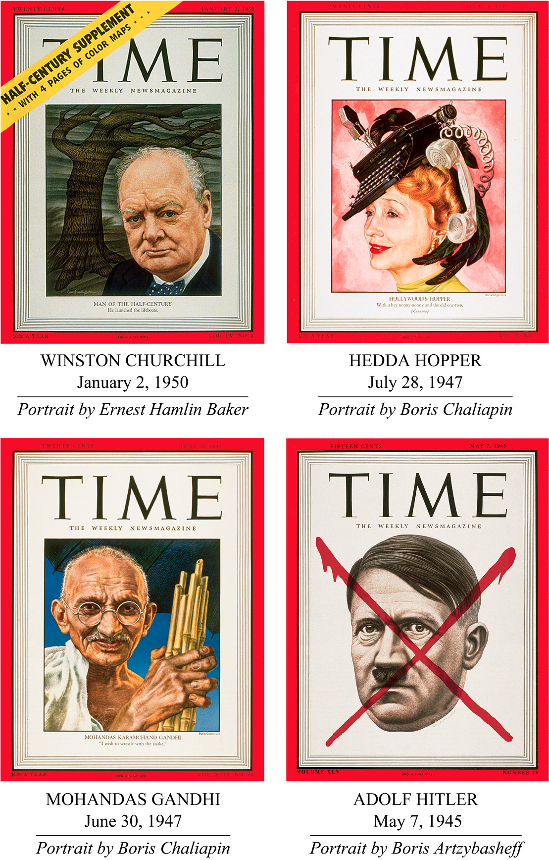
The first full-color portrait, an oil painting of Walter P. Chrysler, appeared in January 1929. Within 10 years, there were color photographs on the cover. But by 1939, TIME began to take a different direction. For the next 25 years, TIME featured distinctive painted cover portraits by three artists: Boris Artzybasheff, Ernest Hamlin Baker and Boris Chaliapinthe ABCs as they were known in the office. This era was the golden age of the TIME cover.
B aker was a Colgate university grad who started drawing caricatures when he was in college. Both of the Borises were Russians who had been displaced by the Russian Revolution. Artzybasheff escaped as a deckhand on a steamer and jumped ship in New York. Chaliapin was the son of the one of Russias greatest opera singers. In terms of style, Baker was the most straightforward and realistic, yet his covers often had a sweetness and optimism about them. Chaliapins pictures were moody, more impressionistic and often lyrical. Artzybasheffs portraiture was extremely realistic, but his images, especially the backgrounds, were often surreal, displaying an imagination that was wild and surprising. From 1939, when Baker did his first cover, until 1970, when Chaliapin executed the last of his, the three men painted more than 900 covers.
Within a few years, these portraits added another feature. Because some of the subjects were not well known to readers, the artists started painting elaborate backgrounds filled with objects and iconography that put the person in context. One of the first of these was a 1941 portrait of the dissident Lutheran pastor Martin Niemoller of Germany; his face was flanked by a swastika and a cross. The backgrounds came to be symbolic landscapes with images and objects that helped identify the subject. They were as rich in their own way as the portraits. For many readers, the background came to be a kind of weekly puzzle helping them decipher the main image.
I have two portraits from this period hanging in my office. One is Bakers wonderful rendering of Jackie Robinson, showing the beaming Brooklyn Dodger surrounded by giant baseballs. It is a happy image, with a sunny Robinson radiating optimism and confidence. Its hard not to smile while looking at it. The other is Artzybasheffs brilliant portrait of designer Buckminster Fuller with a head shaped like his greatest invention, the geodesic dome. It is so clever, so brilliantly executed and so much fun. It is irresistible.
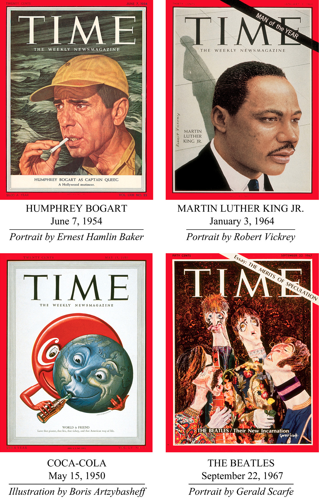
By 1940 the filigree was gone. In the 1950s the logo began to be superimposed on the cover image rather than sitting above it. This created more of a pure poster effect. Ive always conceived of the TIME cover as a poster, something that catches your eye and informs at the same time. Like posters, it is meant to be bold, clean, immediately understandable. To use Horaces definition of great art: the TIME cover is dulce et utile it teaches while delighting.
In the mid-60s, TIMEs editors began moving the covers away from portraiture. They did not abandon it altogether but used more graphic images and bigger headlines to tackle social and societal issues. The iconic 1966 cover Is God Dead?which simply used bold red type on a black backgroundwas powerful, visually arresting and modern. One of my favorite covers from this period is Roy Lichtensteins 1968 The Gun in America, published a week after the assassination of Robert Kennedy. Just four issues before, Lichtensteins brilliant portrait of Kennedy, in the middle of his campaign for President, depicting him as a comic-book superhero, had been the cover of the magazine.
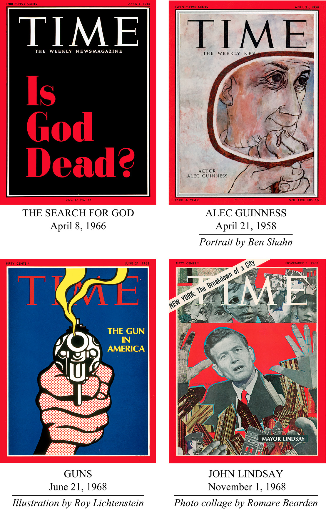
T he red border remained unchanged until the late 1970s, when the magazine introduced a corner flapa graphic version of a page corner being turned down. The idea was to feature a second big story. We also introduced a more compact logo that, like so many things of the 70s, seems a little less than lofty today. Elegance should be a virtue of the TIME cover, and the classic logo, as well as the one today, preserves that.
Font size:
Interval:
Bookmark:
Similar books «Inside the Red Border»
Look at similar books to Inside the Red Border. We have selected literature similar in name and meaning in the hope of providing readers with more options to find new, interesting, not yet read works.
Discussion, reviews of the book Inside the Red Border and just readers' own opinions. Leave your comments, write what you think about the work, its meaning or the main characters. Specify what exactly you liked and what you didn't like, and why you think so.

