Tina Sutton - The Pocket Complete Color Harmony
Here you can read online Tina Sutton - The Pocket Complete Color Harmony full text of the book (entire story) in english for free. Download pdf and epub, get meaning, cover and reviews about this ebook. year: 2020, publisher: Rockport Publishers, genre: Romance novel. Description of the work, (preface) as well as reviews are available. Best literature library LitArk.com created for fans of good reading and offers a wide selection of genres:
Romance novel
Science fiction
Adventure
Detective
Science
History
Home and family
Prose
Art
Politics
Computer
Non-fiction
Religion
Business
Children
Humor
Choose a favorite category and find really read worthwhile books. Enjoy immersion in the world of imagination, feel the emotions of the characters or learn something new for yourself, make an fascinating discovery.

- Book:The Pocket Complete Color Harmony
- Author:
- Publisher:Rockport Publishers
- Genre:
- Year:2020
- Rating:5 / 5
- Favourites:Add to favourites
- Your mark:
The Pocket Complete Color Harmony: summary, description and annotation
We offer to read an annotation, description, summary or preface (depends on what the author of the book "The Pocket Complete Color Harmony" wrote himself). If you haven't found the necessary information about the book — write in the comments, we will try to find it.
Tina Sutton: author's other books
Who wrote The Pocket Complete Color Harmony? Find out the surname, the name of the author of the book and a list of all author's works by series.


The Pocket Complete Color Harmony — read online for free the complete book (whole text) full work
Below is the text of the book, divided by pages. System saving the place of the last page read, allows you to conveniently read the book "The Pocket Complete Color Harmony" online for free, without having to search again every time where you left off. Put a bookmark, and you can go to the page where you finished reading at any time.
Font size:
Interval:
Bookmark:
Tina Sutton
THE POCKET
1,500+ Color Palettes for Designers, Artists, Architects, Makers, and Educators


When you enter a room, see someone walking toward you on the street, or look up at a billboard while stuck in a traffic jam, the first thing you notice is color. The yellow walls in a childs room make you smile, the red of a womans coat catches your eye, the orange background of an advertisement grabs your attention.
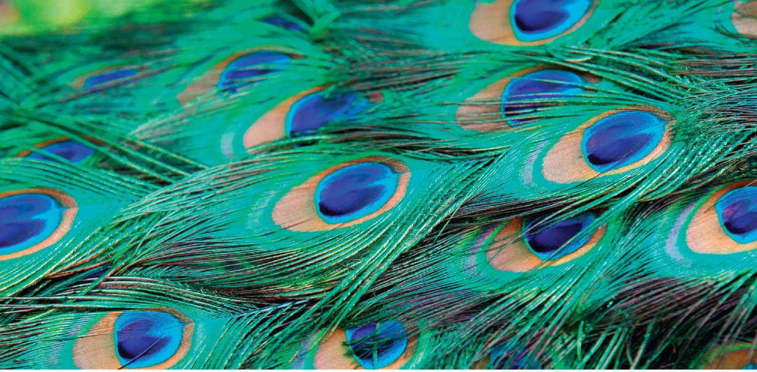
As Walt Disney so aptly put it, we live in a wonderful world of color. Color combinations can dazzle, soothe, or charm. In the bird kingdom, a male peacocks stunning plumage of iridescent blues and greens quickens the heartbeat of potential mates.
Color is also egalitarian. We can all use and enjoy a wide spectrum of colors in our lives, no matter what our income level or profession.
But everyone needs a little help. Thats where the experts come in. Consumers of all products are looking for guidance in choosing color palettes that harmonize with their lives. While many decisions about colors are emotional and based on immediate visceral reactions, creating inventive combinations of hues is a more practiced art.
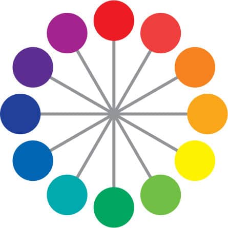
Most people are unaware of the science of color, which starts with the twelve-segment color wheel as a road map to effective combinations. Direct opposites on the wheel are complementary. Adjacent colors clash. Warm colors appear to come forward. Cool colors recede.
Colors also have psychological and physiological effects on our bodies. Reds make people jumpy. Greens calm us down. In a red room, time seems to fly.
This book is designed as a guide for anyone interested in the field of color, from graphic, interior, and fashion designers to artists, craftspeople, and flower arrangers. Not only does it explain the science of color but it also suggests innumerable harmonies to fit every mood and end use.
Sections on the psychology of color and color-trend forecasting are of particular value to advertisers and product designers to aid them in subliminally communicating with target markets.
The days of simply relying on colors that have been successful in the past are long gone. Take advantage of the color harmonies and imaginative variations in this book to launch your own creativity.
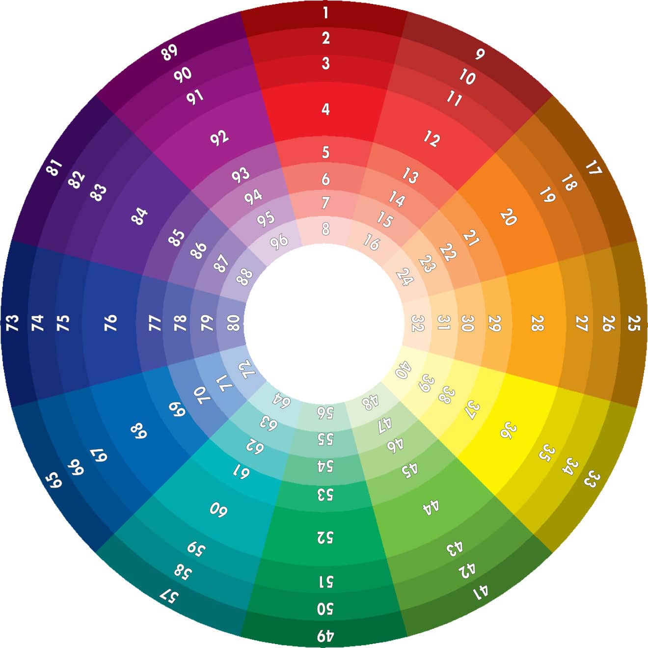
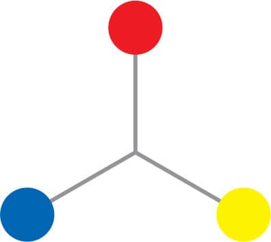
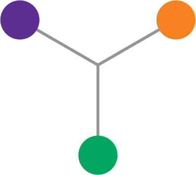
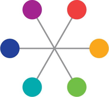
The twelve segments of the color wheel consist of primary, secondary, and tertiary hues and their specific tints and shades. With red at the top, the color wheel identifies the three primary hues of red, yellow, and blue. These three primary colors form an equilateral triangle within the circle. The three secondary hues of orange, violet, and green are located between each primary hue and form another triangle. Red-orange, yellow-orange, yellow-green, blue-green, blue-violet, and red-violet are the six tertiary hues. They result from the combination of a primary and a secondary hue.
Constructed in an orderly progression, the color wheel enables the user to visualize the sequence of color balance and harmony. The colors on the wheel are numbered 196, and correspond to the color chart (see ) and to the colors throughout the book.

Working with color to achieve intended results can be a challenge, but it can also be fun! An effective color scheme can make a room feel warm and inviting; a graphic design able to attract attention; or a poster to recall days gone by. Before learning what colors to use in order to achieve the best results, you must first understand some basic color terms.
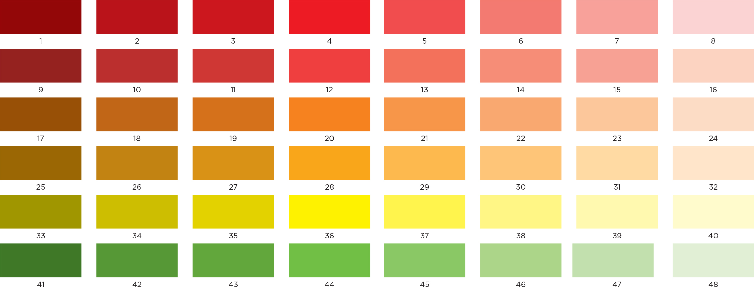
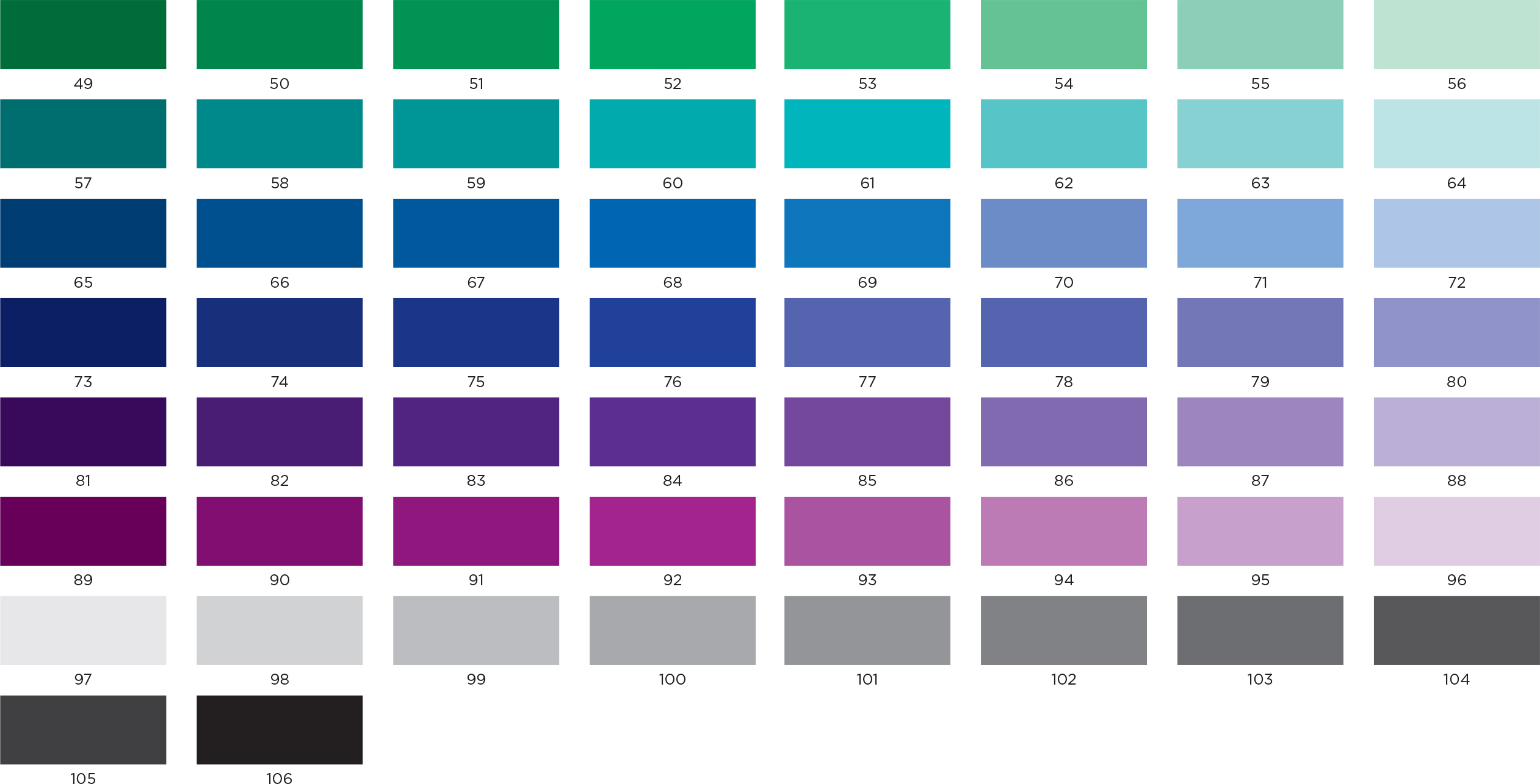
Each primary, secondary, and tertiary hue is at a level of full saturation, or brightness, which means that there is no black, white, or gray added. Color is described in terms of value, which measures the lightness or darkness of a color, or the relative amount of white or black in a hue. White added in increments to any of the twelve colors results in lighter values of the hue, called tints. For example, pink is a tint of the primary color red. The incremental addition of black or gray to a hue results in darker values known as shades. A shade of red is burgundy or maroon. These shades and tints are illustrated by the color chart on the following pages.
PRIMARY
SECONDARY
TERTIARY
The color chart is the color wheel in chart form. The rows above and below the fully saturated center hue represent the tints and shades of each color. Each hue, tint, and shade on the chart below is numbered 196 for easy reference. Numbers 97106 represent the value range from lightest gray to black. These numbers correspond with the colors used in combination throughout this book and offer a wide selection of balanced and effective color possibilities within each interpretive section.
The Pocket Complete Color Harmony is divided into sections to show aspects of color and color combinations that visually explain the effect color has on our lives. The color conversion chart, the color wheel shown , and color cards all work together to develop unique color possibilities. The Pocket Complete Color Harmony explores color terminology, the aspects of color, color schemes, and color combinations. It serves as a practical guide for accurate and positive results when designing with color.
 STEP 1 Clearly define the results you want to achieve with color.
Font size:
Interval:
Bookmark:
Similar books «The Pocket Complete Color Harmony»
Look at similar books to The Pocket Complete Color Harmony. We have selected literature similar in name and meaning in the hope of providing readers with more options to find new, interesting, not yet read works.
Discussion, reviews of the book The Pocket Complete Color Harmony and just readers' own opinions. Leave your comments, write what you think about the work, its meaning or the main characters. Specify what exactly you liked and what you didn't like, and why you think so.