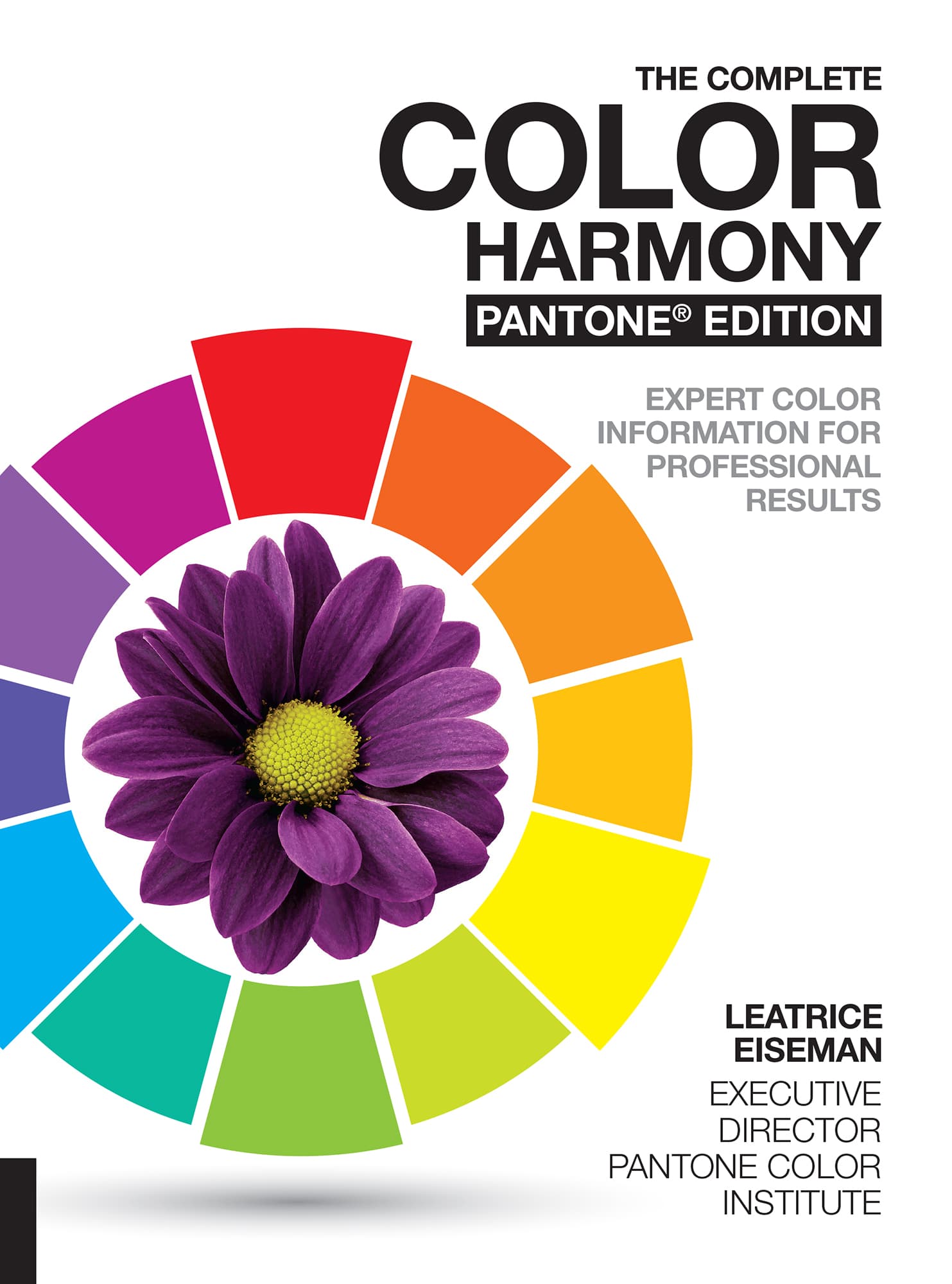
THE COMPLETE
COLOR HARMONY
PANTONE EDITION
EXPERT COLOR INFORMATION FOR PROFESSIONAL RESULTS
LEATRICE EISEMAN
EXECUTIVE DIRECTOR PANTONE COLOR INSTITUTE


FOREWORD:
A JOURNEY IN COLORImagine for a moment what it would be like to live in a world without color, a world where we could only see black and white and shades of gray. It is almost impossible for us to imagine as color defines our world. The first thing you remember and the last thing you forget, color is an identifier; the visual cue that engages us; drawing us in to feel a connection with our environment and the things we love.
Like artists and designers have done throughout time, many of us look to color as a fantastic way to express ideas and emotions; turning to bright and bold shades to convey energy or softer quieter shades when we want to create a feeling of calm. However, there is so much more to learn about the power of color and the role that this unique mode of communication plays in our lives. As the single most important design element in creating mood and style, the influence color has on our feelings, our well-being, and our perceptions cannot be underestimated.
This is something I dont think I fully appreciated until I came to Pantone and met Leatrice Eiseman. Like Dorothy waking up in the Land of Oz, Leatrice Eiseman unlocked a door; opening my eyes, leading me into her captivating world of color where I discovered a new language and a new way of being.
Color plays such a vital role in conveying a message and establishing an ambiance. As Executive Director of the Pantone Color Institute and author of this book, Lee Eiseman has filled its pages with colorful inspiration and ideas as well as colorful combinations to help you create the magic and the mood you are looking for. Throughout these pages Lee has used the PANTONE PLUS color palette so you can match your color choices exactly. Having a precise way to communicate and replicate your color choices will help ensure you are able to accurately bring your colorful vision to life.
We at Pantone congratulate Lee for this beautiful book; we appreciate her unique color savvy and thank her for all of her work in consumer color research, color trend forecasting, and color education, which she has so generously shared.
To my guide, my mentor and my colorful hero, Leatrice Eiseman; I cannot thank you enough for unleashing my creative spirit: you inspire me every single day and it is through your tutelage that I learned so much and have come to love and embrace all that this magical world of color has to offer. And to you, our reader, whether you are first learning about color or are already an acknowledged color aficionado, we hope this book will open your mind, arouse your imagination, and, most importantly, color your world.
Laurie Pressman, Vice-President, Pantone Color Institute

INTRO:
COLOR HARMONYFrom the time we were tiny children, we innately understood that color is a vital part of our lives. When offered a box of crayons, we scribbled with great delight and abandonnever mind staying within the lines of the coloring book. Color provided the freedom to express ourselves, gaining approval and appreciation from doting parents.
As we grew older, we became more conscious of the emotional components of color and how effective it can be in directing and diverting the eye. In fact, there are subtleties and nuances in numerous hues, tints, tones, shades, and intensities to excite or calm, pacify or energize, and even suggest strength or vulnerability. They can nurture you with their warmth, soothe you with their quiet coolness, and heighten your awareness of the world around you. Color enriches the universe and our perception of it.
We respond to color at a very visceral level and our preferences can often be the key to understanding memories and buried emotions. They can produce what is termed a mnemonic association by reminding us of another time or place. Throughout our waking hours and even in our dreams, color is a constant presence.
There is color in landscape and seascape, and a riot of color under a tropical sea or in a rainforest. The desert yields subtle tonal variations of sand and dunes, and even the snow-covered North Pole shows variations of white, depending on the weather conditions. The native people who inhabit the region apply a multitude of different names to the varying shades of white.
Because of color, we take pleasure in the wonders of naturea glowing orange, vermillion, and lavender sunset; the magenta and purple pattern on butterfly wings; the iridescent spread of teal and cobalt blue of a mallard duck floating on a peaceful pond; the changing green leaves of autumn to russets and golds; and the aubergine leaves on the forest floor.
From a broad perspective, animals are colored for disguise or for display, especially in attracting a suitable and healthy mate. A male locust turns vibrant yellow when it is sexually mature. A male peacock proudly spreading his wings is impossible to ignore against any background, while some species of frogs and chameleons are capable of changing color to suit their environment to escape predators. The survival of the fittest is well served by color.
As for humans, from a purely practical standpoint, color is essential to our very existence, as it enables us to judge the freshness of ripe fruit, berries, vegetables, and other foodstuffs. It helps us to identify birds, insects, fish, flora, and faunathose to enjoy and those to avoid, or at least, to exercise some caution around them. It can inform us that we must stop at a red light and go on green. Color stimulates and works synergistically with all the sensessight, smell, hearing, taste, and touch, evoking enjoyment, or, at the opposite extreme, repulsion and rejection.
Wassily Kandinsky, the renowned abstract artist, heard the sound of musical instruments when he painted. He stated: The sound of colors is so definite that it would be hard to find anyone who would express bright yellow with base notes or dark lake with the treble. Kandinsky seemed rather an eccentric in his day, but recent research shows that a condition called synesthesia exists and Kandinsky was one of the rare individuals who had it. It is defined as a condition in which one sense (for example, hearing) is simultaneously perceived by one or more senses, such as sight. So it is a double-whammy of two senses working synergistically together, especially when color is involved. To call it a condition as if it is a medical affliction seems rather strange to some of us, as we would welcome that multi-sensory experience with color!
