Recker Keith - Pantone: the 20th century in color
Here you can read online Recker Keith - Pantone: the 20th century in color full text of the book (entire story) in english for free. Download pdf and epub, get meaning, cover and reviews about this ebook. City: San Francisco, year: 2011, publisher: Chronicle Books LLC, genre: Non-fiction. Description of the work, (preface) as well as reviews are available. Best literature library LitArk.com created for fans of good reading and offers a wide selection of genres:
Romance novel
Science fiction
Adventure
Detective
Science
History
Home and family
Prose
Art
Politics
Computer
Non-fiction
Religion
Business
Children
Humor
Choose a favorite category and find really read worthwhile books. Enjoy immersion in the world of imagination, feel the emotions of the characters or learn something new for yourself, make an fascinating discovery.
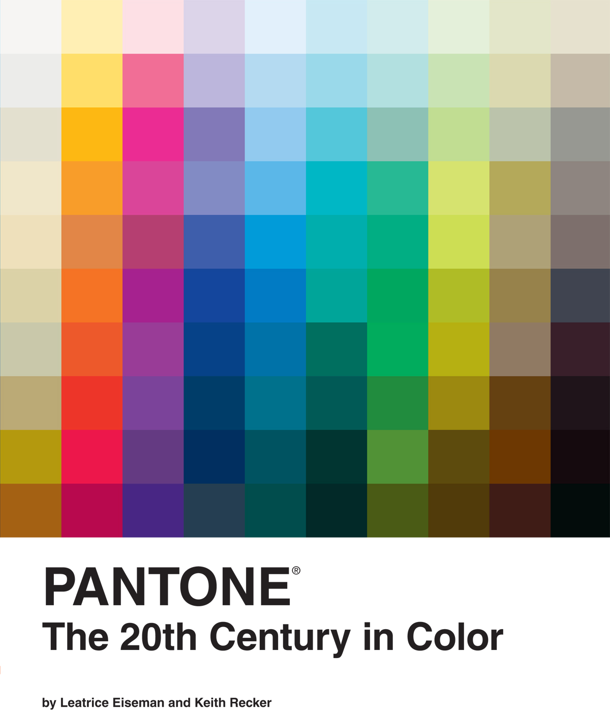
- Book:Pantone: the 20th century in color
- Author:
- Publisher:Chronicle Books LLC
- Genre:
- Year:2011
- City:San Francisco
- Rating:5 / 5
- Favourites:Add to favourites
- Your mark:
Pantone: the 20th century in color: summary, description and annotation
We offer to read an annotation, description, summary or preface (depends on what the author of the book "Pantone: the 20th century in color" wrote himself). If you haven't found the necessary information about the book — write in the comments, we will try to find it.
Recker Keith: author's other books
Who wrote Pantone: the 20th century in color? Find out the surname, the name of the author of the book and a list of all author's works by series.


Pantone: the 20th century in color — read online for free the complete book (whole text) full work
Below is the text of the book, divided by pages. System saving the place of the last page read, allows you to conveniently read the book "Pantone: the 20th century in color" online for free, without having to search again every time where you left off. Put a bookmark, and you can go to the page where you finished reading at any time.
Font size:
Interval:
Bookmark:

We see color with everything we are. What starts as a signal passing along the optic nerve quickly develops into an emotional, social, and spiritual phenomenon that carries many layers of vivid meaning. Light with a wavelength of 650 nanometers or so is seen as red. But it is experienced as warmth or danger, romance or revolution, heroism or evil, depending on the cultural and personal matrix in which it appears. Crimson, scarlet, and cerise suggest nuances of feeling and reaction that nanometers cannot quantify. And what red can express is different from the symbolic potential of greens and blues. Or yellows and oranges. The resonance of any shade across the spectrum shifts and develops according to the context in which it appears.
The context within which color unfurls its rainbow of symbolism and emotion is history itself. Historians look back in time to explain the intricacies of people and their societies the forces that make crimson an ancient color of authority and power, scarlet a badge of sin, and cerise the essence of feminine seduction. And the forces that, over time, may well exchange these associations for others. The evolution of color is fascinating to watch. PANTONE The 20th Century in Color explores a hundred years of such evolution.
At more than a decades distance, we are now just far away enough to try to perceive the era as a whole. We can look through the lens of history at both the first and last decades (and all the decades in between) and discuss with some objectivity what best expressed the creative, cultural, and social influences of the dayor in some cases what helped create them.
The last century was a remarkably significant time for color. Revolutionary changes occurred in every visual discipline, with rules being broken and new ones set in their place at every turn. New materials became available as new technologies transformed (or indeed invented) everything from paints to plastics to powder coatings, and changed the nature of making with new manufacturing processes. The near-alchemy of Louis Comfort Tiffanys iridescent glazes, Bakelites emulation of expensive natural materials, and the Day-Glo fluorescents of the latter part of the century all point to technologys role in propelling twentieth-century arts and design into new creative territory.
For most of the century, technology simply supported the advancement of the creative disciplines with new materials, but by the end of the century, technology had become so deeply embedded in design that computers themselves became design objects and generators of color palettes. Software written to help designers began to influence what was created, and once impossible projects like Frank Gehrys Guggenheim Museum in Bilbao became realities. Apple Computers 1998 iMac, which incorporated bright translucent plastics into its outer shell, was another link between color and technology. In many ways, our book traces the centurys continuum from handcraft to computer.
And finally, for those of us fascinated by colorwe who routinely try to name the colors found in any given sunset or brilliant autumn leaf, every swatch of paint or complex fabrichow could we not try to understand, in color terms, the century in which most of us were born and acquired our own lexicon of color symbols? We can trace, with color, some of the most important social changes of that century. For example, women started the twentieth century wearing the pastels and earnest neutrals that outfitted them for a set of defined and constraining social roles. By the 80s, they were looking for personal, bespoke colors that brought out their individual potential.
Our changing feelings about war found expression in color, too. The chivalrous and patriotic palette at the outbreak of World War I gave way to disillusionment with what war could achieve and dismay at its aftermath. World War IIs more somber and dutiful mood often was leavened by a bit of lighthearted comedy, but the idealism of the late teens is absent and reflected in the colors of the Forties.
The change across the century in aesthetics is also impressive. The seminal color influences of Tiffany, Faberg, and Paul Poiret still linger as visual creatives revisit their work. But late-century talents Robert Rauschenberg, Andy Warhol, Keith Haring, and Karim Rashid offer up new visions of color, each of which captures something essential about the world in which they operated.
Because color is such a fundamental element in the human experience, a book about color ends up being a book about human experience itself. Part textbook and part fairy tale, part biography and part novel, our history of color is designed to start each reader on his or her personal and creative exploration of color.
Even for two self-confessed color fanatics, looking at a hundred years of color presents some important challenges, the greatest of which has to do with the inherently fugitive nature of color. We have based our discussion on objects from each decade of the twentieth century whose colors tell a story about the emotions and aspirations of their creators and their users, and the societies they lived in. But since the color of nearly every object changes as it ages, arriving at an accurate color specification is not easy.
When we describe the shade of red in an important Fauve painting as PANTONE Pompeian Red, have we chosen the red of the paint on the painters palette? Or the red as it looked wet on the canvas when the painting was finished? Or the red of the freshly cured paintings first day on a gallery wall? Or the red as it appears in the paintings eventual museum home? As years pass, materials mature into slightly different color values.
Since each gently different red was accurate at one time, which red do we choose in a history of color? Lacking a time machine for convenient travel back to early twentieth-century Paris, we generally chose color values as they appear today.
But even that has its challenges. In addition to the almost inevitable shifting over time of an objects colors, shifts come from other sources, too. Lets again use our Fauve painting as an example. At a certain point in the paintings career as a museum artifact, it will have been photographed and catalogued so that a record of the museums collection is available to administrators as well as art historians. Despite all the best efforts of the photographer, the photograph will never exactly convey the colors of the actual painting. Something will shift. So now there are two ways to perceive the painting, each with its own slightly different color values: a viewing of the actual painting, and a viewing of the photograph of the painting.
Perhaps at some point, an art historian will want to include the painting in a book on the Fauve movement. The museums photograph will be reproduced by the books printer and, once again, no matter how carefully the process is managed, some color shifts will occur. So now there will be three ways to perceive the paintingor even more if the colors shift subtly across the print run of the book. Or infinitely more if images of the painting achieve an online presence, because every computer screen will display a slightly different color matrix.
In doing our best to sift through the various pitfalls of specifying a color, we have referred to actual paintings, products, textiles, and fashion wherever possible. Please be patient with any discrepancies in color identification you might uncover as you explore the book: we did our best to negotiate these dangerous territories.
Another challenge comes from the vast scope of the project. Because color evolves in a unique way in every culture across the globe, tracing color across all cultures in the twentieth century would be not a book project, but a lifetimes work. Perhaps even more than one lifetime and one set of co-authors would be required! As a result, our account of color in the twentieth century is admittedly U.S.centric. Both co-authors are American, and our cultural lens has certainly shaped the focus of the book.
Next pageFont size:
Interval:
Bookmark:
Similar books «Pantone: the 20th century in color»
Look at similar books to Pantone: the 20th century in color. We have selected literature similar in name and meaning in the hope of providing readers with more options to find new, interesting, not yet read works.
Discussion, reviews of the book Pantone: the 20th century in color and just readers' own opinions. Leave your comments, write what you think about the work, its meaning or the main characters. Specify what exactly you liked and what you didn't like, and why you think so.