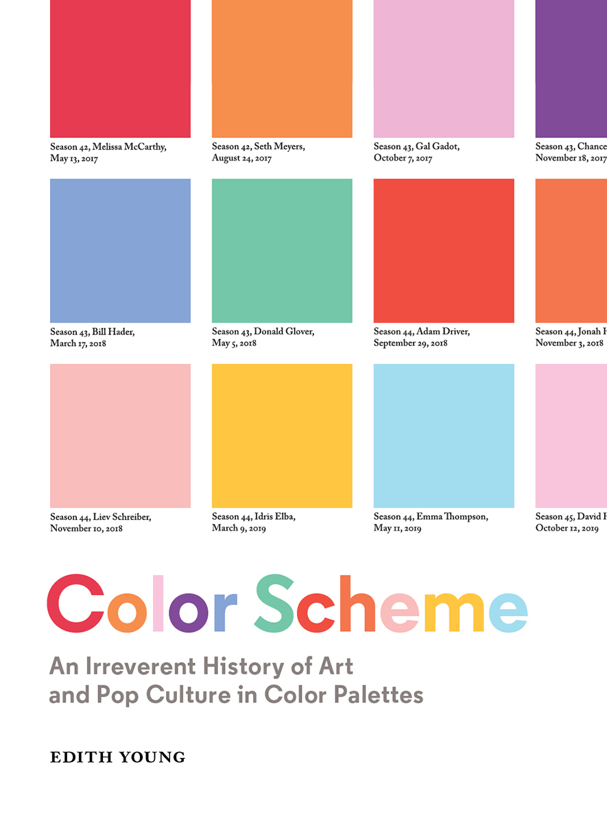
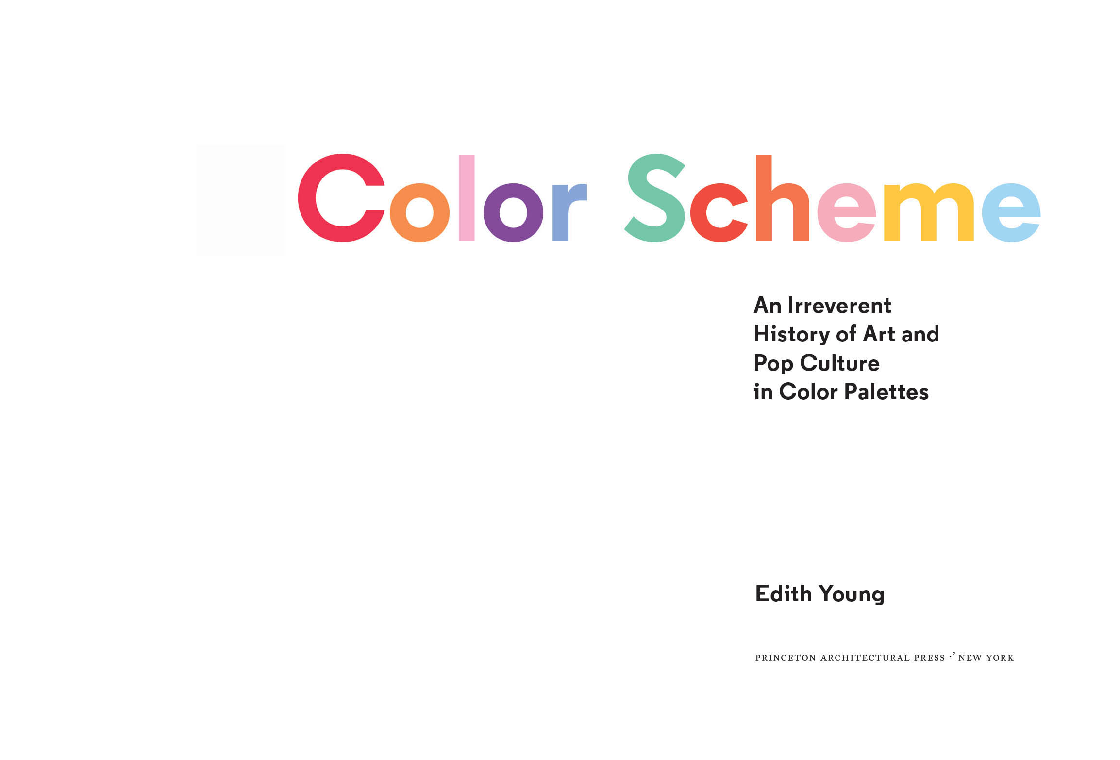
Edith Young - Color Scheme: An Irreverent History of Art and Pop Culture in Color Palettes
Here you can read online Edith Young - Color Scheme: An Irreverent History of Art and Pop Culture in Color Palettes full text of the book (entire story) in english for free. Download pdf and epub, get meaning, cover and reviews about this ebook. year: 2021, publisher: Princeton Architectural Press, genre: Detective and thriller. Description of the work, (preface) as well as reviews are available. Best literature library LitArk.com created for fans of good reading and offers a wide selection of genres:
Romance novel
Science fiction
Adventure
Detective
Science
History
Home and family
Prose
Art
Politics
Computer
Non-fiction
Religion
Business
Children
Humor
Choose a favorite category and find really read worthwhile books. Enjoy immersion in the world of imagination, feel the emotions of the characters or learn something new for yourself, make an fascinating discovery.

- Book:Color Scheme: An Irreverent History of Art and Pop Culture in Color Palettes
- Author:
- Publisher:Princeton Architectural Press
- Genre:
- Year:2021
- Rating:3 / 5
- Favourites:Add to favourites
- Your mark:
Color Scheme: An Irreverent History of Art and Pop Culture in Color Palettes: summary, description and annotation
We offer to read an annotation, description, summary or preface (depends on what the author of the book "Color Scheme: An Irreverent History of Art and Pop Culture in Color Palettes" wrote himself). If you haven't found the necessary information about the book — write in the comments, we will try to find it.
Edith Young: author's other books
Who wrote Color Scheme: An Irreverent History of Art and Pop Culture in Color Palettes? Find out the surname, the name of the author of the book and a list of all author's works by series.
Color Scheme: An Irreverent History of Art and Pop Culture in Color Palettes — read online for free the complete book (whole text) full work
Below is the text of the book, divided by pages. System saving the place of the last page read, allows you to conveniently read the book "Color Scheme: An Irreverent History of Art and Pop Culture in Color Palettes" online for free, without having to search again every time where you left off. Put a bookmark, and you can go to the page where you finished reading at any time.
Font size:
Interval:
Bookmark:
For my brother William,
and in memory of Clark Perkins,
two people Ive been lucky to share
a museum bench with.
, Zachary Fine

I am submitting my bid to have Edith Youngs name added to the graying line of men in the history of color. The philosophers and scientists and dabblersfrom Aristotle, Newton, and Goethe to Albershave told us a great deal about what color is, how it is seen, and how it works. Youngs contribution is different.
Color Scheme is a visually dazzling book that not only brings colors together from different places and epochs but subtly rewires our sense of sight. We are in the habit of seeing color as a kind of ornamental cloak: we adorn ourselves in blues and greens, mistakenly paint our houses in mauve, and repaint them again in beige, the fashions changing, our moods and preferences shifting. But our perception of color is affected by objects as much as our perception of objects is affected by colorits not just a red apple but also an appled red. There is no color without a material substrate: a daub of gouache, a pixel, a particle. The genius of Color Scheme is that it gives color back its form, restoring time and place to the floating wordsred, yellow, blueand supplying them with history and humor.
We can find the isolated detail here changing color-wise across an artists work (the dresses of Diego Velzquezs infantas, the flesh tones of Lucian Freuds ex-wives, the ruff collars in Frans Hals), or the variations of a color across the same item in different paintings (the reds in Renaissance caps). We can see a single thing shifting in time (Dennis Rodmans hair color morphing through the Chicago Bulls 96 playoff run) or have a single thing compressed (Caravaggios Boy with a Basket of Fruit in twelve colored tiles).
For Andr Malraux, the magic of photography was that it could bring the world of art nearChartres Cathedral on the page, shoulder-to-shoulder with Donatellos David and the Taj Mahal. Color Scheme imagines something similar for color. Everything distilled into its most vibrant aspect, collected and arranged. Hidden affinities throughout history, a whole system of correspondence undergirding the visible world.
Through the filter of Youngs palettes, everything looks different to me now. When I pour my coffee in the morning, I am transfixed by the blue of the mug. It is suddenly more than a mug. It is a portal to a larger system of mugs. On its surface, I see the rhubarb-colored mug I bought in college, the mint-colored mug my father was partial to for many months, the lowly and graying white mug from an old diner. I see the contents of my visual life arrayed before me according to color, and its as if Ive entered the world at a secret angle.
W hile a student at the Rhode Island School of Design (RISD), I went to the Cable Car Cinema in Providence one evening and saw the 2011 documentary Diana Vreeland: The Eye Has to Travel. The film, which orbits around Vreelands career as a magazine editor and later as the special consultant to the Metropolitan Museum of Arts Costume Institute, recalls a grandiose passage from D.V., Vreelands 1984 autobiography: All my life Ive pursued the perfect red. I can never get painters to mix it for me. Its exactly as if Id said, I want Rococo with a spot of Gothic in it and a bit of Buddhist templethey have no idea what Im talking about. About the best red is to copy the color of a childs cap in any Renaissance portrait.
Sitting in the dark theater, I was struck by Vreelands idea of perfection in color. Her statement was inexact and somewhat ludicrous, though somehow charming and true, all at once. I immediately had a sense of how the idea could be both debunked and reinforced, and how this would take its visual shape in the form of a color palette, riffing off of the paint chips one might peruse at Benjamin Moore or Farrow & Ball. And so the reds of the red caps in Renaissance portraits became the first palette in this series.
From that first print, the series has expanded in its scope. While these palettes can be enjoyed for the colors alone, the ongoing research project is committed to showing viewers new ways of thinking about artists oeuvres and larger arcs in art history. Art and art history can be a bit intimidating, and I like creating an entry point that sets the tone with a sense of irreverence. At times, these typologies of color and text pinpoint revealing themes throughout artists careers or over time, secreting them into the viewers brain with the Trojan Horse of humor. Other times, the palettes present a bit of a puzzle, willing the viewer to decode the pattern they see before them. For the newly initiated art enthusiast and art history buff alike, I hope the palettes feel a bit like a friend elbowing you in the rib, winking when you get the in-joke. I imagine that conceiving these palettes is the closest Ill ever get to an immersive sensation Ive always wanted to emulate: that of Mario, jumping at full speed through a museums gigantic, membranous paintings to access other dimensions in Super Mario 64.
The first phase of this project originated within the warm confines of art history, though over the course of a few years, the palettes expanded into a slightly more mainstream territory, when certain niche fixtures of pop culture caught my attention with the same kind of verve that paintings do. As all good things do, it started with Tonya Harding. One night, I dove deep into researching the figure skating costumes that Harding had conceptualized and sewn herself, the colors of which I then plotted in chronological order per competition. My sense of subject matter broadened again when I received a commission to create a palette of chromatic eccentricities in director Paul Thomas Andersons films.
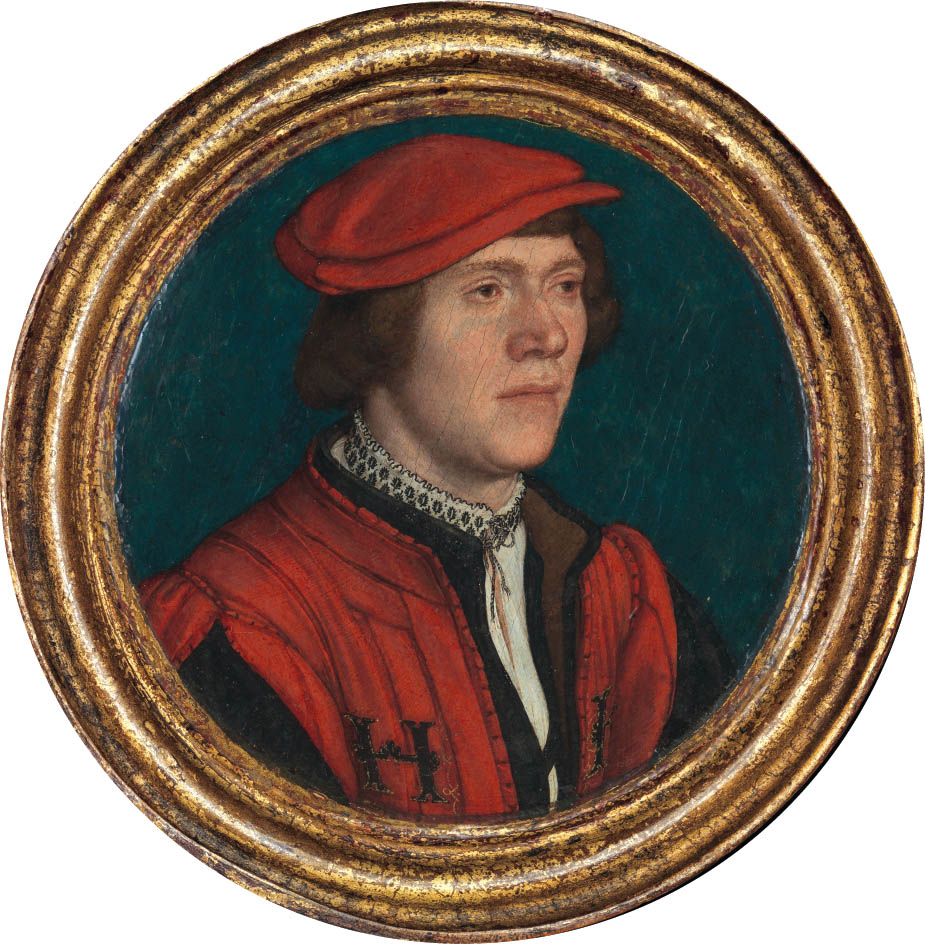
Hans Holbein the Younger (German, 1497/981543), Portrait of a Man in a Red Cap, 153235; oil and gold on parchment, laid down on linden. Courtesy of the Metropolitan Museum of Art, bequest of Mary Stillman Harkness, 1950.
I continued to impose my semi-scientific approach on the nooks and crannies of pop culture that held my interest, elevating these artifacts, character traits, and perceived patterns to the same kind of aesthetic consideration I applied to art. One of my favorite instances of this is evident in a new palette made for this book, which distills the colors of legendary rebounder Dennis Rodmans hair dye in chronological order over the course of his NBA career. An artist in his own right, Rodman is the ultimate colorist, creating a spectacle by punctuating basketball arenas with his own chromatic point of view. In the thick of his career, Rodman injected an element of novelty into the game, conjuring anticipation among his audience for how he might appear at the next game and the nextit was always anybodys guess, but an aesthetic distinctly his own.
Font size:
Interval:
Bookmark:
Similar books «Color Scheme: An Irreverent History of Art and Pop Culture in Color Palettes»
Look at similar books to Color Scheme: An Irreverent History of Art and Pop Culture in Color Palettes. We have selected literature similar in name and meaning in the hope of providing readers with more options to find new, interesting, not yet read works.
Discussion, reviews of the book Color Scheme: An Irreverent History of Art and Pop Culture in Color Palettes and just readers' own opinions. Leave your comments, write what you think about the work, its meaning or the main characters. Specify what exactly you liked and what you didn't like, and why you think so.