Thank you for purchasing this How Design eBook.
Sign up for our newsletter and receive special offers, access to free content, and information on the latest new releases and must-have designing resources! Plus, receive a coupon code to use on your first purchase from MyDesignShop.com for signing up.
or visit us online to sign up at
http://howdesign.com/ebook-promo
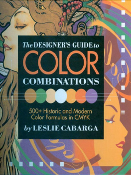
The Designer's Guide to Color Combinations. Copyright 1999 by Leslie Cabarga. Manufactured in China. All rights reserved. No part of this book may be reproduced in any form or by any electronic or mechanical means including information storage and retrieval systems without permission in writing from the publisher, except by a reviewer, who may quote brief passages in a review. Published by North Light Books, an imprint of F&W Publications, Inc., 4700 East Galbraith Road, Cincinnati, Ohio 45236. (800) 289-0963. First edition.
This hardcover edition of The Designer's Guide to Color Combinations features a self-jacket that eliminates the need for a separate dust jacket. It provides sturdy protection for your book while it saves paper, trees and energy.
Other fine North Light Books are available from your local bookstore, art supply store or direct from the publisher.
07 06 10 9 8
Library of Congress Cataloging-in-Publication Data
Cabarga, Leslie
The designer's guide to color combinations / written and designed by Leslie Cabarga: color layouts by Leslie Cabarga and Rose Bevans.1st ed.
p. cm.
ISBN-13: 978-0-89134-857-3 (alk. paper)
ISBN-10: 0-89134-857-3 (alk. paper)
1. Color in art. I. Title.
NK1548.C23 1999
701 .85dc21 98-33482
CIP
EVERY EFFORT HAS BEEN MADE to trace and acknowledge all copyright holders. North Light Books and the author would like to apologize if any credit omissions have been inadvertently made.
THANKS TO: Rose Bevans for items from her collections of 1950s and 1960s ephemera; to Andrew Schwartz and Janet Klein for items from their collection of late nineteenth-century ephemera; to editor Lynn Haller for her patience and humor throughout this arduous process; and to Marga and Anna for making it all worthwhile.
MANY OF THE DISPLAY TYPE FONTS used throughout this book were designed by the author and are available on the Web by visiting www.lesliecabarga.com.
Edited by Lynn Haller
Cover and interior designed by Leslie Cabarga
Cover illustration by Alphonse Mucha and Leslie Cabarga
CONTENTS
Introduction
T he libraries and bookstores are filled with scholarly books on color harmony and color theory. Complete with color wheels, and even mathematical calculations, such books attempt to help the artist achieve successful color through foolproof equations.
Surely, the knowledge of such theories can only be helpful, but for many of us in this day and age, without the benefit (or detriment) of an academy course in color theory, our selections ultimately depend upon predilection or personal taste. As an illustrator, I have never consciously chosen an analogous color combination or a triad, and the only split complements I've gotten have come from my father. Personal taste in color should not be discounted as frivolous. Our mental selection processes involve millions of gigabytes (in computer terms) worth of conscious and subconscious dreams, emotional memories and other associations of color. We may look at an ad in a magazine and say, That looks cool! but our true affinity with the colors we're viewing goes deeper.

A personal method of color selection eschews the intellectual and methodical left-brain approach, which adores color theory, and moves the process to the right brain, which bases its decisions upon instinct and intuition. This is related to the process currently taking place throughout the world in which the intellectual/left-brain /masculine approach is, thankfully, beginning to come into balance with the emotional/right-brain/feminine principle.

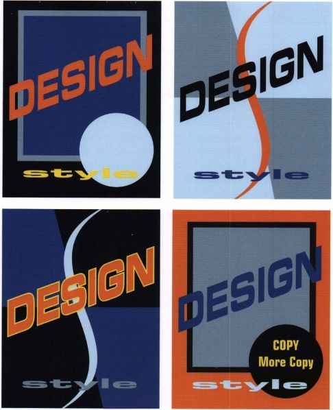
SMOKER'S LUNG Left: This pharmaceutical illustration was painted by the author in 1990. Above: Four examples demonstrate how a color scheme, as well as elements of an existing design, may be extrapolated for use in a new context. Note the vastly different overall effects achieved through the rearrangement of the very same colors from one example to the next.
Another subconscious identification with color comes from the chakra system of energy centers located within our bodies. For example, the root chakra, represented by red, corresponds to the base of the spine and the sexual center. Little wonder that red is often used by artists in connection with sex and Valentine's Day.
In the recently re-emerging art of color therapy, colored lights are applied, in effect, to restore missing tones which can bring harmony back to a sick. body. Similarly, the color of the clothing you tend to select often reflects your mood, or may, in turn, affect it. For this reason, it is said that people who habitually wear black probably should notalthough that would leave everyone in New York and Los Angeles without a thing to wear.
That a poor choice of colors affects us subconsciously is a fact observed by many real estate agents. Potential buyers viewing a house with ugly wallpaper will often reject the whole house. I recall as a child not being able to eat in a certain restaurant whose walls were painted a pale, 1950s green.
But taste in color, like anything else, can be idiosyncratic. Some colors come in shades only their creators could love. Many examples in this book show that the secret of successfully combining a group of colors may have less to do with the colors themselves than with their arrangement within a picture. Occasionally, I have been shocked to notice that the same colors I had used to create an attractive painting looked so awful in their haphazard arrangement on my palette. Therefore, it may be said that colors are only beautiful within the context of their spatial relationships to one another.

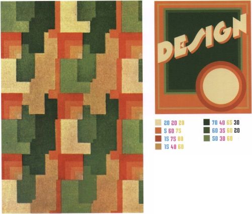
LINOLEUM, 1935 Cool color schemes may be found anywhere, even underfoot, as the sample layout above proves.
A s we reach the end of this twentieth century, an artistic reassessment of all that's come before is taking place. While current trends continually evolve and subsequently dominate fashion and design, in today's aesthetic rule book, (almost) anything goes. The styles and colors of every period throughout history seem to be fair game and valid copy for today's artists. The concept is king (or queen) in today's world of graphics. Style and color choices often become intrinsic to the concept and are dictated by it. The concept may involve a Victorian mood, or a high-tech look may be appropriate. The first suggests warm, highly saturated, though muted, colors, and the second, cooler colors, perhaps metallic hues, and lots of solid black with an accent of solid red.

