Color

Color
A workshop for artists and designers
Second Edition
David Hornung
Laurence King Publishing
For Rosie and Henry

First published in 2005
Second edition published in 2012 by
Laurence King Publishing Ltd
4th Floor, 361373 City Road
London EC1V 1LR
Tel: +44 20 7841 6900
Fax: +44 20 7841 6910
email:
www.laurenceking.com
Copyright 2005, 2012 Laurence King Publishing Ltd
This book was produced by Laurence King Publishing Ltd
All rights reserved. No part of this publication may be reproduced or transmitted in any form or by any means, electronic or mechanical, including photocopy, recording or any information storage and retrieval system, without prior permission in writing from the publisher.
A catalogue record for this book is available from the British Library
ISBN: 978-1-85669-878-8
Commissioning Editor: Kara Hattersley-Smith
Editor: Sarah Batten
Picture Researcher: Ida Riveros
Design by David Hornung
Cover design by Jason Ribeiro
Layout production assistance by Lozana Rosenova
Printed in China
CONTENTS
ACKNOWLEDGMENTS
In creating this second edition of Color, I have drawn on the support and encouragement of many friends and colleagues. Foremost, I want to thank Laurence King for initially encouraging me to write a second edition, and for allowing me the freedom to make all the improvements I felt were necessary.
I would also like to recognize the contribution of Kara Hattersley-Smith, editorial manager at Laurence King, who organized the project from its inception and whose assistance and patience were essential to the books progress. As it was nearing completion Sarah Batten took over the reigns and helped shepherd the project into production.
I would also like to thank Robert Shore, who edited both editions; Simon Walsh, production manager, for insuring that the color throughout the book is as good as it can be; and Ida Riveros, picture editor, who procured the images I needed from outside sources to illustrate the text. Thanks also to my reviewers, whose critical insights on the first edition helped me make many improvements in the second.
I am grateful to my colleague Jennifer Maloney, who gave the entire text a close and critical reading. Lozana Rosenova deserves special acknowledgment for her steadfast and able assistance in putting this book together from beginning to end.
Finally, I want to express my gratitude to all of my color students who, over the years, have provided me with an education.
PREFACE
One would think that a condition of the physical world as omnipresent as color would be easy to understand. Because it is a function of light, however, and because light is highly variable, color is one of the most elusive and enigmatic elements for the artist and designer to master.
David Hornung has brought his long experience as a visual artist to the task of demystifying the phenomenon we call color and making it accessible to the art and design student. He wisely avoids the tendency of color theorists to systematize color and opts for a hands-on experience that is both practical and logical. He recognizes from his own studio career that colorists dont spring to life with some fully formed capacity to compose color and to communicate with it. Rather, they develop confidence in working expressively with color through a dedicated and disciplined practice experienced at the tip of a brush or pen or pencil, through cut or torn collage elements, or via pixilated images on a computer monitor.
Color language is quite specific and efficient, and Hornung is careful to define and to illustrate the terms we commonly use to describe characteristics or aspects of color and color usage. From semantic misunderstandings or misreadings arise many of the problems associated with color study, but here the student will find a rigorous yet streamlined analysis of that language designed to avoid just such misinterpretations.
I have been fortunate on a number of occasions to visit David Hornungs color classes at the Rhode Island School of Design, to sit in on critiques of student work, and to look closely at student portfolios from those classes. One of the many strengths of his pedagogical approach is that it is flexible enough to allow for, in fact to encourage, explorations through a broad range of visual structures. This democratic sensibility makes the work comfortable for students in widely varying disciplines. The experience of color that each student engages in through the exercises documented in this course of study provides a solid grounding for professional activity in all visual fields.
This book will serve as both a manual of self-guided study as well as a handbook for directed study under the guidance and oversight of an experienced artist. As such it deserves a place alongside the classics of color literature such as Josef Albers Interaction of Color and Johannes Ittens The Art of Color. Its clarity, accessibility, and practicality make it an ideal complement to those universally respected studies.
Michael James Ardis
James Professor of Textiles, Clothing and Design
University of Nebraska at Lincoln, Nebraska

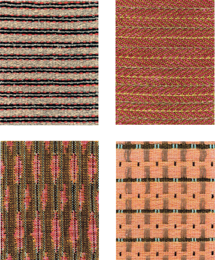
Lydia Neuman, weave samples. Courtesy of the Artist.
FOREWORD
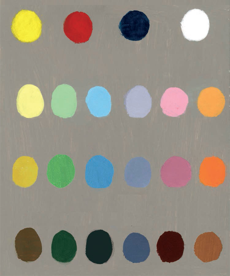
Fifteen years ago, a fellow student at Rhode Island School of Design showed me a group of small paintings she had done in a class with David Hornung. She called them her Wonder Bread Dots. As I looked through the work page after page of gouache gumballs perched inside six-inch colored squares I knew I had to take Davids class. Poetically titled Handmade Light, it was the color theory course Id always hoped for.
Davids approach hinges on the recognition of three constituent parts of color. Hue is what we generally mean when we talk about color the redness or blueness of something. Value, or quantity of light, describes lightness or darkness how a color would look on a grayscale, or in a black-and- white photograph. And finally, saturation refers to quality of light a colors relative brightness, or purity of pigment. In order to illustrate this last, most elusive concept, David had us mix countless chromatic grays colors that look neutral but contain only red, yellow, and blue (both warm and cool) in various proportions. It would be difficult to overstate the value of this exercise, which confers a superpower of sorts a kind of x-ray vision that allows you to see grays, browns, and even whites in terms of their primary color ingredients.
Referencing sources from Europe to Asia to the Americas, from paintings to woodcuts to textiles, from the ancient to the contemporary, from folk art to Modernism, David demonstrates that the mechanics of color transcend time, geography, media, subject, and style.
My own perception of color has always felt like a kind of synesthesia that blends sight and taste or more precisely, thirst. Looking at an unfinished or not-quite-right color arrangement, I automatically ask myself what its thirsty for. The answer has always come from instinct, as I suspect it does for many artists. Davids analytical vocabulary helped me to articulate such visceral responses. Color theory turned out to be color practice the rigorous, simultaneous exercise of intuition and intellect. Davids gift is that he makes this ephemeral subject concrete, but no less magical; his structural approach to color affords access to its emotional valence.
Next page
