For our daughters Olivia and Gustava who teach us everyday, and all mentors, especially Philip B. Meggs and Akira Ouchi.
Copyright 2005, 2012 by Quantum Publishing
Pantone and other Pantone, Inc. trademarks are the property of Pantone, Inc. Pantone, Inc.s trademarks and copyrights used with the permission of Pantone, Inc. Portions Pantone, Inc., 2003.
All rights reserved. Copyright under Berne Copyright Convention, Universal Copyright Convention, and Pan American Copyright Convention. No part of this book may be reproduced, stored in a retrieval system, or transmitted in any form, or by any means, electronic, mechanical, photocopying, recording or otherwise, without the express written consent of the publisher, except in the case of brief excerpts in critical reviews or articles. All inquiries should be addressed to Allworth Press, 307 West 36th Street, 11th Floor, NewYork, NY 10018.
Allworth Press books may be purchased in bulk at special discounts for sales promotion, corporate gifts, fund-raising, or educational purposes. Special editions can also be created to specifications. For details, contact the Special Sales Department, Allworth Press, 307 West 36th Street, 11th Floor, NewYork, NY 10018 or .
While every effort has been made to contact owners of copyright material produced in this book, we have not always been successful. In the event of a copyright query, please contact the Publisher.
16 15 14 13 12 5 4 3 2 1
Published by Allworth Press, an imprint of Skyhorse Publishing, Inc.
307 West 36th Street, 11th Floor, NewYork, NY 10018.
Allworth Press is a registered trademark of Skyhorse Publishing, Inc., a Delaware corporation.
www.allworth.com
Cover 2012 Skyhorse Publishing, Inc.
Cover design by Mary Belibasakis
RotoVision Art Director: Luke Herriot
Creative Directors John T. Drew and Sarah A. Meyer
Book design by John T. Drew and Sarah A. Meyer
Diagram illustrations by John T. Drew and Sarah A. Meyer
Typography: Caslon 224 and Univers
Acuity Color System John T. Drew and Sarah A. Meyer 2005.
For more information about Acuity 1.0 contact John T. Drew at
or Sarah A. Meyer at
.
Reprographics in Singapore by ProVision Pte.
This book produced by Quantum Publishing Ltd., 6 Blundell Street, London N7 9BH.
Library of Congress Cataloging-in-Publication Data is available on file.
ISBN: 978-1-58115-916-5
Printed in China
He
Someone, an imposter,
forged a note to the principal
and he was through the door and gone.
He resumed his trip across the country,
stopping at every bar to take a leak and have a beer,
and outside on the street when no one was looking,
he would drop his pants.
He drove a white 59 Cadillac convertible
and wore a red cowboy hat
and when he went swimming
he wore fluorescent green swim fins,
a fluorescent blue face mask
and a fluorescent orange snorkel.
Later he became famous for serving pancake breakfasts
in the municipal parks of small towns.
Though unannounced, they were well attended.
John Randolph Carter
Contents

Introduction
Color, unlike any other subject in visual communications interactive, print-based, environmental, and motion graphicsis very complex and frequently misunderstood. Color, which has physical, psychological, and/or learned behavioral attributes, can shape effective visual communication. As a physical form of communicationlightwavescolor is both absorbed and reflected by the objects we look at, and meaning is transformed and translated through its use. Color Management describes how to forecast the physical, psychological, and learned behavioral effects of color, and how to use color to create more meaningful messages. The Acuity Color System is available online at Allworth Press: www.allworth.com
As designers, we no longer need to know how to physically mix paint pigments in order to create a certain hue. Most of us have not touched a Prismacolor Pencil, Magic Marker, Color-aid paper, or paintbrush for nearly a decade. This book aims to provide designers with a resource for understanding the dynamics of color in the context of visual communication.
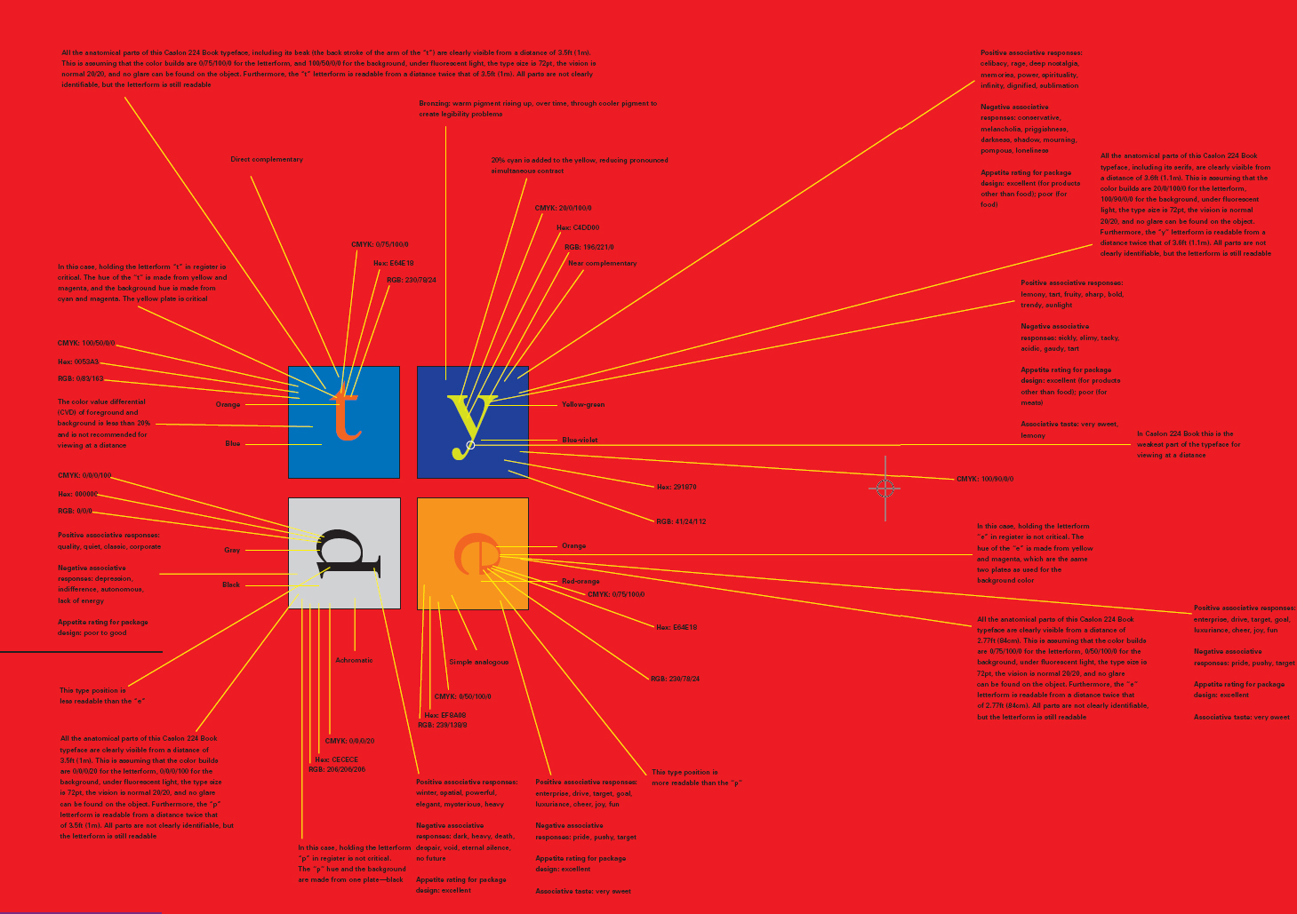
Color Management describes how to determine the distance at which letterforms can be seen in any color combination, for standard visions, including normal vision, minimum U.S. Division of Motor Vehicle standards, visually impaired, and legally blind standards. It is intended to help graphic designers, architects, environmental graphic designers, and sign manufacturers gain confidence in the preparation and production of signs and signage systems that use typographic forms and color combinations.

The Terminology of Color


Understanding the vernacular of color, considering the color complexity we deal with on a day-to-day basis, is often overwhelming. Unlike any other art discipline, visual communication deals not only with color building (the physical mixing of ink pigment and the creation of electronic files), but also with the human perception of hue , and the psychological effects and interpretations of color. This chapter is concerned with the language of color, its theories, and its use as a practical form of problemsolving. The terminology found in this chapter is the building block for understanding color dynamics, including subtractive color theory (both simple and complex color mixing ), additive color theory , and 3-D color theory . Understanding the terms found within this chapter will broaden your color knowledge, thereby increasing the effectiveness of the visual messages you create.
Understanding color allows you to envision the power of visual messages, and a familiarity with color terminology will help you fully realize hue implications in the context of color theories, as well as in the context of print-based, interactive, environmental, and motion graphics. Strategies to understand effective color use are provided, including color legibility and readability using type and simple symbols, along with color matrices and paradigms. These strategies are demonstrated through exemplary professional work.

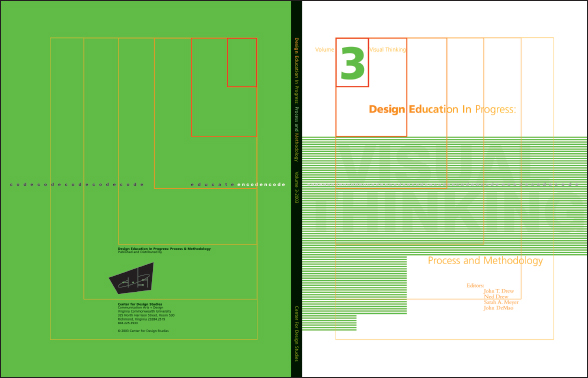
Figure 1
Art Directors Sarah A. Meyer, Ned Drew, and John T. Drew
Designer Sarah A. Meyer
Figure 1 The words Visual Thinking, the title of this volume, are concealed by a careful examination of the color value numbers associated with green. Within this example, subtle variations of green create a color effect the words disappear when viewed at different angles. To ensure that an object or letterform can be viewed and understood at a distance, a 20% color value differential (CVD) is recommended. In the example above, the CVD is 5%.

