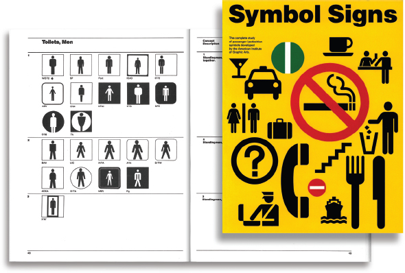
Cover design: Chris Calori
This book is printed on acid-free paper.
Copyright 2015 by Chris Calori, David Vanden-Eynden. All rights reserved
Published by John Wiley & Sons, Inc., Hoboken, New Jersey
Published simultaneously in Canada
No part of this publication may be reproduced, stored in a retrieval system, or transmitted in any form or by any means, electronic, mechanical, photocopying, recording, scanning, or otherwise, except as permitted under Section 107 or 108 of the 1976 United States Copyright Act, without either the prior written permission of the Publisher, or authorization through payment of the appropriate per-copy fee to the Copyright Clearance Center, 222 Rosewood Drive, Danvers, MA 01923, (978) 750-8400, fax (978) 646-8600, or on the web at www.copyright.com. Requests to the Publisher for permission should be addressed to the Permissions Department, John Wiley & Sons, Inc., 111 River Street, Hoboken, NJ 07030, (201) 748-6011, fax (201) 748-6008, or online at www.wiley.com/go/permissions.
Limit of Liability/Disclaimer of Warranty: While the publisher and author have used their best efforts in preparing this book, they make no representations or warranties with the respect to the accuracy or completeness of the contents of this book and specifically disclaim any implied warranties of merchantability or fitness for a particular purpose. No warranty may be created or extended by sales representatives or written sales materials. The advice and strategies contained herein may not be suitable for your situation. You should consult with a professional where appropriate. Neither the publisher nor the author shall be liable for damages arising herefrom.
For general information about our other products and services, please contact our Customer Care Department within the United States at (800) 762-2974, outside the United States at (317) 572-3993 or fax (317) 572-4002.
Wiley publishes in a variety of print and electronic formats and by print-on-demand. Some material included with standard print versions of this book may not be included in e-books or in print-on-demand. If this book refers to media such as a CD or DVD that is not included in the version you purchased, you may download this material at http://booksupport.wiley.com. For more information about Wiley products, visit www.wiley.com.
Library of Congress Cataloging-in-Publication Data:
Calori, Chris.
Signage and wayfinding design: a complete guide to creating environmental graphic design
systems/Chris Calori, David Vanden-Eynden; Forewords by Ivan Chermayeff, Tom Geismar.
Second edition.
pages cm
Includes bibliographical references and index.
ISBN 978-1-118-69299-8 (hardback); ISBN 978-1-119-08582-9 (ebk);
ISBN 978-1-119-08583-6 (ebk)
1. Computer graphics. 2. Communication in architectural design. 3. Graphic arts.
I. Vanden-Eynden, David, 1951- II. Title.
T385.C351 2015
741.6dc23
2015016444
To our esteemed colleagues who made enormous contributions to the design profession:
- Jack Biesek
- Deborah Sussman
- Massimo Vignelli
And to Hanley Bloom, who contributed so much to the EGD industry before his passing.
Foreword to the Second Edition
We experience the physical world in different ways at different times.
On a vacation trip to Paris, just wandering through the streets and passageways of the Left Bank with no pre-determined route can be a joyful and serendipitous experience. But when first arriving in the city, whether at the airport or train station, we basically just want to know how to find the Metro or a taxi, and we rely on clearly visible and unambiguous signs to direct us.
When we need to see a doctor in a large metropolitan hospital, we follow signs and other visual clues that will hopefully get us through the maze of floors, disciplines, and services to the correct destination. But when we are a patient in that hospital, we would like the physical environment to be as calm and pleasant as possible.
Environmental graphic design plays a role in both aspects of these places. The signs directing us in and out of Charles De Gaulle Airport were undoubtedly the work of environmental graphic designers, working along with the facilities architects and planners. But in central Paris itself, signs of a different kind help define the character and ambience of that place we think of as Paris. Many of the shop signs, with their beautiful scripts and richly ornate letterforms, were the work of generations of skilled craftsmen. Professional architects and planners contributed in other ways. For example, the architect Hector Guimard's Paris Metro entrances, with their famous Art Nouveau lettering, are used to symbolize Paris in many tourist brochures.
And while environmental graphic designers are often challenged to provide clear, functional and attractive wayfinding for hospital labyrinths, they also have a role in helping make patient areas visually calm and pleasant through the use of carefully selected color and artwork. In this sense, environmental graphic design clearly ties into the idea of branding when the design is helping to establish an environment that delivers an image and experience consistent with and appropriate to the goals of the institution or place.
As these examples indicate, environmental graphic designers, generally working behind the scenes, can have significant impact on how we experience the physical world. Since their work often directly effects people's actions, the designer needs to understand human psychology as well as the basics of architecture, industrial design, color theory, and graphic design and typography. And today, continual advances in digital technology demand yet another complex discipline to understand and exploit for more effective signage, wayfinding and placemaking, to help people experience the physical world in appropriate and meaningful ways.

Tom Geismar chaired the effort by the American Institute of Graphic Arts (AIGA) to research and design the now-familiar Symbol Signs system of travel-related pictograms for the United States Department of Transportation.
This book, more than any other I've seen, clearly and succinctly describes the many overlapping aspects of the field, and presents proven approaches to a wide variety of real issues that the designer faces. Written by long-time practitioners, it is clearly a labor of love, providing a great deal of information about this still-evolving, multi-disciplined field of design.
Tom Geismar
Chermayeff & Geismar & Haviv
Foreword to the First Edition
Regarding wayfinding, it might be noted that after you get there, in an ideal world, there would be very little that needs to be told about where to go, because on arriving at an unfamiliar destination the next directions would be self-evident. Within the best architecture, finding one's way around should hopefully require a relatively minimal effort and, at least, little signage.
If some sign is needed at all, it should be one of confirmation, to make a visitor comfortable with the path taken. It is far better to say too little than too much. To quote Mies: Less is more.
Signage either adds some degree of quality to the environment in which it finds itself or it takes something away, diminishing the experience by being distracting to a visitor. If a message is there and is unnecessary, that's a serious distraction that should be avoided.
If a message is too big or too visually loud, if it overwhelms and negates other things such as the feeling of architectural materials, the play of light, reflections, the texture of surfaces, transparency, distant views, and a myriad of other environmental elements, including the presence and contribution of art or even the presence of other people, then the message is not quite right.
Next page


