No part of this book may be used or reproduced in any manner without written permission from the publisher, except in the context of reviews.
Every reasonable attempt has been made to identify owners of copyright. Errors or omissions will be corrected in subsequent editions.
Library of Congress Cataloging-in-Publication Data available upon request.
Introduction
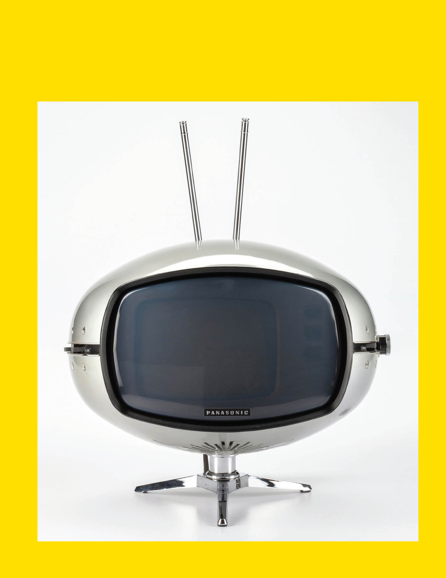
All design in any media is created to engage the viewer. Designers use typography, images, form, material, and color to communicate a message, whether designing a 2D graphic, automobile, or telephone. The communication is often overt: Im functional as a radio, or Visit Australia. Some covert signals and cues also help the viewer form thoughts and emotions that are less easy to articulate. It mayor may not bethe goal of the designer to manipulate the viewers reaction. Nevertheless, every element in successful design works together to tell us how to think and, typically, what to do.

Braun T 1000 Radio Dieter Rams 1963 photographer Katherine Du Tiel

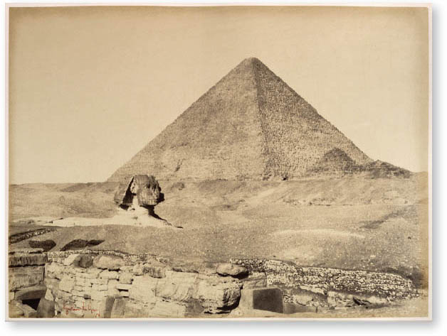
Pyramides de Gizh photograph Gustave Le Gray 186569
Interestingly, when interviewed, most designers are seemingly unaware of the formal tools applied to manipulate a response. One might suggest that he or she added yellow to a poster to make it happy. Another describes the smooth forms of the vacuum cleaner as nicer to see. While this may indicate a deficit in the designers self-awareness or ability to articulate critical thinking, intuition is one of the best designers greatest tools.
One designer told me that he advises clients that 80 percent of the solution will be based on research, logic, and rational thinking. The remaining 20 percent is intuition. He could not, and would not, attempt to justify this part of a solution. Working intensely in a world of communication driven by the tiniest detail, designers are brilliant at intuitively recognizing the formal issues required to elicit the correct response. Deep experience manipulating form, materials, color, typography, and imagery allows a skilled designer to elicit a reaction from the viewer that is complex and, at times, contradictory.
For example, a childrens toy will read as innocent and carefree. But why? What in its form is honestly innocent and playful? We read these attributes into the artifact because we have repeated exposure to similar toys in the context of children. Add some blank zombie-like white eyes to the porcelain doll, and its evil. The culmination of our experiences and references determine our connection, or lack thereof, to a communication.
Other forms demand that we think. For example, we might ask why there is a bite out of the Apple logo. Or, when we are confronted by the pyramids at Giza, we might ask who built them, how, and why they were built. These questions arise as we feel awe, power, and our sense of smallness against the vast size of the structures.
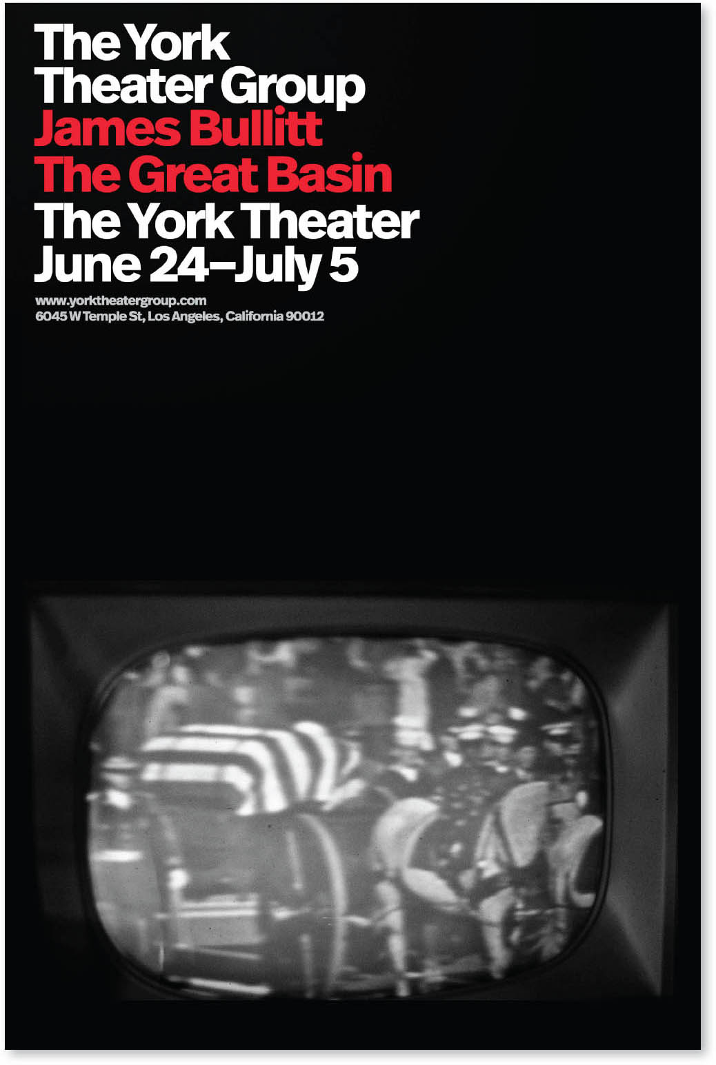
As another example, consider the poster for a play by James Bullitt, The Great Basin. The design suggests that this is not a slapstick comedy. We expect the content to be cerebral and thought-provoking. Why do we make these assumptions? By deconstructing the elements, we can see how the message is manipulated:
- Bold sans serif typography with a strict asymmetrical flush left layout to tell us that the subject is serious. It is not frivolous or to be considered light.
- A black-and-white photograph presented with no alteration, such as Photoshop manipulation or color addition tells us that there is no deception. The raw truth will be exposed.
- The white background creates a tone of drama, rather than a black background that, when combined with the stark image, may appear as a horror.
These choices tell the viewer what to expect and entice him or her to attend the theatrical production. In this case, the goal is transparent honesty. If this is your cup of tea, youll enjoy it. Nobody is pretending there will be dancing and singing cowboys and cowgirls, ranch hands, and a rousing chorus like in Oklahoma!.

The York Theater Group poster Sean Adams 2019

Vase California Faience Pottery Studio 1920
This tells us that the vase is connected to the natural world and is an everyday object. It is not a beautiful piece of French porcelain with hand-painted flowers and aristocrats on swings. Secondly, the form is fluid and straightforward, referencing Japanese pottery rather than European styles. The takeaway for the viewer, regardless of their design experience, is that the vase is friendly, natural, and casual. This is not the vase at your grandmothers house that everyone avoided.
Many forms have explicit cultural significance. The color white in Western society reads as purity. In Eastern culture, it may be considered a symbol of death. Recognizing the genesis and the intended audience is critical to the practice of deconstructing any form of design.
We are surrounded by design. Every part of the man-made world is designed. Often we stop seeing it; it fades into the background, like telephone poles. Ask a non-designer how cereal boxes are made, and he or she will assume a giant cereal box machine pumps out the design.
Recognizing the designers power to create an emotional response and arouse desire is critical to modern life. As designers it allows us to be more purposeful and aware of the formal choices we makeand our inherent responsibility to do good. For non-designers, it creates a level playing field. One may feel moved to tears after seeing the television commercial of a puppy reunited with a twelve-year-old boy by the river. But now, we will be cognizant of the conscious connection to the characters and symbols we already know from books like
