2019 Quarto Publishing plc
For The Bright Press
Text and design:
Sean Adams
Editors:
Jacqui Sayers and Emily Angus
For Abrams
Editors:
John Gall and Ashley Albert
Production Manager:
Lindsay Bleemer
ISBN: 978-1-4197-3718-3
eISBN: 978-1-68335-590-8
Published in 2019 by Abrams, an imprint of
ABRAMS. All rights reserved. No portion
of this book may be reproduced, stored
in a retrieval system, or transmitted in
any form or by any means, mechanical,
electronic, photocopying, recording, or
otherwise, without written permission
from the publisher.
Abrams books are available at special
discounts when purchased in quantity
for premiums and promotions as well as
fundraising or educational use. Special
editions can also be created to specifica-
tion. For details, contact specialsales@
abramsbooks.com or the address below.
Abrams is a registered trademark of
Harry N. Abrams, Inc.
195 Broadway
New York, NY 10007
abramsbooks.com

INTRODUCTION
INTRODUCTION
Pictures of Words
TYPEFACES CREATE PICTURES OF WORDS.
Like images, each typeface
communicates an idea, emotion, and point of view. Helvetica might speak
to neutrality and information; Garamond can read as literary and classic;
Bodoni feels sophisticated, urbane, and crisp.
The choice of typeface communicates a subtle message to the viewer.
The typeface choice, like a moving and powerful photograph, is the
difference between a good idea expressed adequately and a good idea
expressed persuasively.
There are as many approaches to typeface choice as there are design
processes. Some designers, such as Massimo Vignelli, work with a small
handful of typefaces for their entire career. Other designers may be more
promiscuous with type, switching typefaces on every project. Neither of
these is wrong. Vignelli adhered to strict modernist principles of simplicity
and reduction. Herb Lubalin designed his own typefaces, preferring variety,
flourish, and drama. These examples are extremes; many designers operate
closer to the center of the spectrum.
This book is not a comprehensive analysis and history of every typeface.
Such an undertaking would require several volumes, each one thousands
of pages thick.
The Designers Dictionary of Type provides historical and
contextual examples of interesting multimedia applications of each typeface.
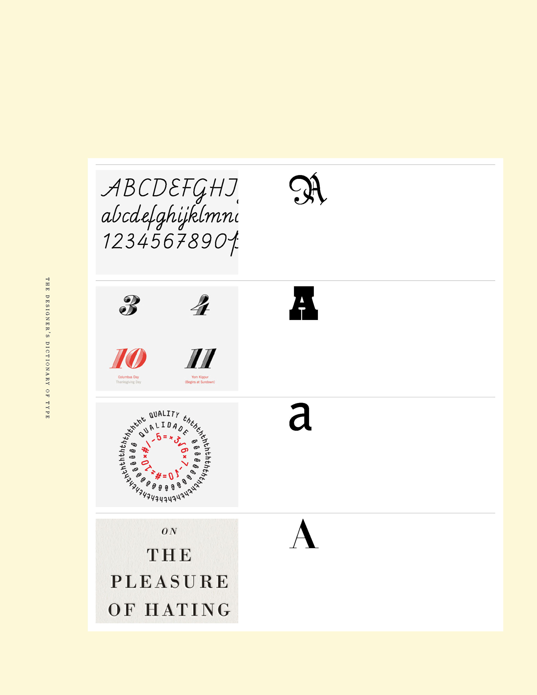
Typeface classifications such as serif and sans serif divide the book. Styles
such as transitional and modern divide each classification. A diagram for
easy identification of each typeface will help the reader determine if he or
she is looking at Bembo or Baskerville.
The Designers Dictionary of Type aims to illustrate the multiple ways in
which a designer might apply a typeface, as well as the many variations
of each one. With experience, a designer will be able to look at a version of
Caslon and determine whether it is well-crafted and refined, or a cheap
knock-off from a free download.
My advice to designers throughout my career has been to work with the
classics represented in this book. They are classics for a reason, and they
are timeless. I also advise designers to think of typefaces like haircuts.
One does not want to choose the latest, grooviest, trendiest style and years
later be embarrassed by the sight of ones high-school portrait.
OPPOSITE
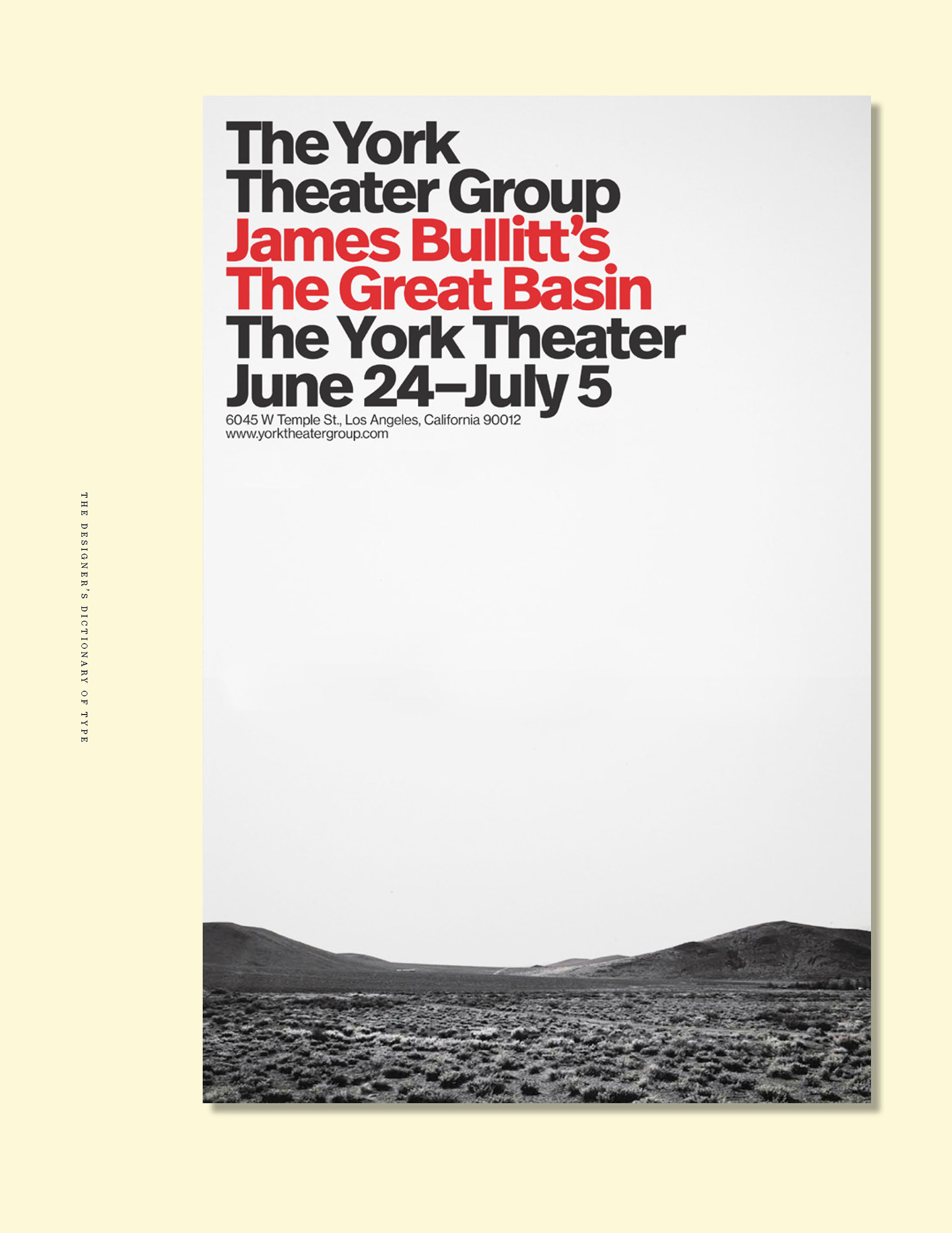
The Great Basin
Sean Adams ~ 2018
Poster
The graphic system for the York Theater
Group is simple: full-bleed photography
and Neue Haas Grotesk Bold. Rather than
adopting a traveling productions existing
poster, the images represent the content
of the production. The typography is
consistently the same size, weight, and style.
