• Complain

Sean Adams - The Designer’s Dictionary of Color

Here you can read online Sean Adams - The Designer’s Dictionary of Color full text of the book (entire story) in english for free. Download pdf and epub, get meaning, cover and reviews about this ebook. year: 2017, publisher: Abrams, genre: Computer. Description of the work, (preface) as well as reviews are available. Best literature library LitArk.com created for fans of good reading and offers a wide selection of genres:

Romance novel Science fiction Adventure Detective Science History Home and family Prose Art Politics Computer Non-fiction Religion Business Children Humor

Choose a favorite category and find really read worthwhile books. Enjoy immersion in the world of imagination, feel the emotions of the characters or learn something new for yourself, make an fascinating discovery.
No cover
  • Book:
    The Designer’s Dictionary of Color
  • Author:
  • Publisher:
    Abrams
  • Genre:
  • Year:
    2017
  • Rating:
    3 / 5
  • Favourites:
    Add to favourites
  • Your mark:
    • 60
    • 1
    • 2
    • 3
    • 4
    • 5

The Designer’s Dictionary of Color: summary, description and annotation

We offer to read an annotation, description, summary or preface (depends on what the author of the book "The Designer’s Dictionary of Color" wrote himself). If you haven't found the necessary information about the book — write in the comments, we will try to find it.

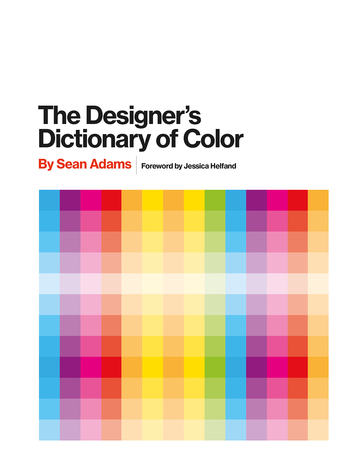
The Designers Dictionary of Color provides an in-depth look at 30 colors key to art and graphic design. Organized by spectrum, in color-by-color sections for easy navigation, this book documents each hue with charts showing color range and palette variations. Chapters detail each colors creative history and cultural associations, with examples of color use that extend from the artistic to the utilitarianwhether the turquoise on a Reid Miles album cover or the avocado paint job on a 1970s Dodge station wagon. A practical and inspirational resource for designers and students alike, The Designers Dictionary of Color opens up the world of color for all those who seek to harness its incredible power.

Sean Adams: author's other books


Who wrote The Designer’s Dictionary of Color? Find out the surname, the name of the author of the book and a list of all author's works by series.

The Designer’s Dictionary of Color — read online for free the complete book (whole text) full work

Below is the text of the book, divided by pages. System saving the place of the last page read, allows you to conveniently read the book "The Designer’s Dictionary of Color" online for free, without having to search again every time where you left off. Put a bookmark, and you can go to the page where you finished reading at any time.

Light

Font size:

Reset

Interval:

Bookmark:

Make
Table of Contents
Guide
The Designers Dictionary of Color The Desi - photo 1
The Designers Dictionary of Color The Designers Dictionary of Color A B R - photo 2
The Designers
Dictionary of Color
The Designers Dictionary of Color A B R A M S N E W Y O R K by Sean Adams - photo 3
The Designers Dictionary of Color A B R A M S N E W Y O R K by Sean Adams - photo 4
The Designers
Dictionary of Color
A B R A M S
,
N E W
Y O R K
by Sean Adams
Foreword by Jessica Helfand
2017 Quid Publishing Ltd For Quid Text and design Sean Adams Editor Lucy - photo 5
2017 Quid Publishing Ltd.
For Quid
Text and design:
Sean Adams
Editor:
Lucy York
Picture Researchers:
Katriona Feinstein, Simona Stabados
For Abrams
Editors:
John Gall and Ashley Albert
Design Manager:
Devin Grosz
Production Manager:
Alex Cameron
Library of Congress Control Number: 2016949082
ISBN: 978-1-4197-2391-9
eISBN: 978-1-6833-5002-6
The principal typeface used is Sentinel, designed by Jonathan
Hoefler and Tobias Frere-Jones in 2009. Sentinel is based on earlier
Egyptian or Slab Serif typefaces such as Clarendon designed by
Robert Besley in 1845.
The color swatches contained in this book are as accurate as
possible. However, due to the nature of the four-color printing
process, slight variations can occur due to ink balancing on press.
Every effort has been made to minimize these variations.
PANTONE Colors displayed here may not match the PANTONE -
identified standards. Consult current PANTONE Color Publications
for accurate color. PANTONE and the PANTONE Chip Logo are the
property of Pantone, Inc.
Published in 2017 by Abrams, an imprint of ABRAMS. All rights
reserved. No portion of this book may be reproduced, stored in
a retrieval system, or transmitted in any form or by any means,
mechanical, electronic, photocopying, recording, or otherwise,
without written permission from the publisher.
Abrams books are available at special discounts when purchased
in quantity for premiums and promotions as well as fundraising
or educational use. Special editions can also be created to
specification. For details, contact specialsales@abramsbooks.com
or the address below.
115 West 18th Street
New York, NY 10011
abramsbooks.com
I think it pisses God off if you walk by the color purple in a field somewhere - photo 6
I think it pisses God off if you walk by the color purple in
a field somewhere and dont notice it.
ALICE WALKER , THE COLOR PURPLE
Contents THE DESIGNERS DICTIONARY OF COLOR - photo 7
Contents
THE DESIGNERS DICTIONARY OF COLOR OPPOSITE Berlin Sean Adams 2014 Poster - photo 8
THE DESIGNERS DICTIONARY OF COLOR OPPOSITE Berlin Sean Adams 2014 Poster - photo 9
THE DESIGNERS DICTIONARY OF COLOR
OPPOSITE Berlin Sean Adams 2014 Poster Red is used with the extreme layout to - photo 10
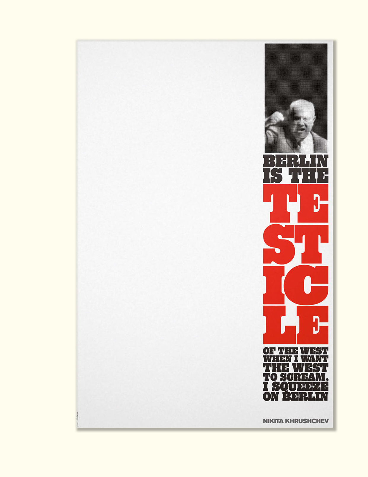
OPPOSITE
Berlin
Sean Adams ~ 2014
Poster
Red is used with the extreme layout
to viscerally communicate the idea
of squeezing.
Foreword
Seeing Red
F OR YEARS , J OSEF A LBERS TAUGHT A COLOR CLASS
at Yale that began with
an identical assignment. Participants were each asked to bring in examples of
something redfound objects, loose remnants, the detritus of the everyday
their purpose or provenance of little concern. Thus challenged, students would
enthusiastically disperse, each seeking the perfect specimen: from rescued
textiles to tarnished metals, paper samples to paint chips, old discarded pizza
boxes to treasured bits of propaganda, each hoped to impress the great master
with dazzling brilliance and impeccable taste.
Returning to the studio to pin up their findings, the students soon saw that the
intended lesson was little more than a demonstration of the impossible. Beauty
is indeed in the eye of the beholder. Color is an exercise in visual slippage:
its intrinsically and deeply personal. No two reds could everindeed, would
evermatch.
And that, observed Albers, was precisely the point.
Sean Adams is spot-on when he says that color is subjective. Its also tricky,
idiosyncratic, and prone to mercurial shifts of temperament. Flowers bloom
bright before fading. Pigments can be engineered to dye or to dissipate.
Staring at a spot of blue for too long will result in a subsequent burst of
perceived orangea useful operation when explaining optics to students, but
an exasperating exercise for anyone hoping to be rewarded for their scrutiny,
or, for that matter, their stamina. Its all fascinatingif bewilderingmaking
decisions at once perplexing and onerous.
This book provides an invaluable resource for visual practitioners, offering
both conceptual guidelines and concrete examples for the color-challenged.
Color perception is not only personal, its contextual, gesturing to all sorts
of invisible phenomena that orbit, for most of us, in a seemingly endless
and unbidden referential haze. Colors spark memories, cue emotions, and
trigger willful associations. When too close in value, adjacent colors can shift
from harmonious to hilarious (certain bridal parties come to mind), while
improperly contrasting hues will sooner compete than cooperate.
In the end, all color embraces a spectrum of light that may never be possible to
fully comprehend. Aristotle tried, and so did Goethe and Wittgenstein. (Isaac
Newton tried, too.) Perhaps this is why Josef Albers always returned to that
deliciously simple exercise. My red is not now, nor will it ever be, the same as
yours. And that, as this book so eloquently demonstrates, is precisely the point.
J ESSICA H ELFAND
FOREWORD
C OLOR IS SUBJECTIVE AND EMOTIONAL It is often the most volatile element of - photo 11
C OLOR IS SUBJECTIVE AND EMOTIONAL .
It is often the most volatile element
of a project. To declare that the choice of a favorite color is inferior is to
personally attack a persons core. A client may arbitrarily demand a specific
color or reject another based on outwardly irrelevant reasons. Our response to
Next page
Light

Font size:

Reset

Interval:

Bookmark:

Make

Similar books «The Designer’s Dictionary of Color»

Look at similar books to The Designer’s Dictionary of Color. We have selected literature similar in name and meaning in the hope of providing readers with more options to find new, interesting, not yet read works.


Reviews about «The Designer’s Dictionary of Color»

Discussion, reviews of the book The Designer’s Dictionary of Color and just readers' own opinions. Leave your comments, write what you think about the work, its meaning or the main characters. Specify what exactly you liked and what you didn't like, and why you think so.