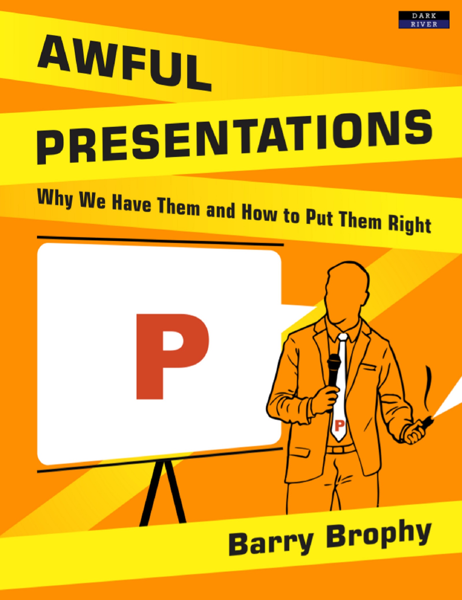
Barry Brophy - Awful Presentations: Why We Have Them and How to Put Them Right
Here you can read online Barry Brophy - Awful Presentations: Why We Have Them and How to Put Them Right full text of the book (entire story) in english for free. Download pdf and epub, get meaning, cover and reviews about this ebook. year: 2017, publisher: Bennion Kearny, genre: Romance novel. Description of the work, (preface) as well as reviews are available. Best literature library LitArk.com created for fans of good reading and offers a wide selection of genres:
Romance novel
Science fiction
Adventure
Detective
Science
History
Home and family
Prose
Art
Politics
Computer
Non-fiction
Religion
Business
Children
Humor
Choose a favorite category and find really read worthwhile books. Enjoy immersion in the world of imagination, feel the emotions of the characters or learn something new for yourself, make an fascinating discovery.

- Book:Awful Presentations: Why We Have Them and How to Put Them Right
- Author:
- Publisher:Bennion Kearny
- Genre:
- Year:2017
- Rating:3 / 5
- Favourites:Add to favourites
- Your mark:
Awful Presentations: Why We Have Them and How to Put Them Right: summary, description and annotation
We offer to read an annotation, description, summary or preface (depends on what the author of the book "Awful Presentations: Why We Have Them and How to Put Them Right" wrote himself). If you haven't found the necessary information about the book — write in the comments, we will try to find it.
Barry Brophy: author's other books
Who wrote Awful Presentations: Why We Have Them and How to Put Them Right? Find out the surname, the name of the author of the book and a list of all author's works by series.


Awful Presentations: Why We Have Them and How to Put Them Right — read online for free the complete book (whole text) full work
Below is the text of the book, divided by pages. System saving the place of the last page read, allows you to conveniently read the book "Awful Presentations: Why We Have Them and How to Put Them Right" online for free, without having to search again every time where you left off. Put a bookmark, and you can go to the page where you finished reading at any time.
Font size:
Interval:
Bookmark:
*
Barry Brophy
*
[Smashwords Edition]
*

*
Published in 2017 by Dark River, an imprint of Bennion Kearny Limited.
ISBN: 978-1-911121-32-9
All Rights Reserved. No part of this publication may be reproduced, stored in a retrieval system, or transmitted in any form or by any means, electronic, mechanical, photocopying, recording or otherwise, without the prior permission of the publisher.
This book is sold subject to the condition that it shall not, by way of trade or otherwise, be lent, re-sold, hired out or otherwise circulated without the publishers prior consent in any form of binding or cover other than that it which it is published and without a similar condition including this condition being imposed on the subsequent purchaser.
Dark River has endeavoured to provide trademark information about all the companies and products mentioned in this book by the appropriate use of capitals. However, Dark River cannot guarantee the accuracy of this information.
Published by Dark River, an imprint of Bennion Kearny Limited, 6 Woodside, Churnet View Road, Oakamoor, Staffordshire, ST10 3AE
www.BennionKearny.com
Cover image by Hamza El Gehani
Table of Contents
Barry Brophy has nearly two decades experience in helping people make presentations in both the private sector, and as lecturer at University College Dublin. There he has developed specialist Masters courses that run across all disciplines in the university and has carried out research on how oral presentations work and what gets remembered. He is also the author of The Natural Presenter Turning Conversations into Presentations , which was published in 2007.
The print version of this book is large and in colour but many eReaders are a bit smaller and only offer grayscale. As such, we have tried to anticipate readers issues and have tweaked the images accordingly; but, even then, there may be images that you struggle to make out fully.
If you experience any difficulties with images, please email us and we will do our best to help rectify matters!
info@BennionKearny.com
I could show you many examples but do I really need to? We have all experienced this problem, probably hundreds of times. People fill slide after slide with bullet points and then read them out, one by one. You know youre in trouble when you catch a glimpse of the slide-sorter at the start of the presentation, and it looks like an aerial view of the American Great Plains: lots of dull-coloured rectangles, each intricately lined. Not only does it resemble ploughed prairie, it is about as interesting.
*

[above] The all too familiar text-laden, bullet point slide.
*
This is bad for the audience who wants to read text, or have it read to them(?) but it is worse for the presenter because he or she gets sucked into gawping at their own slides to remember what they were going to say. And its actually even worse than this because a bullet point-driven presentation is indicative of an encyclopaedic approach point; sub-point; sub-sub-point which is totally unsuitable for a short, transient, audio-visual communication. And, apart from being ineffective, it is also a missed opportunity to use more visual content that will excite curiosity and make your points easier to understand and memorable. Its a bad idea all round.
The million dollar question is why on earth do people do this? Repeatedly. If you look for a precedent in popular culture you wont find one. The only time text is overlaid with someone talking is when subtitles are used in films and this is only done when the audience doesnt speak the language of the film (obviously). Subtitles are typically made as unobtrusive as possible so as not to detract from the interesting pictures that the audience actually wishes to see.
If you search the education and psychology literature, again you wont find evidence that on-screen text aids verbal delivery. In fact, the field of Cognitive Load Theory throws up many studies that say the exact opposite: text is distracting, not enhancing, and certainly not appealing. But it doesnt take a rocket scientist or a cognitive psychologist to work this out. Try reading a book and having a conversation at the same time; it cant be done.
In my experience there are three reasons why people persist in filling slides with bullet points. None are good reasons, but because presentations are so presenter-centred with presenters worrying far more about what they are saying than what the audience is hearing these three factors dominate thinking during the preparation phase.
Firstly, bullet points act as a prompt for the presenter. This is helpful to the speaker but not the audience. Why would they want to see the speakers guide notes? Also it leads the presenter into a damaging cycle. The more text you put on the screen, the more you need to read that text to remind you what you put there in the first place. The act of having a prompt begets the need for one, if you think about it.
*

[above] The more you put on the screen, the more you have to look at the screen to remember what you put there.
*
The most extreme example of this I have encountered was a philosophy PhD student who, at conferences, favoured reading his paper out, word for word. This is actually the norm in many of the humanities disciplines. He told me that his argument was so intricate and required such precise explanation, that he had to write it down in a very ordered way or he would lose his train of thought. The obvious counter-argument to this is that if he needed such a precisely crafted script to allow him, the expert, to follow his own argument, then what chance had the audience got of following it?
The second reason for bullet points is that people plan their presentations in PowerPoint. Often I hear presenters say things like, Well, I have ten minutes, so thats ten slides: three on company background, one each on our five products, and two to wrap up. This approach can only result in a brain-dump of bullets and not a well-structured presentation.
To be honest, I can understand why it happens. A presentation is like an exam: you prepare and worry about it for maybe weeks on end, but the second before you start to speak just like the second before you turn over an exam paper you still have nothing to show for your efforts. Everything may yet go wrong. No matter how many times you run through the presentation in your head, those words keep sliding around mercurially and coming out differently. The worry is that when you get up to speak, they wont come out at all. By writing these words down on slides, youre latching them in place. Now you can be sure that the presentation will progress in a precise order which is greatly reassuring. The only downside is, your presentation will be awful.
The third reason for this hail of bullets is the increasing tendency for companies to use PowerPoint slide decks a term I abhor, by the way as documents. Email me the PowerPoint, is an expression you often hear and suggests that the presentation should work nearly as well
Font size:
Interval:
Bookmark:
Similar books «Awful Presentations: Why We Have Them and How to Put Them Right»
Look at similar books to Awful Presentations: Why We Have Them and How to Put Them Right. We have selected literature similar in name and meaning in the hope of providing readers with more options to find new, interesting, not yet read works.
Discussion, reviews of the book Awful Presentations: Why We Have Them and How to Put Them Right and just readers' own opinions. Leave your comments, write what you think about the work, its meaning or the main characters. Specify what exactly you liked and what you didn't like, and why you think so.