Cover design: Ryan Myers
Copyright 2013 by Dan Siroker and Pete Koomen. All rights reserved.
Published by John Wiley & Sons, Inc., Hoboken, New Jersey.
Published simultaneously in Canada.
No part of this publication may be reproduced, stored in a retrieval system, or transmitted in any form or by any means, electronic, mechanical, photocopying, recording, scanning, or otherwise, except as permitted under Section 107 or 108 of the 1976 United States Copyright Act, without either the prior written permission of the Publisher, or authorization through payment of the appropriate per-copy fee to the Copyright Clearance Center, 222 Rosewood Drive, Danvers, MA 01923, (978) 7508400, fax (978) 6468600, or on the web at www.copyright.com . Requests to the Publisher for permission should be addressed to the Permissions Department, John Wiley & Sons, Inc., 111 River Street, Hoboken, NJ 07030, (201) 7486011, fax (201) 7486008, or online at www.wiley.com/go/permissions .
Limit of Liability/Disclaimer of Warranty: While the publisher and author have used their best efforts in preparing this book, they make no representations or warranties with the respect to the accuracy or completeness of the contents of this book and specifically disclaim any implied warranties of merchantability or fitness for a particular purpose. No warranty may be created or extended by sales representatives or written sales materials. The advice and strategies contained herein may not be suitable for your situation. You should consult with a professional where appropriate. Neither the publisher nor the author shall be liable for damages arising herefrom.
For general information about our other products and services, please contact our Customer Care Department within the United States at (800) 7622974, outside the United States at (317) 5723993 or fax (317) 5724002.
Wiley publishes in a variety of print and electronic formats and by print-on-demand. Some material included with standard print versions of this book may not be included in e-books or in print-on-demand. If this book refers to media such as a CD or DVD that is not included in the version you purchased, you may download this material at http://booksupport.wiley.com . For more information about Wiley products, visit www.wiley.com .
Library of Congress Cataloging-in-Publication Data:
Siroker, Dan.
A/B testing : the most powerful way to turn clicks into customers / Dan Siroker, Pete Koomen.
pages cm
Includes index.
ISBN 978-1-118-53609-4 (cloth); 978-1-118-65917-5 (ebk); ISBN 978-1-118-65920-5 (ebk)
1. Organizational effectiveness. 2. Multimedia systemsSocial aspects. 3. Application softwareTesting. I. Koomen, Pete, 1982- II. Title.
HD58.9.S5447 2013
658.83402854678dc23
2013016038
Chapter 1
How A/B Testing Helped Win the White HouseTwice
The $57 Million Button
It was 2007 when then-Senator Barack Obama was running for President, and no one but the Des Moines Register seemed to think he had a chance of winning the Democratic primary.
DAN: I was a product manager at Google at the time, and I'd seen Obama speak at our headquarters several weeks prior to the primary election. I am a big believer in reason and facts and evidence and science and feedbackeverything that allows you to do what you do. That's what we should be doing in our government, Obama told the packed auditorium. I think that many of you can help me, so I want you to be involved. He probably meant that he wanted donations, or maybe votes, but I took him literally. I took a leave of absence from Google initially and eventually quit my job to move from California to Chicago to join the campaign.
I joined what was being called the new media team. They used the phrase new media because it encompassed everything that didn't typically fit into traditional political campaigns: email, social media, blogging, SMS, and the web. The team had competent bloggers, designers, and email copywriters; I wondered where I might be able to make an impact.
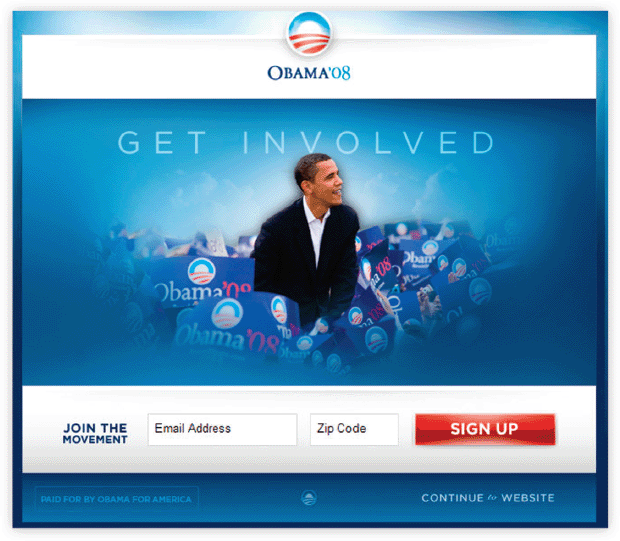
One thing stood out to me: a red button.
Online donations to the campaign came from subscribers to the email newsletter; subscriptions for this came from the campaign website's signup form; and the signup form came as a result of clicking a red button that said Sign Up. This was the gateway through which all of Obama's email supporters had to pass; it all came down to one button. So, one simple, humble question immediately became pivotal.
Is This the Right Button?
Is this our best chance to get every single supporter, and every single dollar, that we possibly can?
I had zero political experience at the time, and little clout within the organization. I didn't have a politico's intuition about what the button or the image above it should look likenor the persuasive rhetoric required to run any proposed improvements up the chain of command. All I had was one insistent question: Is this button the absolute best? and the desire to find the answer. There was only one way to know for certain.
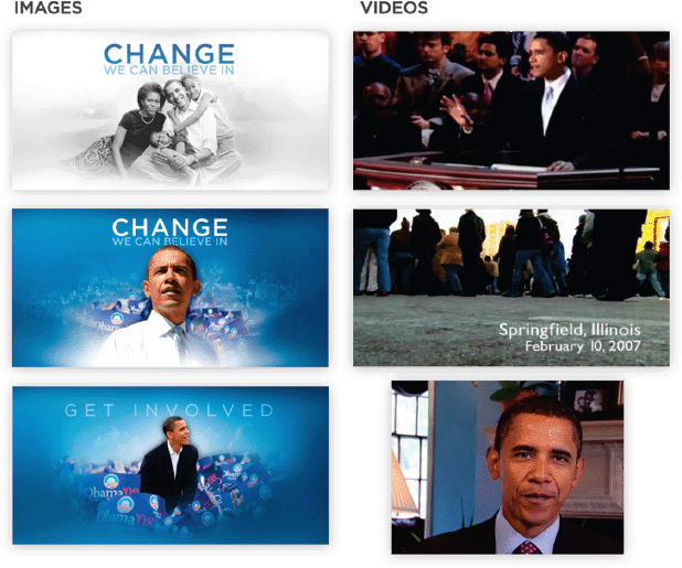
Knowing little about politics or why certain words and images might be more moving or more effective than others, I suggested experimenting to figure out what worked to drive the most signups. Our team tested four different labels for the button (Sign Up,Sign Up Now,Join Us Now, and Learn More) and six different media (images and videos) above it to see which combination induced the most visitors to engage and sign up.
Our team took bets on which variation () would perform best at garnering email signups. Most folks put their money on Sam's Video, a compilation of some of the most powerful moments in Obama's speeches. We assumed any videowith not just Obama's image, but his voice and messagewould lead more people to enter their email addresses than a simple static image would.
The original splash page we set out to optimize at the Obama campaign in 2008.
Source: Optimizely.

Figure 1.2 The button variations we tested.
Source: Optimizely.

The media variations we tested.
Source: Optimizely.

Boy, were we wrong.
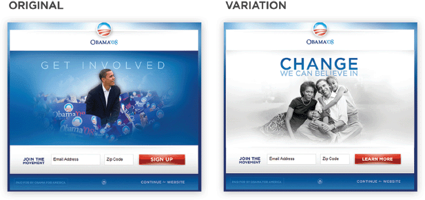
In fact, not only Sam's Video but every video dramatically underperformed every image. Even more dramatically, one image-and-button combination in particular stood head and shoulders above the original ().
A side-by-side comparison of the original and winning variation of the splash page at the 2008 Obama campaign.
Source: Optimizely.

A combination of the Family Image and the Learn More button improved the signup rate by a staggering 40.6 percent. Over the course of the campaign, that 40.6 percent lift in signups translated to 2.8 million more email subscribers, 288,000 more volunteers, andperhaps most important of allan additional $57 million in donations.
Obama went on, with an enormous lead in dollars and supporters raised online, to win the election. He was buoyed by a team willing to test everything and to listen to the data even when it surprised them the most.
