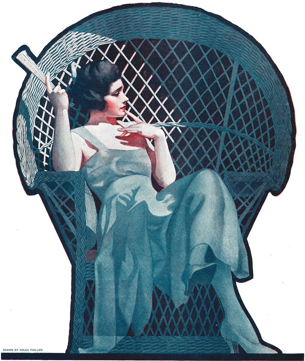
Cover art from
The Saturday Evening Post, August 6, 1921
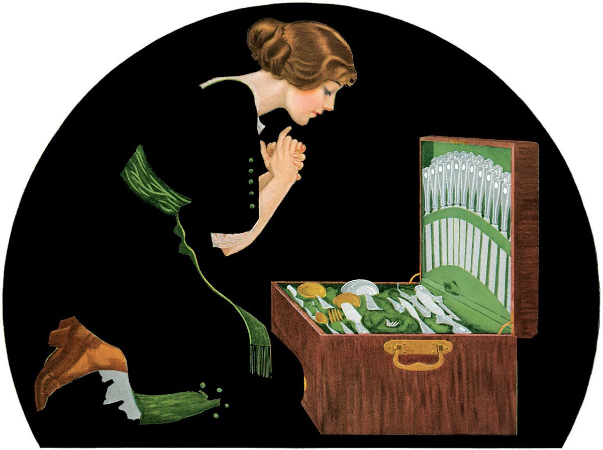 The Good Silver
 Bobbs-Merrill Co., 1912
Copyright Copyright 2019 by Dover Publications, Inc. Introduction copyright 2019 by Scott M. Fischer All rights reserved.
Bibliographical NoteFadeaway: The Remarkable Imagery of Coles Phillips, first published by Dover Publications, Inc., in 2019, is a new collection of illustrations by Coles Phillips, compiled by Jeff A. Menges from the following sources:
A Gallery of Girls by Coles Phillips, originally published in 1911 by The Century Company, New York;
The Gorgeous Isle by Gertrude Atherton, illustrated by Coles Phillips, originally published in 1908 by Doubleday, Page & Company, New York; and
A Young Mans Fancy by Coles Phillips, originally published in 1912 by The Bobbs-Merrill Company, Indianapolis, Indiana. Scott M. Scott M.
Fischer has provided an Introduction for this work. Library of Congress Cataloging-in-Publication Data Names: Phillips, Coles, 18801927, artist. | Menges, Jeff A., editor. | Fischer, Scott M., writer of introduction. | Phillips, Coles, 18801927. Gallery of girls.
Selections. | Phillips, Coles, 18801927. Young mans fancy. Selections. Title: Fadeaway : the remarkable imagery of Coles Phillips / Coles Phillips ; edited by Jeff A. Fischer. Fischer.
Description: Mineola, New York : Dover Publications, 2019. | Series: Dover fine art, history of art Identifiers: LCCN 2018036642| ISBN 9780486828633 (paperback) | ISBN 0486828638 Subjects: LCSH: Phillips, Coles, 18801927Themes, motives. | BISAC: ART / Individual Artists / Monographs. Classification: LCC NC975.5.P49 A4 2019 | DDC 741.6092dc23 LC record available at https://lccn.loc.gov/2018036642 Manufactured in the United States by LSC Communications 82863801 2019 www.doverpublications.com CONTENTS 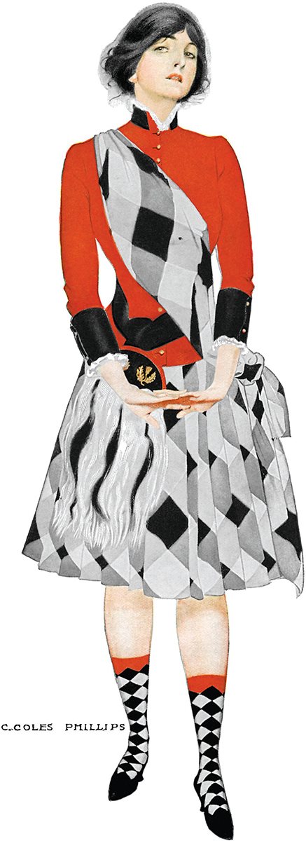 Hoot Mon! Cover art from Life Magazine, October 20, 1910 INTRODUCTION A bsence makes the heart grow fonder. While this phrase is not usually associated with art, in the case of illustrator Coles Phillips (18801927), it certainly applies. In viewing Phillipss work, one is immediately struck by what isnt there.
We quickly understand that what he chose not to paint is as important as what he chose to paint. Myself, being an artist that is obsessed with the mechanics of great picture making, I might even argue that what Phillips left out of his paintings is actually more important than what he put into his paintings. Sure, an art director needs an illustration to have a subject by the very definition of the word illustration. But today, some 100 years after Phillips was working, would we still be talking about him with the same reverence, if he had made the choice to paint every element in his work? What I am looking for in great art is evidence that the artist was there, making bold decisions that often break the rules of reality. Because here is the thingreality is a crutch. I am not suggesting that hyper-photorealistic art is easy.
It requires amazing technique and a discipline that I do not possess. But what I am suggesting is that in this day and age of super HD imagery, you can always paint toward that observed perfection. If you want to render down to the pores on someones nose you can; because the answers are in front of you the whole time. I am much more interested in seeing an artists mind at work. If they are a chunky painter, I want to see those brushstrokes taking us on the ride of an artist discovering the form of his subject. If they are a realistic painter I want to see where the artist deviated from that reality, and tiptoed into the surreal.
If they are a portrait artist, I am looking for an unexpected moment in the pose or expression. And in the case of Coles Phillips, I revel in seeing his math-mind at work. For me, it isnt about how well Phillips rendered his subjects at all. Though he is an exceptional draftsman, there is no shortage of artists I can look at for painting technique. I am looking at him for the way he saw things more than the way he painted them. My late twenties is when Coles Phillips started to have a serious impact on my art.
Prior to that, my journey was all about technique. Once skill is acquired, though, the question becomes, What do you want to do with it? The old adage, You have to learn the rules before you can break them, applies. And I wanted to break stuff. And what I began to realize was it did not matter how you frosted a cake, if the cake itself was as bland as cardboard. I dont care if you render like Chuck Close or Rembrandt, if you cant give me something unexpected, youve lost me. From that point on, I considered myself as much an editor as a painter.
And few artists in history have the editing genius of Coles Philips. To put this into context, we have to realize that Phillips was doing all of this long before Photoshop existed. But if you look at the work, though the subject matter is antiquated, it has a modern feel to itas if you are seeing a Photoshop screen today. His mind is clearly working in layers. Like Photoshop, each element is on a layer, and he is deciding which layers to turn on and off in his head in order to optically tease us. 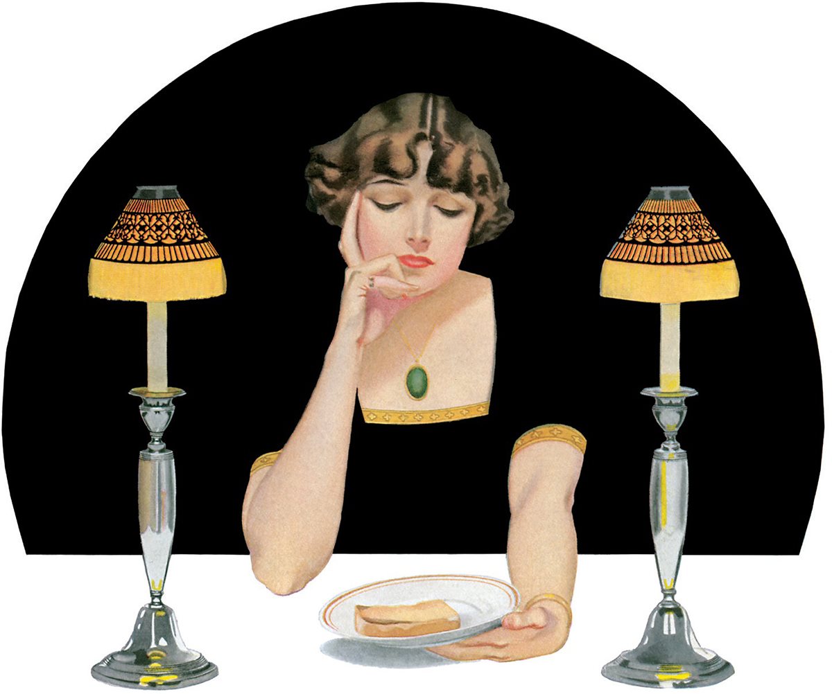 From A Young Mans Fancy Bobbs-Merrill Co., 1912 It is a bit of a paradox.
  From A Young Mans Fancy Bobbs-Merrill Co., 1912 It is a bit of a paradox.
In Phillipss Fade Away style, he is literally editing out elements (by making them the same flat color as the background), but those elements are still there. It is just that we, the viewer, are completing them with our mind. We are participating. To me the best works of art do thisallow for the viewer to participate in the process of completing the picture. I love it when you view a painting on the wall from 10 feet away and think it is a highly rendered subject, only to have it dissolve into brushstrokes upon closer examination. With Phillips, it is less about strokes and more about viewing ghosts of things that arent there, but kind of are there.
When everything is spelled out for us, art becomes less of a cooperative experience and more of a lecture. To pull this off is no easy feat. There is little room for error. I am reminded of a quote by childrens book illustrator Mo Willems, who said, Simple and Easy are opposites. For Phillips, the results have a simplicity that is far from easy. One misplaced element and the entire image will fall apart.
Your composition skills have to be off the charts, and beyond that, you have to be a master of shape language. Pay attention to the silhouettes of his subjects. Phillips is a master of making sure the silhouette tells the story of his paintings, even if the silhouette is an implied silhouette. Because it shares the value/color of something behind it, we can read it. There is an irony in the lasting affection artists have toward Coles Phillips. Scott M. Scott M.








 Cover art from The Saturday Evening Post, August 6, 1921
 The Good Silver Bobbs-Merrill Co., 1912 Copyright Copyright 2019 by Dover Publications, Inc. Introduction copyright 2019 by Scott M. Fischer All rights reserved. Bibliographical NoteFadeaway: The Remarkable Imagery of Coles Phillips, first published by Dover Publications, Inc., in 2019, is a new collection of illustrations by Coles Phillips, compiled by Jeff A. Menges from the following sources: A Gallery of Girls by Coles Phillips, originally published in 1911 by The Century Company, New York; The Gorgeous Isle by Gertrude Atherton, illustrated by Coles Phillips, originally published in 1908 by Doubleday, Page & Company, New York; and A Young Mans Fancy by Coles Phillips, originally published in 1912 by The Bobbs-Merrill Company, Indianapolis, Indiana. Scott M. Scott M.
  Hoot Mon! Cover art from Life Magazine, October 20, 1910 INTRODUCTION A bsence makes the heart grow fonder. While this phrase is not usually associated with art, in the case of illustrator Coles Phillips (18801927), it certainly applies. In viewing Phillipss work, one is immediately struck by what isnt there.
 From A Young Mans Fancy Bobbs-Merrill Co., 1912 It is a bit of a paradox.