How to Make an e-Book Cover:
For Non-Designers
By Kate Harper
All Rights Reserved 2012 Kate Harper
Berkeley, California
TABLE OF CONTENTS
.
INTRODUCTION
This illustrated book will show you how to make your own eBook cover, even if you are not a designer. It is intended for the indie writer who is on a budget and who wants to publish and sell their own book online in stores such Amazon.com and the Apple iBookstore.
Selling your book in these stores will allow customers to buy and read it on multiple eReading devices such as the Kindle, iPad, iPhone and many others .
In this book you will learn:
How to design a basic book cover, using step-by-step visual instructions.
How to use your own photos to create an attractive design.
How to prepare the cover at the correct size and format for an eBook store.
How to make your cover stand out in an online bookstore like Amazon.com
Why eBook covers should be designed differently than printed book covers, so that they sell better.
How to use a word processor and/or graphics program to create a book cover.
Sometimes writers spend months working on a book and then get stuck when they try to publish it in an eBook store. They cannot complete the process because they dont have a book cover, and are surprised to find out it can cost several hundred dollars to hire a designer.
I dont believe indie authors need to go to extraordinary efforts and expense to have a cover designed by a professional when they first start out. In fact, I think eBook covers should be designed differently from traditionally printed covers. You might be able to read 12-point type on a printed book cover, but you will not be able to read that same type in an online store because book covers are displayed at the size of a postage stamp.
On the other hand, if you are publishing a printed book, or are a full time professional wri ter, it is important to invest in a top rate book design. But for the rest of us, we dont need to have the perfect layout or the latest font in order to create a cover that grabs a customers attention. I believe it is possible to create a legible, tasteful and colorful book cover without being a professional designer.
PART A:
Beginners Tips for eBook Covers
Learn how people shop online.
People generally scan images before they read any text. This is why good blogs often have a lot of images. It is common for a reader to only spend a few seconds on a webpage before they click through to another site, and this is also true when it comes to shopping online.
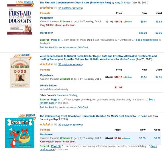
For example, i f you do a search for dog in the Amazon bookstore, you will get about 12 different books displayed on the first page of your results. When you look at that page, notice where your eyes go first.

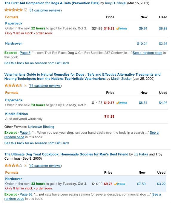
Most likely you will be drawn toward the book cover image first, before you even read the title, price or rating displayed on right side of the image. If you arent convinced, look this same page without any images:

This page looks confusing. Its harder to scan products that dont have images. It is also hard to separate the book titles from all of the other information on the page. There are several colors, stars, and numbers, and they are all competing for your attention.
This is the why a book cover image is very important. It has a great influence over a customer when they are searching for titles and purchasing books.
The main purpose of an online book cover is to encourage the customer to click on the title and read the books description, sample pages, index and table of contents. But if your cover doesnt grab their attention from the beginning, they may just pass it by. This can be unfortunate if your book was on a topic the customer was searching for.
2. Make title text large.
It is important for customers to be able to read the title of your book when it is about one inch tall. This is the average size of most book covers displayed in Amazon store search results. Once a customer clicks on your book, the second page will display your book a little larger, at approximately two inches high. Either way, they are both very small, and if you cant read the title on the cover, chances are the customer is not going to click any further, and they wont read the book description.
Most printed book covers are designed for display on a bookstore shelf and information about the book is on the spine, inside flap, dust jacket, and back cover. It is easy to pick it up and learn more about the content. Even if your have an award winning book cover design, if you put that same book cover in an eBook store, the title alone might be difficult to read.
Here are some examples of book covers I found on Amazon that are hard to read because the title text is too small.

If your book has a great image with emotional impact, but the customer cannot read the title, chances are they will not click through to get more information. Instead, they will probably scan down and look at the next book below yours. You might think they would first glance to the right and read the title (before they scan down), but since the eyes are drawn towards images, people have the tendency to scan book covers first. You might be unaware that your own eyes do this, and it can happen in just a few seconds.
Even though the Amazon store encourages customers to Click and Look Inside, by placing a banner above their books, the odds of a customer doing this are less if the title on the book cover is not legible.
Put dark text on light backgrounds.
If you have ever tried to read a website that has a black background and white text, you have probably experienced eye strain or found yourself squinting after a few minutes. This is because it is easier for the eyes to read dark text on a light background. If the text you are reading right now was white, and sitting on a black background, it would be much more difficult to read. Therefore, try to make your book title using dark text on a light background.
Notice in the examples below. Both are attractive covers, but the Dog Breed Bible title is easier to read when it is thumbnail size.

There are many beautiful book covers created by graphic designers who do the opposite, by putting light text on dark backgrounds, but this is not always easily accomplished since it depends on carefully selected color palettes, blending modes and imagery. If you are a beginner and have trouble getting your title to stand out, try putting dark text on a light background. It will probably be easier to read online.
4. Dont clutter text with images.
Another problem that occurs when book covers are reduced down to postage stamp size, is that their title can disappear inside of an image like in the following examples:

This is why it is important to avoid nesting images behind your book title. You want your customers to read the title without the image interfering with the text.
Choose a short title.
Next page