comic & fantasy artists photo reference
Colossal Collection of Action Poses
Buddy Scalera


Dedications
To Janet
Youre still my favorite.
To Danielle & Nicole
Stick together and help your sister. Everything else will fall into place.
To Dad & Mom
Thanks for years and years of support and encouragement.

How to Use Photo Reference

BY SEAN CHEN
Youd think that looking at photo reference would be a simple and straightforward process. But it just isnt. Photographs and comic book pages are two-dimensional representations of three-dimensional objects.
An experienced artist can trick the viewer into seeing 3-D people, places or things by leveraging art techniques such as foreshortening, shading and perspective. A good photograph can help you add weight, depth and realism to your illustrations. But first, you need to know how to look beyond the flat image of the photo to see form and motion.
1 Find Your Photo
Look for a photo that gives you the pose you need to tell your story. There are only so many ways that the body can move and twist, but there are infinite ways to draw it. As an artist, you can move your mental camera in any possible angle to create a new, fresh and exciting illustration. Choose a photograph that closely approximates the picture you want to draw. It may not match perfectly, but as an artist you can borrow gestures and expressions from other photographs or something that you envision in your head.
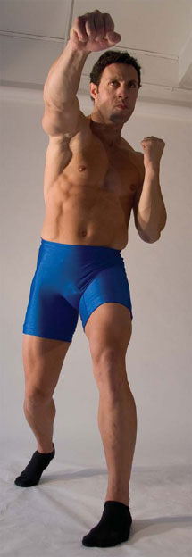
This photograph shows a tall, physically powerful man throwing a punch. The low angle of the shot makes him seem even taller and more imposing.
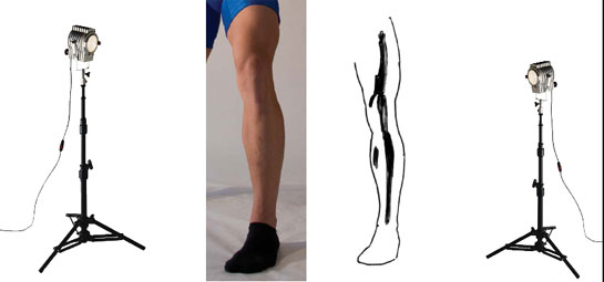
From an emotional standpoint, a reference photo with two light sources adds drama, depth and feeling to the figure.
2 Understand Three-Dimensional Space
The model in this photo exists in the real world, in 3-D space. But the photograph shows only a 2-D representation of this person. Our minds allow us to use visual cues to perceive depth and distance in a flat image.
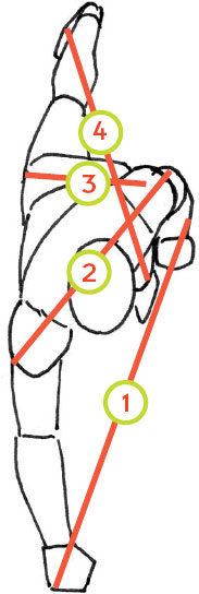
Try to move the mental camera I mentioned in step 1 to a vantage point directly above the figure, and draw what the model is doing in the 3-D space. This will allow you to see how the body is moving in the real world. You can see that this models body is moving forward while one of the legs remains firmly behind. Most of his body weight is on the left leg. All the other body parts fan out from this point. When the figure is standing at rest, it is completely balanced. When the body begins to move, there is a new dynamic as the figure stretches and expands in the 3-D plane. The figure in this position is out of balance. One side is compressed and bears most of the weight. The other side is delivering energy by pushing weight into a punch. Notice how the punch leads the body with forward momentum. It looks almost like a spiral staircase, which gives you a sense of how this shape exists in the real world. These are important details that will make your final drawing breathe with depth, weight and motion.
The fist is the part of the body that has travelled farthest from its original position.
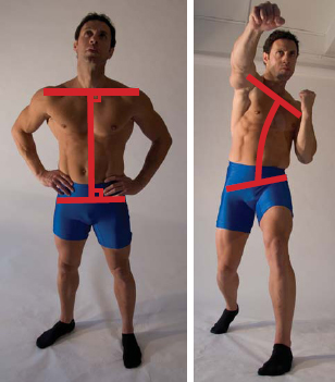
The head and shoulders lead the torso. Because of the outstretched arm, the shoulders are angled from their original position. Notice how the angle differs from that of the hips.
The hips remain straight and close to their starting position. In the starting position, the hips bear the bodys weight, but here the weight has shifted to the models left upper thigh and left knee.
The models right foot remains in its original position. It anchors the figure and gives him something to push and launch against. If this model were standing on ice, he would not have the power and thrust shown in this pose.
Ultimately this is a body out of balance. This pose suggests a figure in motion and delivering energy, which is something that comic artists must be able to draw.

throw off the balance
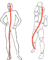
The natural, at-rest state of the body is standing up straight (near right). Thats when the body is most balanced. Running and punching (far right) put the body out of balance. In comics, the action will often make the body look like its about to tip over. Use this to your advantage to heighten the sense of motion.
These figures are approximately the same height, weight and body type, but notice the subtle visual cues that tell the reader that the body on the far right is in motion. Notice also how the pose on the near right is very relaxed, compared to the picture on the far right. Both are effective poses that convey different messages to the reader.

3 Break Down the Body Into Sections
Every part of the body has weight and volume. Start your drawing by sketching the figure with simple lines. When you draw the hips and shoulders, imagine the 3-D space. Notice how the body torques and spirals, just as we discussed in step 2. Look for other anatomy clues, such as the way the back leg and the hip pivot together. The hip and the leg can bend and move, but the anatomy and mechanics will stay relatively consistent in all figures. That is, there are only so many ways the leg can move within the bone structure of the hip.
Imagine each body part to be a cylinder stacked on top of another cylinder, then draw the cylinders.

its all connected
Remember that the parts of the body are interconnected. When one part moves, it affects other parts.
When the body is stable and straight (far left), the spine is straight and perpendicular to the shoulders and hips. When the spine bends (near left), other aspects change too: The spines angle to the shoulders and hips changes, and the shoulder and hip lines go from parallel to angled.


4 Add Shading
Two light sources reveal the contours and volume of the figure in this photo. The bones add structure, but the musculature creates complex shadows. You can figure out about 70 percent of the shadows from just knowing the direction of the light. But to get the core tonality right, you must analyze the peaks and valleys created by the muscles. Remember, also, that bones are not perfectly straight. Use a ruler to reveal the natural curve of the bone, and use this knowledge to create a more realistic shadow.


