Eric Gill - An Essay on Typography
Here you can read online Eric Gill - An Essay on Typography full text of the book (entire story) in english for free. Download pdf and epub, get meaning, cover and reviews about this ebook. year: 1993, genre: Art / Computer. Description of the work, (preface) as well as reviews are available. Best literature library LitArk.com created for fans of good reading and offers a wide selection of genres:
Romance novel
Science fiction
Adventure
Detective
Science
History
Home and family
Prose
Art
Politics
Computer
Non-fiction
Religion
Business
Children
Humor
Choose a favorite category and find really read worthwhile books. Enjoy immersion in the world of imagination, feel the emotions of the characters or learn something new for yourself, make an fascinating discovery.

An Essay on Typography: summary, description and annotation
We offer to read an annotation, description, summary or preface (depends on what the author of the book "An Essay on Typography" wrote himself). If you haven't found the necessary information about the book — write in the comments, we will try to find it.
Eric Gill: author's other books
Who wrote An Essay on Typography? Find out the surname, the name of the author of the book and a list of all author's works by series.


An Essay on Typography — read online for free the complete book (whole text) full work
Below is the text of the book, divided by pages. System saving the place of the last page read, allows you to conveniently read the book "An Essay on Typography" online for free, without having to search again every time where you left off. Put a bookmark, and you can go to the page where you finished reading at any time.
Font size:
Interval:
Bookmark:
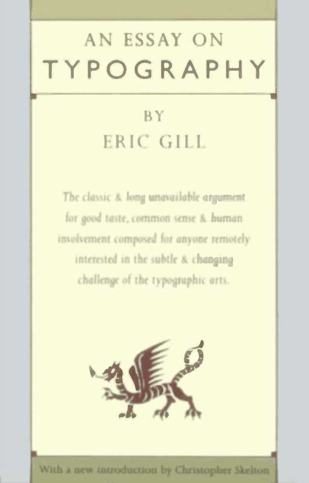
The 1936 edition of An Essay on Typography by Eric Gill, of which this edition is a photo-lithographic copy, was re-set with extensive changes from the first 1931 edition It is set in Joanna, the typeface having been designed by Eric Gill in 1930, and An Essay on Typography being the first use of this now famous typeface.
For the 1936 edition the original founders type was used, cut by H W Caslon and Co Ltd, handset by Hague and Gill in 12 point with 3 point leading, and printed by them at Pigotts The book was published by Sheed and Ward.
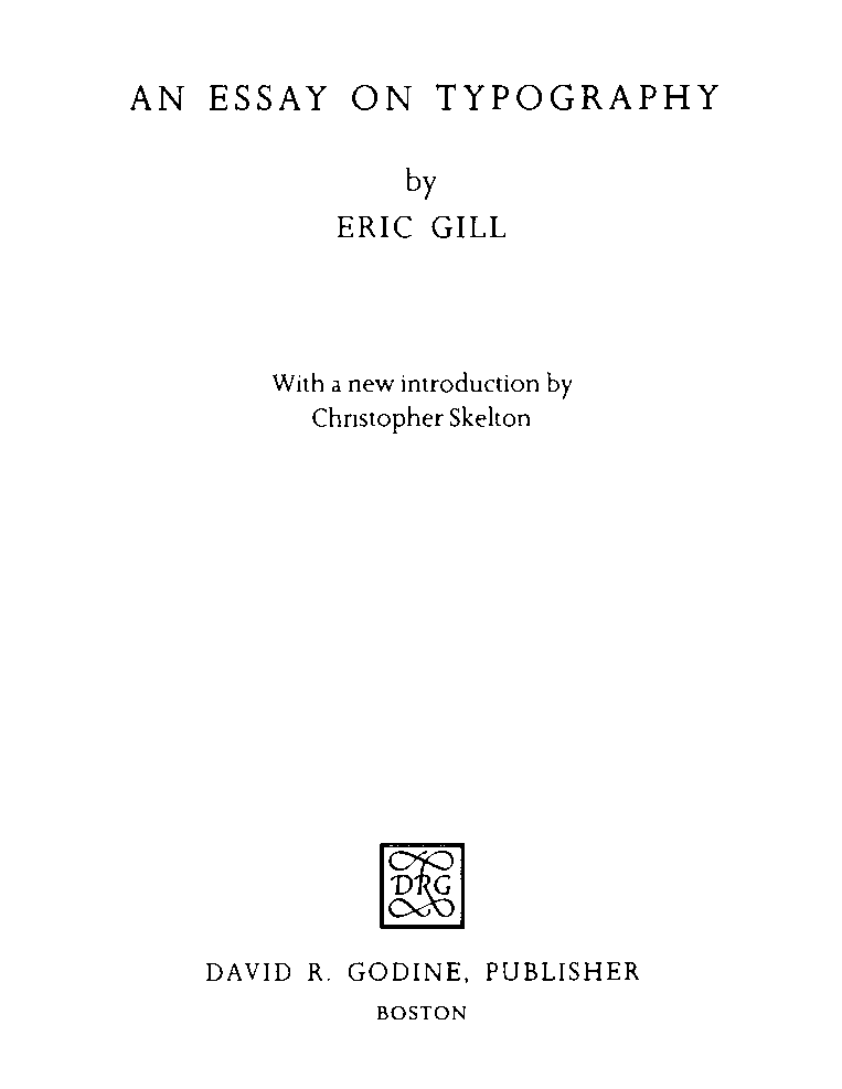
The new Introduction by Christopher Skelton to this edition has been filmset in Linotron 202 10 on 13 point Joanna.
First U. S edition published by DAVID R. GODINE, PUBLISHER, INC, Horticultural Hall, 300 Massachusetts Avenue, Boston, Massachusetts 02115
This edition published in the United Kingdom by Lund Humphries Publishers, Limited, London
Copyright 1988 estate of the late Eric Gill Introduction 1988 Christopher Skelton
All rights reserved No part of this publication may be produced in any manner whatsoever without written permission, except in the case of brief quotations embodied in critical articles and reviews
ISBN 0-87923-762-7(HC) / ISBN 0-87923-950-6(SC) Library of Congress Catalog Card Number 88^-5284
First softcover printing, 1993 Second hardcover printing, 1993 Printed in the United States of America
The Monotype Corporation exhibition held to celebrate Gills work in 1958 was called Eric Gill: Master of Letters and it is in that capacity that he is best remembered today.
Although highly regarded as a teacher in the workshop by his assistants and associates his work left him little time for formal teaching. The Essay on Typography is the one book that he devoted to any practical aspect of his work with letters. For this reason alone it is worth our continued attention, even though in the thirty-three years since it was last reprinted the revolution in the techniques of the reproduction of letters has been immense. The letters, including Gills, are still the same as in 1931.
Gill himself defines typography as the reproduction of letters by means of movable types, a definition that can include all forms of typesetting and printing although in Gills context he takes typography as being synonymous with letterpress printing.
The book was first published by Sheed & Ward in 1931, titled on the front of the jacket Printing & Piety and simply Typography on the spine. An Essay on Typography appears on the contents page, which also serves as a title-page. Essay is a misleading description for a work of over 140 pages divided into nine chapters. (It may have been originally intended as a shorter work as Rene Hagues estimate was for 80 pages of composition. ) It was the first substantial piece of Gills writing to be published. His previously printed works are all small pamphlets, short essays and lectures - mostly collected in Art Nonsense in 1929.
Gill began designing typefaces in 1925. Gill Sans was first shown by the Monotype Corporation in 1929, and the first book printed in Perpetua also appeared in that year. Gills collaboration with Robert Gibbings, begun several years earlier, was at its most active with the drawings for the Golden Cockerel type in 1929 and with The Four Gospels, published in 1931. The drawings for the Joanna typeface were started in April 1930. This was the period, too, of Gills closest association with Stanley Morison, whose First Principles of Typography were published in 1930 in Fleuron VII. A large part of that volume is devoted to Gills work. By 1931 he was a considerable figure in the typographical world.
Gill had moved to Pigotts in Buckinghamshire from Capely-ffin in South Wales in 1928. In April 1930 he and his future son-in-law, Rene Hague, set about buying the equipment for the printing business, Hague & Gill, which was to share the farm buildings with the stonecarving workshop and the engraving studio. One of the objects of the new press was to make use of Gills types and Joanna was designed specifically and exclusively for it. Rene Hague, a somewhat wayward Irishman, had met the Gill family in Wales in 1924 and married Gills daughter, Joanna, after whom the type was named, in November 1930. How he came by his printing knowledge is somewhat obscure although there is no doubting his competence. It may well be that Gills establishment of this new venture had a lot to do with giving his son-in-law employment within the workshop milieu.
With the years of his type designing coming to fruition, and the establishment of the printing business, it was natural for Gill to set down his ideas on typography in a way that was characteristic of him. The Essay can be seen partly as an attempt to explain his excursion into the industrial activity so alien to his often stated principles.
Gills diary records that he began writing Typography in October 1930 while he was in hospital. The writing continued throughout October and November, sometimes being dictated to Rene Hague. He notes several periods of discussion with him and it is probable that in the more technical sections the book is partly Hagues. Hague himself wrote very little on the subject. His provocative essay Reason and Typography is full of phrases that echo Gill, and there is no doubt that in typographical matters the two men thought alike.
As we have seen, this was a period of concentrated activity for Gill. Besides the work mentioned he was busy with drawing the variations of Perpetua and Gill Sans, the BBC carvings and the Four Gospels engravings. He seems to have induced activity in others as well: there were barely six months between finishing the drawings for Joanna Roman in June 1930, and his record of correcting the proofs of Typography on 4 January 1931. In this time the typefounder, H. W. Caslon, had cut the punches and cast the type, and Hague & Gill had set it up by hand for its first use in the book.
The first edition of 500 copies is noted as no. 4 of the publications of Hague & Gill and is dated in the colophon, June 1931, although Gills diary records their being signed in September. The whole edition is signed by both Gill and Hague (Hague first). It is printed on the specially watermarked Hague and Gill hand-made paper in a format of 7-3/4 x 5 inches.
The second edition, which is used for this facsimile, was published in 1936, also by Sheed & Ward, in a smaller format. It has additions to the introductory paragraphs, a new chapter at the end, and other revisions. It is basically the same typesetting as the earlier printing with several significant differences. Joanna italic became available in 1931 and is used for the captions and running headlines. A third edition was published by J. M. Dent & Son in 1941 from the same typesetting (Dents were part owners of Hague & Gill from 1936). The book was reissued by Dents in 1953, but set in the 11 point version of the type that was cut by the Monotype Corporation in 1937.
Sheed & Ward, the books first publishers, normally handled work of specifically Roman Catholic interest; and from its inception Gill must have regarded the book as something far different from a mere treatise on typography. Underneath the heading PRINTING & PIETY on the jacket of the first edition is the subtitle An Essay on life and works in the England of 1931, and particularly TYPO/GRA/PHY, the last word dominating the cover in large red capitals split into three lines. Clearly, it was never intended to be all typography. Although this theme is restated in the opening sentence of the book, the tone and hectoring style of the first chapter must have come as a surprise to those seeking instruction on typographical matters and unfamiliar with Gills brand of Christian socialism, particularly without the jacket of the first edition to sound a warning.
Font size:
Interval:
Bookmark:
Similar books «An Essay on Typography»
Look at similar books to An Essay on Typography. We have selected literature similar in name and meaning in the hope of providing readers with more options to find new, interesting, not yet read works.
Discussion, reviews of the book An Essay on Typography and just readers' own opinions. Leave your comments, write what you think about the work, its meaning or the main characters. Specify what exactly you liked and what you didn't like, and why you think so.