/ GET TIN G ST AR TED GETTI NG ST AR TED
How t o us e thi s b ook
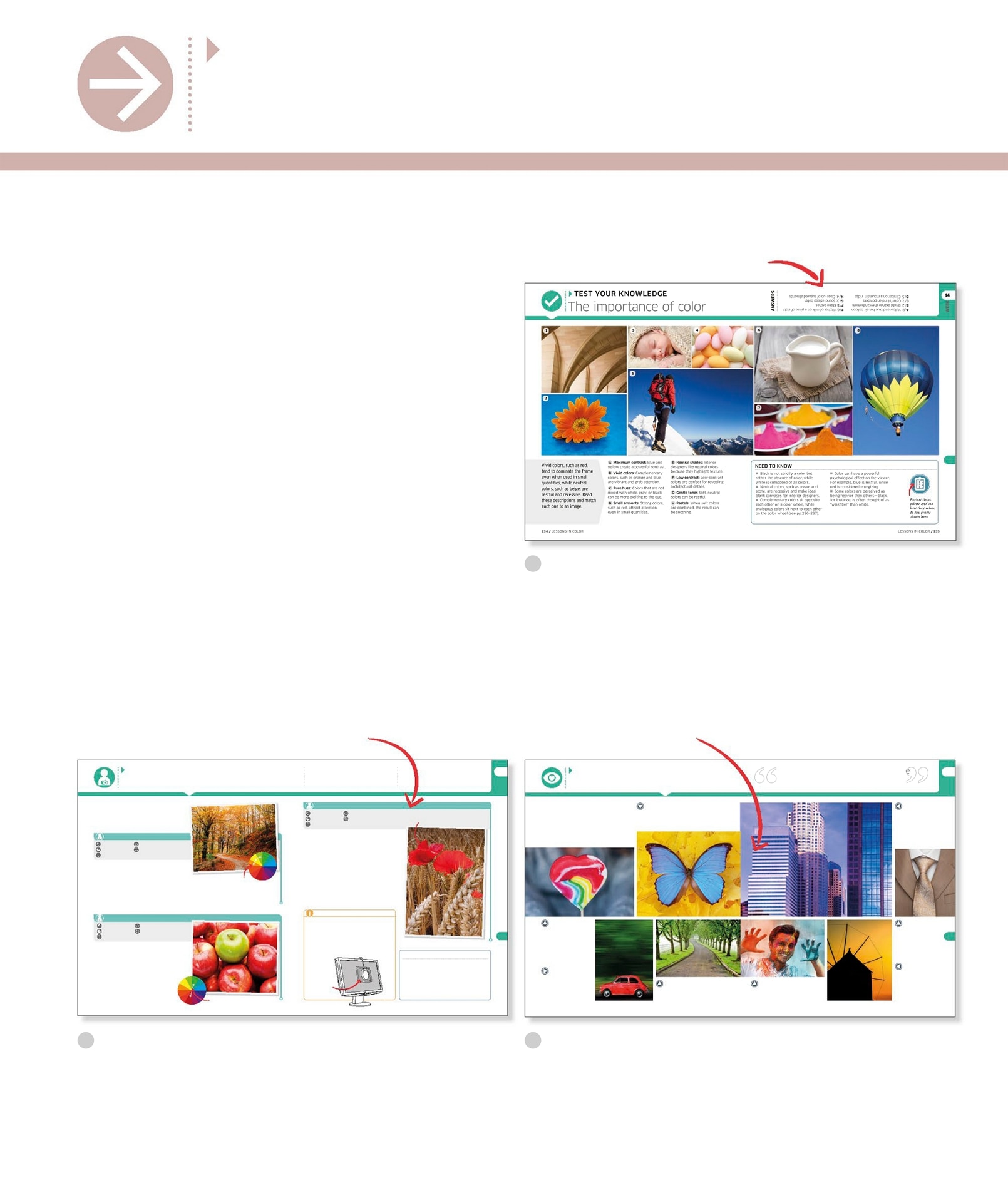
Photography is more popu lar than e ver befo re, with bil lions of photos sh ot and share d each ye ar . If photography has neve r been so popul ar , it is larg ely bec ause it ha s never been so si mple. Sophis ticated modern cameras make it easy to shoot and upl oad photos, w hile e diting softwa re can give dramatic r esults. The down side is that this ex citing technolog y make s it al l too temptin g to ignore t he fundament als of pho tography . This b ook is a c omprehensiv e gui de to photographic princ iples. It is d ivided into 2 modules, e ach of whi ch follo ws the sa me step- by-step pattern a nd can be tackle d in one w eek. By the end of the boo k, you sh ould underst and what it t akes to m ake a goo d photo. Ma stering photography is a jo urney that can last a li fetime. Enjoy y our rst steps on tha t journey . Brie fs tel l you t he whe re, w ha t, how , and why of e ach assig nme nt In s pirat iona l yet achi evab le pho tos sh ow case the ran ge of eect s y ou ca n crea te Ans wers are lo cated in the top ri ght - han d corn er Test you r knowled ge Introduc tory quizz es test what you already kn ow abou t each subje ct. Practice a nd experim ent Themed cr eative assig nments help you to apply your ne w photographi c skil ls. Assess yo ur results Interact ive image gall eries ide ntify and troubleshoo t common proble ms and show you how to av oid mist akes in the future . / LESSON S IN COLO R L ESSONS IN COLOR / WEEK A Maximum contrast : Blue and yellow cr eate a powe rful contrast. B Vivid colors : Complementary colors, suc h as orange and blue, are vibran t and grab at tenti on. C Pure hues: Colors that are no t mixed with whi te, gray , or black can be more e xciting to the eye. D Small amounts : Strong colors , such as red, attr act at tent ion, even in sma ll quan tities. E Neutral shades: Interior design ers li ke ne utral color s because t hey hig hligh t texture . F Low contrast : Low-c ontrast colors are pe rfe ct fo r reveali ng architec tural detail s. G Gentle tones Soft , neutral colors can be restf ul. H Pastels: When soft colors are combined , the result ca n be sooth ing. Vivid c olors, suc h as red, tend to domi nate the frame even whe n used in small quantities , whi le ne utral colors, suc h as bei ge, are restful an d recessi ve. Read these descri ptions a nd match each one to an image. Black i s not st rict ly a color but rather the abse nce of color , while white is c omposed o f all c olors. Neutral color s, such as cre am and stone, are re cessiv e and make i deal blank canv ases for in terior des igners . Complementar y colo rs sit opp osite each other on a colo r wheel, while analogous color s sit next to each other on the color whe el (see pp.236 7) . Color can have a power ful psycholo gical eff ect o n the view er . For example, bl ue is r estful , whil e red is cons idered e nergiz ing. Some colo rs are percei ved as being heavier th an others black, for insta nce, is oft en thought of as weight ier th an white. NEED TO KNOW TEST YOUR KNOWLEDGE ANSWERS The im portan ce of col or A /8: Ye llow and blue hot -air balloo n B / 2: Bright or ange chrys anthemum C / 7: Colorf ul Indi an pow ders D / 5: Cli mber on a m ountain ridge E / 6: Pitcher of mi lk on a piece of cl oth F / 1: Stone arche s G / 3: Sound-a sleep baby H / 4: Close -up of suga red almo nds Rev iew the se poin ts and see how the y rel ate to the pho tos sho wn h ere WEEK LESSONS IN COLOR / / LESSON S IN COLO R ASSESS YO UR RESUL TS Reviewing your shot s The ch ief functi on o f color shoul d b e to se rve expression. HENRI MA TI SSE Have you ach ieved color harmony ? Colors that si t next to each other on th e color wheel are e xtremel y harmoniou s. The p urple and blue in this sc ene work well together . Can you li mit the color palett e? This image uses diff erent shades and to nes of brown, givi ng it a si mple, streamli ned lo ok. Can you com bine vivid colors and n eutrals? Neutral colo rs create the ideal backdrop fo r vibra nt colors. Here, the gray sweater in the backg round make s the lollip op look even more bright and colorf ul. Do you nd any colors distract ing? In this pict ure, the red takes our ey e rst, before shif tin g to the blue. If you had used tw o reces sive color s, it wo uld be ha rd to know wher e to look rs t. Does one c olor dominate? Colors of pu re hue domin ate the frame, and sh ould be used wi th cautio n. The c ar here occupie s a small part of the pict ure, but o ur eye is natural ly draw n to it. Are you aw are of any c olor psychol ogy? Green is a color we asso ciate with nature and tranqui llit y, so when it fe atures heav ily in the frame, such as here, the res ult can be wonderf ully se rene. Is the image warm or cool? We oft en think of co lors as bein g either warm or cool. Morni ng li ght oft en appears much cooler than evening li ght when glor ious sunsets, such as this one, can be captu red. Have you ach ieved con trast betw een two colors? Colors that si t opposi te (or nearl y opposi te) one another on the c olor whee l produc e strik ing contrast . In this image, the bl ue of the bu tter y looks vibrant set again st the orange of the leaves . What other complementary colors work we ll with each other? Having l earned how color can be u sed to inuence e motion, produce cont rast, or cre ate harmony , its time to choose some o f your best ima ges and run thro ugh this checkli st. Look at each shot and as k yourse lf how color affect s your fee lings toward the subje ct. LESSONS IN COLOR / / LESSON S IN COLO R WEEK PRAC TICE AND EXPERIMEN T Playing wit h col or Pro tip: You can take in spiratio n from pain ters as well as p hotographers. Vincent van G ogh was hig hly adept at using complementar y colo rs. If yo u study his pai nting The Sta rry Ni ght, you wil l see a yello w/ orange moon an d stars s et again st a blue/p urple sky . MAKING A COMPLEMENT 45 MINUT ES A SUBJECT WITH COMPLEMENTA RY COLO RS EASY INDOORS O R OUTDO ORS BASIC + tripod A cali brat ion devi ce a ache s to th e fr ont of your m oni tor Red and gree n are com pleme nta ry colo rs WHAT HAV E YOU LEA RNED? The use of complementar y colo rs result s in vibrant, eye-c atching p hotographs. When a key col or is a pu re hue, the eff ect can be dramatic , but it stil l nee ds to be relevant to the subjec t. Analogous colors lead t o calm com positi ons, but they nee d to be a djust ed sensi tively. 1 HOUR A SUBJECT WITH O NE KEY COLOR AMONG MORE SUBDUED TINTS MEDIUM INDOORS O R OUTDO ORS BASIC + tripod STA NDING OUT These assi gnments i nvolve e xperiment ing wi th color in a number of wa ys, in cludin g creating contrast usi ng compleme ntary col ors, pla cing a vivid color agai nst a sub dued backd rop, reducin g saturatio n, and usi ng analogo us colors. Settin g one bold col or against the tin ts, to nes, or shades of anot her wi ll a llow it to take center s tage. Search for a subjec t wit h pale or neut ral tones and introd uce one bold color , such as red. Make sure the color you introd uce is rel evant and in kee ping wi th the scene. These bri ght owers, for example, su ggest new life a gainst the ripe ned wheat stal ks. Select an AF poin t or swit ch to manual foc us to make sure the vi ewers atte ntion is drawn to the right place if the bold colo r is not ce ntrall y posi tioned . Use image-e ditin g soft ware to enhanc e the key color on ce you have secured your shot, or desaturate th e support ing colors even more. Graphic des igners and painters are aware that when a color is used wi th its compl ement, b oth hues appear brig hter . Use a color whe el to sel ect a pair of complementary colors, suc h as red and gre en or yel low and blue, and nd subjec ts wi th those colo rs. Give the colors a bo ost by playing with Pic ture Style s on your came ra, or in po st- product ion. Keep your composi tion sim ple, and exc lude anyt hing th at doesnt reinfor ce the contrast betwee n the two colo rs. Sometim es the color , brightne ss, and cont rast of the pict ures you pri nt bear litt le relatio n to the way they loo k on your comput er screen . T o solve this pr oblem, you need to cali brate you r monitor . A color cali bratio n device (se e p.347 ) tun es your display to a reference st andard, ensuri ng consist ency ac ross multi ple device s. GEAR: COLOR CA LIBRA TI NG 45 MINUT ES A SUBJECT DISPLA YI NG ANALOGOUS C OLORS EASY INDOORS O R OUTDO ORS BASIC + tripod USE ANALOGOUS COLORS By limiting yo ur color palett e to small groups of adja cent colors , you can create restf ul images . Use the color whee l to sele ct some analogous colors, suc h as blue, blu e-green, and green . Look for examples of analogous col ors occurrin g naturall y. For example, if you head outsid e on a fall day you ar e li kely to nd orange, yellow, and green in wooded areas. Use image-e ditin g soft ware to des aturate the colors and red uce the contrast betwe en them. Apply any adjust ments se nsitively, though, or your pict ure could end up l ooking fad ed. Thes e bri ght red poppie s stan d out again st the pale he ad s of wh eat Ana logou s colo rs


