T ABLE OF C ONTENTS
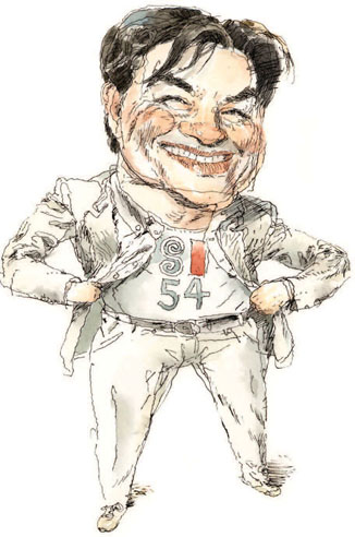
Portrait by John Cuneo Hanging the annual show used to be easy. You needed a sack of nails and somebody tall. Things got a little more complicated this year when we added Moving Image to the competition categories. Animation has been a film staple in the U.S. for nearly a century, but it has become a major outlet for illustration. As we are all aware, delivery systems for visual materials have moved beyond the static printed page and can now be broadcast and stored on personal devices.
To showcase this category of work, we created a screening room at the Society. Named for an illustrator who was also one of Americas early animation pioneers, The Winsor McCay Screening Room was dedicated in 2012, when we showed McCays The Flying House , a 1921 animated film that was recently remastered by Bill Plympton Studios in partnership with the Society. The annual show still boasts the finest cross section of the years best printed illustration work, so we offer this book as its permanent showcase and invite you to visit us year round to see whats moving in the screening room. My thanks to this years chair, Yuko Shimizu, to assistant chair, John Hendrix, and to the jurors for the careful choices they made and for their time well spent. Thanks go to our Executive Director Anelle Miller, Exhibitions Director Kate Feirtag, and the entire Society staff for their enormous efforts in making every aspect of this competition and exhibitionincluding the awards ceremoniesoutstanding. 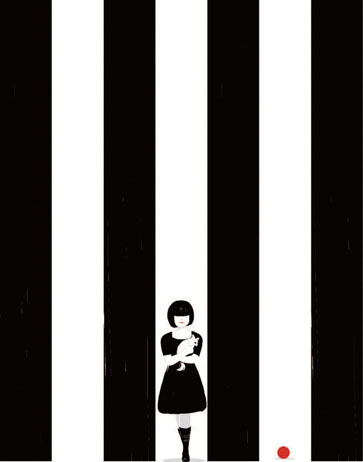 Portrait by Alessandro Gottardo (SHOUT) Ten years ago, when I just started illustrating, I was poor.
  Portrait by Alessandro Gottardo (SHOUT) Ten years ago, when I just started illustrating, I was poor.
I wanted to submit work to illustration competitions, but with a very limited budget I had to carefully pick and choose which competitions to apply to. I dropped the Society of Illustrators Annual from the list that year. I felt that the Society was more for celebrating the traditional and not welcoming newbies like me. Whether what I felt was a reality or not, I knew that a lot of young illustrators felt the same way I did. Seeing the attendees of the three openings for the 54th competition ten years later, I could not help smiling. Young artists we had never heard of, or whose work we hadnt seen before, giving beautiful acceptance speeches that brought tears to our eyes.
And veterans who have never stopped growing and working to be even better artists, receiving their well-deserved medals. You can see it with your own eyes, packed in this annual, from the first page to the last. I am very proud of how the Society of Illustrators Annual is looking more diverse than ever. I am not a newbie anymore. In fact, I have been teaching the next generation of young artists for some time. And you know what? I tell them, if they cant afford to apply to all the competitions theyd like to, they should consider the Society of Illustrators, because the Society is the most diverse one.
I thank all 45 jury members who donated their time, eyes, and brains. Some are my longtime heroes, some are peers and clients, and some are the future we believe in. They represent a full spectrum, just like the selected work. Thank you, Tomer Hanuka for creating such a powerful illustration for the call for entries poster, and Anton Ioukhonovets for designing the poster to enhance that power. And thank you all who applied, whether you are in the annual or not; you are the ones who made this happen. Really.
So, thank you, thank you, thank you. Since 1958, the Society of Illustrators has elected to its Hall of Fame artists recognized for their distinguished achievement in the art of illustration. Artists are elected by former presidents of the Society and are chosen based on their body of work and the impact it has made on the field of illustration. HALL OF FAME 2012
R.O. B LECHMAN [ b. 1930 ] 
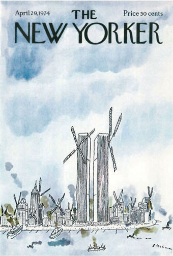 Twin Windmills .
Cover, The New Yorker, April 29, 1974. Ink and watercolor. All images courtesy of the artist. In 1967 a talking stomach was interviewed about its digestion on TV in a commercial spot for Alka-Seltzer, the effervescent cure for indigestion. That a talking organ would change television advertising forever was surprising. Who would have thought such an essentially unattractive muscle could become a TV star, and later an icon of the Creative Revolution? Its creator, R.O.
Blechman, knew in his gut that it would. The talking stomach was an instant success and viewers were charmed by its understated hilarity, rendered with R. O. Blechmans famously nervous comic line. Understated is the best way to describe Blechmans work. His art foregoes slapstick.
His line is genuinely humane. Although many cartoonists have copied the shaky look, no one has ever duplicated the human qualities of his everyman (or every stomach) images. Perhaps the perception of a spiritual humanity has something to do with Blechmans inventive animation work in which he employs voices that transcend the mere line and move from comic to emotionally multifaceted characterizations. (I always associate Blechmans figures with Max Von Sydows dulcet voice. What other cartoonist can trigger such voices in the head?) Blechmans ability to invest emotion onto his scratchy homunculi has to do with his painstaking attention to gestured detail. 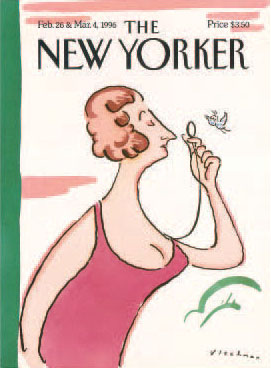 Female version of Eustice Tilley .
  Female version of Eustice Tilley .
Cover, The New Yorker, Febuary 26 & March 4, 1996. Ink and watercolor. Yet contrary to what one might expect of such a minimal line, Blechmans every last pen stroke is purposely, often excruciatingly composed. He has been known to draw dozens of tiny squiggly noses, for instance, on adhesive-backed paper until the right one materializes; then he meticulously cuts it out with an Xacto knife and pastes it onto the image. The final drawing is pieced together like a jigsaw puzzle. And as studied as this process is, the end product is the perfect marriage of comedy and emotionaccomplished through signature gestures.
When Blechmans art was on its ascent during the late fifties and sixties, he bucked the prevailing style of gag cartoons. With the notable exception of James Thurbers primitive scrawls and Robert Osborns expressionist brush strokes, abstraction was frowned upon. Blechmans abstract linear economy was innovative, but so were his themes. The 1953 adaptation of The Juggler of Our Lady , which prefigured todays graphic novels by decades, was not the usual cartoon or comic fare. Likewise, his 1977 No Room at the Inn , a retelling of the nativity myth, was surprisingly warm and spiritual. His drawing is a form of writing and his writing brilliantly complements his drawing.








 Portrait by John Cuneo Hanging the annual show used to be easy. You needed a sack of nails and somebody tall. Things got a little more complicated this year when we added Moving Image to the competition categories. Animation has been a film staple in the U.S. for nearly a century, but it has become a major outlet for illustration. As we are all aware, delivery systems for visual materials have moved beyond the static printed page and can now be broadcast and stored on personal devices.
  Portrait by Alessandro Gottardo (SHOUT) Ten years ago, when I just started illustrating, I was poor.
 Twin Windmills .
 Female version of Eustice Tilley .