J align="j T
Published in 2014 by
Laurence King Publishing Ltd
361373 City Road
London EC1V 1LR
e-mail:
www.laurenceking.com
text 2014 Henry Carroll
This book was designed and produced by Laurence King Publishing Ltd, London.
The right of Henry Carroll to be identified as the author of the work has been asserted by him in accordance with the Copyright, Designs and Patents Act of 1988.
All rights reserved. No part of this publication may be reproduced or transmitted in any form or by any means, electronic or mechanical, including photocopy, recording or any information storage and retrieval system, without prior permission in writing from the publisher.
A catalogue record for this book is available from the British Library.
ISBN: 978-1-78067-335-6
Design: The Urban Ant
Picture research: Peter Kent
Printed in China
J align="j T

J align="j TJ align="j T
Start by ignoring everything
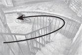
Look, heres a drawing of your camera:

OK, so your camera doesnt look much like this one, but they both work in exactly the same way. Yours just looks more complicated.
A lot of new stuff has been added to cameras over the years. Some of these additions are quite handy, but a lot of them arent. This book will teach you about the handy ones the ones that actually work and give you all the creative freedom you need to take great photographs.
This isnt a textbook and Im not going to use graphs and camera-club jargon to explain the fundamentals of photography. You dont need to know all that. In fact, when youre starting out, it only gets in the way and stops you being creative.
Instead, this book contains the work of inspirational photographers past and present. Through looking at their pictures youll understand their ideas and techniques and learn how to put them into practice yourself.
Youll see that taking great pictures is less about technical knowhow and much more about mastering that most valuable piece of kit your eyes.
But for now, try to remember that no matter how unnerving all the buttons, symbols and dials may seem, your camera is just a box with a hole in it. Whether it cost a few pennies or a few grand, thats all there is to it.
J align="j T

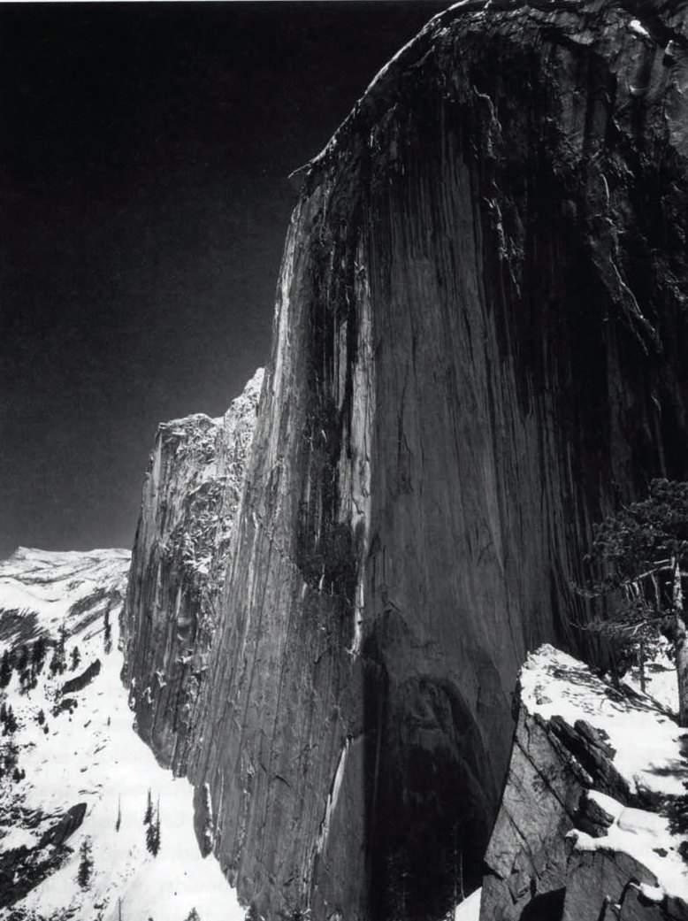
Monolith , The Face of Half Dome,
Yosemite National Park, California
Ansel Adams
1927
J align="j T
COMPOSITION
You dont take a photograph, you make it
(Ansel Adams)
There are 50 different photographers featured in this book. Theyre a mixed bunch, each with their own styles, interests and ways of doing things. Put them in a room together and it might get heated.
But, eclectic as they are, theres something they all have in common. Its their shared appreciation for one of the most important aspects of photography composition.
Think of composition as the foundations of your image. And just like those of a building, foundations need to be strong.
Composition is all about how you choose to order the visual elements in your picture. Its slippery and subjective, and often something you have to feel rather than calculate. But dont let this talk of feeling make you nervous, as Im about to show you some fundamental techniques to help get you com">
These techniques are the ones that great photographers use time and time again. Theyre also the ones that will instantly make your pictures come alive.
J align="j T
Leading lines
Look for the leading lines

For other examples:
Alkan Hassan p. 21
Luca Campigotto p. 38
Joel Sternfeld p. 68
Jeanloup Sieff p. 88
Great compositions take you on a journey. Your eyes are guided around the image on a specific path, leading to where the photographer wants to take you.
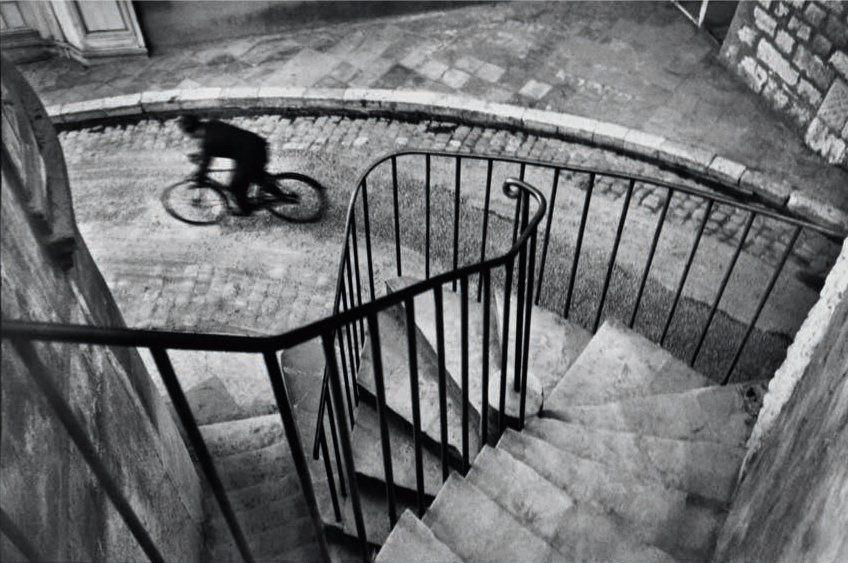
Here, Henri Cartier-Bresson has taken a simple scene and created something beautiful. Instantly the strong, downward point of view makes us feel like were falling into the composition. Soon our eyes latch onto the foreground railings and descend down the steps. As the railings bend to the left, the kerb becomes more dominant. Only then do we arc around to reach the subject a man racing past on a bike.
This tightly controlled visual journey is called a leading line and photographers love them.
Use leading lines to give your composition structure and draw the viewer to key elements.
One main leading line is often all you need and theyre at their most powerful when they sweep in from the edge of the frame.
If you keep your eyes peeled youll find leading lines everywhere, from the converging rails of a train track, to the branch of a tree or the cracks in a rock face and dont be shy about making these lines very overt in your image.
In this case, Cartier-Bresson makes our eyes travel in a slingshot motion around the image to heighten its very essence movement.
J align="j T

The Var department.
Hyres. France
Henri Cartier-Bresson
1932
J align="j T
Landscape or portrait
The shape of things
For other examples:
Cristina Garcia Rodero p. 15
Elaine Constantine p. 81
Youngjun Koo p. 96
Dorothea Lange p. 11em"erif">D5
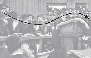
Its not just the lines in your image that dictate how our eyes move across it. The shape (or format) is just as important.
Horizontal pictures (or landscape format) encourage our eyes to move from side to side. Vertical pictures (or portrait format) make them move up and down.
Choosing the format has nothing to do with whether youre shooting landscapes or portraits. Instead, try to match the format of your picture to the dominant lines or natural flow of your subject. This means the shape of your picture and the subject matter will work together to guide the eye in one clear direction.
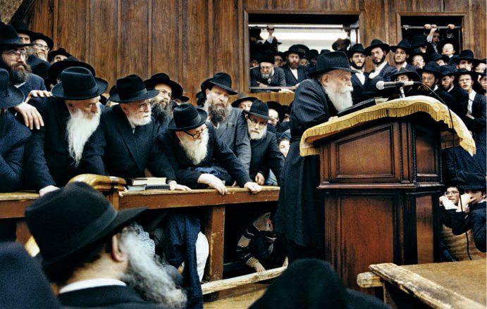
In this photograph by Marc Asnin the landscape format prompts our eyes to glide from left to right along the undulating line of heads. Its a busy scene, but the landscape format creates order by drawing out this leading line, which in turn communicates the acute sense of drama.
Look at the Ansel Adams image on page 8 and see how the portrait format accentuates the hanging weight of the monolithic rock face. The gravity of the lines works in tandem with the vertical shape of the image, making our eyes sink from top to bottom.
J align="j T


The Rebbe
Marc Asnin
1992
J align="j T
Framing
Think inside the box
For other examples:
Martin Parr p. 18
Ernst Haas p. 37
Denis Darzacq p. 53
Like the post-apocalyptic film Mad Max , in this image teenagers rule the world, running free across desert plains fuelled by one hedonistic fix after another.
Next page
