• Complain

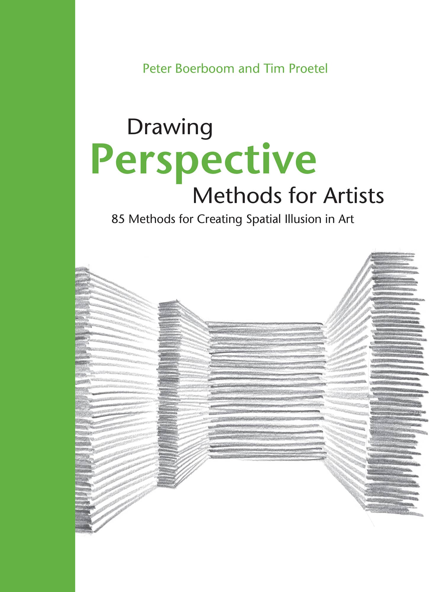
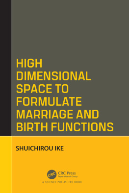
Peter Boerboom - Drawing Perspective Methods for Artists: 85 Methods for Creating Spatial Illusion in Art

Here you can read online Peter Boerboom - Drawing Perspective Methods for Artists: 85 Methods for Creating Spatial Illusion in Art full text of the book (entire story) in english for free. Download pdf and epub, get meaning, cover and reviews about this ebook. year: 2017, publisher: Rockport Publishers, genre: Children. Description of the work, (preface) as well as reviews are available. Best literature library LitArk.com created for fans of good reading and offers a wide selection of genres:

Romance novel Science fiction Adventure Detective Science History Home and family Prose Art Politics Computer Non-fiction Religion Business Children Humor

Choose a favorite category and find really read worthwhile books. Enjoy immersion in the world of imagination, feel the emotions of the characters or learn something new for yourself, make an fascinating discovery.
No cover
  • Book:
    Drawing Perspective Methods for Artists: 85 Methods for Creating Spatial Illusion in Art
  • Author:
  • Publisher:
    Rockport Publishers
  • Genre:
  • Year:
    2017
  • Rating:
    5 / 5
  • Favourites:
    Add to favourites
  • Your mark:
    • 100
    • 1
    • 2
    • 3
    • 4
    • 5

Drawing Perspective Methods for Artists: 85 Methods for Creating Spatial Illusion in Art: summary, description and annotation

We offer to read an annotation, description, summary or preface (depends on what the author of the book "Drawing Perspective Methods for Artists: 85 Methods for Creating Spatial Illusion in Art" wrote himself). If you haven't found the necessary information about the book — write in the comments, we will try to find it.

Learn how to create the illusion of three-dimensional space in your drawings

It is as mundane as it is astounding: placed in the right way, a couple of lines on paper create three-dimensional space. To be more exact, the illusion of space. The interest in three-dimensional drawing may initially arise from the intention to depict visible reality. However, the creation of depth is a fascinating challenge in every artistic composition. In this volume, Peter Boerboom and Tim Proetel have arranged, commented on, and with a guiding hand intuitively and tangibly presented the fundamental methods of three-dimensional illustration. For laymen and professionals alike, this book offers a refreshing, simple approach to the graphic depiction of three-dimensionality.

Peter Boerboom: author's other books


Who wrote Drawing Perspective Methods for Artists: 85 Methods for Creating Spatial Illusion in Art? Find out the surname, the name of the author of the book and a list of all author's works by series.

Drawing Perspective Methods for Artists: 85 Methods for Creating Spatial Illusion in Art — read online for free the complete book (whole text) full work

Below is the text of the book, divided by pages. System saving the place of the last page read, allows you to conveniently read the book "Drawing Perspective Methods for Artists: 85 Methods for Creating Spatial Illusion in Art" online for free, without having to search again every time where you left off. Put a bookmark, and you can go to the page where you finished reading at any time.

Light

Font size:

Reset

Interval:

Bookmark:

Make
Drawing Perspective Methods for Artists 85 Methods for Creating Spatial - photo 1
Drawing
Perspective
Methods for Artists

85 Methods for Creating Spatial Illusion in Art

Peter Boerboom and Tim Proetel

The Spatial Illusion It is as mundane as it is intriguing Correctly placed a - photo 2

The Spatial Illusion

It is as mundane as it is intriguing: Correctly placed, a few lines on a piece of paper can create spatialityto be more exact, the illusion of space. The interest to draw space might come first and foremost from the purpose of wanting to depict the visible reality. But it has a more basic meaning: to create depth is a primary aspiration of every artistic design, whether for illustrations or architectural outlines, posters, Roman mosaics, or graffiti.

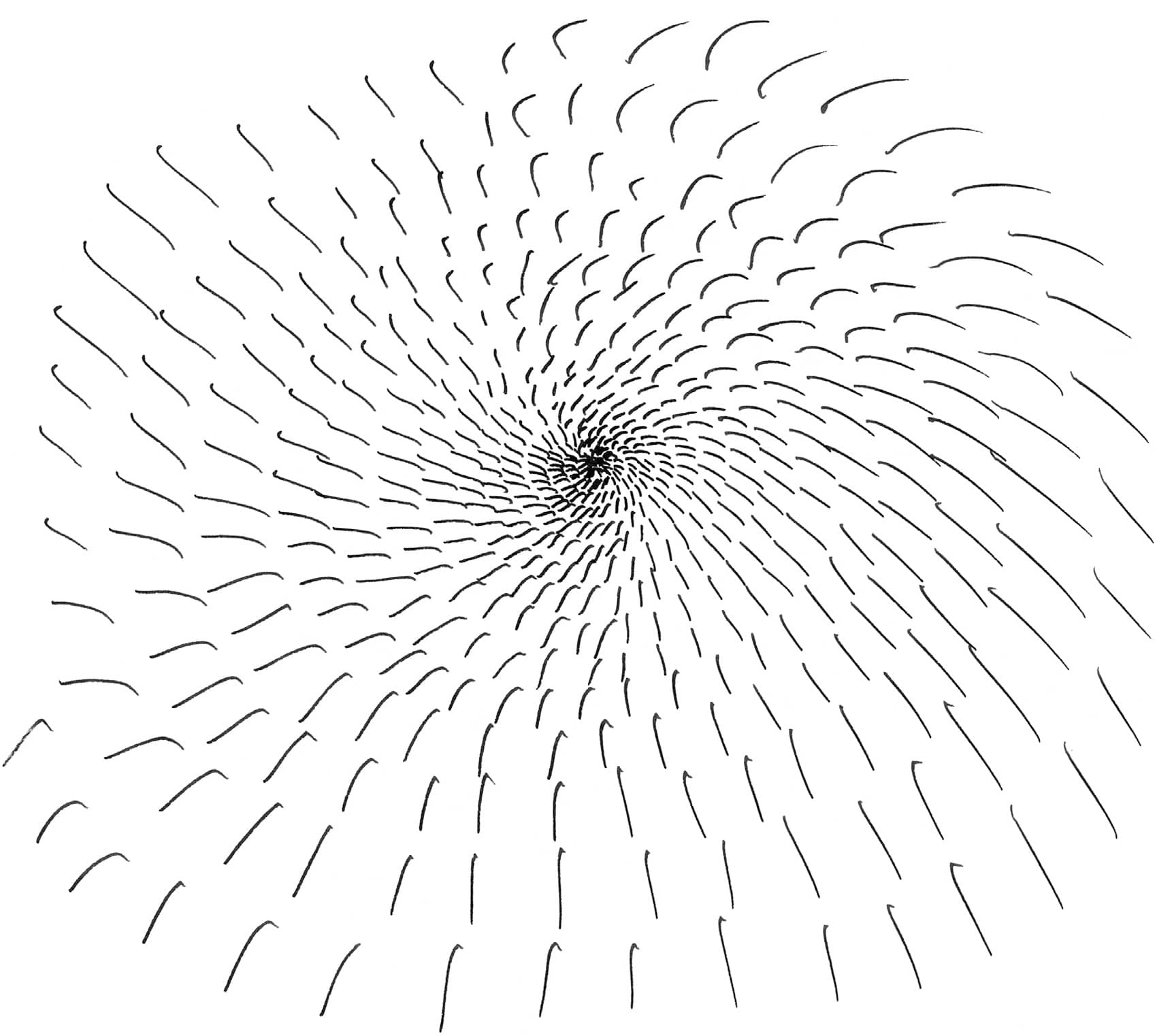
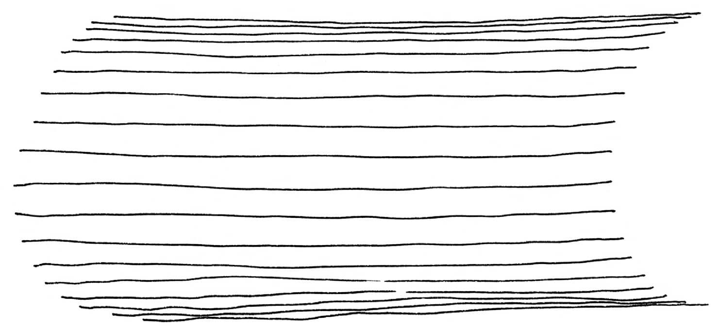
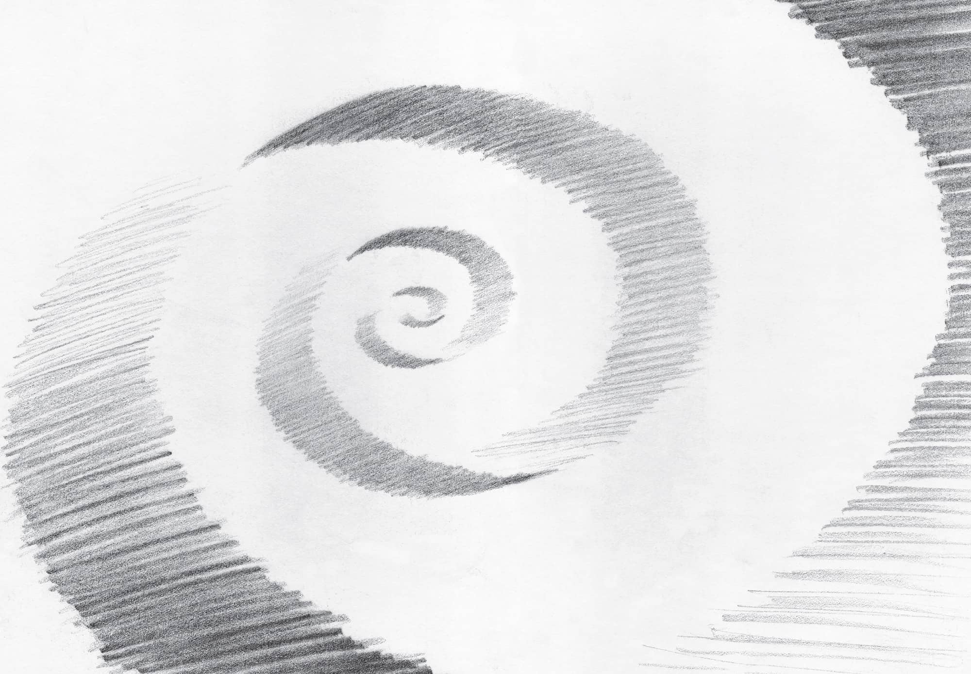
Spatiality fascinates the viewer; it independently draws him or her into the picture, whether it is objective or abstract. This book teaches methods of artistically depicting space: big and small, overlap, folds and waves, one-point perspective, shaping, fade, light, and shadow.

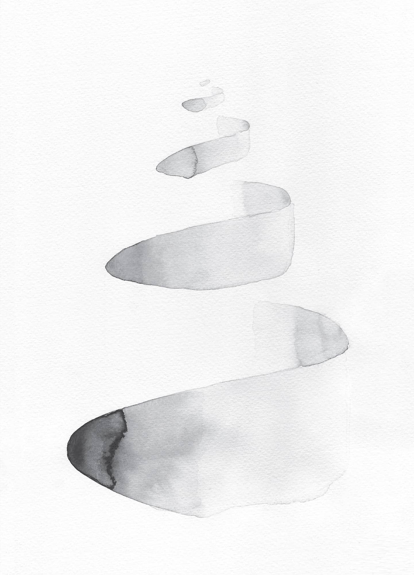
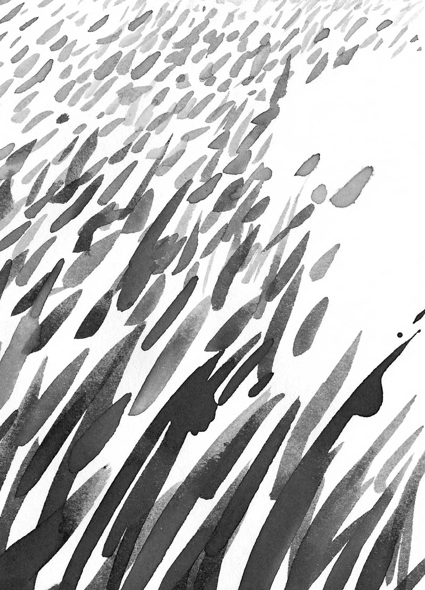
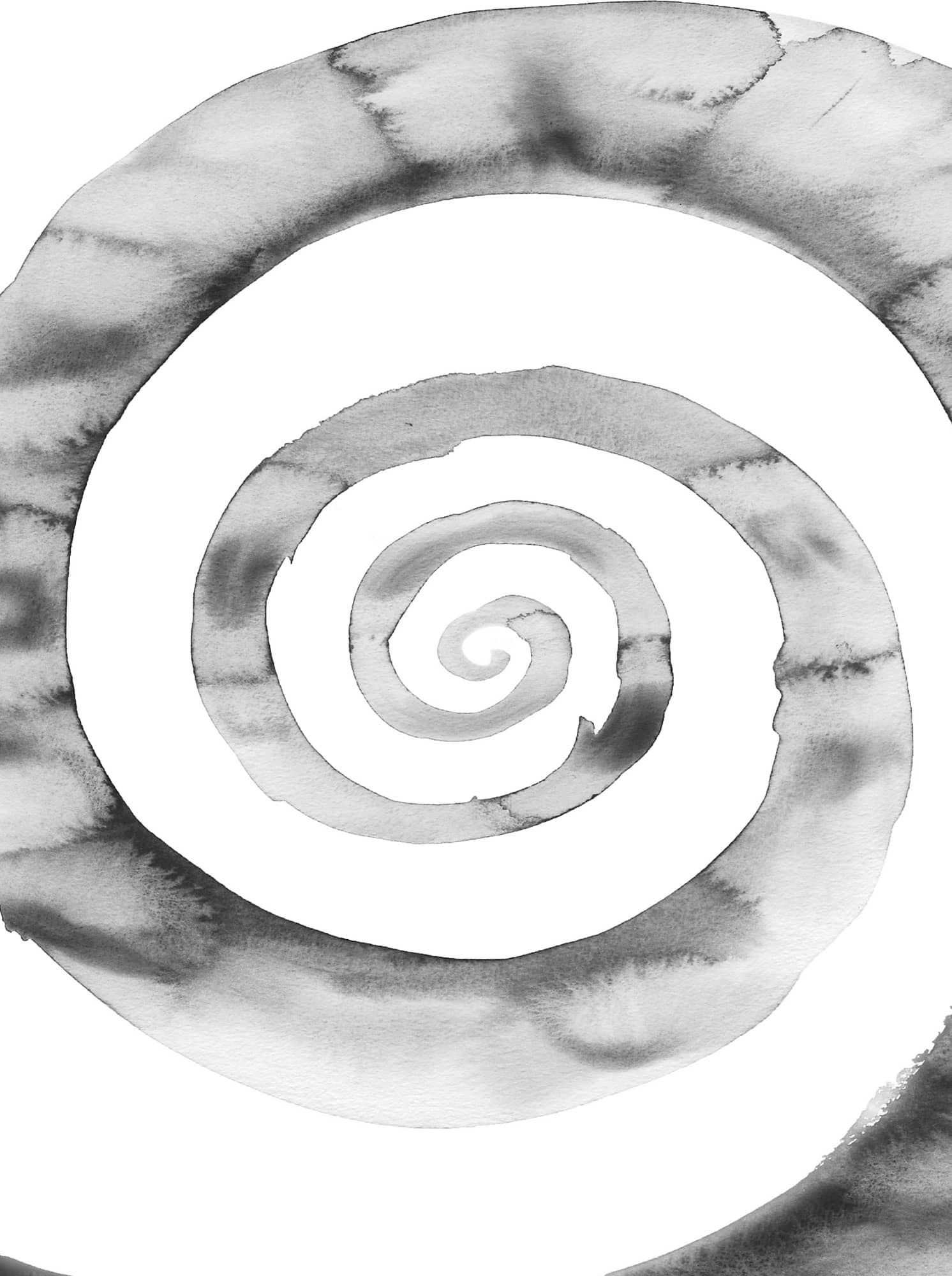
Big and small objects placed next to each other lead us to assume that the smaller one is farther back. An object partially covered by another in front of it allows us to see an overlap. Tracks that meet in the distance are moving toward a vanishing point, which is called one-point perspective. A circle turns into a ball when the object is shaped with light and shadow. Mountain ranges in the distance are paler than the boulder that is closer to us. Blurry shapes give us an inkling of vastness, while proximity is precisely represented. The features of three dimensionalities are based on the methods introduced here. When working on the exercises, the methods can be varied, combined, and refined, and they can be applied in both representational and new image creations.

1. Big and Small

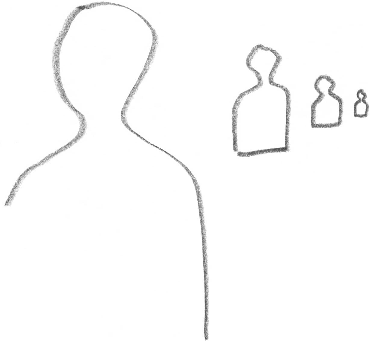
Sucessively reducing the size of objects and things creates the impression that they are positioned behind each other. On the other hand, children (similar to artists in the Middle Ages) draw the sizes of objects depending on importance, not distance. The top of the picture represents the back to them.

With objects of identical shape the smaller ones appear to sit farther back - photo 3
With objects of identical shape the smaller ones appear to sit farther back - photo 4
With objects of identical shape the smaller ones appear to sit farther back - photo 5

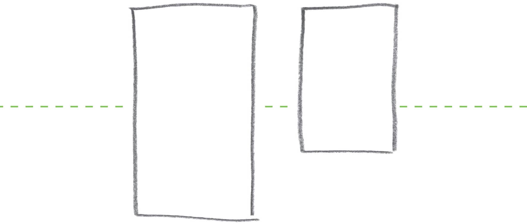
With objects of identical shape, the smaller ones appear to sit farther back.

Not only do shapes become smaller the distance between them becomes shorter - photo 6
Not only do shapes become smaller the distance between them becomes shorter - photo 7

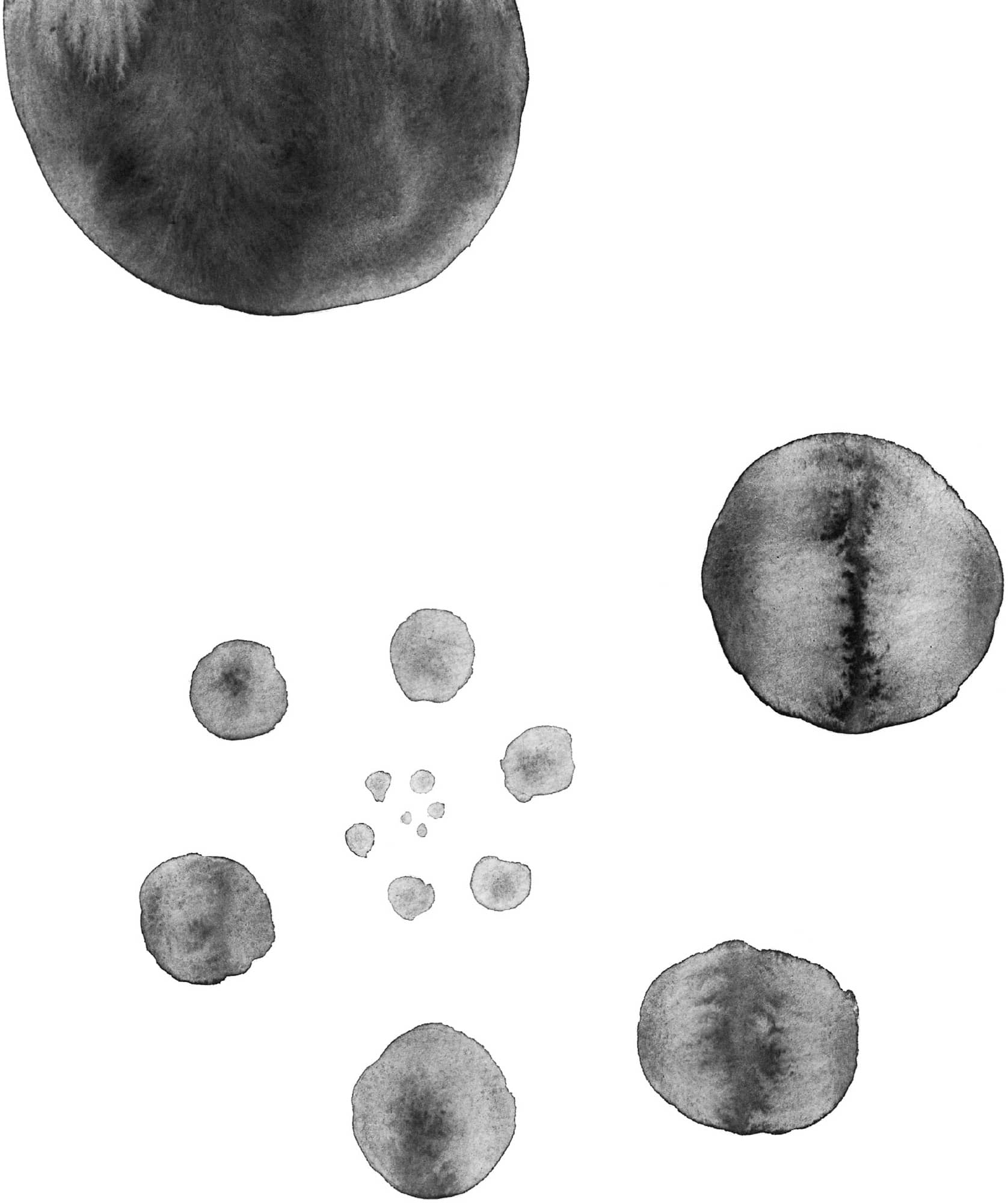
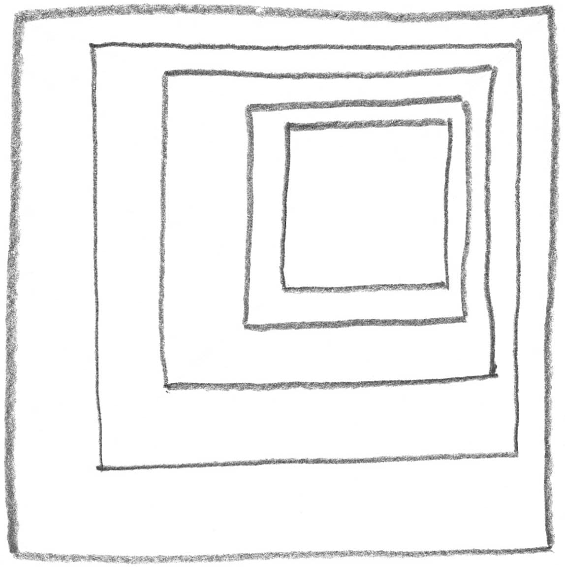
Not only do shapes become smaller, the distance between them becomes shorter the farther back they are.

Wide lines become thinner the more distant they are The impression of regular - photo 8

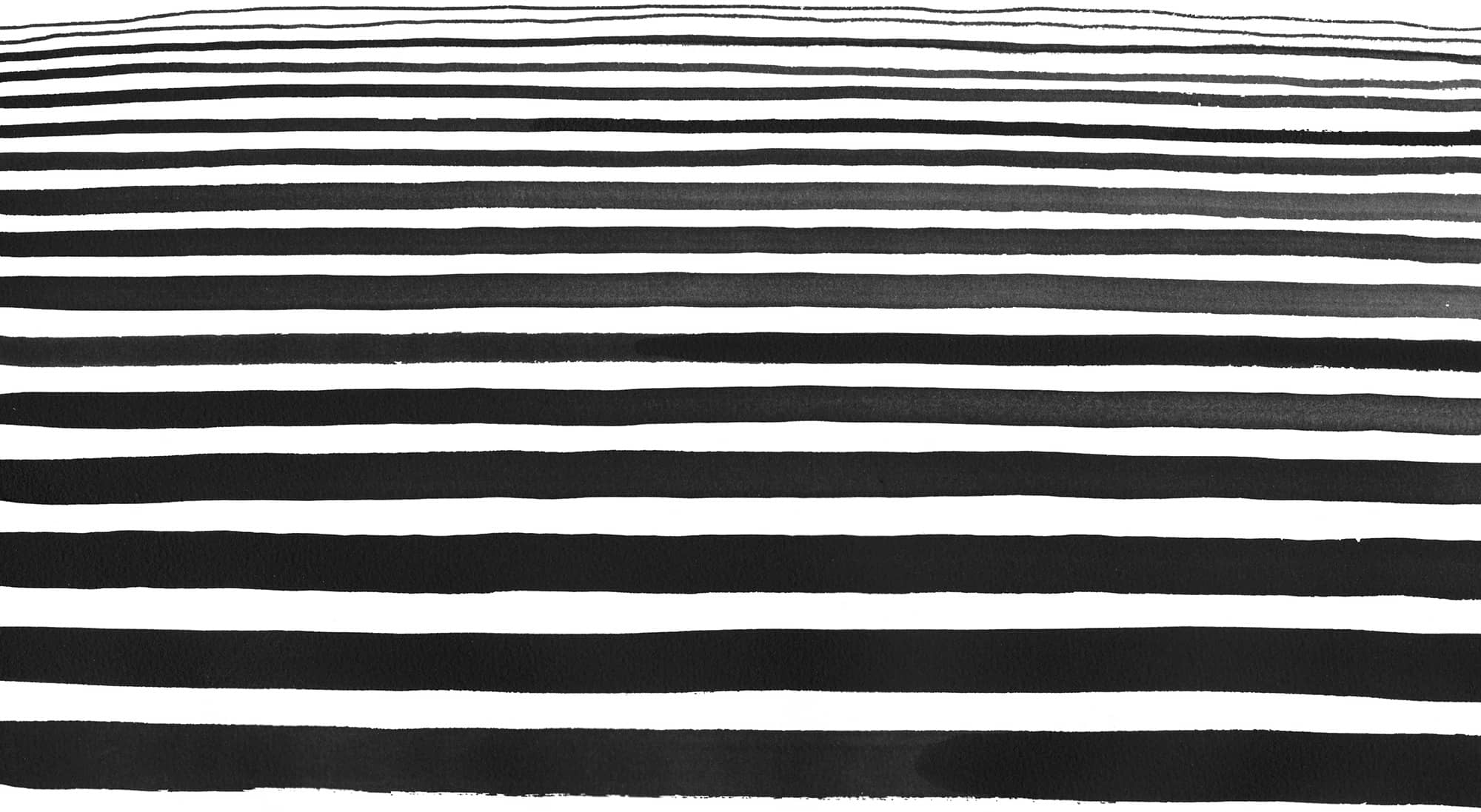
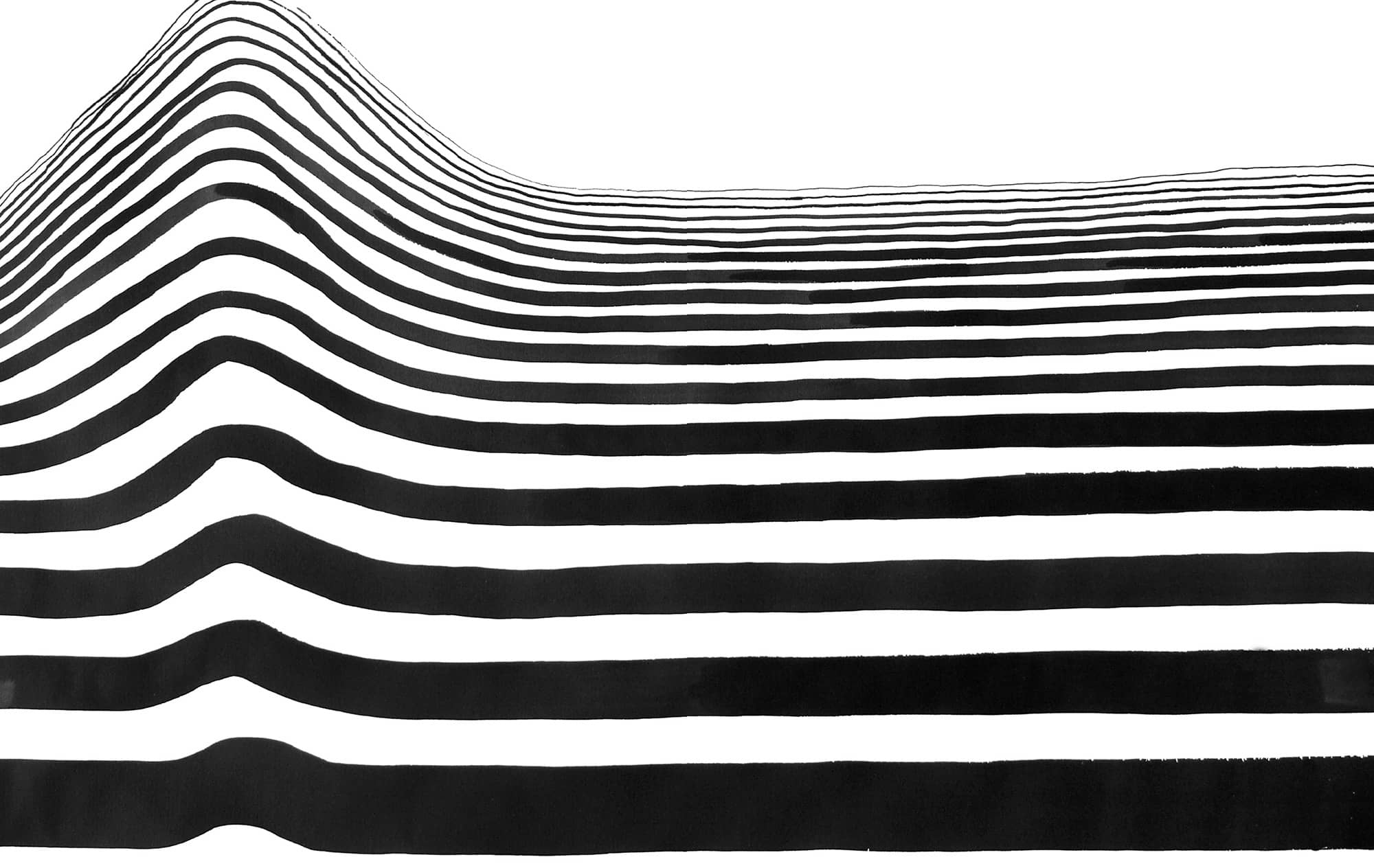
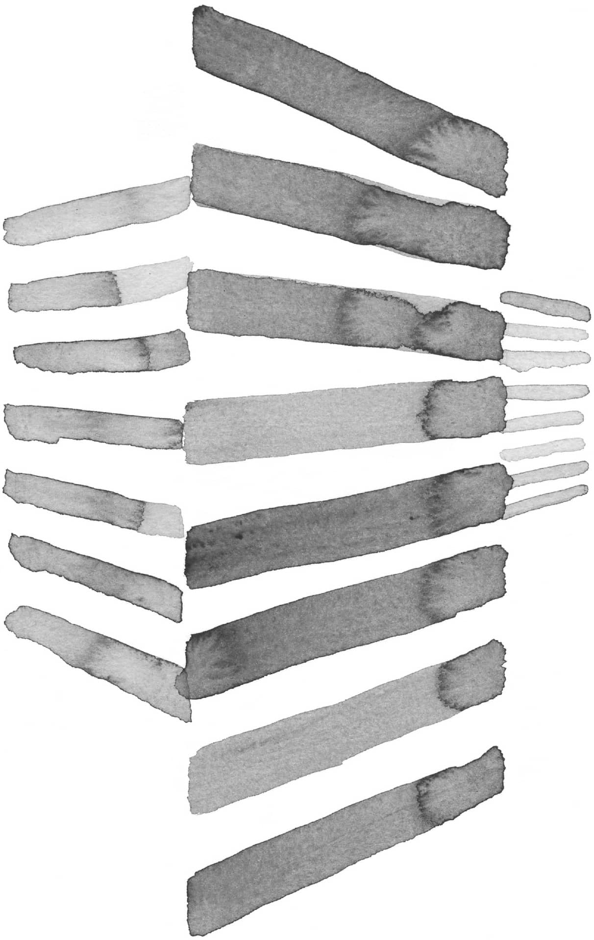
Wide lines become thinner the more distant they are. The impression of regular repetition is important for depth perception.

The imagined horizon line staggers the areas in space Below is in front - photo 9

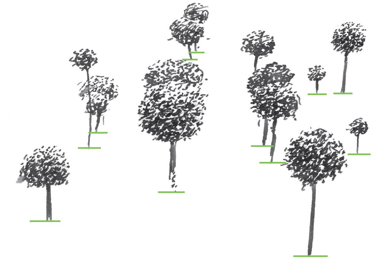
The imagined horizon line staggers the areas in space.

Below is in front above is in back no matter how big the trees are The - photo 10

Below is in front; above is in back no matter how big the trees are.

The street edge defines the terrain Thats why the gradually receding street - photo 11

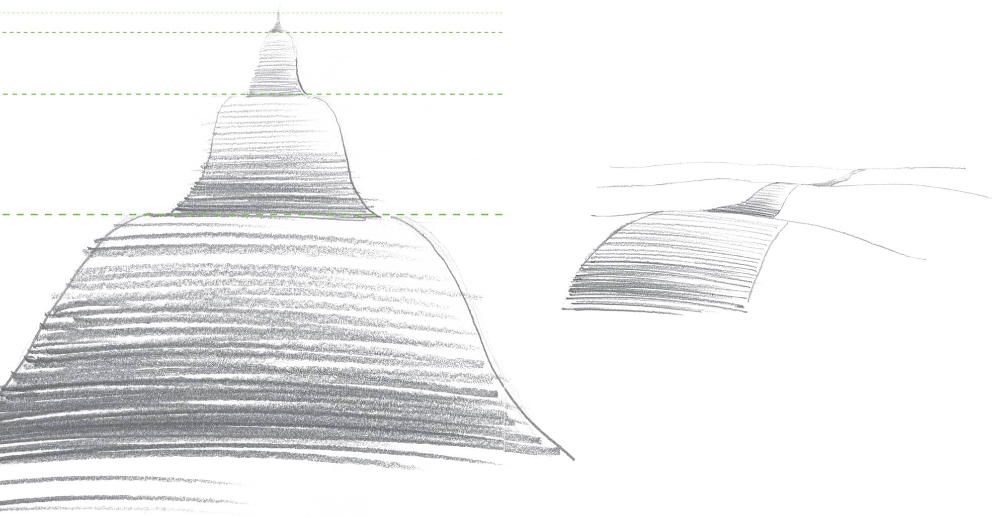
The street edge defines the terrain. Thats why the gradually receding street disappears behind the hills, its smooth course broken up.

The various line widths show the spatial order of the three walls When - photo 12
The various line widths show the spatial order of the three walls When - photo 13

The various line widths show the spatial order of the three walls.

When clear overlaps are missing it is not always obvious whether the small - photo 14

When clear overlaps are missing, it is not always obvious whether the small shapes are farther back than the bigger ones.

Depicted here are sounds swinging in space quiet and loud - photo 15

Depicted here are sounds swinging in space: quiet and loud.

Condensing generates depth The space pulls together at compressed areas - photo 16
Condensing generates depth The space pulls together at compressed areas - photo 17
Condensing generates depth The space pulls together at compressed areas - photo 18

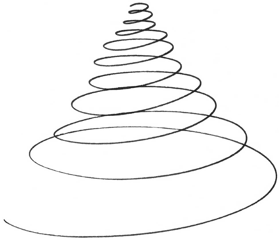
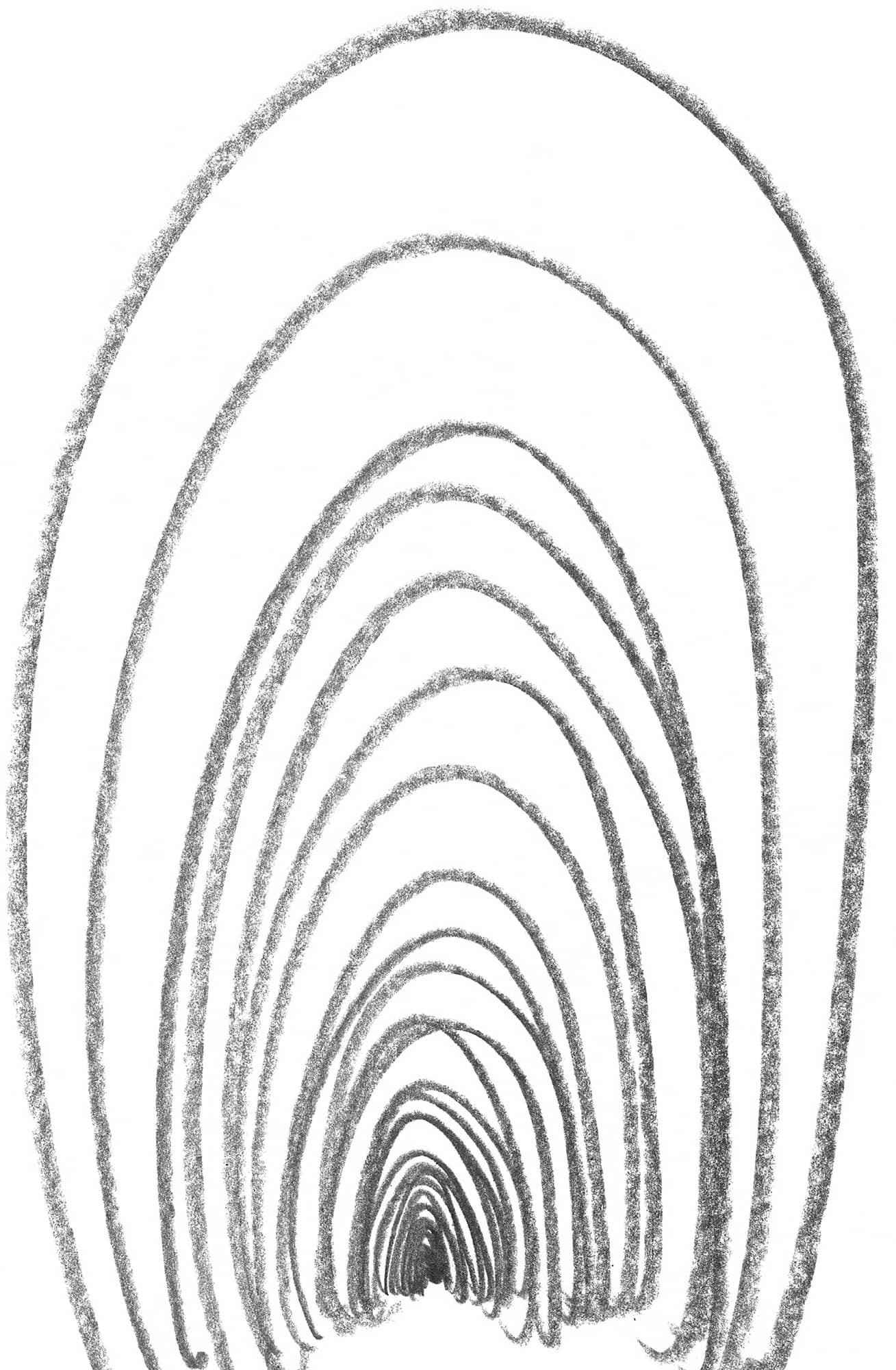
Condensing generates depth. The space pulls together at compressed areas because the distance between the lines is smaller there.

2 Overlap The visible reality is full of overlaps meaning objects partially - photo 19
2. Overlap

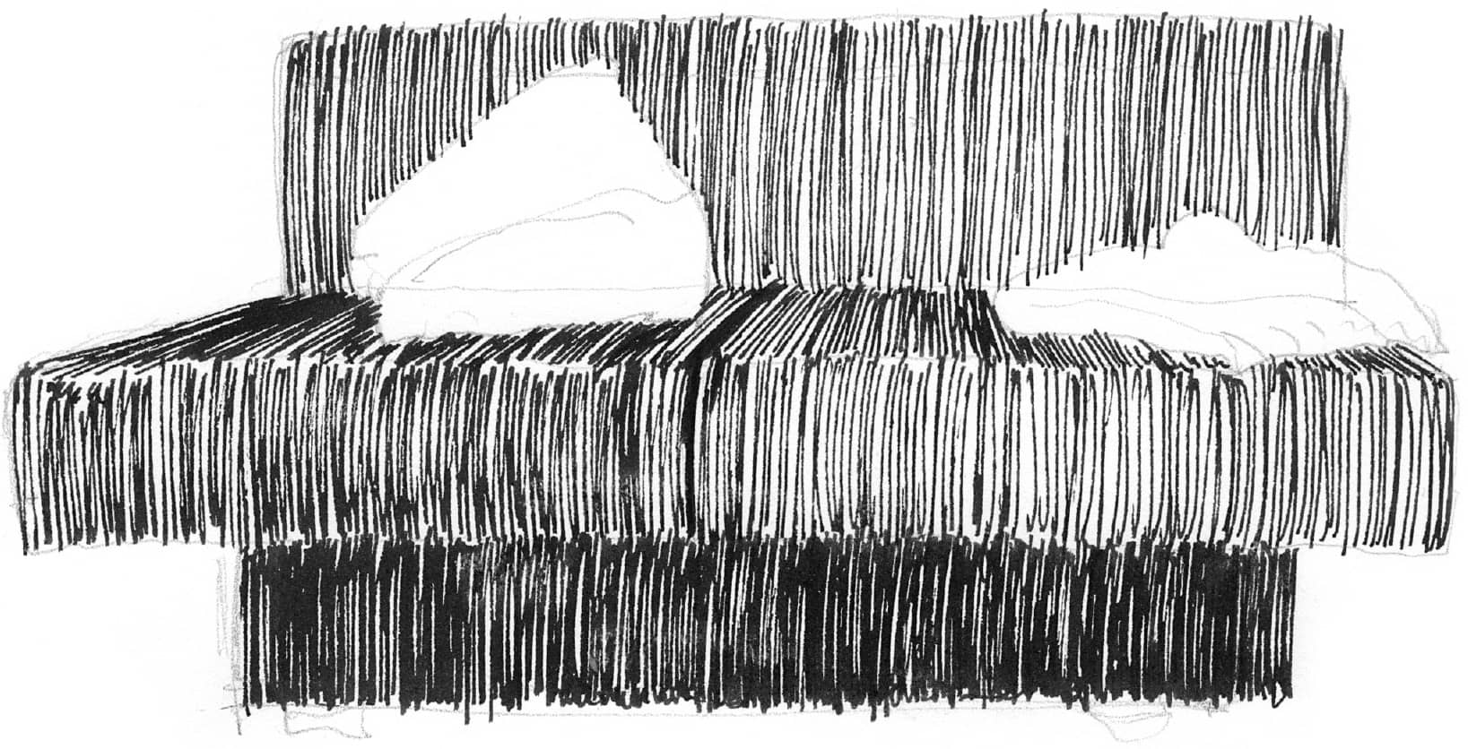
The visible reality is full of overlaps, meaning objects partially covering other objects. Lines are broken up if something, such as couch pillows, lies in front of it.

Overlaps are generated where something lies in front of another object - photo 20
Overlaps are generated where something lies in front of another object A - photo 21

Overlaps are generated where something lies in front of another object.

A loop alternates the inside and outside A white stripe lies on top of a - photo 22
A loop alternates the inside and outside A white stripe lies on top of a - photo 23

A loop alternates the inside and outside.

A white stripe lies on top of a single dark area because both parts are - photo 24

A white stripe lies on top of a single dark area because both parts are perceived as one unit.

Obviously a rectangle is lying in front of the image plane The dark spots move - photo 25

Obviously a rectangle is lying in front of the image plane. The dark spots move into the background because our perception prefers crisp, concise shapes.

Next page
Light

Font size:

Reset

Interval:

Bookmark:

Make

Similar books «Drawing Perspective Methods for Artists: 85 Methods for Creating Spatial Illusion in Art»

Look at similar books to Drawing Perspective Methods for Artists: 85 Methods for Creating Spatial Illusion in Art. We have selected literature similar in name and meaning in the hope of providing readers with more options to find new, interesting, not yet read works.


Reviews about «Drawing Perspective Methods for Artists: 85 Methods for Creating Spatial Illusion in Art»

Discussion, reviews of the book Drawing Perspective Methods for Artists: 85 Methods for Creating Spatial Illusion in Art and just readers' own opinions. Leave your comments, write what you think about the work, its meaning or the main characters. Specify what exactly you liked and what you didn't like, and why you think so.