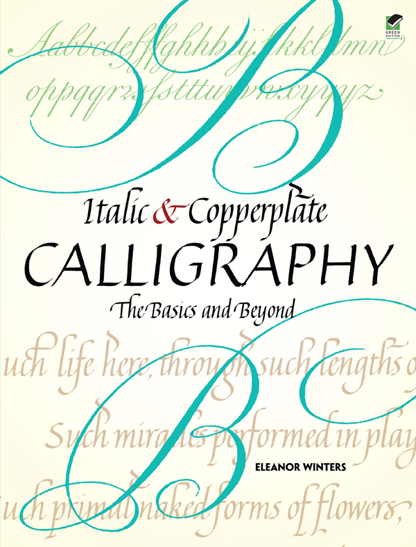
Eleanor Winters - Italic and Copperplate Calligraphy: The Basics and Beyond
Here you can read online Eleanor Winters - Italic and Copperplate Calligraphy: The Basics and Beyond full text of the book (entire story) in english for free. Download pdf and epub, get meaning, cover and reviews about this ebook. year: 2011, publisher: Dover Publications, genre: Children. Description of the work, (preface) as well as reviews are available. Best literature library LitArk.com created for fans of good reading and offers a wide selection of genres:
Romance novel
Science fiction
Adventure
Detective
Science
History
Home and family
Prose
Art
Politics
Computer
Non-fiction
Religion
Business
Children
Humor
Choose a favorite category and find really read worthwhile books. Enjoy immersion in the world of imagination, feel the emotions of the characters or learn something new for yourself, make an fascinating discovery.
- Book:Italic and Copperplate Calligraphy: The Basics and Beyond
- Author:
- Publisher:Dover Publications
- Genre:
- Year:2011
- Rating:4 / 5
- Favourites:Add to favourites
- Your mark:
Italic and Copperplate Calligraphy: The Basics and Beyond: summary, description and annotation
We offer to read an annotation, description, summary or preface (depends on what the author of the book "Italic and Copperplate Calligraphy: The Basics and Beyond" wrote himself). If you haven't found the necessary information about the book — write in the comments, we will try to find it.
In recent years, calligraphy has evolved from an esoteric art form to an everyday pursuit for artists, students, and amateurs. This guide for novices with some experience offers the chance to advance to the next level. Well-illustrated, step-by-step instructions by an expert calligrapher explain every detail of the two most popular calligraphic alphabets..
Author Eleanor Winters introduces the Italic hand, which originated during the Renaissance, and the Copperplate style, which dominated European calligraphy during the eighteenth century. Her three-part approach begins with a review of the basics, advancing to variations in letter size, form, weight, and flourishes. It concludes with a wealth of advice on layout and design as well as inspiration for original projects.
Eleanor Winters: author's other books
Who wrote Italic and Copperplate Calligraphy: The Basics and Beyond? Find out the surname, the name of the author of the book and a list of all author's works by series.


Italic and Copperplate Calligraphy: The Basics and Beyond — read online for free the complete book (whole text) full work
Below is the text of the book, divided by pages. System saving the place of the last page read, allows you to conveniently read the book "Italic and Copperplate Calligraphy: The Basics and Beyond" online for free, without having to search again every time where you left off. Put a bookmark, and you can go to the page where you finished reading at any time.
Font size:
Interval:
Bookmark:
ITALIC and
COPPERPLATE
CALLIGRAPHY
The Basics and Beyond
E LEANOR W INTERS
DOVER PUBLICATIONS, INC.
M INEOLA, N EW Y ORK
For Leendert and the Kitchen Girls
_________________________
Copyright
Copyright 2011 by Eleanor Winters
All rights reserved.
Bibliographical Note
Italic and Copperplate Calligraphy: The Basics and Beyond
is a new work, first published by
Dover Publications, Inc., in 2011.
International Standard Book Number
ISBN-13: 978-0-486-47749-7
ISBN-10: 0-486-47749-5
Book design by Jason Snyder
Manufactured in the United States by Courier Corporation
47749501
www.doverpublications.com
Table of Contens
A Review of the Basics: Information
Common to Both Italic & Copperplate
CALLIGRAPHY CONTINUED:
LETTER VARIATIONS
I am Very grateful to the following extraordinary calligraphers who most generously permitted me to publish their artwork: Pat Blair, Mike Kecseg, Alice Koeth, Caroline Paget Leake, Carole Maurer, Barry Morentz, Anna Pinto, Sheila Richter, Michael Sull, and Jeanyee Wong. I would also like to thank Lisa Weingarten for her very fine photography, and Kay Radcliffe, whose beautiful marbled paper was specially created for this book.
A great debt is owed to Jeanette Green, without whose advice and support this book would not have been started, and to John Grafton and Suzanne E. Johnson at Dover Publications who helped bring the project to fruition.
I am also indebted to John Golden and Laurent Raccah for technological advice and troubleshooting, invaluable in these computer-driven times.
My gratitude also goes to the John Paul Getty Museum and to Dover Publications for granting permission to publish the historical examples reproduced herein.
And finally, I would like to thank Bob Cooperman, Caroline Paget Leake, Carrie Robbins, Julia Paterson, Kathryn Sartori, Kathy Wallace, Terry Moriber, Roberta Wetherbee, and, of course, Leendert, for ongoing support and encouragement during the (several) years that this book was in the works.
During the last twenty-five years, the popularity of calligraphy has been growing steadily. Calligraphy has evolved from an esoteric art form to an everyday pursuit for artists, students, and interested amateurs. This gratifying, not to say meteoric, development is witnessed by the ever-growing number of classes, workshops, exhibitions, books, and calligraphy organizations. Just a few years ago, this was not the case. To many, calligraphy was a relatively unknown art, a footnote in the history of twentieth-century art education and, indeed, a word that was unfamiliar to a remarkable number of otherwise well-informed people. An often repeated anecdote concerns a student who sat through an entire two-hour introductory session of an Italic class, only to realize that he was in the wrong room; hed registered for a class in upholstery!
As with other popular forms of art, there are many possible resources available for the beginner: classes, how-to books, lectures, and demonstrations. It seems that just about every adult-education program and community center offers classes entitled Introduction to Calligraphy, Beginning Italic, or Copperplate 1. Bookstores are well stocked with manuals and textbooks for these classes, as well as a number of calligraphy-as-art books, showing the work of contemporary calligraphic artists, as well as beautiful examples of writing and illuminating from the past. These art books serve as an inspiration to beginners and experienced calligraphers alike, but they generally dont give any step-by-step instructions.
And that is where Italic and Copperplate Calligraphy comes in. The purpose of this book is to begin where the others leave off, to answer the big questions: Whats next? and Where do I go from here? These are the questions so often asked at the end of beginner classes, when students are familiar with the minuscule and capital letters, have been introduced to the concept of spacing, addressed an envelope or two, and have been given a glimpse of the principles of layout and design. The luckier students are offered an Italic 2 class, or perhaps an Intermediate Copperplate workshop, but the majority of neophyte calligraphers are left without direction or more advanced instruction.
Italic and Copperplate Calligraphy will attempt to provide the map for this uncharted territory. We have chosen the two most popular hands (calligraphic alphabets) as our area of focus. As previously noted, Italic and Copperplate are the most common choices in introductory calligraphy classes, especially in the United States. (In the UK, Foundational is more often taught as a primary calligraphic hand, but this is less frequently the case in the U.S.)
Italic and Copperplate have many characteristics in common, but also differ in many important regards. It is their position in the educational hierarchy that brings them immediately to mind as the appropriate choices for an intermediate/advanced level book. In the following chapters, we will consider these similarities and differences. We will study Italic and Copperplate in both their shared principles and their individual characteristics.
Although this book is primarily aimed at the non-beginner, we are including a few chapters which cover the basics. These can serve as either an in-depth review for those familiar with Italic and/or Copperplate, or as an introduction for enthusiastic students who wish to start at the beginning and progress to more complicated ideas, exercises, and projects. Whatever your level of expertise may be, these chapters are worth a few minutesand possibly a lot more than thatof your time.
And finally, this book may also serve as an interesting resource as well as a challenge to calligraphers who are adept at either Italic or Copperplate, but unfamiliar with the other alphabet. It is hoped that the dual focus of this book will help these calligraphers to learn the other style, by comparing and contrasting it with the one which they already know. We hope that whichever group you may fall into, beginner or intermediate in both Italic and Copperplate, or experienced with one of these alphabets but not the other, Italic and Copperplate Calligraphy will offer you a new approach to calligraphy as a living and evolving art form.
PART 1
The Basics
Italic AND Copperplate /
Italic OR Copperplate
Choosing between two beautiful and useful styles of calligraphy can be daunting. Before embarking on the study of calligraphy, beginners are frequently faced with exactly this choice. They may make their decisions by asking themselves some questions:
1. Which style appeals to me more?
2. Would Italic or Copperplate be more useful to me?
3. Which class is being offered at a time that fits into my schedule?
If you are equally drawn to both alphabets, and scheduling is not a problem, another question may arise: Why not learn both?
There are good reasons both for and against studying the two scripts simultaneously. If you have no familiarity with either Italic or Copperplate, and especially if you have never used a calligraphy pen of any kind, it is probably preferable to make a choice. Why? Since the two alphabets are written with very different pens, achieving the motor control for each is, of necessity, a separate process that requires exercise and concentrated practice.
We say probably preferable rather than absolutely essential because, with a reasonable amount of effort (and quite a lot of practice time), learning two sets of motor skills is certainly not out of the question. But most of us are circumscribed by time limitations, so even with the best intentions and a fully focused mind, learning to use the tools for Italic and Copperplate simultaneously can be quite difficult.
We therefore recommend that you, the beginner, make a choice. But which to choose? Choose the hand that you prefer. Thinking about commercial uses for calligraphy and/or calligraphy-for-profit at this time is fairly pointless. We will discuss how to get rich doing calligraphy (just joking) later in this book, but for the moment, be advised: you will not be going into business as a calligrapher quite yet. So look at some examples of Italic and Copperplate and make a choice.
Next pageFont size:
Interval:
Bookmark:
Similar books «Italic and Copperplate Calligraphy: The Basics and Beyond»
Look at similar books to Italic and Copperplate Calligraphy: The Basics and Beyond. We have selected literature similar in name and meaning in the hope of providing readers with more options to find new, interesting, not yet read works.
Discussion, reviews of the book Italic and Copperplate Calligraphy: The Basics and Beyond and just readers' own opinions. Leave your comments, write what you think about the work, its meaning or the main characters. Specify what exactly you liked and what you didn't like, and why you think so.