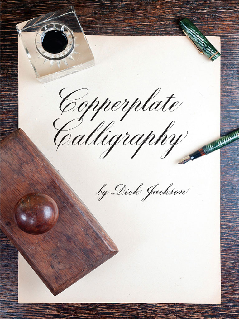
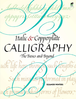
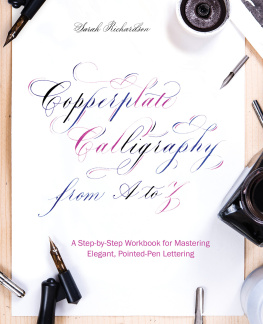
Jackson - Copperplate Calligraphy
Here you can read online Jackson - Copperplate Calligraphy full text of the book (entire story) in english for free. Download pdf and epub, get meaning, cover and reviews about this ebook. City: Mineola;New York, year: 2016;2015, publisher: Dover Publications, genre: Children. Description of the work, (preface) as well as reviews are available. Best literature library LitArk.com created for fans of good reading and offers a wide selection of genres:
Romance novel
Science fiction
Adventure
Detective
Science
History
Home and family
Prose
Art
Politics
Computer
Non-fiction
Religion
Business
Children
Humor
Choose a favorite category and find really read worthwhile books. Enjoy immersion in the world of imagination, feel the emotions of the characters or learn something new for yourself, make an fascinating discovery.
Copperplate Calligraphy: summary, description and annotation
We offer to read an annotation, description, summary or preface (depends on what the author of the book "Copperplate Calligraphy" wrote himself). If you haven't found the necessary information about the book — write in the comments, we will try to find it.
Jackson: author's other books
Who wrote Copperplate Calligraphy? Find out the surname, the name of the author of the book and a list of all author's works by series.


Copperplate Calligraphy — read online for free the complete book (whole text) full work
Below is the text of the book, divided by pages. System saving the place of the last page read, allows you to conveniently read the book "Copperplate Calligraphy" online for free, without having to search again every time where you left off. Put a bookmark, and you can go to the page where you finished reading at any time.
Font size:
Interval:
Bookmark:
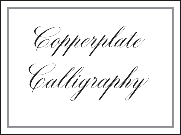
Copperplate Calligraphy
by Dick Jackson
D OVER P UBLICATIONS , I NC . M INEOLA , N EW Y ORK
Copyright
Copyright 1979 by Dick Jackson
All rights reserved.
Bibliographical Note
This Dover edition, first published in 2015, is an unabridged republication of the work originally published by Collier Books, a division of Macmillan Publishing Co., Inc., in 1979.
International Standard Book Number
ISBN-13: 978-0-486-80386-9
ISBN-10: 0-486-80386-4
Manufactured in the United States by RR Donnelley
80386401 2015
www.doverpublications.com
Contents
Introduction
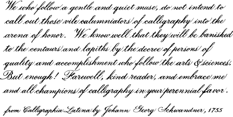
C OPPERPLATE . What has copper got to do with a style of calligraphy? The best way to answer the question is to look very briefly at the history of this style.
The direct ancestor, the beginning of the use of a flexible pen to achieve differences in stroke width, was the French Ronde in the seventeenth century. The English quickly adopted and adapted it; much for its economic appeal in being swift in execution, though still neat and legible for use in the rapidly expanding world of commerce. With the growth in demand for clerks who could write this style, there was a corresponding growth in teachers of the style. Their stock in trade was the copybook containing their instructions and examples.
The writing-masters penned their works, then took them to an engraver who could copy all the variations in turn and line thickness in a sheet of copper. These engraved copper plates then were used to print the copybooks. The style was at this time called Round Hand or Round Text.
The term round hand had been used for other styles and was sometimes referred to as English Round Hand in an attempt to distinguish it from broad-pen styles with the same name. Later on it came to have a number of names including Engravers Script, Engrossers Script, or just Script. There seems to be less likelihood of confusion if the style is called Copperplate, so that is the name I will use for it throughout the book.
As the competition among the writing masters both in England and America grew, each strived to make his copybook just a little different, a little better, than his rivals. In this effort, they took more and more advantage of the ability of the engraver to produce thick or thin lines anywhere in a letter or stroke. As a consequence, they added swirls, flourishes, strikings, and thick and thin strokes without regard to the ordinary position of pen and paper for writing. Some of the instructions directed the student to keep the point of the pen on the paper while turning the paper 180 degrees for the continuation of a stroke.
As a result, much of the Copperplate of the nineteenth and twentieth centuries isnt calligraphed at all; it is drawn.
In this book, I try to maintain Copperplate as calligraphy. There are no paper, pen, or body manipulations required to execute any letter. The strokes comprising the letters are made with ordinary pen movements in an ordinary sequence. In other words, the letters are calligraphed, not drawn.
There is little in this book that is original. I have studied and tried to emulate the work of many authors and writing-masters, old and not so old. Most of what I give you is the distillation of my own study from those many sources. Even a presentation of the minuscules as a combination of a limited number of identical strokes has been done. In 1791, John Jenkins had printed a book titled The Art of Writing Book I in which he did this. I havent had the honor of seeing the book, but I am aware of its existence and the stroke principle he used. I dont think I knew about it when I first started teaching Copperplate by this approach several years ago. But it works.
The order and emphasis of these instructions are the product of having taught Copperplate to several hundred students. I recommend that you follow the order and heed the emphasis. They work.
Copperplate Calligraphy
Materials
T HERE ARE FOUR INGREDIENTS necessary to produce calligraphy of any kind: the pen, the ink, the paper, and the calligrapher. You are, or will be, the calligrapher. So this section will briefly cover the other three components.
You will need an offset (or oblique or elbow) penholder and flexible nibs. The penholder has an offset so that you can aim the nib along the paper at a steeper angle than would be comfortable otherwise. Aiming and angle will be discussed later. The nib is flexible so it spreads when pressure is applied to it and closes when the pressure is released.
The nib, like all metal nibs, is shipped from the manufacturer with a thin film of oil on it. In order for the ink to flow well, this film of oil should be removed. You can do this in several ways. Hold the nib in your mouth awhile and your saliva will remove the oil. They really dont taste all that bad, but a sudden sneeze might create a problem. Spray it with one of the liquid household cleaners, rinse, and dry it. The quickest and easiest way is to hold it briefly over the flame of a match or cigarette lighter. Move it back and forth to get it black all over, but dont let it get red hot. Its a good idea to insert the nib in the holder before you heat it so you dont burn your fingers on the hot nib.
A good paper to learn and practice on is a tablet of translucent white, unruled paper. Having the paper in a tablet serves several purposes that loose sheets wont. The tablet will hold the underlay guide sheets firmly enough so that you wont need paper clips or tape to keep them from slipping. The paper in the tablet will serve as a good pad under the sheet on which youre writing. Its better not to write on a hard surface since any irregularities will affect the pen strokes, and, even if the surface is perfectly smooth, the pen just works better if there is a little padding under the paper. If you dont tear the sheets out, the tablet will serve as a chronological file of your practice efforts. Its great for the morale, when youre a little dejected after some hard practice because you dont feel you are making any headway, to go back through the sheets from previous practices and see just how much progress youve made. It would be desirable for the reader to make tracings of the guide sheets at the back of this book. Guide sheets should then be used as suggested.
Some papers that work well for regular or italic pens may not be as good for Copperplate and vice versa. The only way to tell for sure if a particular paper is good is to try it, or ask another Copperplate calligrapher who has.
Ink for the flexible nib needs to be a little thicker than ink for other pens. A good ink is Higgins Eternal, made slightly more viscous by the addition of ten or twelve drops of gum arabic. This ink dries to a dark, flat black. There are other inks which work very well. Some, like the oriental inks, dry to a glossy finish. A good ink will be viscous enough to allow the nib to hold a full load without it all flowing out when pressure is applied for a dark down-stroke, but thin enough to flow at the lightest possible touch of the nib on paper.
If you dont have gum arabic, you can thicken the ink some by leaving the cap off the bottle and letting the ink evaporate a few days. The number of days depends on how humid the air is. You will soon find that the opening in the standard two-ounce ink bottle is too small to dip your nib in easily, so you may want to get a wider-mouthed bottle. Small baby food jars or some types of medicine bottles serve very well.
Next pageFont size:
Interval:
Bookmark:
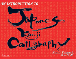
Similar books «Copperplate Calligraphy»
Look at similar books to Copperplate Calligraphy. We have selected literature similar in name and meaning in the hope of providing readers with more options to find new, interesting, not yet read works.
Discussion, reviews of the book Copperplate Calligraphy and just readers' own opinions. Leave your comments, write what you think about the work, its meaning or the main characters. Specify what exactly you liked and what you didn't like, and why you think so.