Introduction
IN OUR EVER-INCREASINGLY MECHANICAL AND DIGITAL WORLD, HANDMADE ITEMSthings that bear the fingerprints, experience, and the heart and soul of their creatorare especially meaningful. Part of the handcrafted renaissance has been a renewed interest in everything lettered by hand. This has spurned a gorgeous modern pointed-pen style, done with the pointed nib in an unstructured style.
Todays millennial calligraphy style evolved from traditional pointed-nib lettering, and those historical styles are the focus of this book. In the pages that follow, we will explore calligraphy exemplars from the periods when the various hands were in use. Then we will use these exemplars to study these iconic traditional calligraphy styles.
Well focus on script pointed-pen styles of calligraphy, from the origins of pointed pen in Renaissance Italy (Cancellaresca Corsiva) to Copperplate, Bickham, Italian hand, and Spencerian. Well supplement these traditional styles with some less common styles: pointed-pen Uncials and Roman, which are very useful for calligraphy projects.
Well also cover the most elegant hand-lettering styles to pair with pointed-pen scripts, beginning in the mists of old Ireland with the intricate Celtic Uncial styles. Well move to the European Medieval period and study gothic scripts. Well also look at over-the-top Victorian embellished letters and elaborate Art Nouveau letters.

The word calligraphy comes from the Greek words calli (beautiful) and graphein (to write). So calligraphy is, by definition, beautiful writing! Im certain that as long as people have been communicating visually, there has been both a need and desire to do it beautifully.
How to Use This Book
THE CREATIVE PROMPTS, TIPS, PROJECTS, AND EXERCISES IN THIS BOOK are designed to inspire you to learn the art of traditional pointed-pen calligraphy. Inside these pages, you will learn how to create a variety of classic alphabets, as well as how to use them. Historical tidbits are included along the way for context and understanding of how these traditional letterforms came to be.
In , youll learn basic calligraphy terms, techniques, and terminology. Youll also discover how to work with a range of calligraphy tools and color media, set up a work station for maximum success, warm up your hand, learn basic strokes, and enjoy the creative process along the way.
In , you will dive into learning the art of crafting beautiful hands and scripts, such as Copperplate, Spencerian, Italian, and many more. Youll be treated to the basic strokes of each featured hand in addition to fun practice prompts and inspiring creative exercises.
is devoted to specific styles of calligraphy that are timeless and evergreen. These include a range of Victorian hands, as well as Gothic and Art Nouveau styles.
Finally, beautiful step-by-step projects demonstrate how to use the letters you have learned, while lettering templates and open practice pages encourage you to put your pen to paper immediately!
Part I: Getting Started
Calligraphy is a craft that does not require many tools or materials. All you need to begin is a pen, nib, ink, paper, and practice!
Calligraphy & Lettering Basics


The Importance of Lines
Lines are important in lettering for practice and learning, as well as for creating finished pieces.
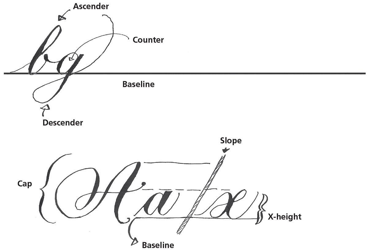
There are four key lines in calligraphy: baseline, x-height, cap height, and slant line. These lines are arguably the most important aspect of creating beautiful and legible calligraphic art.
The baseline is the line upon which all the letters rest.
The x-height is the height of a small letter x placed upon the baseline. When creating letters, its a priority to keep them nicely placed along the baseline, and to keep all the x-height letters within the x-height.
The cap height is the height of the capital letters, or majuscules.
The slant line is the line at which the letters are sloped. Keep all downstrokes at this angle.
General Points
The slope of the letterthe line that shows the angle at which the letter has been constructedis vital for defining the style of the lettering, as well as maintaining its fluidity.
Letters written in a very upright fashionno slopetend to have a more casual feel.
Highly slanted letters have a more formal feel.
Maintaining a consistent slope among all your strokesthat is, maintaining a similar angle of all heavy downstrokesis key to creating a unified look. As a general rule (and rules are meant to be broken, but thats another story!), keep all downstrokes on the same slant line.
Traditional script pointed-pen styles have a fixed slant line that must be followed to maintain the look of the hand.
Modern calligraphy has no fixed slope line, which adds to its individuality.
Always use lines when writing. This is so important to creating elegant calligraphy. As you become more comfortable and practiced with your calligraphy and lettering, you may only need to use a baseline.
Using a light box, or other lighting setup, allows you to see guidelines without having to draw them on the page. A light box is worth its weight in gold to a calligrapher!
Tools & Materials
