Jane Sullivan - Calligraphy: A Comprehensive Guide to Beautiful Lettering
Here you can read online Jane Sullivan - Calligraphy: A Comprehensive Guide to Beautiful Lettering full text of the book (entire story) in english for free. Download pdf and epub, get meaning, cover and reviews about this ebook. year: 2016, publisher: Peter Pauper Press, genre: Home and family. Description of the work, (preface) as well as reviews are available. Best literature library LitArk.com created for fans of good reading and offers a wide selection of genres:
Romance novel
Science fiction
Adventure
Detective
Science
History
Home and family
Prose
Art
Politics
Computer
Non-fiction
Religion
Business
Children
Humor
Choose a favorite category and find really read worthwhile books. Enjoy immersion in the world of imagination, feel the emotions of the characters or learn something new for yourself, make an fascinating discovery.

- Book:Calligraphy: A Comprehensive Guide to Beautiful Lettering
- Author:
- Publisher:Peter Pauper Press
- Genre:
- Year:2016
- Rating:3 / 5
- Favourites:Add to favourites
- Your mark:
Calligraphy: A Comprehensive Guide to Beautiful Lettering: summary, description and annotation
We offer to read an annotation, description, summary or preface (depends on what the author of the book "Calligraphy: A Comprehensive Guide to Beautiful Lettering" wrote himself). If you haven't found the necessary information about the book — write in the comments, we will try to find it.
Discover the timeless art of beautiful writing! This introduction to creating calligraphy combines beginner-friendly clarity with thorough guidance and, of course, gorgeous examples. Written and illustrated by master calligrapher Jane Sullivan, this book introduces nine major calligraphic styles, with detailed diagrams and tips for writing each letter. Sub-sections include histories of each alphabet; step-by-step tutorials for embellishing your calligraphy; and ways to showcase your elegant lettering, from a hand-made envelope to a decorative dinner menu. Printed in full color, its a pleasure to look at as well
Jane Sullivan: author's other books
Who wrote Calligraphy: A Comprehensive Guide to Beautiful Lettering? Find out the surname, the name of the author of the book and a list of all author's works by series.


Calligraphy: A Comprehensive Guide to Beautiful Lettering — read online for free the complete book (whole text) full work
Below is the text of the book, divided by pages. System saving the place of the last page read, allows you to conveniently read the book "Calligraphy: A Comprehensive Guide to Beautiful Lettering" online for free, without having to search again every time where you left off. Put a bookmark, and you can go to the page where you finished reading at any time.
Font size:
Interval:
Bookmark:
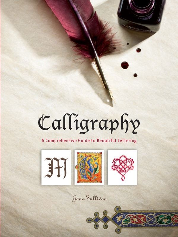
A Comprehensive Guide to Beautiful Lettering
Written and illustrated by
Jane Sullivan

Acknowledgments
My special thanks to Corinne de Montalembert, Colette Hanicott, Didier Boursin, and Franois Junot.
Text copyright 2016 Jane Sullivan
English translation by Jane Sullivan
Originally published in France as Calligraphie
Dessain et Tolra / Larousse 2011
Photo credits
page 12: ms NAL 2334, Bibliothque nationale de France;
page 22: Book of Kells, ms 58, fol. 104 r Trinity College Library, Dublin;
page 32: ms Rawlinson B 502, fol. 33 v, The Bodleian Libraries, University of Oxford;
page 42: ms Add 47673, fol. 15, British Library, UK;
page 52: ms 103, 13th-century Breviary, fol. 001 (2nd pagination): Beatus Cambrai, Mdiathque municipale, clich CNRS-IRHT;
page 64: LATIN 9474, Bibliothque nationale de France, Paris;
page 74: LATIN 5713, Bibliothque nationale de France, Paris;
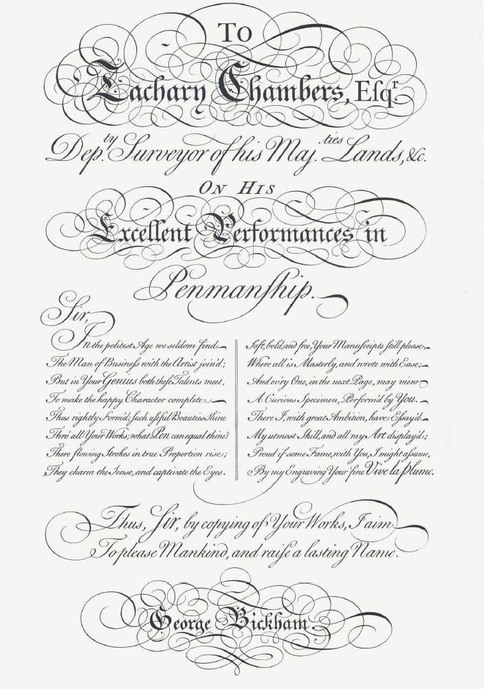
page 86: The Universal Penman, engraved by George Bickham, London, 1743, Dover Publications, Inc., New York;
page 98: Masters of the Italic Letter by Kathryn A. Atkins, Allen Lane, The Penguin Press 1998.
Copyright 2016
Peter Pauper Press, Inc.
Manufactured for Peter Pauper Press, Inc.
202 Mamaroneck Avenue
White Plains, NY 10601
All rights reserved
Published in the United Kingdom and Europe by
Peter Pauper Press, Inc.,
c/o White Pebble International
Unit 2, Plot 11 Terminus Road
Chichester, West Sussex PO19 8TX, UK
This book is dedicated to Sully, my father,
who whispered words of encouragement in my
ear when, at the age of ten, I fell in love with letters.
In fact, these words only sounded in my heart, for my
fatheran excellent calligrapher and an accomplished
artistdied when I was only 18 months old.
But he continued to influence my life through
his paintings and books, and through my mothers
infinite and faithful love.
I also dedicate this English
edition to my beloved Michel.
ISBN 978-1-4413-2242-5
Library of Congress Cataloging-in-Publication
Names: Sullivan, Jane, 1960- author.
Title: Calligraphy : a comprehensive guide to
beautiful lettering / written and illustrated by
Jane Sullivan.
Other titles: Calligraphie. English
Description: White Plains, New York : Peter Pauper
Press, Inc., [2016]
Identifiers: LCCN 2016010626 (print) | LCCN
2016011746 (ebook) | ISBN 9781441321855
(hardcover : alk. paper) | ISBN 9781441322425 ()
Subjects: LCSH: LetteringAmateurs manuals. |
CalligraphyAmateurs manuals.
Classification: LCC Z43 .S9313 2016 (print) | LCC
Z43 (ebook) | DDC 745.6/1-dc23
LC record available at http://lccn.loc.
gov/2016010626
7 6 5 4 3 2 1
Visit us at www.peterpauper.com
e-Books conversion by DigiConv Technologies
N owadays, putting pen to paper has almost become a curiosity. Few still write to their friends on stationery or record their thoughts in a personal journal. One sends an email, or a text, or writes a hasty note with a ballpoint or felt-tip pen, or whatever comes to hand. We often no longer teach the fine art of cursive script at school, at least not as it was taught in previous generations, when our grandparents and great-grandparents struggled with dip-pens, Sergent-Major nibs, and bottled ink.
In the Middle Ages, carefully handwritten calligraphy was likewise beyond the day to day experience of ordinary folk. Most of the population was illiterate, and only the educated (and therefore rich) or those in religious orders had access to this fine art. We have, in our time, come full circle in a sense, except that today it is not due to a lack of education or social status that one fails to learn the art of beautiful writing, but rather the pressure of an accelerated rhythm of life and differing technology. There are fewer opportunities to experience the simple pleasure of expressing ourselvesand also of exhibiting and celebrating our individualityin the mastery of our own style of handwriting or in the subtle arts of calligraphy and illumination.
Perhaps consciousness of this state of affairs has sparked the current renaissance in the arts of calligraphy and hand-lettering. We slow down time, or so it seems, when we turn our attention to methodically writing letters, or working on a final lettering project. Of course, were not about to replace our emails with handwritten medieval scrolls, nor painstakingly write out our shopping lists in Copperplate script! However, there is most certainly a renewed interest in these graceful pastimes of lettering, illumination, and creative crafts associated with papers and scripts.
As a hobby, calligraphy requires very little in the way of basic materials: pen and ink, paper, a corner of a table and a good source of light. No particular artistic skill is needed to master the techniques presented in this book. Naturally, some styles of script are more demanding than others. But that said, everything that is covered here is quite accessible to all. Practice with patience and delight, and youll discover each day new reasons to continue your studies: the beauty of the letters, their unique forms and applications, and the pleasure of using them to express your heartfelt feelings and philosophies.
Our words, and the thoughts that lie behind them, charge the atmosphere around us with a powerful energy. Let your words and thoughts flow from your pen, influencing and enriching your world! You will feel your breathing grow more peaceful, stress and tensions will be soothed, your negative thoughts will retreat andthe cherry on the cake!you will also be creating marvelous works of art that allow you to share your serenity and your joy with others!
Minuscule: Small letters, often what we think of as lower case. For much of history, Minuscule and Majuscule letters were not mixed in the same alphabet.
Majuscule: Large letters, often what we think of as upper case.
Letterform: The shape of a letter in a particular script.
Lower writing line: The baseline on which your letters rest.
Upper writing line: Marks the height of letterforms without an ascender.
Descender: A portion of a letter that extends below the lower writing line.
Ascender: A portion of a letter that extends above the upper writing line.
Ascender line/descender line: The lines above your upper writing line and below your lower writing line, to which ascenders and descenders extend.
Stroke: A mark made without lifting your pen off your paper.
Ductus: The order of the strokes used to write each letter.
Counter space: The empty or negative space inside a letter.
Bowl: The rounded space inside a letter, such as d.
Minims: The short verticals of a lettervertical lines that arent ascenders or descenders.
Terminal: An end of a line in a letterform.
Serifs: Lines or shapes, often formed with additional strokes, at the terminals of a letter. Common serifs youll find in this book are hair lines (thin lines often made with the side of the nib) and wedges (broad spatulate shapes).
Font size:
Interval:
Bookmark:
Similar books «Calligraphy: A Comprehensive Guide to Beautiful Lettering»
Look at similar books to Calligraphy: A Comprehensive Guide to Beautiful Lettering. We have selected literature similar in name and meaning in the hope of providing readers with more options to find new, interesting, not yet read works.
Discussion, reviews of the book Calligraphy: A Comprehensive Guide to Beautiful Lettering and just readers' own opinions. Leave your comments, write what you think about the work, its meaning or the main characters. Specify what exactly you liked and what you didn't like, and why you think so.