• Complain

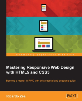
Zea - Mastering responsive web design : push your HTML and CSS skills to the limit and build professional grade, responsive websites

Here you can read online Zea - Mastering responsive web design : push your HTML and CSS skills to the limit and build professional grade, responsive websites full text of the book (entire story) in english for free. Download pdf and epub, get meaning, cover and reviews about this ebook. year: 2015, publisher: Packt Publishing - ebooks Account, genre: Computer. Description of the work, (preface) as well as reviews are available. Best literature library LitArk.com created for fans of good reading and offers a wide selection of genres:

Romance novel Science fiction Adventure Detective Science History Home and family Prose Art Politics Computer Non-fiction Religion Business Children Humor

Choose a favorite category and find really read worthwhile books. Enjoy immersion in the world of imagination, feel the emotions of the characters or learn something new for yourself, make an fascinating discovery.

Zea Mastering responsive web design : push your HTML and CSS skills to the limit and build professional grade, responsive websites
  • Book:
    Mastering responsive web design : push your HTML and CSS skills to the limit and build professional grade, responsive websites
  • Author:
  • Publisher:
    Packt Publishing - ebooks Account
  • Genre:
  • Year:
    2015
  • Rating:
    4 / 5
  • Favourites:
    Add to favourites
  • Your mark:
    • 80
    • 1
    • 2
    • 3
    • 4
    • 5

Mastering responsive web design : push your HTML and CSS skills to the limit and build professional grade, responsive websites: summary, description and annotation

We offer to read an annotation, description, summary or preface (depends on what the author of the book "Mastering responsive web design : push your HTML and CSS skills to the limit and build professional grade, responsive websites" wrote himself). If you haven't found the necessary information about the book — write in the comments, we will try to find it.

Push your HTML and CSS skills to the limit and build professional grade, responsive websites

About This Book
  • Take your RWD skills to the next level with HTML5 and CSS3 best practices that will give you a solid foundation to build out from
  • Harness the power of the CSS pre-processor Sass to speed up the creation of your CSS
  • Each chapter dives deep in to different aspects of RWD and is designed to get you up to speed with the latest developments in professional web design
Who This Book Is For

If youre already building responsive designs and are looking to level up your skills, then Mastering Responsive Web Design is the book for you. Regardless of whether youre a web designer, or web developer, youll find something here to help you in your responsive design journey.

What You Will Learn
  • Install and use Sass with SCSS syntax to create your CSS
  • Use HTML5 tags the right way, for the right type of content
  • Enhance the experience of users with assistive technology with ARIA roles
  • Design with a desktop-first approach, but implement with mobile-first methodology
  • Master your layouts by creating your own scalable CSS grid, or using Flexbox for total layout flexibility
  • Retrofit your old web sites with your new responsive design skills
  • Deal with legacy browsers, and learn how to keep your designs consistent
  • Implement widely used responsive patterns, such as the drawer navigation , the off-canvas and the flexbox-based navigation patterns
  • Find the best way to serve the right type of image and how to make videos responsive
  • Build custom responsive emails to ensure the message gets across regardless of the device
In Detail

Building powerful and accessible websites and apps using HTML5 and CSS3 is a must if we want to create memorable experiences for our users. In the ever-changing world of web design and development, being proficient in responsive web design is no longer an option: it is mandatory.

Each chapter will take you one step closer to becoming an expert in RWD. Right from the start your skills will be pushed as we introduce you to the power of Sass, the CSS preprocessor, to increase the speed of writing repetitive CSS tasks. Well then use simple but meaningful HTML examples, and add ARIA roles to increase accessibility. Well also cover when desktop-first or mobile-first approaches are ideal, and strategies to implement a mobile-first approach in your HTML builds.

After this we will learn how to use an easily scalable CSS grid or, if you prefer, how to use Flexbox instead. We also cover how to implement images and video in both responsive and responsible ways. Finally, we build a solid and elegant typographic scale, and make sure your messages and communications display correctly with responsive emails.

Style and approach

Designing and developing for the web should be fun, and thats the tone used in the book. This book is written in a step-by-step format with clean-cut examples. You will also find tips and notes all over the book to help clarify those small and simple details most books and tutorials assume you already know.

Zea: author's other books


Who wrote Mastering responsive web design : push your HTML and CSS skills to the limit and build professional grade, responsive websites? Find out the surname, the name of the author of the book and a list of all author's works by series.

Mastering responsive web design : push your HTML and CSS skills to the limit and build professional grade, responsive websites — read online for free the complete book (whole text) full work

Below is the text of the book, divided by pages. System saving the place of the last page read, allows you to conveniently read the book "Mastering responsive web design : push your HTML and CSS skills to the limit and build professional grade, responsive websites" online for free, without having to search again every time where you left off. Put a bookmark, and you can go to the page where you finished reading at any time.

Light

Font size:

Reset

Interval:

Bookmark:

Make
Mastering Responsive Web Design with HTML5 and CSS3

Mastering Responsive Web Design with HTML5 and CSS3

Copyright 2015 Packt Publishing

All rights reserved. No part of this book may be reproduced, stored in a retrieval system, or transmitted in any form or by any means, without the prior written permission of the publisher, except in the case of brief quotations embedded in critical articles or reviews.

Every effort has been made in the preparation of this book to ensure the accuracy of the information presented. However, the information contained in this book is sold without warranty, either express or implied. Neither the author nor Packt Publishing, and its dealers and distributors will be held liable for any damages caused or alleged to be caused directly or indirectly by this book.

Packt Publishing has endeavored to provide trademark information about all of the companies and products mentioned in this book by the appropriate use of capitals. However, Packt Publishing cannot guarantee the accuracy of this information.

First published: August 2015

Production reference: 1180815

Published by Packt Publishing Ltd.

Livery Place

35 Livery Street

Birmingham B3 2PB, UK.

ISBN 978-1-78355-023-4

www.packtpub.com

Credits

Author

Ricardo Zea

Reviewers

Jean-Marc Buytaert

Tristan Denyer

Alan Plotko

J. Pedro Ribeiro

Marija Zaric

Commissioning Editor

Usha Iyer

Acquisition Editor

Meeta Rajani

Content Development Editor

Neeshma Ramakrishnan

Technical Editor

Manali Gonsalves

Copy Editors

Roshni Banerjee

Project Coordinator

Shweta H. Birwatkar

Proofreader

Safis Editing

Indexer

Priya Sane

Production Coordinator

Shantanu N. Zagade

Cover Work

Shantanu N. Zagade

Cover Image

Ricardo Zea

About the Author

Ricardo Zea , originally from Medelln, Colombia, is a passionate and seasoned full-stack designer now located in Dayton, OH (USA). He is always looking for ways to level up his skills and of those around him. Constantly wondering how things are made on the Web, how they work, and why they work the way they do have made Ricardo a very technical designer, allowing him to explain to others the intricacies of design and the technicalities of the Web in ways that are very easy to understand and assimilate.

With a master's degree in publicity and advertising and having a deep passion for understanding human behavior complemented with a fierce competitive PC gaming hunger have allowed Ricardo to "switch" from the creative side of the brain to the rational side very easily. This has allowed him to visualize and create technically sound web and mobile designs that are responsive, perform well, and convey the proper message through design.

Ricardo is the organizer of the CodePen Dayton meetup group. He's a member of the Dayton Web Developers and UX Dayton meetup groups. He's also one of the first members of SitePoint's Ambassadors program. He is the author of the monthly Web Design & Development, Level Up! Newsletter . He was also a technical reviewer for the books Sass and Compass, Designers Cookbook and Sass Essentials by Packt Publishing. He is a real-time, live one-on-one expert advisor on https://wizpert.com/. For several years, he was also a Flash and CorelDRAW professor at different universities in his home country, Colombia.

Ricardo has 15 years of experience in web design and 20 years of experience in visual and graphic design.

You can contact Ricardo through the following links:

Personal website: http://ricardozea.design

Twitter: @ricardozea (https://twitter.com/ricardozea)

Wizpert: https://wizpert.com/ricardozea

Acknowledgment

A huge and infinite thanks to my wife, Heather, and my beautiful son, Ricardo; they are my inspiration to be a better professional, a better person, a better husband, and a better dad.

To my mom, Socorro, who showed me the values that made me the man I am today. To my dad, Ricardo "Pinta" Zea, for giving me the determination to not only be good at what I do, but to also be the best I can be.

To God, for allowing me to share with you, the readers, my knowledge of the sometimes unforgiving world of Responsive Web Design .

And to you directly, the readers, for giving me the chance to help you be better web professionals.

About the Reviewers

Jean-Marc Buytaert , with an associate's degree in multimedia and web design and a bachelor's degree in fine arts in interactive media design, has been involved in a diverse array of projects since 2003, ranging from graphic design, to video production, web design, and last but not least, web development, where he found his niche.

With experience in multiple web scripting languages and having developed websites using several content management systems, Jean-Marc is now a lead web developer for Houston-based interactive marketing agency, TopSpot Internet Marketing, where he oversees a team of web developers and builds responsive websites using MODX and WordPress while implementing third-party web services using new technologies and APIs.

Tristan Denyer is a UX designer for web and mobile applications, including web apps and portals, eCommerce, online video players and widgets, games (online, iPhone, board), marketing sites, and more. He is also a UI developer and WordPress theme developer. He is currently leading the UX design for the product team at a start-up in San Francisco.

He recently wrote a book, A Practical Handbook to WordPress Themes , to help owners and operators of self-hosted WordPress websites get the most out of their themes.

His passions include prototyping, web security, writing, carpentry, and burritos. He can be contacted through the following links:

Twitter: @tristandenyer

GitHub: https://github.com/tristandenyer

His portfolio and blog: http://tristandenyer.com/

Alan Plotko is a software developer who works across the full stack. He loves developing applications for the Web and always makes time to attend "hackathons", weekend-long programming competitions where participants build projects from scratch to benefit the community. Alan's experience extends to Python development, various database technologies such as NoSQL, and frameworks for rapid application development. When he's not writing code, Alan spends his spare time writing stories; he is an avid writer, having previously self-published a fantasy novel and reviewed books for Packt.

J. Pedro Ribeiro is a Brazilian user interface engineer living in the heart of London. He has been working on the Web for several years, coding websites for start-ups and large companies. Currently working at RetailMeNot UK, he is responsible for creating the mobile-first experience at VoucherCodes.co.uk, focusing on performance and usability.

Website: jpedroribeiro.com

GitHub: github.com/jpedroribeiro

Marija Zaric is a web designer living in Belgrade with a focus on individual and commercial clients who demand websites that are clear, modern, creative, simple, and responsive. She works with clients from USA and all over the world, helping them present their services in a unique, yet professional, way.

She is a relentless learner. What she loves the most about web design is the constant changes in the field, especially its evolution over the last 4 years when she became inspired by its simplicity, great images, typography, and the possibility of optimizing a single website for various devices.

Next page
Light

Font size:

Reset

Interval:

Bookmark:

Make

Similar books «Mastering responsive web design : push your HTML and CSS skills to the limit and build professional grade, responsive websites»

Look at similar books to Mastering responsive web design : push your HTML and CSS skills to the limit and build professional grade, responsive websites. We have selected literature similar in name and meaning in the hope of providing readers with more options to find new, interesting, not yet read works.


Reviews about «Mastering responsive web design : push your HTML and CSS skills to the limit and build professional grade, responsive websites»

Discussion, reviews of the book Mastering responsive web design : push your HTML and CSS skills to the limit and build professional grade, responsive websites and just readers' own opinions. Leave your comments, write what you think about the work, its meaning or the main characters. Specify what exactly you liked and what you didn't like, and why you think so.