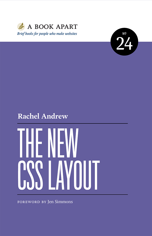
Rachel Andrew - The New CSS Layout
Here you can read online Rachel Andrew - The New CSS Layout full text of the book (entire story) in english for free. Download pdf and epub, get meaning, cover and reviews about this ebook. year: 2017, publisher: A book Apart, genre: Computer. Description of the work, (preface) as well as reviews are available. Best literature library LitArk.com created for fans of good reading and offers a wide selection of genres:
Romance novel
Science fiction
Adventure
Detective
Science
History
Home and family
Prose
Art
Politics
Computer
Non-fiction
Religion
Business
Children
Humor
Choose a favorite category and find really read worthwhile books. Enjoy immersion in the world of imagination, feel the emotions of the characters or learn something new for yourself, make an fascinating discovery.
- Book:The New CSS Layout
- Author:
- Publisher:A book Apart
- Genre:
- Year:2017
- Rating:3 / 5
- Favourites:Add to favourites
- Your mark:
- 60
- 1
- 2
- 3
- 4
- 5
The New CSS Layout: summary, description and annotation
We offer to read an annotation, description, summary or preface (depends on what the author of the book "The New CSS Layout" wrote himself). If you haven't found the necessary information about the book — write in the comments, we will try to find it.
The New CSS Layout — read online for free the complete book (whole text) full work
Below is the text of the book, divided by pages. System saving the place of the last page read, allows you to conveniently read the book "The New CSS Layout" online for free, without having to search again every time where you left off. Put a bookmark, and you can go to the page where you finished reading at any time.
Font size:
Interval:
Bookmark:
Accessibility for Everyone
Laura Kalbag
Practical Design Discovery
Dan Brown
Demystifying Public Speaking
Lara Hogan
JavaScript for WebDesigners
Mat Marquis
Practical SVG
Chris Coyier
Design for RealLife
Eric Meyer & Sara Wachter-Boettcher
Git for Humans
DavidDemaree
Going Responsive
Karen McGrane
Responsive Design: Patterns & Principles
EthanMarcotte
Designing for Touch
Josh Clark
Visit abookapart.com for our full list of titles.
Copyright 2017 Rachel Andrew
All rights reserved
Publisher: Jeffrey Zeldman
Designer: Jason Santa Maria
Executive Director: Katel LeD
Managing Editor: Tina Lee
Editors: Lisa Maria Martin, Caren Litherland
Technical Editor: Chen Hui Jing
Copyeditor: Katel LeD
Proofreader: Mary van Ogtrop
Book Producer: Ron Bilodeau
ISBN: 978-1-937557-69-0
A Book Apart
New York, New York
http://abookapart.com
ForBeth.
Graphic design on the web has evolved significantly over the past twenty-five years. At first, screen pixels were huge. Now theyre so tiny we cant see them. We started with a palette of 216 colors, (if we had color at all); now we play in color spaces far beyond whats possible in any other medium. For years, typography was limited to a handful of typefaces. These days, we have more font options than metal typesetters would have dared to dream of. Layout, however, has barely evolved since the advent of CSS. Fifteen years ago, we created a layout for blog articles, taught it to each other, and pretty much stopped there. Frameworks like Bootstrap have given us a few more options but, even with responsive web design, weve been severely constrained by the limitations of our tools.
Now its time to take a giant leap forward. Its finally page layouts turn to shine .
When CSS Grid shipped in March 2017, our toolbox reached a tipping point. At last we have technology powerful enough to let us really get creative with layout. We can use the power of graphic design to convey meaning through our use of layoutcreating unique layouts for each project, each section, each type of content, each page.
Grid gets the most attention, but its not the whole story. Combining all of the options available to us in CSS creates amazing new possibilitiesit changes everything. Grid, flexbox, multicolumn, flow, writing modes, shapes, object fit, alignment, sizing, viewport unitsthese are the tools that now make up our full toolkit. They will make it possible to launch designs unlike those that have co me before.
You hold in your hands a technical introduction to this new world, a practical tour of whats ahead. Absorb this CSS. Play with it. Dont just ship the same old layouts with a different underlying technology. Discover what has changed about our medium. Dont assume that we already know what the web is about to become. Or that web designers and developers have mastered anything about layout on the web. There is no right way to design layout s anymore.
Everything about web page layout jus t changed.
JenSimmons
Sometimes, in front of rooms filled with developers who have never had to turn their hand to a font tag or a nested style sheet, I remark that my career on the web predates Cascading Style Sheets (CSS). As CSS celebrates its twentieth birthday, when I look back over my own history of learning and teaching CSS, I marvel at the fact that it has taken until 2017 to come close to cracking how to do layout o n the web .
Before we start looking at the methods for creating layout on the web that have landed in the past few years, I want to revisit where we came from. Doing this historical groundwork is important, because many of todays assumptions about layout stand on the shoulders of what has co me before.
Early CSS layouts were a mixture of floats and positioned elements. A common pattern was to give the main content of the page a wide left or right margin, and then use absolute positioning to place the sidebar into that gap. This workeduntil you wanted a footer on the layout and couldnt be sure the positioned item would not be taller than the main content. A lot of websites attempted to fix the heights of elements to cope with this; it wasnt unusual to discover a page with elements overflowing one another, especially if you adjusted the text size to make fonts larger than the designer expected.
Over time, we became better at layout. Online community-created resources like the Noodle Incident ( http://bkaprt.com/ncl/01-01/ ) still exist, with examples of CSS layouts to copy and paste. These relics of our past remind me how far weve come in terms of the complexity of the designs we buildand yet how much we still lean on the techniques we developed back then.
As we became better at building floated layouts, we continued to be frustrated by the lack of full-height columns. Having floated a sidebar left and the main content right, there was no way to put a background color or image behind that sidebar. It would sit just under the content.
But web designers have always been incredibly resourceful at finding creative ways to use a limited toolset. A solution to the full-height column conundrum came when Dan Cederholm documented his faux columns technique on A List Apart ( http://bkaprt.com/ncl/01-02/ ). By tiling an image behind the entire layout, we could create the effect of a full-heigh t column.
That was just one of the many ways we learned to fake the appearance of layouts. The main debateaside from a few outliers stubbornly insisting we should continue to use HTML tables for layoutrevolved around whether we should build designs that had a fixed pixel width, or designs that stretched to fill the available screen space (sometimes referred to as liquid designs). Those of us who developed and taught these techniques got pretty adept at them, and knew how to identify most of the tricky browser bugs we had to wor k around.
Then came a curveball: the iPhone. As the web community discussed the best way to provide a separate mobile site, Ethan Marcotte set forth his ideas on responsive design ( http://bkaprt.com/ncl/01-03/ ). A whole new challenge for CSS layout mat erialized.
By the time Marcotte detailed his responsive design ideas on A List Apart, many websites had already opted for a fixed-width approach. Larger screens meant that liquid websites stretched too wide, and reliance on methods such as faux columns made it very hard to create flexible grids. Responsive design threw everything up in the air againnot only did we need to create designs that used fluid percentage-based grids, but we had to do so for a multitude of screen sizes. The techniques we had developed fell apart, and we had to revisit how we used floats and other parts of CSS to make layo ut easier.
Font size:
Interval:
Bookmark:
Similar books «The New CSS Layout»
Look at similar books to The New CSS Layout. We have selected literature similar in name and meaning in the hope of providing readers with more options to find new, interesting, not yet read works.
Discussion, reviews of the book The New CSS Layout and just readers' own opinions. Leave your comments, write what you think about the work, its meaning or the main characters. Specify what exactly you liked and what you didn't like, and why you think so.





![Weber - The layout look book. [1]](/uploads/posts/book/242236/thumbs/weber-the-layout-look-book-1.jpg)
