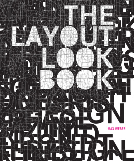
Weber - The layout look book. [1]
Here you can read online Weber - The layout look book. [1] full text of the book (entire story) in english for free. Download pdf and epub, get meaning, cover and reviews about this ebook. City: New York;NY, year: 2008, publisher: HarperCollins;Collins Design, genre: Art. Description of the work, (preface) as well as reviews are available. Best literature library LitArk.com created for fans of good reading and offers a wide selection of genres:
Romance novel
Science fiction
Adventure
Detective
Science
History
Home and family
Prose
Art
Politics
Computer
Non-fiction
Religion
Business
Children
Humor
Choose a favorite category and find really read worthwhile books. Enjoy immersion in the world of imagination, feel the emotions of the characters or learn something new for yourself, make an fascinating discovery.
![Weber The layout look book. [1]](https://litark.com/uploads/posts/book/242236/weber-the-layout-look-book-1.jpg)
The layout look book. [1]: summary, description and annotation
We offer to read an annotation, description, summary or preface (depends on what the author of the book "The layout look book. [1]" wrote himself). If you haven't found the necessary information about the book — write in the comments, we will try to find it.
When undertaking a new project, the first thing that must be decided on is the layout. Organized so as to encourage creativity, serendipitous discovery, and inspiration, The Layout Look Book is a great guide for both amateur and professional designers. The book includes techniques that can be used to enhance any layout, as well as insights into the factors that helped make each layout an effective piece. The styles covered in the volume range from traditional to cutting edge, and will enable any designer to become a more creative thinker and produce fantastic work.
Weber: author's other books
Who wrote The layout look book. [1]? Find out the surname, the name of the author of the book and a list of all author's works by series.


The layout look book. [1] — read online for free the complete book (whole text) full work
Below is the text of the book, divided by pages. System saving the place of the last page read, allows you to conveniently read the book "The layout look book. [1]" online for free, without having to search again every time where you left off. Put a bookmark, and you can go to the page where you finished reading at any time.
Font size:
Interval:
Bookmark:
The Layout Look Book offers a look at the panorama of current print design, scanning a wide range of different projects from China to New York, from the simple postcard to the campaign poster, from the emerging to the established artist. It is neither a lexicon nor an analysis, but provides a snapshot of this fast, multifaceted and highly present sector of the design industry.
The network within this industry is very close. Current trends are registered with seismographic precision on numerous Internet forums; creative people throughout the world communicate and cooperate via digital data paths. The bandwidth of Internet has increased to such an extent that even high-resolution graphics and extensive publications may reach the other side of the globe within a few seconds. Someone designing in Amsterdam knows what is going on in New York; someone writing a book in Malaysia knows the projects in Bern.
This exchange is not limited to virtual space; the personal network functions similarly. There is a cooperation among young highly creative designers, and one single name can be found on different projects and in different places. Projects like Rinzen RMX depend on this type of exchange. Publications like the Made Magazine and institutions like the Benetton Communication Research Center Fabrica in Italy encourage it. Inspiring examples like designer Uwe Loesch work as tutors with the aim of creating an active dialogue with young talent.
This international networking is facilitated by a unification of digital instruments, and this affects the entire business. Offices throughout the world tend to work with the same small range of high-performance software. Those programs are easy to operate and have done away with many technical obstacles designers had to deal with in the past. Graphic designers do not have to bother with traditional (i.e., paper) copies anymore but they deliver their layout drafts to printers digitally.
Technical barriers have been reduced extensively and therefore the number of people working with graphic design has grown. It is not only graphic artists who work in graphic design, but also architects, musicians and a variety of different artists and people who just want to give it a go.
Conversely, graphic designers also produce more than just graphic design. Many of them have incorporated Web design, animation, movies and events into their repertoire. The creation of hybrid forms is a logical consequence: the swift production of a book becomes an event. Mixed forms are developed: bookazines or books that include DVDs, posters or other design objects.
The same factors that make this creative diversity possible also abet the risks of an internationally design as well as artistic arbitrariness. If the same few software programs are used throughout the planet, then graphic designers are tempted to create their design along the same lines. Standardization of software risks the assimilation of aesthetics without individuality. Furthermore, if this software eventually automates many of the creative methods that previously required technical know-how, and can be used by anybody, specialization becomes redundant. Everybody knows everything, and somebody who knows everything is consequently tempted to do everything.
For that reason some of the most interesting works stand out due to the absence of digital performance. Sara De Bondts newsletter for the British Council was created by crayon on paper, Stilettos photographs are taken from handmade 3D-objects and Stefan Sagmeister printed on newspaper material with a hot iron. In other cases, top quality is obtained by concrete technical expertise even if projects are developed by digital means, as can be seen in the work of celebrated print specialist Michael C. Place, whose design style developed along with his experience in silkscreen printing.
Those projects of creative determination are The Layout Look Book s actual eye-catchers. There was no objective rule for the selection of the various works. The Layout Look Book does not search for a specific styleand it has no restriction as to special formats or methods. It focuses instead on outstanding projects that rise above the mainstream of print design due to a refreshing character, conceptual elegance or sophistication.
However, flipping through the pages of the finished book, the selection does show a common ground: at the core of the works there is an unambiguous idea that is visualized appropriately and without vanity. The most convincing design is not the one that is obtained for the sake of designing but the one that is self-confident enough to fade from the spotlight. The creators of such works are distinguished by the efficiency of their visual language.
Despite the books focus on the projects, it also offers information on the offices and individuals that designed them. In many cases the designers talk about themselves and answer questions regarding their work methods, roots, preferences and aversions.
Yet the most transparent message about the design is expressed by the works themselves, and the major space in this book is reserved for them.
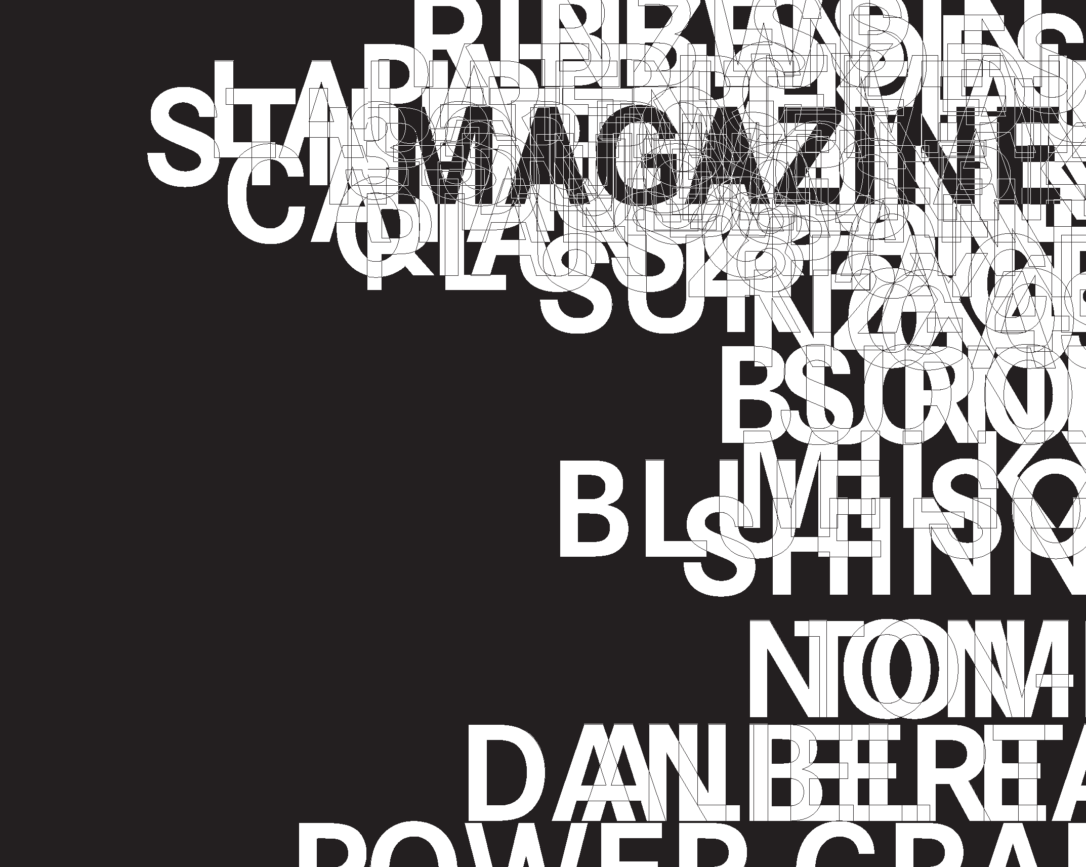
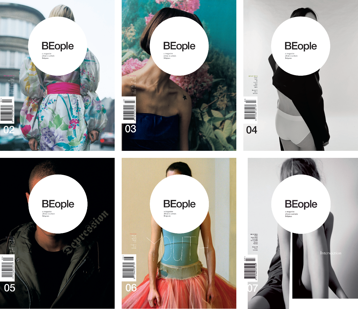
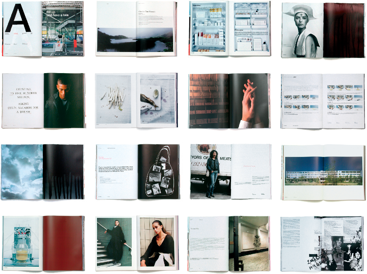
MILKXHAKE // HKG //
MILKXHAKE // HKG //
MILKXHAKE // HKG //
MILKXHAKE // HKG //
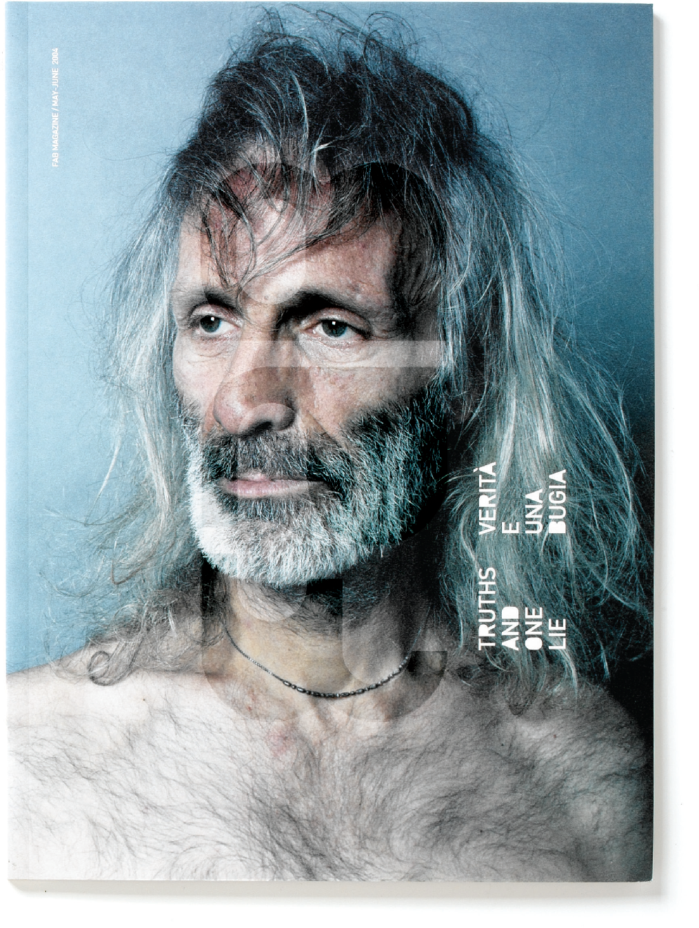
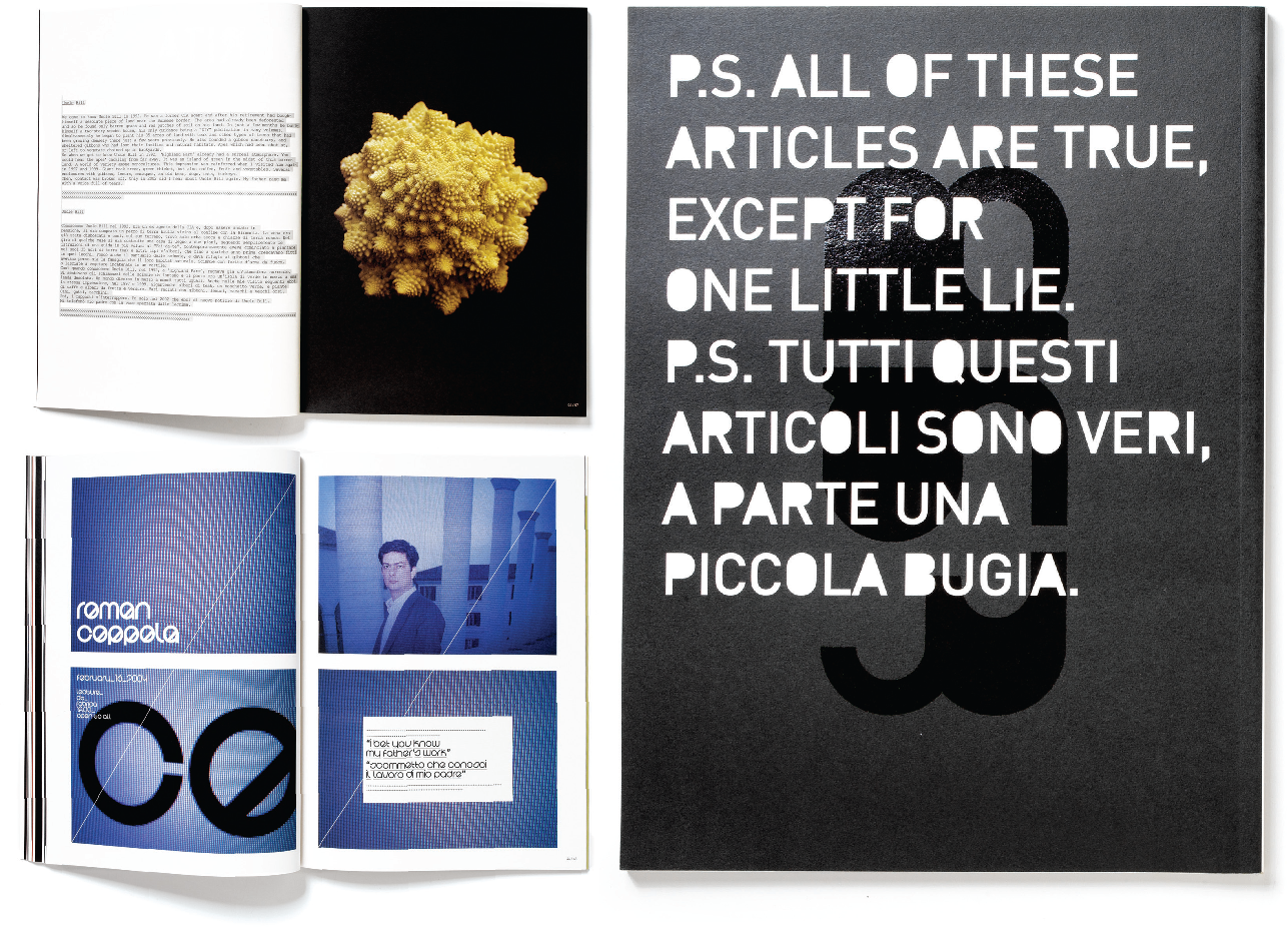
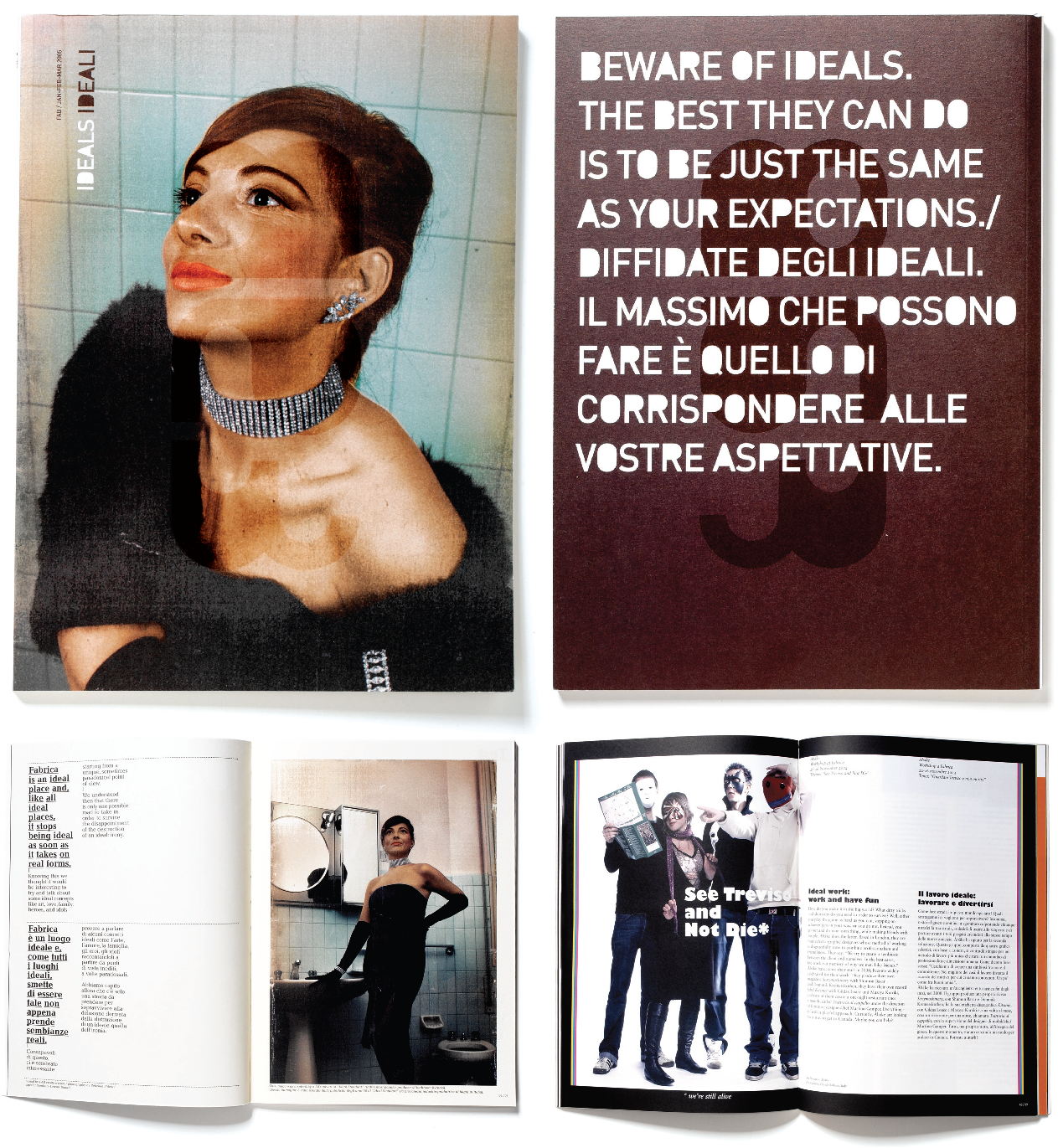
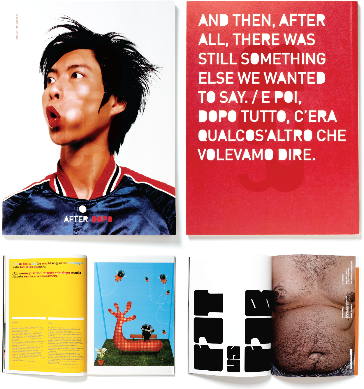
FAB Magazine // 2004-2005 //
The Benetton Communication Research Center Fabrica in Italy is considered an international meeting place and talent incubator for promising artists in the areas of design, film, music and text. Fabricas Department for Visual Communication has been publishing the quarterly magazine FAB since May 2004. The Chinese designer Javon Mo was responsible for the first three issues, as well as for the development of the logotypes. Today Javon Mo is head of the design firm Milkxhake in Hong Kong. The magazine is bilingual (Italian and English) and primarily features photos, short stories and interviews for a young target group.
Milkxhake // Hong Kong, China // www.milkxhake.org //
Our motto is: Mix it a better world. Mix has always been our culture, so our design is Mix, too. Even though we are Chinese, we have grown up under strong influences from both Eastern and Western culture. We dont care too much about East and West, because sometimes we are neither. To us, it is interesting ideas that make good design. Inspiration can be found anywhere. Our working environment looks like chaoslots of design books and magazines on our desks. If a student asked for advice, we would say: Be true to yourself and your works. Keep thinking, dreaming and mixing.
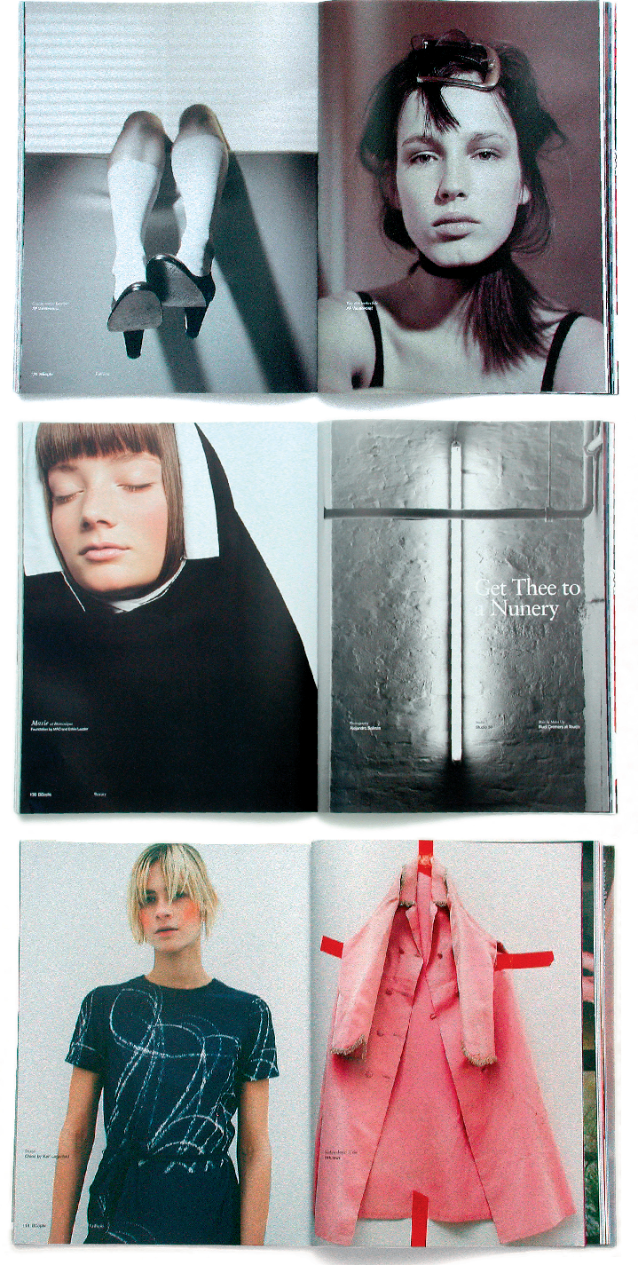
BASE // BEL //
BASE // BEL //
BASE // BEL //
Font size:
Interval:
Bookmark:
Similar books «The layout look book. [1]»
Look at similar books to The layout look book. [1]. We have selected literature similar in name and meaning in the hope of providing readers with more options to find new, interesting, not yet read works.
Discussion, reviews of the book The layout look book. [1] and just readers' own opinions. Leave your comments, write what you think about the work, its meaning or the main characters. Specify what exactly you liked and what you didn't like, and why you think so.