Gregory - A Pocket Guide to CSS3 Layout Modules
Here you can read online Gregory - A Pocket Guide to CSS3 Layout Modules full text of the book (entire story) in english for free. Download pdf and epub, get meaning, cover and reviews about this ebook. year: 2013, publisher: BookBaby, genre: Computer. Description of the work, (preface) as well as reviews are available. Best literature library LitArk.com created for fans of good reading and offers a wide selection of genres:
Romance novel
Science fiction
Adventure
Detective
Science
History
Home and family
Prose
Art
Politics
Computer
Non-fiction
Religion
Business
Children
Humor
Choose a favorite category and find really read worthwhile books. Enjoy immersion in the world of imagination, feel the emotions of the characters or learn something new for yourself, make an fascinating discovery.
A Pocket Guide to CSS3 Layout Modules: summary, description and annotation
We offer to read an annotation, description, summary or preface (depends on what the author of the book "A Pocket Guide to CSS3 Layout Modules" wrote himself). If you haven't found the necessary information about the book — write in the comments, we will try to find it.
Gregory: author's other books
Who wrote A Pocket Guide to CSS3 Layout Modules? Find out the surname, the name of the author of the book and a list of all author's works by series.


A Pocket Guide to CSS3 Layout Modules — read online for free the complete book (whole text) full work
Below is the text of the book, divided by pages. System saving the place of the last page read, allows you to conveniently read the book "A Pocket Guide to CSS3 Layout Modules" online for free, without having to search again every time where you left off. Put a bookmark, and you can go to the page where you finished reading at any time.
Font size:
Interval:
Bookmark:

A Pocket Guide to CSS3 layout modules
by Rachel Andrew
Published in 2013 by Five Simple Steps
Studio Two, The Coach House
Stanwell Road
Penarth
CF64 3EU
United Kingdom
On the web: fivesimplesteps.com
and: rachelandrew.co.uk
Please send errors to
Publisher: Five Simple Steps
Editor: Owen Gregory
Production Manager: Jo Brewer
Art Director: Nick Boulton
Designer: Nick Boulton, Colin Kersley
Copyright 2013 Rachel Andrew
All rights reserved. No part of this publication may be reproduced or transmitted in any form or by any means, electronic or mechanical, including photocopy, recording or any information storage and retrieval system, without prior permission in writing from the publisher.
ISBN: 978-1-907828-09-6
A catalogue record of this book is available from the British Library.
I have been using CSS ever since it first became a practical possibility in browsers and I was a fairly early adopter of CSS for layout. I have always enjoyed playing with the latest features, despite the inevitable frustration of dealing with lack of support in browsers. In the last few years we have seen a great leap forward in what we can achieve with CSS web fonts, gradients, shadows and media queries are now part of our everyday toolkit.
CSS layout itself, however, has moved on little. Developers have experimented with using display:table and display:inline-block for layout, in order to mitigate the limitations of layouts based on absolute positioning and floats. Yet, these methods seem as much like hacks as those they try to replace, and come with their own problems.
The future of CSS layout looks far brighter. In this little book I will cover some of the exciting modules that are part of the CSS3 specification. They promise a future where we can lay out elements to a grid and easily achieve the ambitions of equal height columns or spreading content evenly across a page. With the help of specifications put forward by companies such as Adobe, which knows a thing or two about layout, we can finally take control of how things are displayed in a web browser, without adversely affecting the use of that content in other ways.
I have used examples in this book that have some implementation in one or more browsers, so you can try them out. Some of these modules are at a relatively early stage and implementations may change. Remember that you can give feedback to the standards process yourself. This is our web and we should be keen to engage with those who are involved in creating the specifications we use.
If you use any of these techniques in production you will need to ensure that your pages still display well for users whose browsers do not support that particular module. I dont want to spend much time dealing with browser compatibility issues; however, at the end of each section you will find some tips and suggestions.
Almost everything I cover in this book will require vendor prefixes in some or all browsers. With the more stable modules multicolumn layout and flexible box layout (flexbox) I use Lea Verous -prefix-free script to show you the standard properties and still have working examples in browsers. I would suggest that in production you either add the prefixed versions to your CSS or use a CSS preprocessor to compile them into your final CSS.
With the very new modules that only have support in one browser, and where the specification is highly likely to change, I have used the prefixes for the browser that I have tested the examples in. By the time this book is published it may be that other browsers will have added support with their prefixes. Owing to the experimental nature of these implementations, however, they may work differently. You should test and use the prefixes for other browsers where available, plus the non-prefixed version in production.
CSS3 Multi-column layout has been a tantalizing possibility for some years now. However, with lack of support in Internet Explorer it hasnt had the usage that it deserves. With IE10 supporting these properties, and its usefulness in creating responsive designs, I hope we will see more use on sites very soon. This module is the most mature and has the most browser support of all the modules I will cover in this book so is a great place to start our exploration of all that is new in CSS layout.
Multicolumn layout makes it possible to arrange content in columns, in the same way that content flows in a newspaper. You can take a container in your document and state that you want it to be arranged into columns, and the browser will make it so. If you specify the number of columns that you want the content arranged into, the browser will work out the width of each column so that it will fit into the parent box. If you specify a width for the columns then the browser will display as many columns as it is able, maintaining that width for each.
view example
.col-wrapper { column-width: 220px; }
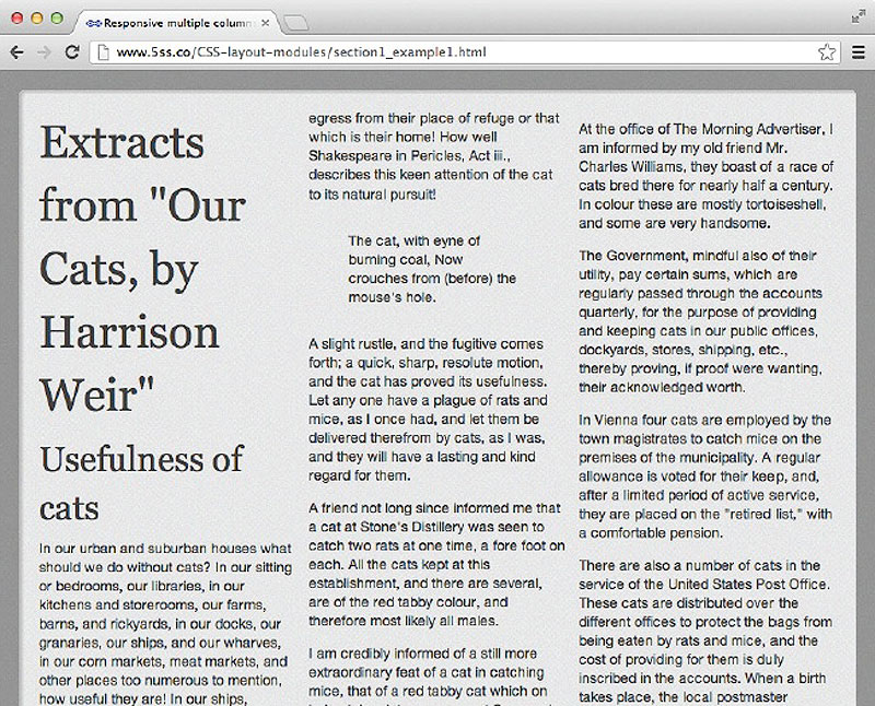
Setting column-width.
Specifying a column-width means that the browser will fit as many columns into the container as possible, using the specified width as the ideal width. You may notice that when we specify the width for columns we dont in fact get that exact width. The columns will always be even in the space, so the browser will work out how many columns can fit as close to the specified width as possible. The specification says;
[The column-width value] describes the optimal column width. The actual column width may be wider (to fill the available space), or narrower (only if the available space is smaller than the specified column width). Specified values must be greater than 0.
Therefore, when setting the width you should specify the optimal column width, though it may be that the actual width is different especially in a flexible design.
view example
You can also specify how many columns you want and then let the browser decide how wide they should be, using column-count.
.col-wrapper { column-count:3; }
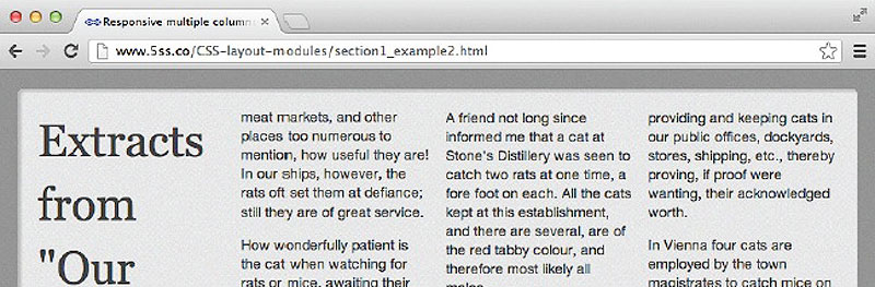
Setting the column-count to 4.
You can also see in my examples that the columns do not butt up against each other: there is a gap between each column. In the multicolumn layout specification this gutter is controlled by the column-gap property. If you set column-gap to zero there will be no space between columns and the text will run together. The specification suggests that user agents use a value of 1em as the default for this property; however, if you want to ensure your gutters are a certain width to line up with a grid, then you should set a value yourself..
view example
.col-wrapper {
column-width: 220px;
column-gap: 1.5em;
}
Column styling is relatively limited in the current specification, although there is a note in the working draft stating that future specifications may add additional functionality. For example, columns of different widths and different backgrounds may be supported. At present you cannot style columns individually.
Font size:
Interval:
Bookmark:
Similar books «A Pocket Guide to CSS3 Layout Modules»
Look at similar books to A Pocket Guide to CSS3 Layout Modules. We have selected literature similar in name and meaning in the hope of providing readers with more options to find new, interesting, not yet read works.
Discussion, reviews of the book A Pocket Guide to CSS3 Layout Modules and just readers' own opinions. Leave your comments, write what you think about the work, its meaning or the main characters. Specify what exactly you liked and what you didn't like, and why you think so.