• Complain

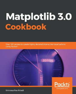
Srinivasa Rao Poladi - Matplotlib 3.0 Cookbook

Here you can read online Srinivasa Rao Poladi - Matplotlib 3.0 Cookbook full text of the book (entire story) in english for free. Download pdf and epub, get meaning, cover and reviews about this ebook. City: Birmingham, year: 2018, publisher: Packt Publishing, genre: Computer. Description of the work, (preface) as well as reviews are available. Best literature library LitArk.com created for fans of good reading and offers a wide selection of genres:

Romance novel Science fiction Adventure Detective Science History Home and family Prose Art Politics Computer Non-fiction Religion Business Children Humor

Choose a favorite category and find really read worthwhile books. Enjoy immersion in the world of imagination, feel the emotions of the characters or learn something new for yourself, make an fascinating discovery.

Srinivasa Rao Poladi Matplotlib 3.0 Cookbook
  • Book:
    Matplotlib 3.0 Cookbook
  • Author:
  • Publisher:
    Packt Publishing
  • Genre:
  • Year:
    2018
  • City:
    Birmingham
  • Rating:
    4 / 5
  • Favourites:
    Add to favourites
  • Your mark:
    • 80
    • 1
    • 2
    • 3
    • 4
    • 5

Matplotlib 3.0 Cookbook: summary, description and annotation

We offer to read an annotation, description, summary or preface (depends on what the author of the book "Matplotlib 3.0 Cookbook" wrote himself). If you haven't found the necessary information about the book — write in the comments, we will try to find it.

Build attractive, insightful, and powerful visualizations to gain quality insights from your data

Key Features
  • Master Matplotlib for data visualization
  • Customize basic plots to make and deploy figures in cloud environments
  • Explore recipes to design various data visualizations from simple bar charts to advanced 3D plots
Book Description

Matplotlib provides a large library of customizable plots, along with a comprehensive set of backends. Matplotlib 3.0 Cookbook is your hands-on guide to exploring the world of Matplotlib, and covers the most effective plotting packages for Python 3.7.

With the help of this cookbook, youll be able to tackle any problem you might come across while designing attractive, insightful data visualizations. With the help of over 150 recipes, youll learn how to develop plots related to business intelligence, data science, and engineering disciplines with highly detailed visualizations. Once youve familiarized yourself with the fundamentals, youll move on to developing professional dashboards with a wide variety of graphs and sophisticated grid layouts in 2D and 3D. Youll annotate and add rich text to the plots, enabling the creation of a business storyline. In addition to this, youll learn how to save figures and animations in various formats for downstream deployment, followed by extending the functionality offered by various internal and third-party toolkits, such as axisartist, axes_grid, Cartopy, and Seaborn.

By the end of this book, youll be able to create high-quality customized plots and deploy them on the web and on supported GUI applications such as Tkinter, Qt 5, and wxPython by implementing real-world use cases and examples.

What you will learn
  • Develop simple to advanced data visualizations in Matplotlib
  • Use the pyplot API to quickly develop and deploy different plots
  • Use object-oriented APIs for maximum flexibility with the customization of figures
  • Develop interactive plots with animation and widgets
  • Use maps for geographical plotting
  • Enrich your visualizations using embedded texts and mathematical expressions
  • Embed Matplotlib plots into other GUIs used for developing applications
  • Use toolkits such as axisartist, axes_grid1, and cartopy to extend the base functionality of Matplotlib
Who this book is for

The Matplotlib 3.0 Cookbook is for you if you are a data analyst, data scientist, or Python developer looking for quick recipes for a multitude of visualizations. This book is also for those who want to build variations of interactive visualizations.

Downloading the example code for this book You can download the example code files for all Packt books you have purchased from your account at http://www.PacktPub.com. If you purchased this book elsewhere, you can visit http://www.PacktPub.com/support and register to have the files e-mailed directly to you.

Srinivasa Rao Poladi: author's other books


Who wrote Matplotlib 3.0 Cookbook? Find out the surname, the name of the author of the book and a list of all author's works by series.

Matplotlib 3.0 Cookbook — read online for free the complete book (whole text) full work

Below is the text of the book, divided by pages. System saving the place of the last page read, allows you to conveniently read the book "Matplotlib 3.0 Cookbook" online for free, without having to search again every time where you left off. Put a bookmark, and you can go to the page where you finished reading at any time.

Light

Font size:

Reset

Interval:

Bookmark:

Make
Getting ready

Set up the backend:

import matplotlib
matplotlib.use('tkagg')

Import the required libraries:

import tkinter as tk
import numpy as np
import matplotlib.pyplot as plt
How to do it...

The following are the steps required to plot our map:

  1. Download the required shapefile using the following command:
shpfilename = shpreader.natural_earth(resolution='110m', category='cultural', name='admin_0_countries')
  1. Extract and sort the data to get countries by population in ascending order, as follows:
reader = shpreader.Reader(shpfilename)
countries = reader.records()
country = next(countries)
population = lambda country: country.attributes['POP_EST']
sort_by_pop = sorted(countries, key=population)
  1. Extract first five and last five entries, which represent the bottom five and top five populated countries. Get corresponding longitude and latitude coordinates from the net offline:
# get the first 5 entries that represent lowest population
B5_countries_by_pop = sort_by_pop[:5]
B5_Country_Names = ', '.join([country.attributes['NAME_LONG'] for
country in B5_countries_by_pop])
# get the last 5 entries that represent highest population
T5_countries_by_pop = sort_by_pop[-5:]
T5_Country_Names = ', '.join([country.attributes['NAME_LONG'] for
country in T5_countries_by_pop])
#B5_Country_Names = ['French Southern and Antarctic Lands',
'Falkland Islands', 'Antarctica', 'Greenland', #'Northern Cyprus']
B5_lat = [49.28, 51.796, 82.862, 71.71, 35.32]
B5_lon = [69.35, 59.523, 135, 42.60, 33.31]
#T5_Country_Names = ['Brazil', 'Indonesia', 'United States',
'India', 'China']
T5_lat = [-14.2350, -0.7893, 37.0902, 20.5937, 40]
T5_lon = [-51.9253, 113.9213, -95.7129, 78.9629, 116.5]
  1. Define the figure, axes, and set defaults:
fig = plt.figure(figsize=(10, 5))
ax = fig.add_subplot(1, 1, 1, projection=ccrs.Robinson())
ax.set_global()
ax.stock_img()
ax.coastlines()
  1. Plot these points on a global map as follows:
ax.plot(B5_lon, B5_lat, 'o', transform=ccrs.PlateCarree(), markersize=10, color='r')
ax.plot(T5_lon, T5_lat, 'o', transform=ccrs.PlateCarree(), markersize=10, color='g')
  1. Plot labels corresponding to each of the points by using the t ext embedding feature:
plt.text(B5_lon[0], B5_lat[0], 'FSAL', size=12, color='indigo',
horizontalalignment='left', transform=ccrs.Geodetic())
plt.text(B5_lon[1], B5_lat[1], 'FI', size=12, color='indigo',
horizontalalignment='left', transform=ccrs.Geodetic())
plt.text(B5_lon[2], B5_lat[2], 'Antarctica', size=12,
color='indigo', horizontalalignment='left', transform=ccrs.Geodetic())
plt.text(B5_lon[3], B5_lat[3], 'Greenland', size=12, color='indigo',
horizontalalignment='right', transform=ccrs.Geodetic())
plt.text(B5_lon[4], B5_lat[4], 'NC', size=12, color='indigo',
horizontalalignment='left', transform=ccrs.Geodetic())
plt.text(T5_lon[0], T5_lat[0], 'Brazil', size=12, color='m',
horizontalalignment='left', transform=ccrs.Geodetic())
plt.text(T5_lon[1], T5_lat[1], 'Indonesia', size=12, color='m',
horizontalalignment='left', transform=ccrs.Geodetic())
plt.text(T5_lon[2], T5_lat[2], 'United States', size=12, color='m',
horizontalalignment='left', transform=ccrs.Geodetic())
plt.text(T5_lon[3], T5_lat[3], 'India', size=12, color='m',
horizontalalignment='left', transform=ccrs.Geodetic())
plt.text(T5_lon[4], T5_lat[4], 'China', size=12, color='m',
horizontalalignment='right', transform=ccrs.Geodetic())
  1. Display the plot on the screen using the following command:
plt.show()
Plotting subplots on the same figure

Matplotlib provides many different methods and helper functions that leverage the axes method for drawing multiple plots on the same figure and arrange them in a variety of grid formats. This allows us to develop sophisticated dashboard applications.

How to do it...

Here are the steps to plot the required plots:

  1. Create a simple JointGrid with default parameters, and axes-level customization:
g1 = sns.JointGrid(x='Coffee', y='Cookies', data=snacks_sales,
space=0.1, height=6, ratio=2)
g1 = g1.plot(sns.regplot, sns.kdeplot)
#g = g.plot(plt.scatter, sns.distplot);
g1.ax_joint.set_xlabel('Coffee', color='g', size=20, weight='bold')
g1.ax_joint.set_ylabel('Cookies', color='g', size=20, weight='bold')
plt.setp(g1.ax_marg_x.get_yticklabels(), visible=True)
plt.setp(g1.ax_marg_x.get_xticklabels(), visible=True)
plt.setp(g1.ax_marg_y.get_xticklabels(), visible=True)
plt.setp(g1.ax_marg_y.get_yticklabels(), visible=True)
g1.ax_marg_x.set_facecolor('wheat')
g1.ax_marg_y.set_facecolor('wheat')
for l in chain(g1.ax_marg_x.axes.lines, g1.ax_marg_y.axes.lines):
l.set_linestyle('--')
l.set_lw(3)
l.set_color('red')
g1.ax_marg_x.set_title('1. Regression Plot - KDE on marginals',
size=20, color='g')
  1. Separate the joint and marginal plots with their respective parameters:
g2 = sns.JointGrid(x='Pies', y='Smoothies', data=snacks_sales,
space=0, ratio=2)
g2 = g2.plot_joint(sns.regplot, color="g", order=3, ci=68 )
g2 = g2.plot_marginals(sns.distplot, kde=False, rug=True, fit=norm,
color="#1EAFCD23")
g2.ax_marg_x.set_title('2. Regression Plot - Histogram, Normal,
Rug', size=20, color='g')
  1. Separate the j oint, marginal x, and marginal y plots with independent controls on each:
g3 = sns.JointGrid(x='Pies', y='Smoothies', data=snacks_sales,
space=0, ratio=2)
g3 = g3.plot_joint(sns.regplot, color="g", order=3, ci=68)
g3.ax_marg_x.hist(snacks_sales['Pies'], color="b", alpha=.6,
bins=np.arange(0, 100, 5))
g3.ax_marg_y.boxplot(snacks_sales['Smoothies'], 1, 'gD')
g3.ax_marg_x.set_title('3. Regression Plot - Histogram, Boxplot',
size=20, color='g');
  1. Implement hue on JointGrid:
g4 = sns.JointGrid("Cookies", "Smoothies", snacks_sales, space=0,
ratio=2)
i=1
for quarter, sales in snacks_sales.groupby('Quarter'):
sns.kdeplot(sales["Cookies"], ax=g4.ax_marg_x, label='Q'+str(i));
sns.kdeplot(sales["Smoothies"], ax=g4.ax_marg_y, vertical=True,
label='Q'+str(i));
g4.ax_joint.plot(sales["Cookies"], sales["Smoothies"], "D", ms=5)
i +=1
g4.ax_marg_x.set_title('4. Scatter Plot - Histogram with hue, KDE on
marginals', size=20, color='g')
  1. Use a user-defined joint and marginal plots:
g5 = sns.JointGrid("Cookies", "Coffee", snacks_sales, space=0.5,
ratio=6)
def marginal_boxplot(a, vertical=False, **kws):
g = sns.boxplot(x="Promotion", y="Coffee", orient="v", **kws) if
vertical \
else sns.boxplot(x="Cookies", y="Promotion",
orient="h", **kws)
g.set_ylabel("")
g.set_xlabel("")
g5.plot_marginals(marginal_boxplot, palette={"Yes": "#ff000088", "No": "#00aa007e" }, data=snacks_sales,
linewidth=1, fliersize=10,notch=True)
sns.regplot(x="Cookies", y="Coffee", data=snacks_sales.query("Promotion == 'Yes'"), color="#ff000088",
truncate=True, label='Promotion: Yes', marker='D',
ax=g5.ax_joint,
scatter_kws={"s": 100, "edgecolor": "k", "linewidth":
.5, "alpha": .8})
sns.regplot(x="Cookies", y="Coffee", data=snacks_sales.query("Promotion == 'No'"),
color="#00aa007e", marker='^', label='Promotion: No',
scatter_kws={"s": 50, "edgecolor": "k", "linewidth": .5,
"alpha": .4},
line_kws={"linewidth": 2}, ax=g5.ax_joint)
g5.ax_marg_x.set_title('5. Regression Plot with hue - Boxplots on
marginals', size=20, color='g')
g5.ax_joint.legend(loc=4)
plt.show();
Getting ready

You'll need to import the requisite libraries using the following commands:

import numpy as np
import matplotlib.pyplot as plt
Next page
Light

Font size:

Reset

Interval:

Bookmark:

Make

Similar books «Matplotlib 3.0 Cookbook»

Look at similar books to Matplotlib 3.0 Cookbook. We have selected literature similar in name and meaning in the hope of providing readers with more options to find new, interesting, not yet read works.


Reviews about «Matplotlib 3.0 Cookbook»

Discussion, reviews of the book Matplotlib 3.0 Cookbook and just readers' own opinions. Leave your comments, write what you think about the work, its meaning or the main characters. Specify what exactly you liked and what you didn't like, and why you think so.