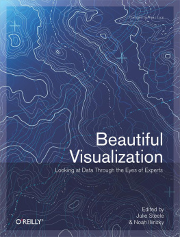
Particularly intriguing when assembling a list of potential contributors was how many ways the word beautiful can be interpreted. The book that founded this series, Andy Oram and Greg Wilson's Beautiful Code (O'Reilly), defined beauty as a simple and elegant solution to some kind of problem. But visualizationas a combination of information and artnaturally combines both problem solving and aesthetics, allowing us to consider beauty in both the intellectual and classic senses.
We hope you will be as delighted as we are by the diversity of backgrounds, projects, and approaches represented in this book. Different as they are, the chapters do offer some themes to the thoughtful and observant. Look for ideas about storytelling, color use, levels of granularity in the data, and user exploration woven throughout the book. Tug on these threads, and see where they take you in your own work.
The royalties for this book are being donated to Architecture for Humanity (http://www.architectureforhumanity.org), an organization dedicated to making the world better by bringing design, construction, and development services to the places where they are most critically needed. We hope you'll consider how your own design processes shape the world.
How This Book Is Organized
Here's a preview of what you'll find in this book:
, by Noah Iliinsky, offers an examination of what we mean by beauty in the context of visualization, why it's a worthy goal to pursue, and how to get there.
, by Matthias Shapiro, explains the importance of storytelling to visualization and walks readers through the creation of a simple visualization project they can do on their own.
, by Jonathan Feinberg, explains the inner workings of his popular method for visualizing a body of text, discussing both the technical and aesthetic choices the author made along the way.
, by Michael Driscoll, shows how color can be used effectively to convey additional dimensions of data that our brains are able to recognize before we're aware of it.
, by Eddie Jabbour, explores the humble subway map as a basic visualization tool for understanding complex systems.
, by Aaron Koblin with Valdean Klump, visualizes civilian air traffic in the United States and Canada to reveal a method to the madness of air travel.
, by Valdis Krebs, digs into behavioral data to show how the books we buy and the people we associate with reveal clues about our deeper selves.
, by Andrew Odewahn, uses quantitative evidence to evaluate a qualitative story about voting coalitions in the United States Senate.
, by Todd Holloway, uses a proximity graphing technique to explore the dynamics of search and discovery as they apply to YELLOWPAGES.COM and the Netflix Prize.
, by Adam Perer, empowers users to dig into chaotic social network visualizations with interactive techniques that integrate visualization and statistics.
, by Martin Wattenberg and Fernanda Vigas, takes readers through the process of exploring an unknown phenomenon through visualization, from initial sketches to published scientific papers.
, by Robert Kosara, emphasizes the relationship between the visual representation of data and the underlying data structure or database design.
, by Moritz Stefaner, describes the process of striving to find a representation of information that is not only useable and informative but also sensual and evocative.
, by Maximilian Schich, uncovers nonintuitive structures in curated databases arising from local activity by the curators and the heterogeneity of the source data.
, by Jer Thorp, guides readers through using the API to explore and visualize data from the New York Times archives.
, by Michael Young and Nick Bilton, relates how the New York Times R&D group is using Python and Map/Reduce to examine web and mobile site traffic data across the country and around the world.
, by Lance Putnam, Graham Wakefield, Haru Ji, Basak Alper, Dennis Adderton, and Professor JoAnn Kuchera-Morin, describes the remarkable scientific exploration made possible by cutting-edge visualization and sonification techniques at the AlloSphere.
, by Anders Persson, examines new imaging technologies being used to collect and analyze data on human and animal cadavers.
, by Danyel Fisher, attempts to work out a framework for designing animated visualizations.
, by Jessica Hagy, provides insight into various aspects of the "elephant" we call visualization such that we come away with a better idea of the big picture.


