1.1 People Are Not Perfect
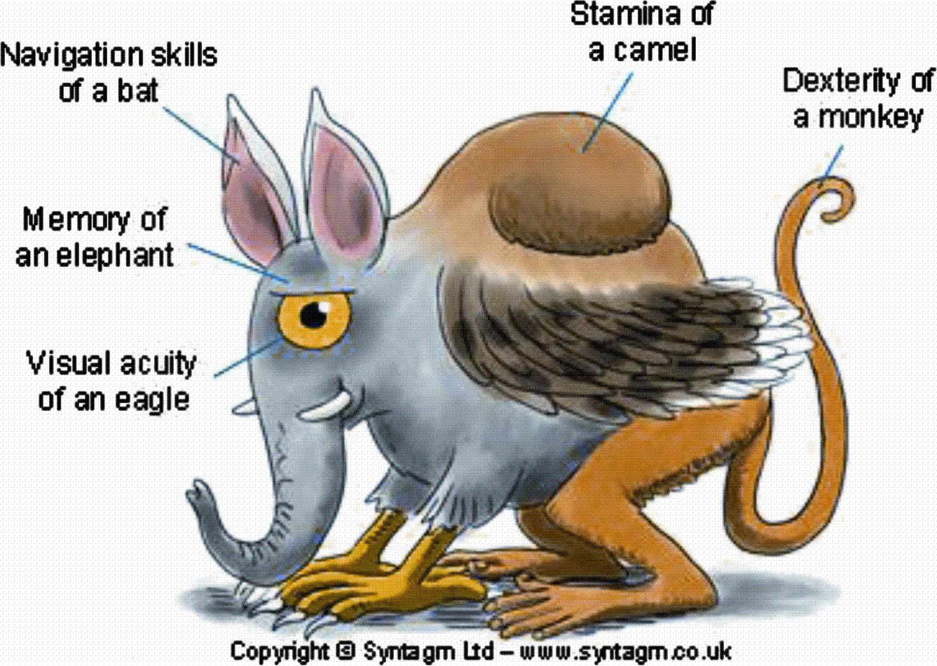
While human beings are amazing creatures, we have our limitations. In the field of design, one glaring limitation is our willingness to overlook them. We design and develop systems that assume the visual acuity of an eagle; memory of an elephant; navigation skills of a bat; stamina of a camel; and the dexterity of a monkey (see Fig. ].
Fig. 1.1
The perfect user
There are several reasons for this. The first is that, by default, designers and developers focus very intently on the problem at hand in the abstract . Issues that stem from human limitations or needs (such as leaving the office to eat or sleep) are peripheral to the solution being designed. However, to make matters worse, there are several human limitations relevant to interactive systems that are not very well known within the field of HumanComputer Interaction (HCI). All these stem from failings of visual perception and so are called blindnesses: attentional blindness, change blindness, and mud splash blindness.
Attentional blindness is well known within the field of visual perception []. It is best illustrated through demonstration, but even a description of the problem is fairly impressive. Perhaps the best-known example is a short video clip of two teams of students wearing either black or white T-shirts (depending on the team). The audience is told simply to count the number of times the teams pass a ball between them as they move about in a fairly distracting manner. About half way through the clip, someone dressed in a gorilla suit walks into the scene, beats their chest and then walks off. They are on screen altogether for about 5 s. At the end of the clip the audience is asked if they observed anything unusual. Only about half of the audience will have noticed the gorilla. The other half of the audience was so intent on performing the task in hand that they were oblivious to this unexpected event.
Another surprising aspect of visual attention is our inability to see changes on a screen when a brief blanking field is present the kind that separates virtually all web pages as the browser loads new content. The phenomenon is called change blindness []. Its effect is a little harder to predict than inattention blindness as some participants will notice the change straight away but others may give up after a minute or two.
The third perceptual issue is related to change blindness. Rather than a blanking field between screens, its contents are changed at the same time as simulated mud splashes hence its name, mud-splash blindness. Participants find it almost impossible to say what has changed.
All three of these issues have important implications for design. Users who might be very distracted by their tasks risk not noticing important information (a gorilla!) on their screens. Changes to web pages may not be seen on reload because of change blindness. And finally, animations or popup boxes, similar to mud splashes in their effect, may mask other changes that occurred at the same time.
1.2 Designers Are Not Perfect
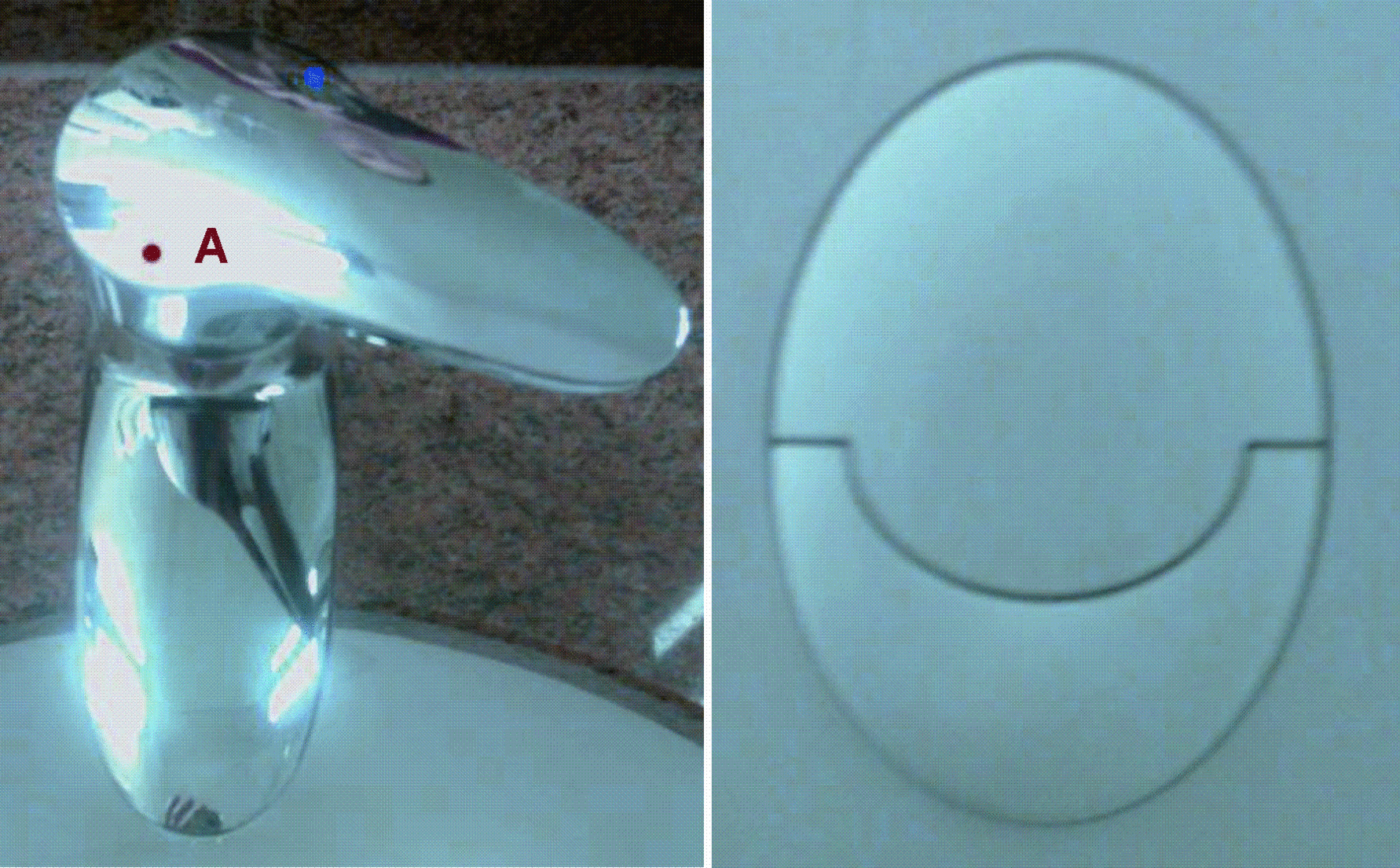
Twenty years on from Don Normans The Psychology of Everyday Things [, where the dot marked A is red, this is the cold setting). In the same hotel room, it is hard to understand why a toilet would have two different flush controls when it is impossible to guess what they do.
Fig. 1.2
Designs are not perfect
The difficulty in these and many screen-based examples of poor design is that we still do not teach (or understand) visual language. We would understand it better if we worked more directly with the users of our creations, but that is still relatively rare. So, for every well-designed web site, desktop application or phone, there are hundreds that could be more self-explanatory and easier to use.
For example, an early version of the Microsoft web site page for Intranet Explorer version 8 should have been fairly straightforward (see Fig. ). But the visual language used suggests that selecting an operating system (A) will show appropriate system requirements (B). On the contrary, the two parts of the page are unrelated. Once the operating system is selected and the Go button pressed, the page is abandoned and replaced with a new one to perform a download.
Fig. 1.3
The new Microsoft web site page for Intranet Explorer version 8
1.3 User-Centred Design (UCD) Usability Cool
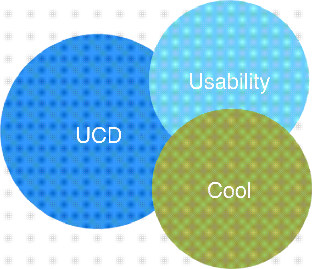
Design examples of this kind are plentiful, but there is an even deeper problem. The pressures to engage and excite customers have created a fog of confusion around the concepts of user-centred design (UCD), usability, and coolness.
These three ideas are related but, as Fig. shows, not equivalent. User interfaces can be usable without being useful (as represented by the UCD circle) and they can be cool without being either. And regrettably, for customers and users, the current trend is towards coolness without substance. Microsoft Windows Vista, Office 2007 and Apples iPhone are all examples of user interfaces that have been designed to be appealing, but in many cases are actually more difficult to use than their predecessors. (The iPhone requires that users have appropriate-sized fingers, for example. It does not recognize a stylus.)
Fig. 1.4
The concepts of user-centred design (UCD), usability, and coolness
Consider Fig.. This shows two views of the same toolbar from Microsoft PowerPoint 2007. The only difference is the window size. In smaller windows, the toolbar is compressed to fit. Cool, but very difficult for technical support departments who are trying to assist colleagues without seeing their screen. And, unlike all previous versions of Microsoft Office applications, the ribbon as this interface is called, completely replaces the menus.

