Thank you for purchasing this How Design eBook.
Sign up for our newsletter and receive special offers, access to free content, and information on the latest new releases and must-have designing resources! Plus, receive a coupon code to use on your first purchase from MyDesignShop.com for signing up.
or visit us online to sign up at
http://howdesign.com/ebook-promo
Dedication
For Angela, my biggest builder.
Contents
Portfolio Sites
As with each previous volume of my Idea Books, I like to focus the first portion of the book on a secondary topic. Volume 1 featured colors, Volume 2 featured the basic elements of design, and Volume 3 featured various technologies that impact web design. This new volume focuses on taking an in-depth look at online portfolio sites.
It may not be all that surprising, but the most common types of sites people submit for my books are agency and portfolio sites. This is also an area that I am asked about very frequently. With this in mind, I am excited to analyze trends and patterns more extensively in this specific area.
Even if you dont need to design a portfolio site, I believe you will find the categories very interesting. Many of the topics I have collected for this section are entirely new to me and represent some interesting ways to look at design patterns. For example, I am particularly intrigued by the regional chapter that shows the differences in portfolios from around the world.
While I completely understand that we think of an individual person when we think of a portfolio, I am also including agencies in this section. Though most of the sites presented here are for a single person, there are some collections here dedicated to agencies of different types. You will also see some agency sites peppered throughout the other sections.
Finally, I want to point out that the sites collected here are not limited to those in the design world. I have attempted to collect a wide range of sites that fall into many areas that require an online portfolio. These include portfolios for designers, photographers, painters and even sports figures.
01
Portfolio styles and trends
At the heart of my Idea Books are design styles and trends. With this in mind I want to lead off this section on these topics. You will perhaps recognize many of these approaches from my previous books. The difference here, of course, is that they are 100% portfolio sites. At first I thought it would be hard to build out this section, but once I got going it was actually really hard to stop. I could fill volumes of books with categories of styles in just the portfolio genre.
I think there is real value in looking at a specific niche of web design in such a detailed way. It is amazing to see just how many patterns emerge. As a result, we can focus on the common ways in which people solve various problems. In the end you will hopefully find some fresh ideas to inspire your portfolio designs and any other type of work as well.
Super Clean
The Super Clean chapter is one I include in all of my Idea Books. As I have said in the past, this style embodies all of my favorite qualities and the sites here are typically the ones I admire the most. Sites that fit in here must display the cleanest and most beautiful designs. And most often they contain a clean, spacious layout that is easy to consume. Lets dissect a few examples to see what I mean.
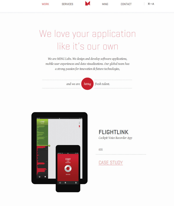
A perfect example is the MING Labs website (). This site embraces a minimalist approach and is void of any structural design elements. This allows the designer to focus the users attention through a clear (and beautiful) typographic hierarchy. Though the site might appear simple, its detailed nuances are gorgeous and leave nothing undone. Notice how clean the design feels. It is full of space and one can easily digest its contenta perfect example of the super clean style at work.
Another example that easily fits into this categoryand is equally easy to loveis the Heikopaiko site (). Again the site leans toward the minimalist mindset, as most Super Clean sites do. But here, it feels less sparse, and yet it still has a clarity to it that is very welcome. Notice how you have no trouble scanning the site and consuming its content. There is no confusion in the flow of the document, no mixed messages, and no details left unattended. Super Clean sites like this one are so refined that it is almost annoying; annoying because it shows just how perfect a website can be. Frankly, this site feels so spot on that you feel like youre looking at a Photoshop comp and not a live website.
Finally, lets look at the portfolio site of Aaron Smith (). Again we find that the site is full of space and relies on a really strong typographic hierarchy. Another pattern starts to emerge, though. Many of the sites I consider Super Clean make use of a single stream of content: rather than having sidebar elements and extra things that confuse the layout, they rely on a single column. This reinforces the content hierarchy and is a powerful component of making something feel clean. It seems that this would also be a great way to make a site easy to translate into a mobile structure. Perhaps some of these sites even took a mobile-first approach, which would explain the pattern.
FIGURE 1: www.minglabs.com
FIGURE 2: www.heikopaiko.com
FIGURE 3: http://adesignerd.com
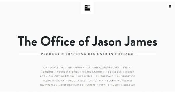
http://jasonjam.es
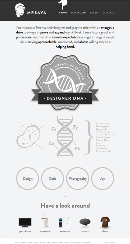
www.mrbava.com
http://robdavisdesigner.co.uk
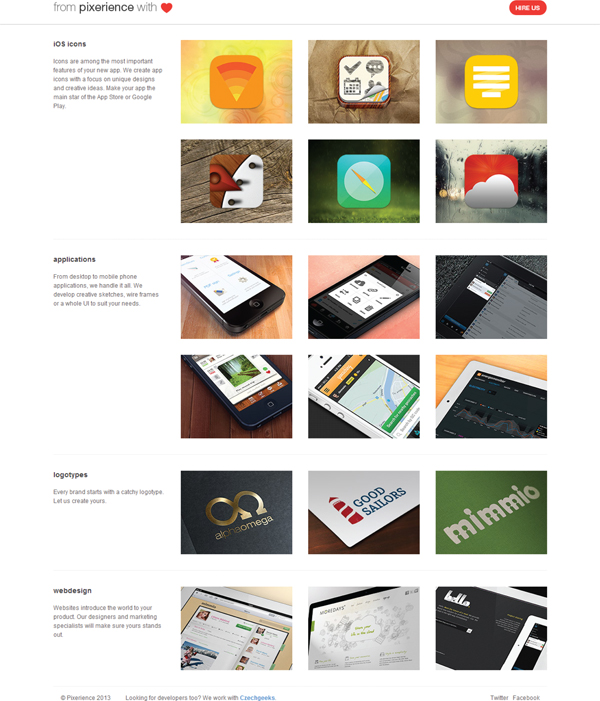
www.pixerience.com

