Thank you for purchasing this How Design eBook.
Sign up for our newsletter and receive special offers, access to free content, and information on the latest new releases and must-have designing resources! Plus, receive a coupon code to use on your first purchase from MyDesignShop.com for signing up.
or visit us online to sign up at
http://howdesign.com/ebook-promo
DEDICATION
For my biggest fan, my mom Alyce
TABLE OF CONTENTS

WORD FROM THE AUTHOR
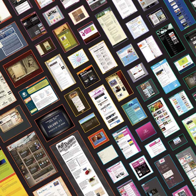
Cataloging web design is a dangerous business that starts with a few obvious topics and soon leads to hundreds of categories and thousands of samples. This book represents two years of just such methodical activity. Inspired by the work of Steven Heller in his book Genius Moves: 100 Icons of Graphic Design, I searched for inspiration in modern web design patterns by creating the website Design Meltdown. The result of this experiment exceeded my expectations. The inspiration I found in these random groupings snowballed into the book that is before you today.
To say that it is a challenge to create a current book about the web is an enormous understatement. By the time this book is published, countless samples will have changed while others will have disappeared completely. This is to be expected. In fact, it is the webs continuous growth and change that appeals to many web designers and keeps the industry exciting. The irony of such change is that it creates an endless need for resources like this book.
I like to think of this book as a snapshot in time. It captures the web as it exists in 2008, showcasing the very best we have to offer at this time. The inclusion of certain topics and the exclusion of others reflects the status of the industry and will hopefully serve as a reference point in years to come. I like to think that web design, like print design, can be nostalgic, and that old styles can return from the grave to find new life. The industry has gotten to a point where it is truly respected as a legitimate platform for commerce, and more interestingly, design. As a result, the quality has improved immensely. I hope we do not look back on this eras web design with disdainas we sometimes do the earlier years of the Internetbut instead appreciate the works that have been created and allow them to re-inspire us to shape the future.
Patrick McNeil, July 2008
01
SITES BY TYPE
The selected site types presented in this book barely scratch the surface of possibilities. In fact, one could easily create an entire book based on the cataloging of sites by their industry or purpose. The selection of topics here, such as web services, software and the ever-present need for web hosting, serves to represent some of the most active segments of the online world. From portfolios and blogs to church sites, these categories showcase some of the finest sites in each segment, and effectively capture exciting new areas of development right now.
BLOG
An entire book could be written on beautiful blog design, so it seems absurd to present only a few examples here. Unfortunately, the scope of this particular book requires me to limit these examples to a few incredibly beautiful ones. The biggest challenge for blog designers is to create a fresh, new design that isnt stuck in a basic blog default template.
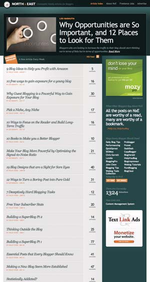
One design pattern that works well is to highlight the most recent post on the homepage so it stands out. A remarkable example of this is North x East. This beautifully crafted blog essentially has the title of the most recent post displayed prominently in the main banner. This is one of the most distinct and effective implementations of this particular style. It appeals to repeat visitors by making the most recent post easy to find. Instead of facing the overwhelming task of choosing from a list of interesting titles, even new users are encouraged to dig deeper on this site by starting with the suggested post.
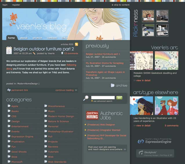
Another nice example of the highlighted post is on Veerle Pieterss blog, which displays the most recent post on the left and a list of previous posts next to it. A short excerpt, a date icon and a large title all help to set the highlighted post apart. Another nice feature of this blog is that it focuses more on the categories of the posts than the order in which they were written. This topic-oriented organization suits the sites content and readers. This is a subtle distinction, but it is certainly different from the default configuration of most blogging engines.
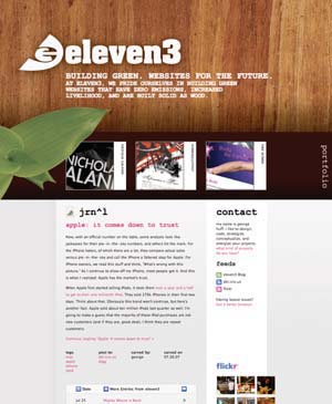
Yet another example of this approach is Eleven3. The primary brand of the site takes up the majority of the screen when the site initially loads. What follows is standard blog content, except that, again, the newest post is emphasized. This unique approach meets the traditional needs of a static sales-oriented site with the fresh content of a thriving blog.
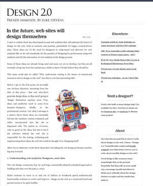
The final twist on this pattern is to display the full content of the most recent post. Design 2.0 does this. Users can easily read the new content without having to click past the homepage. Interestingly, this minimal approach is perfectly aligned with the overall minimal style of the blog.
Ultimately, the goal of blog design is to capture new visitors while rewarding repeat users. Creating an easy-to-consume design is a key piece of the puzzle. Making a distinct and beautiful design is certainly another. These samples have done both.

