Contents

Creating the document
Just because a document looks great doesnt mean it has to be complicated to create. This section provides a summary of how version 2 of the report was created, along with tips for help getting it done.
This document utilizes basic page layout features such as headers and footers, tables to help easily lay out the page, styles to format text and tables, and graphics to help organize content and call out important points. Take a look at how each of these tools was utilized to create this sample document.
- The header uses a two-cell table to enable the company logo on the left side of the page to sit on the same line as the title and page number on the right. Instead of using a tab to separate the left and right content, a table provides a compartment (cell) for each piece of content that lets those pieces sit side side-by-side and enables you to control vertical alignment as well.
With table gridlines and formatting marks visible, you can see the structure of the header here.

- To edit the header or footer, on the Insert menu, in the Header & Footer group, click Header or Footer, and then click the Edit option that appears at the bottom of the gallery. Or double-click the header or footer area of the page.
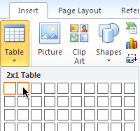
- To insert a table, on the Insert tab, click Table. Drag your insertion point across the number of columns you need and down the number of rows you need, and then click to insert the table. For example, to create the two-column, one-row table for this header, drag your insertion point across the first two cells of the top row of the grid, as shown here.

- When your insertion point is in a table, the Table ToolsDesign and Layout tabs become available automatically. You can add or remove borders on the Table ToolsDesign tab, in the Table Styles group. On the Table ToolsLayout tab, in the Table group, you can toggle gridlines on and off (note that gridlines do not print). Also on the Table ToolsLayout tab, in the Alignment group, you can change the horizontal and vertical alignment of cell content.
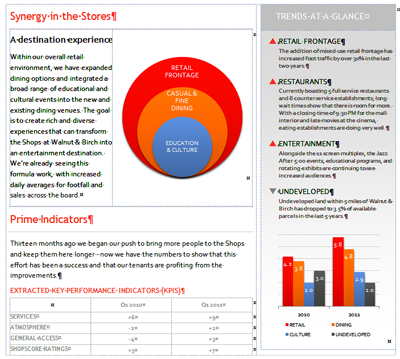
- The layout for the center of this page includes four tables, as you can see with gridlines visible here.

- A simple two cell table is used to create columns for the main body of text and the sidebar text. This outer table is called the host table.
- A two-cell table is nested in both the left and right cells of the host table. On the left, the nested table enables the SmartArt graphic to effortlessly sit beside the related text. On the right, a two-cell table provides separate cells for the heading and the body of the sidebar content. By nesting one table inside another, you enable the cells of each column to grow independently without any extra effort. Notice how the sidebar text can grow vertically without affecting the layout of content on the left.
- The last table in this section is the small data table that is nested at the bottom of the left host table cell.
You can open the sample report document to examine this setup for yourself. Or open the template version of the document to customize and reuse this layout for your own documents as well as for additional tips about how to get it done. For help creating nested tables, see Adding impact to a basic document: agenda/event program.
- A handful of paragraph styles and one table style are used to format the content on the sample page. For example, the dotted borders that surround heading paragraphs such as the one shown here are paragraph borders included in the Heading 2 style.

A style is a collection of formatting that you give a name, to save you time and help keep formatting consistent. So, you only have to set up the formatting you need once, and you can then apply it with just a click wherever you need it throughout the document. If you later want to update that formatting, just update the style, and the formatting is updated automatically wherever that style is applied in the active document.
Take a look at two additional uses of styles to help save time and simplify creating this document.
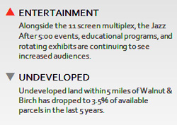
- The positive and negative arrows used in the sidebar are bullets included in two paragraph stylesone for the positive (red) bullets and one for the negative (gray) bullets.

- The small data table uses two paragraph styles to format its text (one for data and one for row headings) and one table style to format the structure of the table. By creating a table style, you can apply consistent formatting to any table in your document with just one click.

Learn about working with paragraph styles.
Learn about using pictures or symbols as bullets.
Learn about table styles.
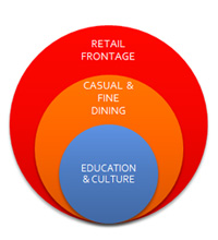
- The sample page shown in this article uses three graphic elements: a SmartArt diagram (the stacked Venn diagram), a chart, and a shape that provides the gradient background for the sidebar.
- SmartArt graphics enable you to create a professional-quality diagram as easily as typing a bulleted list. In the Office 2010 programs Microsoft Word, Microsoft PowerPoint, and Microsoft Excel, there are over 130 diagram layouts available, including organization charts, list diagrams, organization charts, picture diagrams, relationship diagrams (such as the stacked Venn layout used in this sample document), and more.

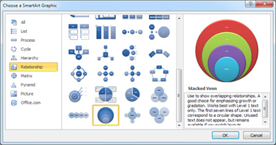
SmartArt helps you tell your story more effectively because a well-chosen layout helps to visually convey your point. In fact, when you view the available layouts in the Insert a SmartArt Graphics dialog box, description text provides tips on both the type and amount of information that the layout can best help to express. For example, see the description of the Stacked Venn diagram shown here.

Learn about working with SmartArt diagrams.
- Charts in Word 2010 are Excel 2010 charts. You can insert, customize, and edit charts in Word just as you do in Excel (or in PowerPoint). The column chart in this sample document is customized, such as to use the same dotted line formatting for the gridlines as is used in several elements throughout the document. SmartArt graphics and charts both coordinate automatically with the active document theme, so the color and graphic formatting effects that you see on both can be applied in just a couple of clicks.

