Bibliography
Borgman, Harry. Drawing in Ink. New York: Watson-Guptill, 1977.
Guptill, Arthur L. Rendering in Pen and Ink. New York: Watson-Guptill, 1976.
Lohan, Frank. Pen and Ink Techniques. Chicago: Contemporary Books, 1978.
Norling, Ernest. Perspective Drawing. Tustin, CA: Walter Foster Art Books.
Pitz, Henry C. Ink Drawing Techniques. New York: Watson-Guptill, 1957.
. How to Draw Trees. New York: Watson-Guptill, 1972.
Sloane, Eric. An Age of Barns. New York: Funk & Wagnalls, 1967.
Note: Eric Sloane has written and illustrated a number of books on Americana. His pen sketches in any of them are worthy of study.
1: Nostalgic Subjects
Things and places of the past are the ingredients of many a favorite painting, sketch, poem, and story. A wistful oversimplification almost always goes hand in hand with a nostalgic piece in any art form. One temporarily sets aside all unpleasant aspects of reality and focuses on the rememberedor imaginedbeauty and peacefulness of long past moments. One basically provides an emotional glance at something that was, or that might have been if...
Nostalgia implies pleasant memories of or fantasies about things that will never again be; for instance, the security and warmth of a happy childhood remembered only as a hazy overall feeling when toys of that era are seen, or the imagined comforts of a far less hurried life when old-time photographs are rediscovered, or the rosy image of a place still loved but unlikely to be visited again.
If you traveleither near or faryou have a wealth of sketching material stored in your memory. Places that are imposing, modest, or downright dingy but still hold a special place in your lifes experience are great subjects. They are good choices because they have spoken to you, touched you, so that your rendition of them can truly be your statement about something of value to you. The way you capture such scenes becomes your personal nostalgia. It may well touch someone else in a similar manner. This is what all art should be. Interpretations by critics are relatively meaningless; the important element is what the artist felt as he or she executed the work and how well he or she feels the statement was made. If seeing the work touches a viewers heart, then the work is even more successful. This added success should be considered only a bonus, however, since the basic success is determined solely by the artist.

Nostalgia can encompass a variety of subjects as wide as your own imagination when tapped as a source for sketch ideas. So, once upon a time...

The Old-Timers
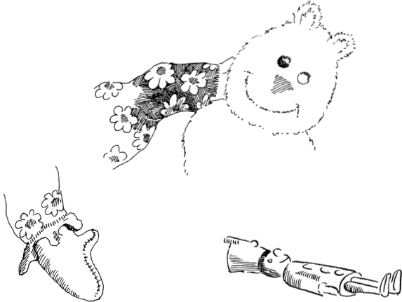
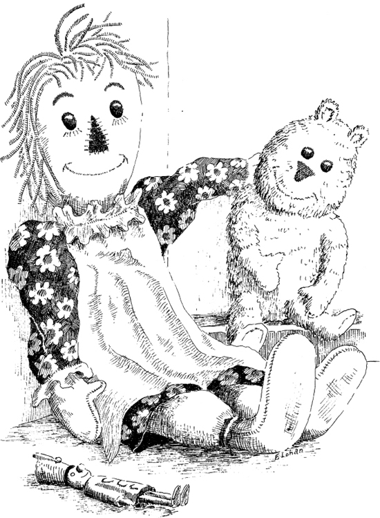
This is a sketch of a small collection of toys that probably predates most of us. It was handled with a fine pen and, for the most part, delicate line work in order to carry out the idea of softness in the dolls clothing and the bears fur. Bold pen work would have created a valid but entirely different feeling.
Notice that the dolls hair was created with relatively few strands actually being drawn. The fur on the bear was suggested with a very few fur indications, the fuzzy outline of the bear carrying most of the idea. Compare the bear with the dolls feet, which are comparatively smooth, as is the wooden toy soldier.
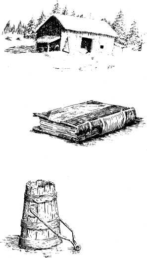
Other old-timer subjects would include some old books, an old Tiffany lamp, a steamer trunk laying open, a well bucket, a horse collar and other tack, and so on.

The Old Rural Route
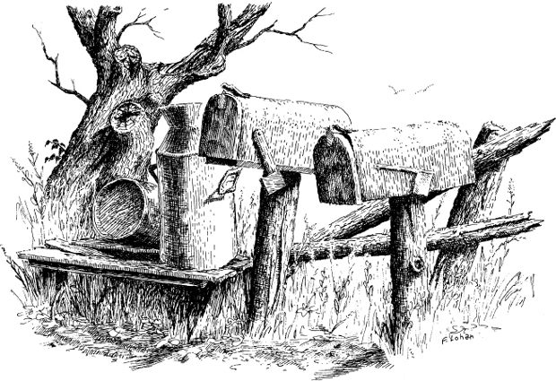
The Old Rural Route includes a number of old-timersmailboxes that have seen better days, milk cans of a bygone age when people were less concerned with health hazards (and probably worked too hard to be sick), a rail fence long past performing any function, and a tree still exhibiting a rugged, massive dignity, even in death.
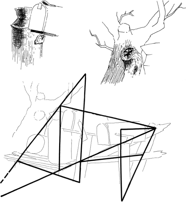
The composition is based on a series of overlapping triangles of different sizes, as shown in the auxiliary sketch.

The predominance of old weathered wood in the composition dictated a bold, rough approach to both the outlining and the texturing lines. A heavier pen was used here than that in the preceding collection of toys.
When I sketch a jumble of weeds and grasses, as around the mailboxes and the milk stand, I indicate just enough to carry the idea of mixed vegetation. Too many strokes make it look dark and shadowed in what should be the sunlit areas.

The four sketches on the following pages 1900 in Farmington, Michigan, now a are based on old photographs taken about Detroit suburb.
The Old Home Town
Correct perspective is vital to successful rendering of structures. Whatever method you use, be certain that you eliminate all perspective problems in your pencil sketch prior to starting with the ink. The best way I have found to catch mistakes in perspective is to look at the working pencil drawing in a mirror. This seems to magnify such problems and lets you spot them more easily.
If you are like me, you are never quite satisfied with the exact view presented by a photograph. Almost without exception I change the angle, move the eye to a position different from that of the camera lensperhaps higher or lower, and often considerably farther to the left or right. This is done to include more of some element or another and often to minimize or eliminate the relative monotony of a particular feature. Artistic license is there for you, the artist, to use.
Successfully changing the point of view requires at least a little knowledge of perspective drawing so that you can reconstruct the object in the correct proportion and relationship of detail. One of the best summary explanations of perspective basicsall anyone needs to know about the subject to sketch reasonably wellis contained in the Walter Foster book Perspective Drawing by Ernest Norling, which is available in artists supply stores that carry the Walter Foster series.
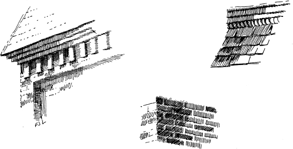
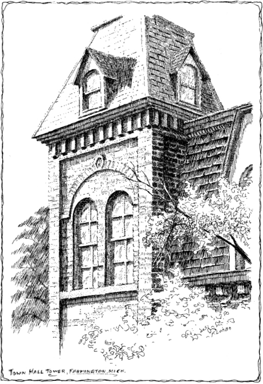
This sketch of Town Hall Tower was taken from a photograph that showed much more of the building, and showed it from ground level. The pattern of the Mansard roof, decorative brickwork, and windows of the tower caught my fancy. I imagined I was up in a cherry picker, close to the second floor level. Then I created my own composition, using the photograph as a reference for placement and proportion of details.
I used a fine point for the line work in the sunshine and a medium one for the shaded work.


The Steele Mill
The Steele Mill sketch was done as if I was looking across the creek at the building on a bright, hot summer day.


