For 50+ design articles, free design courses, updates, and more visit: www.DesignCaffeine.com
Beginning
 Your work should empower and inspire.Thats how important it is.
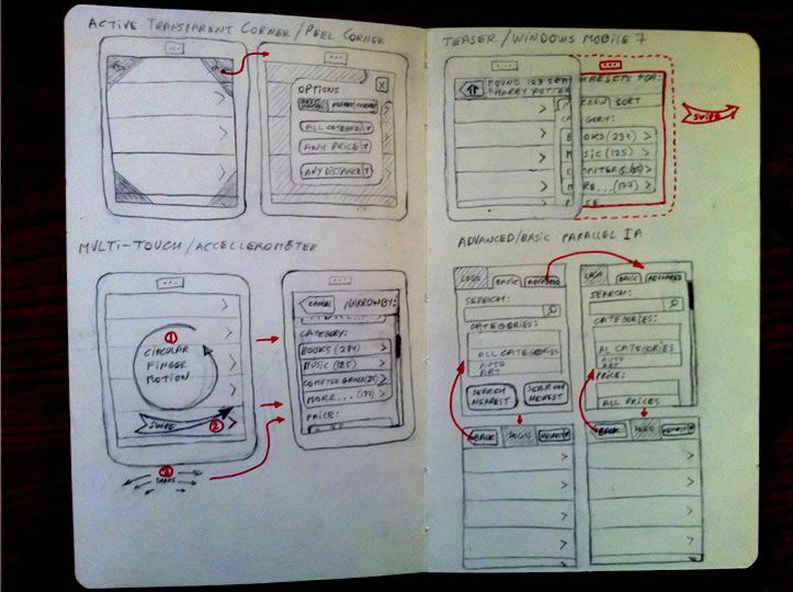
Sketching is the life-blood of any design process. I dida lot of visual thinking in my Moleskine notebook and when I started doingmobile design, my approach was much the same. Proudly, I labored behind closeddoors, producing many sketches like these, which made me feel very designery:

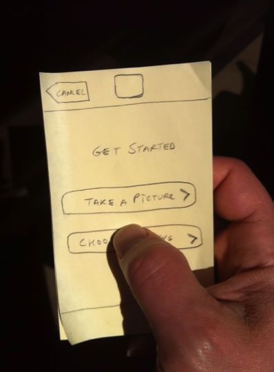
One day, I had to rush out the door to a client meeting and left my Moleskine behind. At the meeting, I needed to quickly think with my pen to design a mobile screen, so I grabbed the first available piece of paper lying on the table: a pack of sticky notes. I was trying to be as quick as I can, so I drew the bare minimumjust the page layout and controls. Imagine my astonishment, when the companys CEO (normally a reserved and dignified personconsummate professional, whom I greatly respect) suddenly jumped up and, seizing my pack of sticky notes in his hand, started vigorously gesticulating and tapping my hand-drawn buttons with his thumb, saying See! This is EXACTLY what I mean!:

Eureka!
I never imagined that an $800 iPhone, thepinnacle of human achievement, the technological miracle of the 21st century ... could be exceedingly well approximated by a $1 pack of sticky notes coupledwith an active imagination!
Since that memorable meeting, I had the privilege to speakat length with Steve Krug, the author of DontMake Me Think (http://bit.ly/1dpdmmt3),who was very receptive to my ideas and encouraged me to explore the conceptfurther. Mr. Krugs interest in the early versions of my sticky note prototypesand his encouragement five years ago eventually led to the book you hold inyour hands.
For the last five years Ive had the privilege to present andteach at more than 50 events, workshops, and university courses in 10countries. Throughout this time, my initial lightweight mobile design techniquehas been challenged and improved through many enthusiastic experiments andinsightful questions from the participants, as well as some intensive clientwork, which resulted in multiple featured apps in both Apple App Store andAndroid Play Store. This book is the result of those workshops and design sessions,so I want to thank the thousands of people that came to my eventsIvelearned as much, if not more, from those sessions as those that have attendedthem. In particular, I want to thank the students of my San Francisco StateUniversity Agile Mobile UX Design Certificate Course, who graciouslyconsented to have their work featured as part of this book:
Will Krause
Adam Beu
Anastasia Walia
Talya Carrie
Frances Liddell
Valerie Lord
Ken Bousquet
Kate Chadd
Darrin Jones
Leslie Keats
Patricia Larsen
Jacob Madsen
Deepti Mande
Katherine Sawyer
Monica Zendig
Theyre the best collaborators anyone can hope to have, andIm proud of what they accomplished in just three short weeks of class!
I also want to thank my sponsors who pre-ordered the book onPublishizer:
Vitaly Polekhin
Guy Vincent
Aaron Vargas
Bob Royce
Louis Rouffineau
Tom Belunis
Andrew Lawton
Anastasia Walia
Andrew Sandler
Anthony Hand
Chris Noessel
Dan Keldsen
David Hunkins
Eric Henderson
Their generous financial support improved everything that isgood about the quality of the book: editing, art and video production, andindeed made this book possible. Any and all mistakes are my own.
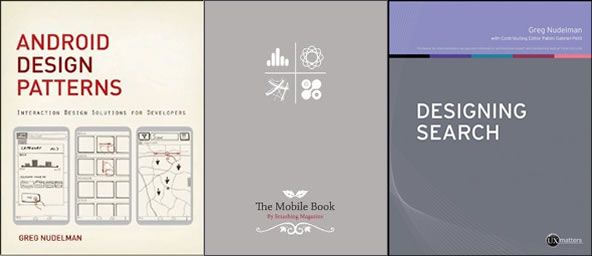
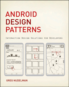
My three previous books were more concerned with the Whatof design, such as design patterns and pitfalls:

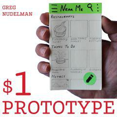
In contrast, the book you hold in your hands is much moreabout the How. Instead of providing design patterns, this book combinesthe best of modern mobile usability techniques with Agile development lifecycleand Lean business practices. This combined methodology creates a practical, no-nonsenselightweight UX design methodology I call The $1 Prototype.
This methodology can be used to quickly envision and designany mobile or tablet product or service: from native and hybrid mobile andtablet apps to responsive and mobile-optimized websites. CEOs, mCommerceDirectors and Product Managers as well as UX Professionals of all kinds shouldfind the book both useful and practical.
Another essential difference from my previous work, is howthis book is organized. I decided to use the Question and Answer formatthroughout the book to create the feel of doing the design process as aworkshop as well as to keep the book concise and practical. My goal is toenable you to finish this book on the flight from SFO to JFK and get off theplane full of new strategic ideas and techniques you can put to work evenbefore jet lag wears off. The Q&A format should also help you easilyrevisit any topics you need at a later time.
Rather than try to convince you that UX design is valuable,I simply assume you already know this. And if at times I speak forcefully, itis to cut through layers of accumulated misunderstandings around UX and to helpyou get back to the core of whats really important: empowering and inspiringyour customers, while making a good living for you (and profit for yourcompanys shareholders.)
If youre currently a UX practitioner, this book will giveyou modern techniques to apply UX principles with renewed vigor, efficiency andconfidence. If youre new to UX design, this book will give you complete, practical,mobile design processes that will immediately benefit you and your team. This bookdoes not aim to present anything particularly Earth-shattering. Instead its arestating of the original UX principles for our modern, mobile agearapid, lightweight, and resilient application of simple but profound techniquesthat really work in the real world.




 Your work should empower and inspire.Thats how important it is.