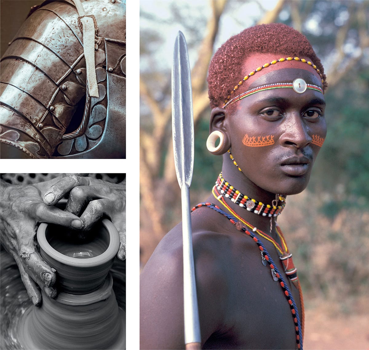
The origins of identity design began in the times of the earliest human tribes. Consider how members of a tribe would distinguish themselves from other tribes by markings, dances, language, and other visual and verbal signs. Knights and nobility, villages, cities, and countriesthey, too, were all given a form of differentiating visual mark.
What began as a manifestation of the human condition evolved into something else in the realm of commerceancient Egyptians branded their cattle with hot irons to signify ownership, and potters engraved their makers marks on bowls and plates as a guarantee of quality.
When the difference between two functionally similar products is minimal, theres a need to create an emotional differentiation, wherein lies the roots of identity design in relation to consumer products and services. In 1876, the Trade Mark Registration Act was passed in the United Kingdom, and Bass Ale was the first trademarked brand in the world. This act gave businesses the ability to protect their identifying marks from use by competing companies and, coupled with the growth in commerce after the Industrial Revolution, opened the door to the spreading of brands across the globe. The oldest U.S. trademark still in use is that of Samson slaying a lion, issued to the Samson rope company in 1884.
Photos from Unsplash (clockwise from top left) by Samuel Zeller, Mark Kucharski, and Quino Al. Previous page by Joao Tzanno.
A visual identity is to business what faces are to people, and although it was once relatively simple to create different marks for competing businesses, the advance of capitalism has challenged designers to craft distinction in highly saturated worldwide markets. Its a challenge that brings opportunity and responsibility. Good businesspeople know the value that design can have on their brands, and whereas it was previously more common for designers to find themselves in meetings with middle managers, theyre now often an integral part of the boardroom, advising owners and CEOs on how to succeed.
Symbolism is generally the first thing that comes to mind when people think about a brands visual identitye.g., the swoosh, red cross, golden arches, and bitten apple. Its also just one small piece of the picture. In the words of Brian Collins, Brands exist in the minds of people who interact with them, and while memories of a brand are driven by the quality of a product or service, the quality is increasingly being backed up by a range of designed elements that are appropriate to whats on offer. A brands identity can include a logo, website, vehicle graphics, business cards, staff uniforms, sound branding, tone of voice, packaging, art direction, mannerisms, and a lot more.
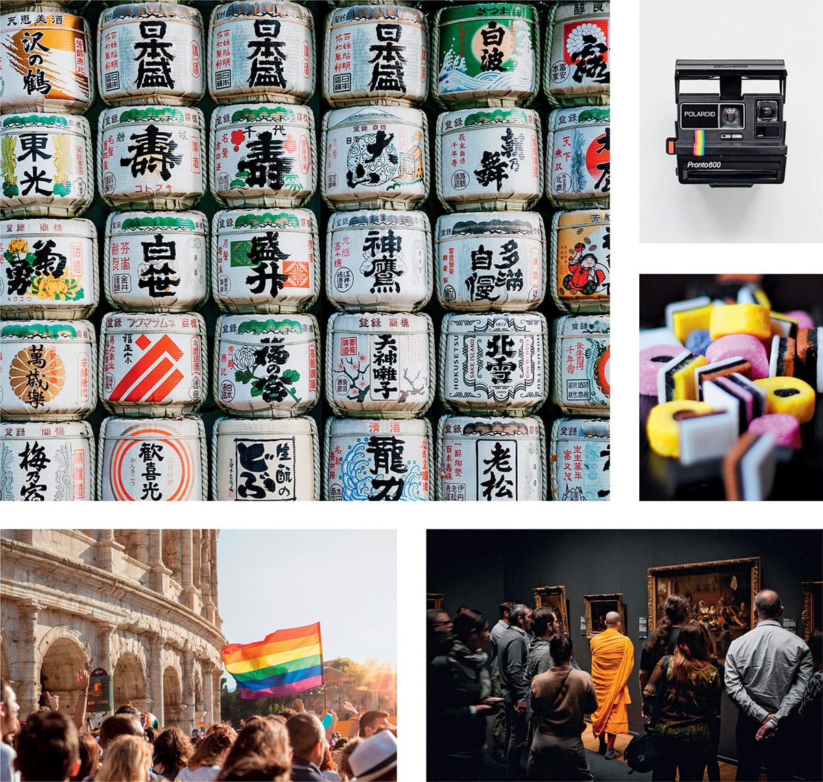
Consider what a potential customer might see, or hear, or even smell, or feel, when lifting a product off a shelf, using a digital service, or climbing up the steps onto a plane. Signage, reception desks, carrier bags, invoices, receipts, social media profiles, language, photography, typefaces in marketing literaturethese are all parts of the broader identity. Although some companies have an enormous number of items that can be branded, good design doesnt need to be complicated. Rather, the strongest design includes only as much as whats necessary.
Photos from Unsplash (clockwise from top left) by Leio McLaren, Yoann Siloine, Hello Im Nik, Antonio Molinari, and Luis Cortes Martinez.
Not every customer is a designer, but were all surrounded by design, and whether or not were aware of it, the ways in which a brand is packaged offer clues to its quality. How a product or service looks must reflect the quality of whats on sale. When it doesnt, theres a disconnect between what a buyer sees and the impression the seller wants to give. Equally, people are smarter than to keep buying something that sets expectations higher than whats delivered. The creation of a fitting brand identity is an investment that can pay off year after year, with a continual increase in value because the more people see a design, the faster they remember it the next time they need the associated product or service.
Consistency is often wrongly associated with sameness, but it can mean consistently distinctive and vibrant.
Great brands are consistent. The same is true of their identities. Consistency is often wrongly associated with sameness, but it can mean consistently distinctive and vibrant. That can be achieved simply by using a single typeface in a variety of ways, combining a distinctive palette with compelling copy, crafting a more extensive unit of complementary elements, and myriad other ways that help to visually ingrain a brand experience to memory.
When used correctly, design helps to turn potential buyers into loyal customers and advocates, and this book has been written to document whats involved in the creation of strong, emotive, and enduring identities. After reading, youll be able to apply the same principles and techniques to your own projects or business ventures.
Im David Airey, and since starting my independent design studio in 2005, Ive specialized in designing identities for companies of all sizes around the world. Despite my years of experience focusing on the topic of this book, the majority of my time in the profession has seen me work independently rather than as part of a larger firm. Although thats helped me to learn about the business of design much quicker than I otherwise would have, its also meant that Ive been less likely to change my waysto fix what isnt broken, at least from my perspective.
From talking to the hundreds of designers Ive made friends with over the years, its clear that theres no single set of rules that eclipses all others when crafting the right brand identity. So instead of writing about how I conduct business, I spent months interviewing a variety of the worlds most talented designers and studios about the processes they follow when helping their clients to achieve their goals. The result is an intriguing insight into how visual identity work is carried out by design firms in the United States, Canada, England, Scotland, Sweden, Belgium, Ukraine, Vietnam, Singapore, and Brazil. The contributing studios reveal their design process from start to finish, sharing a detailed overview of how they work with clients, as well as walking you through one of their most compelling projects. At the end of each feature, Ive added a brief recap to highlight important points.
Thank you for joining us.
Design has to work.
Art does not.
Donald Judd


