Doing Visual Analysis
Doing Visual Analysis
From Theory to Practice
Per Ledin
and David Machin
SAGE Publications Ltd
1 Olivers Yard
55 City Road
London EC1Y 1SP
SAGE Publications Inc.
2455 Teller Road
Thousand Oaks, California 91320
SAGE Publications India Pvt Ltd
B 1/I 1 Mohan Cooperative Industrial Area
Mathura Road
New Delhi 110 044
SAGE Publications Asia-Pacific Pte Ltd
3 Church Street
#10-04 Samsung Hub
Singapore 049483
Per Ledin and David Machin 2018
First published 2018
Apart from any fair dealing for the purposes of research or private study, or criticism or review, as permitted under the Copyright, Designs and Patents Act, 1988, this publication may be reproduced, stored or transmitted in any form, or by any means, only with the prior permission in writing of the publishers, or in the case of reprographic reproduction, in accordance with the terms of licences issued by the Copyright Licensing Agency. Enquiries concerning reproduction outside those terms should be sent to the publishers.
Library of Congress Control Number: 2017945679
British Library Cataloguing in Publication data
A catalogue record for this book is available from the British Library
ISBN 978-1-4739-7298-8
ISBN 978-1-4739-7299-5 (pbk)
Editor: Michael Ainsley
Editorial assistant: John Nightingale
Production editor: Imogen Roome
Copyeditor: Neil Dowden
Proofreader: Christine Bitten
Indexer: Silvia Benvenuto
Marketing manager: Lucia Sweet
Cover design: Jennifer Crisp
Typeset by: C&M Digitals (P) Ltd, Chennai, India
Printed in the UK
Contents
What is visual communication?
Introduction
We often hear that society is becoming more visual, that we are becoming dominated by the image. It is certainly true that technology has made it much easier for us to produce and distribute images. It is also the case that the development of consumerism has led to new levels of visual sophistication in the production and dissemination of advertisements, through social media, the Internet and on our mobile devices. If we just compare the technical standard of commercials and promotional material that we find now to that of 30 years ago, the changes are staggering. But in fact this idea of the visual is rather restricted. Those who research the visual have argued that this is problematic (Smith, 2008), that the visual involves so much more than photographs, commercials and film clips. This book agrees with this position offering a very specific kind of tool kit for analysing a much wider range of visual communication. We say more about the book and how it sits alongside others which provide introductions or methods of visual analysis shortly. But first we want to say what we mean by visual communication. What does this book take as the visual? This has huge importance as regards how we approach and carry out visual analysis.
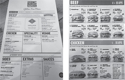
This idea of the increasing impact of images is not as clear as we might think. Images can be pictures, but we also have mirror images, images in our minds and dreams. Even writing on a page presents an image including the kinds of typeface used and the texture of the paper upon which it is printed that may bring certain kinds of associations to the reader. If we look at the two menus in , they are a kind of image or visual wholes used to communicate. The menu on the left for a gluten-free burger kitchen is printed on a rougher type of paper than that for the fast-food restaurant to the right where everything looks shiny and smooth. The gluten-free menu has no pictures, whereas we see photographs of almost shining burgers in the fast-food case. But why is this so? Why might it be inappropriate for the gluten-free menu to also carry these? Also the two use colour, fonts and spacing in very different ways. Visual communication in this sense comprises objects and things that we experience as wholes, which are part of everyday life activities and which are built up of observable qualities.
At a superficial level a casual observer might say that the gourmet-kitchen menu looks more up-market than the fast-food menu. They may say it looks more serious than the more lively fast food. In this book such menus are the kinds of data for which we provide tools for analysis. Both of these are instances of visual communication that are intended to communicate ideas and values about burgers. In marketing terms one of these must communicate ideas of a consumer experience of something more natural, unprocessed, perhaps authentic, while the other must communicate lively, quantity, immediate. What we want to show in this book is that these forms of visual communication can be broken down and analysed in details. While the viewer may experience the menu or other forms of visual communication as a whole, as a physical thing, it is at this level of detail that we can begin to understand how they work. We will be highly specific as to how these ideas of natural or lively can be communicated. And the tools that we present that allow us to do so can allow us to ask and answer all kinds of research questions. For example, a research project may take an interest in the marketing of healthy food, in other words in how food stuffs that are quite ordinary are dressed up to appear natural, traditional or honest.
Figure 1.1 A gluten-free burger menu (left) and a fast-food Burger King menu (right)
The materials of visual communication
When analysing visual communication in this book we do not use the notion of images which is fact very vague and not useful for analytical purposes, but the idea of semiotic materials. This has the advantage that it captures the stuff of which all kinds of visual communication is made. Semiotic materials can be photographs, office spaces, commercials or food containers. All these artefacts have materiality, a physical presence and a design that make them into the wholes that we experience, like the menus, or like the room or place where you are sitting. This idea of semiotic materials is fundamental for how we approach such artefacts, such instances of visual communication. It captures how we experience them in everyday life, how we use them, and how we can explore them as researchers. It also helps us to think about how these materials are manufactured and designed in our societies for specific reasons and how they shape what we can do with and through them.
To help us to think about materiality and wholes, we can use the example of a shampoo bottle. This is a semiotic material that we take to be a whole. A shampoo bottle has, of course, a physical shape. If manufactured for a female consumer group, they are often tall, slender and slightly rounded, suggesting elegance and smoothness. The texture may also be very glossy to indicate the results once used to wash the hair. You would not want a jagged and uneven surface. This surface is used to brand the product, using letter forms, colours, an icon that resembles an item of fruit and a small scientific-type diagram. We immediately recognize such a bottle on the shelf in a grocery store and relate to it as being a form of visual communication. We take it to be an artefact that sets up and codes social meanings. In this case the meaning relates to elegance, natural, ingredients, smoothness and of course femininity.
